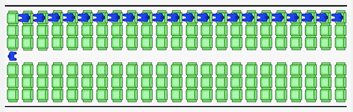
Alighting an aircraft is a time consuming pain in the arse. Probably number one for me, after security. Anyway, Vox looked at the slow boarding and alighting process and how to improve it. And why, most likely, airlines are not terribly interested in improving it. Hint, follow the money.
Doing it right
Credit for the piece goes to Menkes van den Briel.
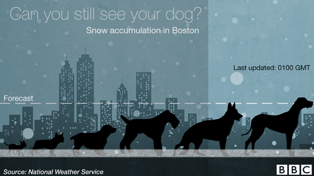
For those of you in the Northeast, you already know you are dealing with a little bit of snow. Thankfully the BBC put the amount received in Boston in context…of dogs.
Snow dogs
Credit for the piece goes to the BBC graphics department.
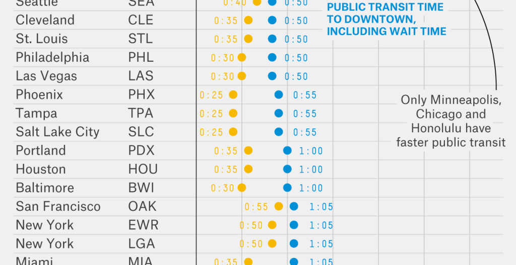
Travelling by plane can often be a hassle because getting from the airport to the destination is not always easy. Suffice it to say your humble author has—on a few occasions—been almost stranded at Philadelphia International because of no way to get where I was going. A lot of that comes down to poor public transit options. In my cases, it mostly stemmed from terrible weather delaying my flight until the wee hours of the morning after which train service stops.
Thankfully, Five Thirty Eight took a look at the public transit vs. car options for various cities/airports and seeing which option is faster. Ultimately Philly is awarded an honourable mention because the R1 (what some people now call the Airport Line) is convenient if your timing is right. Mine, obviously, has never been.
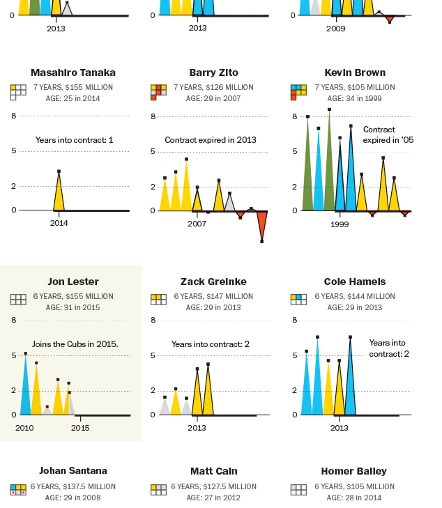
For those knowing baseball, Max Scherzer has almost officially signed with the Washington Nationals for lots and lots of cold hard cash. Over $200 millions’ worth. But how do these big dollar contract pitchers compare over the years? Thankfully the Washington Post took a look at that for us.
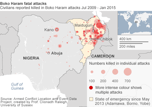
For those of you don’t know, there is an Islamist group operating in northeastern Nigeria. And they have been for a few years now. But recently they devastated a town and killed somewhere between 150 and 2000 people. Now they have taken to kidnapping Cameroonians, who live across the border, but whose government has been taking military action against Boko Haram. In this context, the BBC put together a map that shows the spread and scale of Boko Haram attacks in Nigeria.
The fatal attacks
Credit for the piece goes to the BBC graphics department.
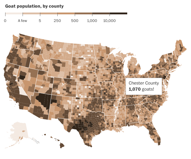
Today is Friday. And that means it is time for the seriousness. So here you go, folks. Goats. All the goats. The US Agricultural Census recorded all the goats as of 2012. And so people can map that out. Thankfully the Washington Post did it for me.
Note the exclamation point
Credit for the piece goes to the Washington Post graphics department.
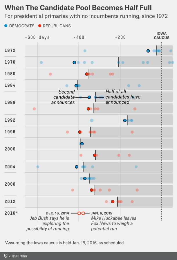
The last week or two have seen some interesting announcement regarding Republican potential presidential candidates. Seems pretty early no? Well, FiveThirtyEight looked at the timing of the announcements and found that it’s quite normal to be announcing this early. The data was summarised in this great dot plot/box chart.
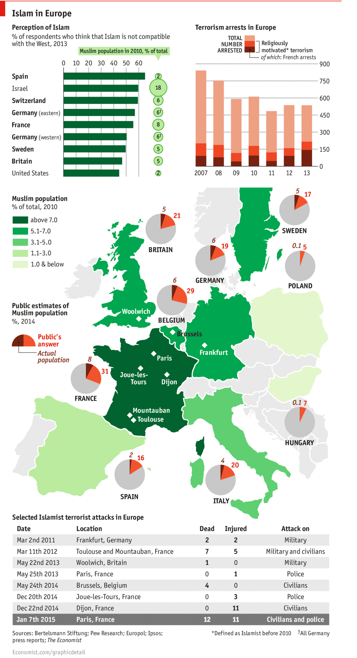
Last week’s terror attacks in Paris highlight the tension in Europe between secular Europe and those believing in Islamist values. The Economist looked at some of the available data and noted the gap between Europe’s perception of Islam and its reality. A quick figure called out for France, French respondents thought 31% of the French population to be Muslim. The reality is a mere 8%.
Perception vs reality
Credit for the piece goes to the Economist Data Team.
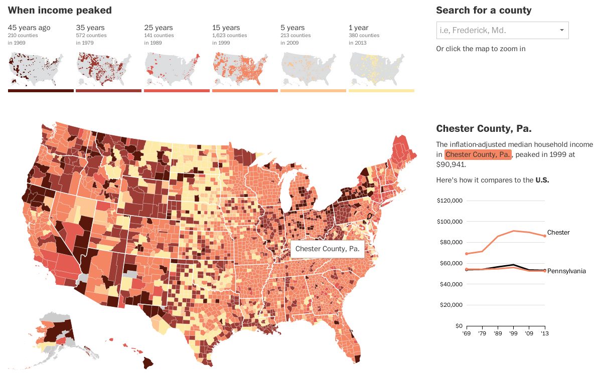
Today’s post looks at peak income for the middle class. The Washington Post looked at peak median household income for each county in the United States. And for 81% of counties, that peak was over 15 years ago.
Income map
The really nice features of this piece are not actually the map, which is a standard choropleth map. Instead small multiples above the map breakdown the appearance of counties in each era bracket. And then to the right the user can compare a selected county against both the state and the United States. Overall, a very nice piece.
Credit for the piece Darla Cameron and Ted Mellnik.