
This piece has been sitting for a month, but I still enjoy it. The Washing Post maps out Russian air activity around NATO airspace over a two-day period.
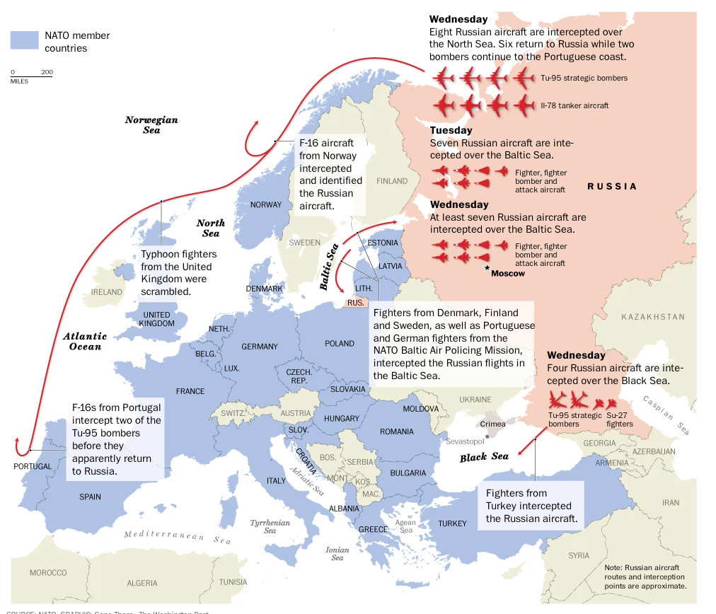
Credit for the piece goes to Gene Thorp.
This piece has been sitting for a month, but I still enjoy it. The Washing Post maps out Russian air activity around NATO airspace over a two-day period.
Credit for the piece goes to Gene Thorp.
What is out there beyond our solar system? Are there little green men in flying saucers? Or Klingons waging war? The first step in figuring that out is knowing how many planets can be inhabited by life as we know it. This interactive graphic from National Geographic explores just that. And as it turns out, most of the exoplanets we have discovered are not habitable. But a few offer promise. If only we could warp on over and properly explore them.
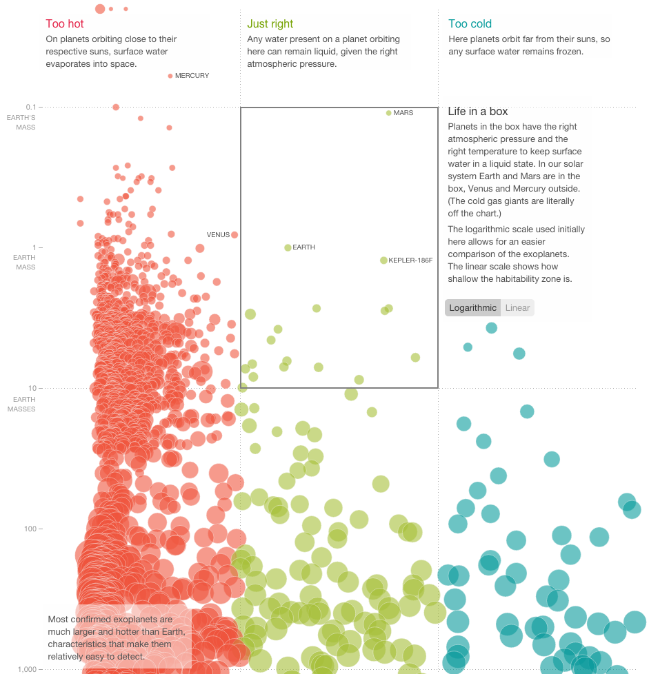
Credit for the piece goes to John Tomanio and Xaquín G.V.
A couple of weeks ago I shared a map from the New York Times that looked at American college football programme loyalty. And I quipped that none of it made sense to me as someone born and raised in the Northeast. The New York Times followed that piece up with another that looks solely at Facebook likes of college football via likes for any team. Not surprisingly the sport does not do too well in the Northeast. But it does appear quite popular in other regions of the country.
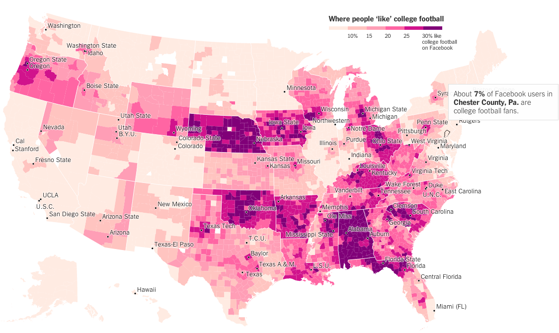
Credit for the piece goes to Neil Irwin and Kevin Quealy.
Today is an American holiday: Thanksgiving. We give thanks that European diseases and military technology allowed us to remove the native population for colonisation of the continent. We do that by watching American football and eating lots and lots of food. For dessert, well, we have dessert. But also gluttonous amounts of shopping. So in that spirit, here is the New York Times’ presentation of Thanksgiving recipes per state. The description is followed by an expandable recipe.

To be fair, I really am a fan of shoofly pie. But that’s just me.
Credit for the piece goes to the New York Times.
The Philadelphia 76ers are a terrible basketball team. FiveThirtyEight details the deficiencies of the team in this small table. Icons represent characteristics that can be either positive or negative. They are then placed within the table to quickly show how awful the team is. My favourite is the icon for poor player.

Credit for the piece goes to the FiveThirtyEight graphics department.
The United States has a long history of deploying troops overseas. How long? And where to? Well, ABC (as in the Australian Broadcasting Corporation) mapped out every US deployment dating back to 1798. I captured the year 2014, but if you are curious, you should check it out for yourself.
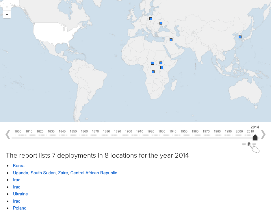
A neat little bonus, watch the growth of the borders of the United States from 1798.
Credit for the piece goes to Simon Elvery.
Today’s piece comes from the Wall Street Journal. It looks at US retail and foodservice spending through different types of stores.
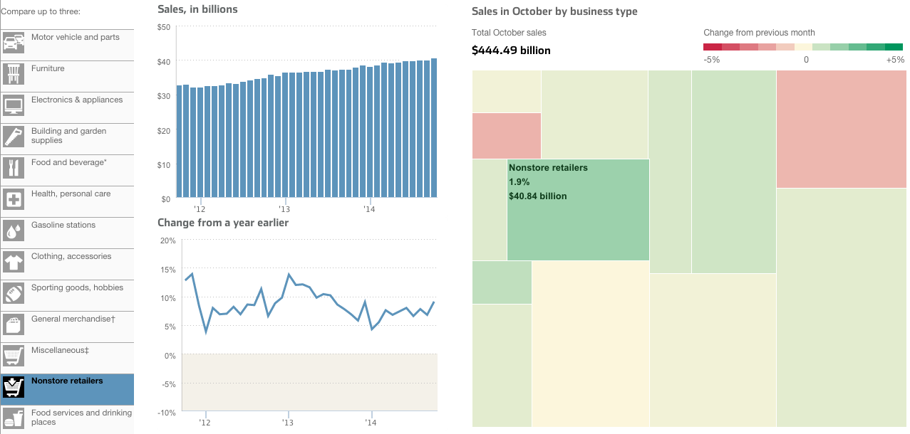
I take issue with a few things, firstly the tree map. Because it’s not really a tree map. Another thing I am not keen on is the comparison feature in the piece. The user can select up to three types of stores to compare. And while the result works in the line chart—three lines—the bar chart devolves into a near useless component. There is no easy way to compare the actual lengths of the individual bars short of mousing over and scribbling down each individual datapoint. In the particular case here, I likely would have changed from bars to line. Because that way I can compare the actual magnitude of each store type.
Credit for the piece goes to Dan Hill.
The subject matter of this one interested me. I am new to hummus. Well, sort of. I never ate it before moving to Chicago. But when I did, I understood it to be essentially a dip made from chick peas. According to an article from Quartz, It turns out that’s what most Americans believe. Even if they’re not necessarily buying it. Literally (sort of). Because some popular brands contain no chick peas. (Disclosure: I work for the company that provided some of the market sizing data used in the piece.)
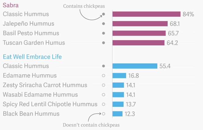
Credit for the piece goes to David Yanofsky.
Last week we covered the fall of the Berlin Wall and the lasting impact in former East Germany vs. former West Germany. This week we look at a piece from Bloomberg Businessweek that looks more broadly at Eastern Europe.
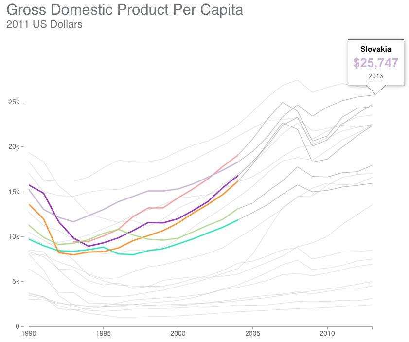
The piece scrolls with the charts updating based upon the available text. And within that text are highlighted keywords with which the user can interact to highlight data within the charts.
Credit for the piece goes to Alex McIntyre, Peter Coy, Christopher Cannon, and Blacki Migliozzi.
As the title says, we are all going to die one of these days. But what are the odds that Ebola will kill you? Turns out it is fairly small. Smaller than your pyjamas catching on fire and killing you. Or even your regular clothes catching fire. How did I know that? Well, the Washington Post put together a nice interactive piece to do just that. It starts you out at Ebola and works up to the most likely causes of death. If you are looking for your morning pick-me-up, this might not be it. Fair warning.
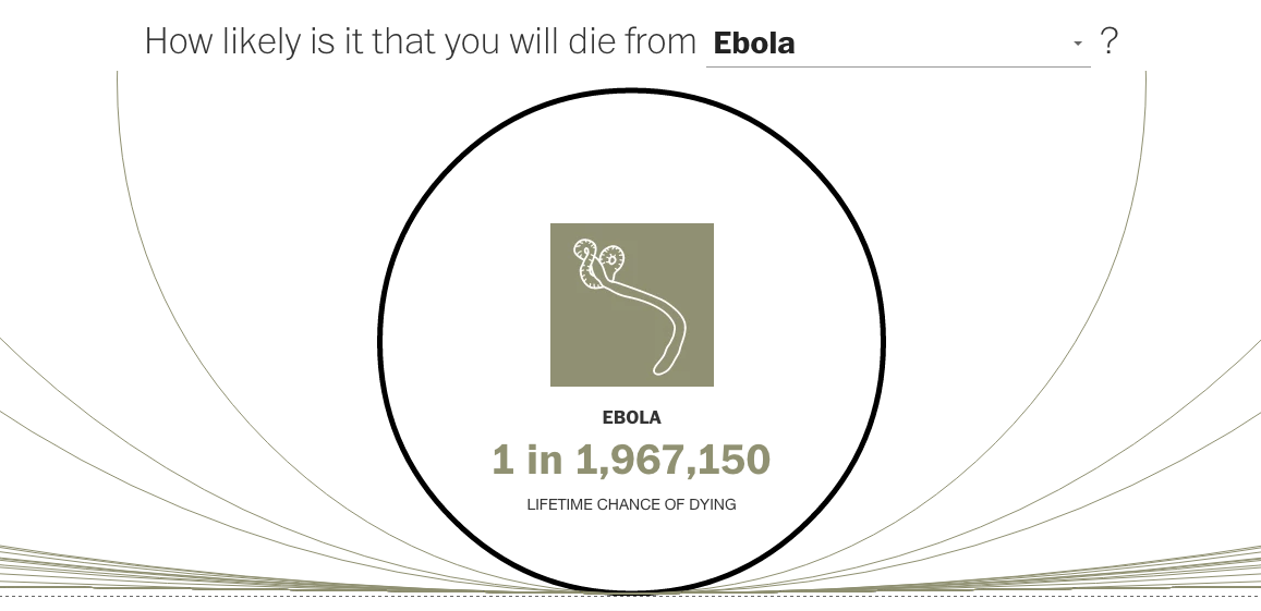
Credit for the piece goes to Richard Johnson and Lazaro Gamio.