Languages can be fascinating things. And not necessarily just in Klingon. Vox has a post using 23 maps and graphics to look at language. As usual with these sorts of things, some are good. Others not so much.
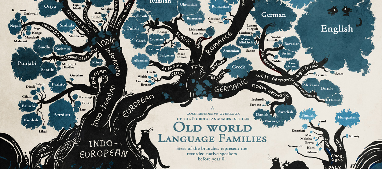
Old World languages
Credit for the highlighted piece goes to Minna Sundberg via Dylan Matthews.
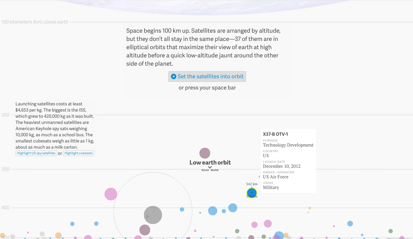
Naturally we have talked a lot about Rosetta and Philae the last few weeks. While Philae has exhausted its battery supply, Rosetta continues to orbit Comet 67P as that satellite’s own satellite. But what about Earth? What about our satellites? Thankfully the folks over at Quartz mapped that out for us in this great graphic. It portrays all the known functioning satellites in Earth’s orbit, their range, and launch weight.
Earth’s satellites
You can switch which variable colour encodes, e.g. country or age. And then by clicking on a satellite you can see its orbit height—this can also be animated. And for a neat little bit, the grey circle with the dotted line represents the International Space Station. The dot its launch weight, the dotted line its current weight. The one I have selected is the X-37B unmanned space plane operated by the US Air Force.
Credit for the piece goes to David Yanofsky and Tim Fernholz.
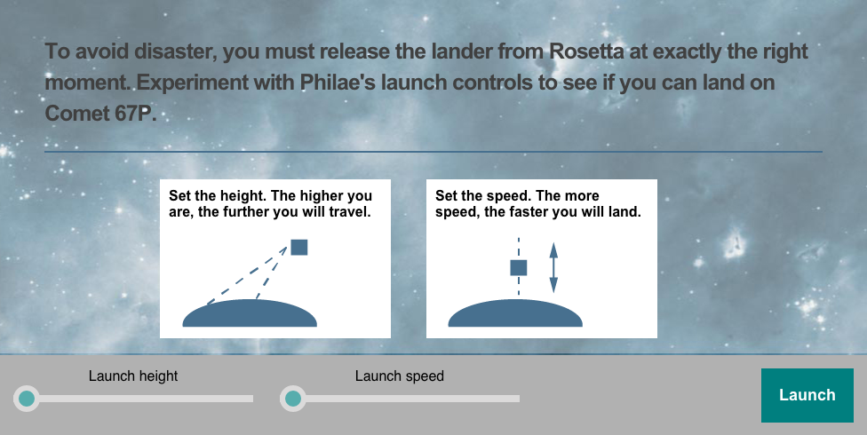
Today is Friday, so let’s take it a bit easy. You have heard of Philae and the comet landing. But we also know now that it bounced upon landing. But could you do any better? The BBC produced this game to let you try to do just that.
Landing Philae
Credit for the piece goes to the BBC graphics department.
After a week of some depressing material. Let’s lighten things up. Since, you know, it is a Friday.
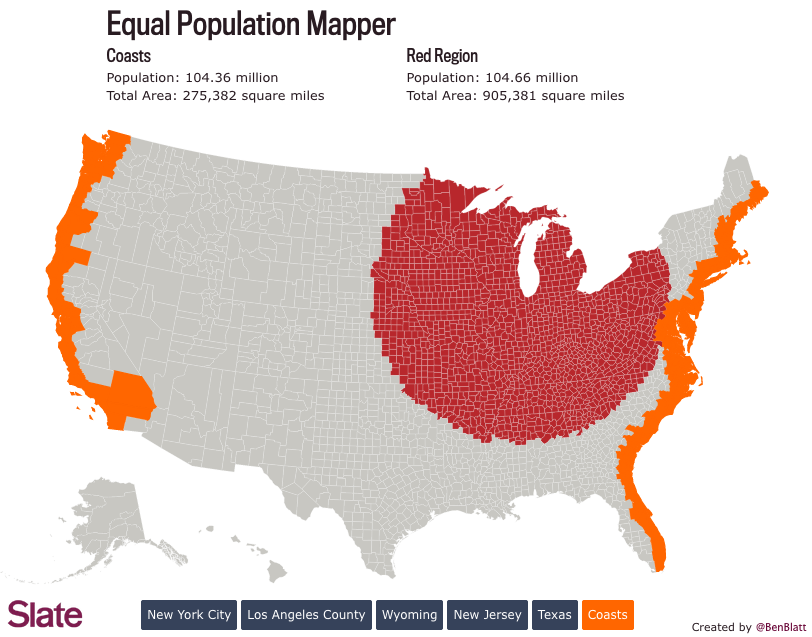
Two weeks ago we looked at comparisons of actual geographic area. These are sometimes useful comparisons. But more often than not we are talking about the people that live in said areas. And speaking as someone who has lived in either suburbs of big cities or within big cities my entire life, comprehending the not-do-dense rural flyover states is a bit hard to do. Thankfully Ben Blatt over at Slate put together a nice interactive piece that allows you to get a better sense of just how empty the middle of the country really is. (Hint, it is empty.)
Here we take a look at comparing the East and West coasts to Chicago. Turns out you have to go pretty far from the shores of Lake Michigan to equal the population of the two coasts. That’s a lot of flyover.
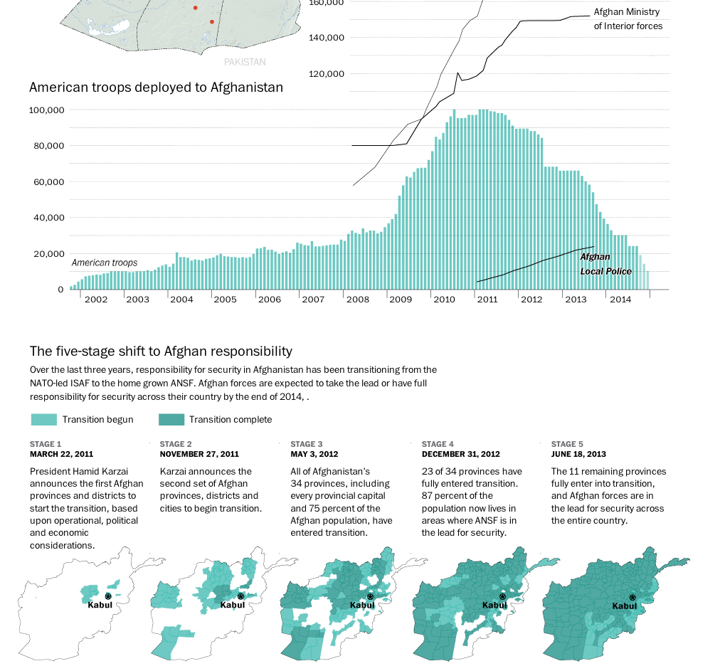
The United States and its allies are slowly beginning to pull out of Afghanistan. While several thousand troops will remain, the total will be nowhere near the peak figure a few years ago. This graphic from the Washington Post details just how this transition has been occurring.
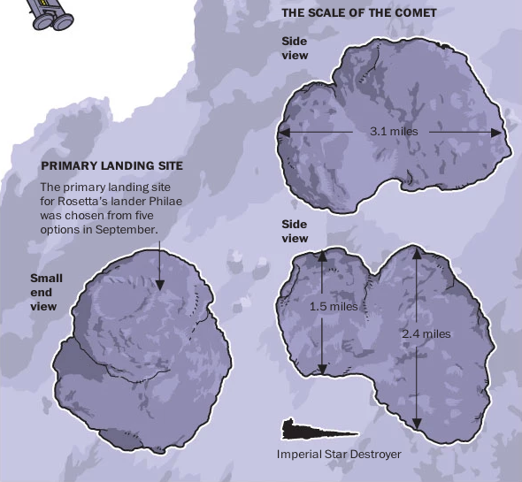
In a few hours—not long after this blog post is published—we should know whether or not the washing-maching sized probe Philae has successfully landed on comet 67P/Churyumov-Gerasimenko. The operation is very complicated, this is a moving and spinning comet with a boulder-strewn surface dotted with ice spires. And as of a few hours the lander was having problems with the gas thrusters designed to slow the lander to a hover above the comet surface. Space is hard. So to explain what is happening and the scale of the things involved, we have an illustration from the Washington Post.
How big is the comet?
Credit for the piece goes to Bonnie Berkowitz, Patterson Clark, and Richard Johnson.
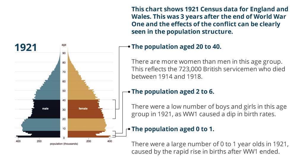
Today is Armistice Day, alternately known as Remembrance Day or Veterans Day. Originally the date remembered the armistice that ended World War I (hence those two names). The war ended at the 11th hour on the 11th day of the 11th month. But in the preceding years, millions of Europeans died along with just over a hundred thousand Americans. (We entered the war quite late.) This had a dramatic impact on the populations of European countries. In the United Kingdom, the Office of National Statistics put together a page for Remembrance Day 2014 that looks at four charts detailing the changes to the UK’s population structure. Suffice it to say there were lasting effects.
UK population in 1921
Credit for the piece goes to the ONS graphics department.
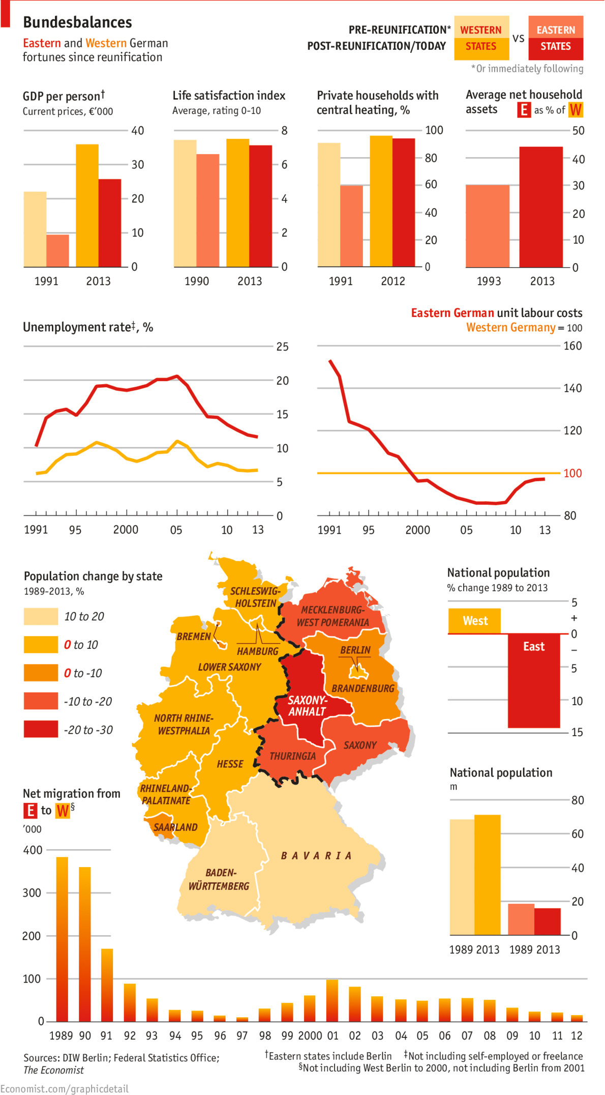
Yesterday marked the 25th anniversary of the fall of the Berlin Wall. But with the reunification of Germany a year later, has the former East Germany been able to catch up to what was West Germany? The Economist looks at the results in this graphic and the answer is yes. And no.
East vs. West. 1989 vs. 2013.
Credit for the piece goes to the Economist’s graphics department.
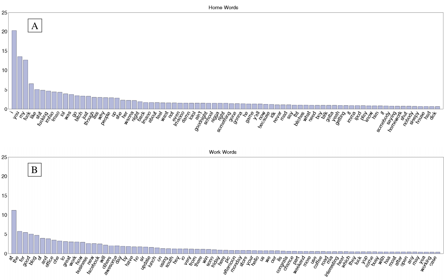
An MIT report looks at, among other things, the words used in tweets based on whether they were tweeted at home or at work. And, well, Malcolm Tucker would be surely disappointed. Because somebody screwed up and switched the words home and work. Clearly they should be reversed.
A rose by any other name is still a f**king rose for f**k’s sake, you t**t.
Credit for the piece goes to the report’s authors Morgan R. Frank, Jake Ryland Williams, Lewis Mitchell, James P. Bagrow, Peter Sheridan Dodds, and Christopher M. Danforth.
Nine years after the impact of Hurricane Katrina upon the city of New Orleans, the touristy French Quarter has returned according to an article in the National Journal. However, the new New Orleans beyond the French Quarter is different from what once was. In short, the new city is whiter and more Hispanic.
And while this graphic that accompanies the piece does a fair job of showing the title, a snapshot, I wish the focus would have been on more of a comparison between pre and post, old and new.
A quick look at New Orleans
I would not necessarily chosen the same components to tell the story. But, I really want to see more direct comparisons of even just the 2000 census and data to that of 2010.
Credit for the piece goes to the National Journal’s graphics department.