In the World of Damnit, Man

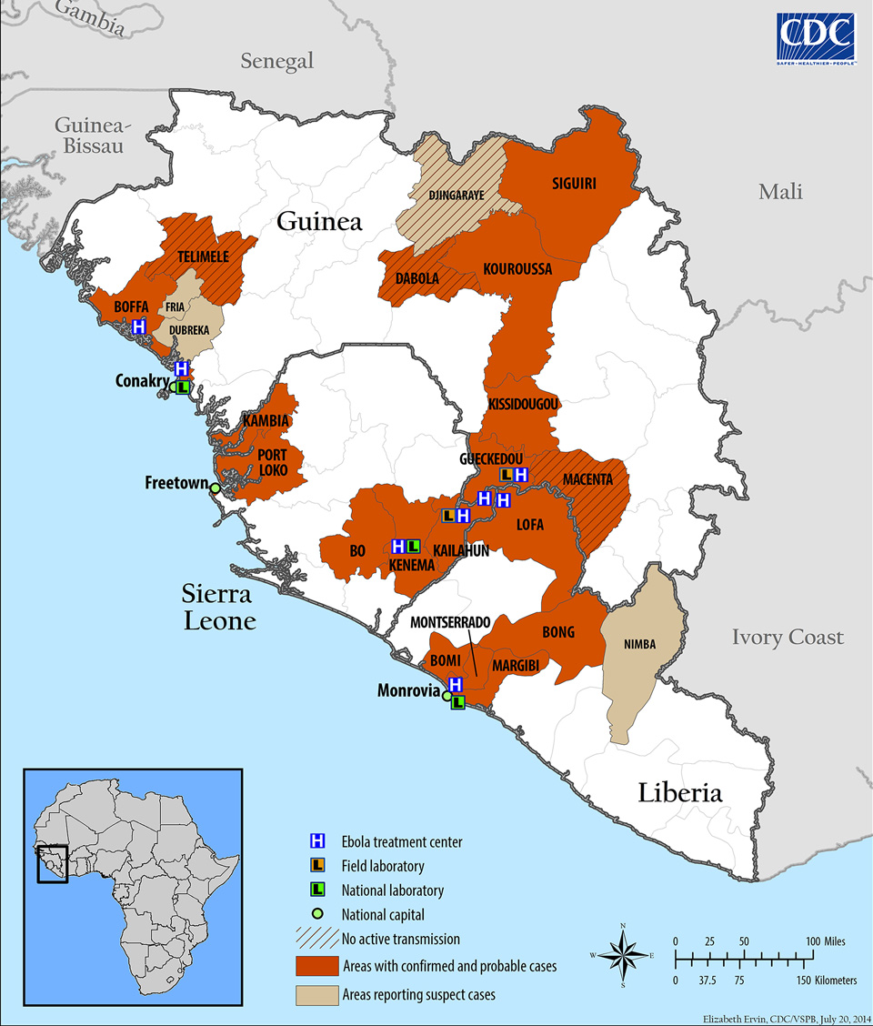
If you haven’t heard, there is a fairly significant outbreak of Ebola occurring in western Africa these days. The most attention has been drawn since the death of an American national in Nigeria. He had been working for the Liberian government and collapsed at the Lagos airport and died shortly thereafter. So the Centers for Disease Control has been reporting and advising on the outbreak and they have at least two graphics.

This first is good. It looks at the spread of the disease through different areas of several countries. It also identifies sites of interest for treating/containing the outbreak.

Outbreak map as of 3 August

The second, however, takes prominence as an “infographic” on the CDC homepage. How this qualifies as an infographic I have no idea. It is…just sad. I mean I get it, too many people do not understand how Ebola is transmitted. But to call this an infographic does disservice to other, real infographics.

The infographic
The infographic

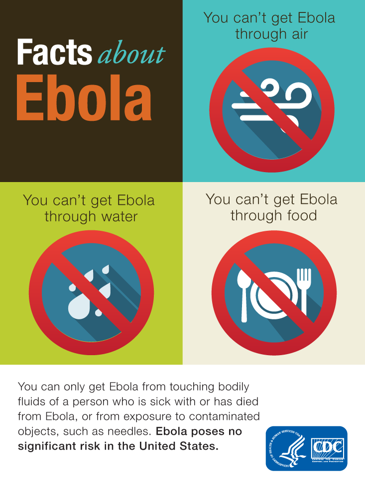
Credit for the map goes to Elizabeth Ervin. For the “infographic”, no idea.

The Silk Road, Respun

Today’s piece comes from the South China Morning Post. It looks at the Chinese government’s efforts to connect China to trade partners via a maritime route. This is conjunction with efforts to build a railway intended to connect Europe and China via Russia.

Cropping of the revival route

Credit for the piece goes to Lau Ka-kuen.

Loaning Art

Two weekends ago I visited the Magritte exhibit currently showing here in Chicago. While I would love to share photographs of some of my favourite works, I cannot. The museum staff was clear that part of the rules for exhibiting loaned work was the prohibition of photography. So that prompted me to wonder how often is artwork loaned?

Thankfully, the Boston Globe (sort of) answered my question this past weekend with a graphic detailing some of the major loans from Boston’s Museum of Fine Arts.

Three paintings on loan

Credit for the piece goes to Cecilia Reyes.

How History Repeats

This week starts with a several-hour ceasefire in the Gaza Strip—though as I write this I am reading reports of a strike in Gaza City. So as those who can remember a few years back might recall, these sorts of Israeli–Palestinian conflicts take a certain, almost prescribed course. The New York Times today charts the parallel narratives through the use of small multiples comparing rockets fired from Gaza and cumulative deaths.

Comparing the three most recent conflicts

Credit for the piece goes to Jeremy Ashkenas, Archie Tse, and Karen Yourish.

The Curse(s) of the CEOs

It’s Friday, so we should try to take things a bit lighter. For me that usually means knocking back a drink or two and a swear-y exultation about it being the end of the work week. But, it turns out, I’m just trying to emulate our captains of industry. Bloomberg has gone through company conference calls and tabulated the number of swear words used and charted the results. And for fun, you can read some of the excerpts.

They'll swear by it
They’ll swear by it

Credit for the piece goes to David Ingold, Keith Collins, and Jeff Green.

Casualties in Palestine and Israel

Yesterday I mentioned the cost of the conflict in and around Gaza and we looked at a map of damage. Today, we look at a daily-updated graphic from the Washington Post that counts the human cost—the number of dead.

The dead in Palestine and Israel

Credit for the piece goes to Lazaro Gamio and Richard Johnson.

Devastation in Gaza

I have done quite a fair bit of coverage on Ukraine. It is a terrible story, but I have also been personally interested in Eastern Europe for awhile. But Ukraine is not the only story in the world, we have seen Gaza erupt in flames. But with the recent, temporary ceasefire, we have been able to calculate the physical and human cost of the Israeli airstrikes and incursions. The New York Times in this graphic looks at the destruction wrought by Israel in one neighbourhood of Gaza City.

Destruction in Gaza
Destruction in Gaza

Credit for the piece goes to the New York Times’ graphics department.

Artillery Strikes in Donetsk

Today’s piece will not likely be the most readable for myself or most of you, my audience. But it is an interesting look at how technology can change the understanding of a modern battlefield for non-combatants. This is a map of Donetsk, Ukraine—the focus of Kiev’s efforts to defeat separatists in eastern Ukraine. The map plots artillery strikes from various days with links to images of the attacks.

Artillery strikes in and around Donetsk

Credit for the piece goes to the site’s designers.

Big Mac Index

For years, the Big Mac Index from the Economist has been a standard of sorts for examining differences in currencies across the world. Well now we have an online, interactive version of the index.

The Big Mac Index
The Big Mac Index

Credit for the piece goes to the Economist’s graphics department.

What if Britain Had Won?

A few weeks ago, one of my coworkers, sent me a link to a Newcastle Ale campaign video asking what would America be like if Britain had won the Revolutionary War. Anybody who knows me really well knows I am an Anglophile. I say mobile instead of cell phone, from time to time I switch from apartment to flat or truck to lorry or elevator to lift. So naturally I checked out the campaign site and what did I find? A map of place names if the Americans had not won the war. You can search for your residence or hometown and see what the Brits would have named it.

Though this ignores the fact that most of where I am from was actually named by the Brits. West Chester was originally called Turk’s Head, but after the a bunch of boundary changes that separated the British named Chester from my area, Turk’s Head was renamed West Chester because it is west of Chester, located on the Delaware River. Anyway, place names are cool. Happy Friday, everybody.

I would have grown up in West Chesterwich

Credit for the piece goes to the design team behind the ad campaign.