Around the World

If you’ll allow your humble author a humblebrag, I often complain about having to daily deal with people around the world living in a lot of different time zones. How do I keep track of business hours around the world? I don’t. Well, not easily. But thanks to xkcd, this is no longer a problem.

Clearly, I wrote this in the evening

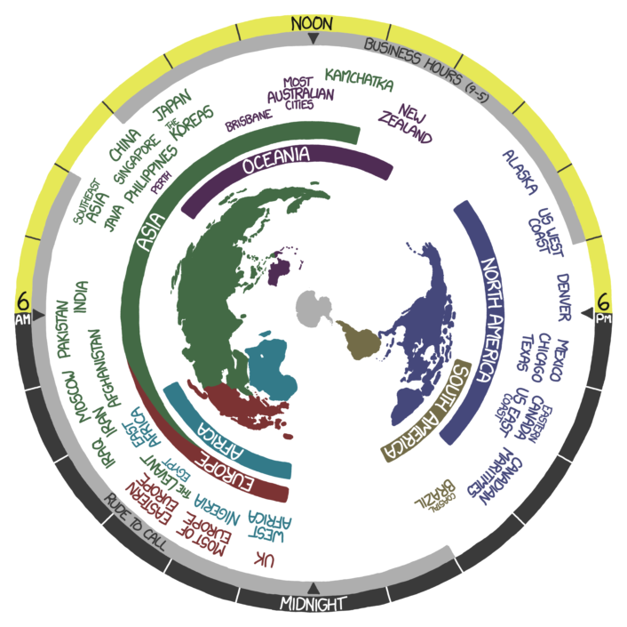
This is only a screenshot. But the actual image actually generally follows the Earth’s rotation. You know, until it stops. Or until we hit daylight saving time. Whichever comes first.

Credit for the piece goes to Randall Munroe.

The Science Behind the Thoroughbred

I do not know a thing about horses. I leave that knowledge to others in my family. However, this piece from the South China Morning Post explains quite a bit of why the thoroughbred is such a famous type of horse for racing.

The science behind thoroughbreds

Credit for the piece goes to Alberto Lucas López.

Defensive Incest

Today’s piece comes from Bloomberg Businessweek. In the wake of the Pentagon’s decision to push for budget cuts including force reduction and slashing several programmes, I decided to show this chord diagram that shows how the defence industry supports itself.

Defence companies supporting each other

Credit for the piece goes to Robert Levinson, Dorothy Gambrell, and David Evans.

Potholes

Today’s piece is from the Washington Post. However, it is less data visualisation and more of a neat little motion graphic explaining the formation of pot holes. Since it seems to be about that time of year when roads are destroyed by the things.

Potholes
Potholes

Credit for the piece goes to Sohail Al-Jamea and Bonnie Berkowitz.

Household Income Inequality

The Washington Post published this dot plot graphic to explore inequality in household income across numerous American cities.

Household income inequality

The chart, as most dot plots do, does a good job of showing where several distinct points within a set fall within the entire range of data. Or to put it into other words, where do the poorest, the richest, and the most middlest households in Philadelphia fall within all Philadelphia households? The data is interesting because you will begin to uncover some significant outliers. For example, by quick glance, the 50th percentile in both Detroit and Cleveland earn less than the 20th percentile in San Jose.

Credit for the piece goes to the Washington Post graphics department.

Baseball Windows

Spring training has begun for baseball fans. The glow from the Red Sox victory last October is fading as we now wonder if we can repeat. Fans of other teams now wonder if this is their year. Over at SB Nation, an article plotted 29 baseball teams—ignoring the Dodgers— and looked at their chances in the upcoming years. The article continues using the chart to explain which teams fall where.

Baseball windows
Baseball windows

And for the designers, note the type choice for “Nope”.

Credit for the piece goes to Grant Brisbee.

The Swiss and Immigration

Last week, the Swiss people narrowly rejected the principle of freedom of movement. This principles serves as one of the foundations of the European Union. And while Switzerland does not belong to the EU, its economy benefits from access to the single market via that freedom of movement principle. That may be an oversimplification perhaps, but it provides some context to the consternation in Europe over the Swiss people rejecting the principle.

This graphic is not particularly complex. It is a choropleth of the vote results. However, it does show that the vote was not unanimous. Rather it was contained to the cantons (analogous to states in the US) more rural in character, i.e. less urban places like Geneva.

Swiss immigration vote results

Credit for the piece goes to the BBC graphics department.

Explaining What is Going on in Ukraine

Not “the Ukraine” as it is (admittedly) fun to do in pop-culture references to Seinfeld. This comes from the Washington Post and the article tries to show that the protests in Kiev are not necessarily a vast majority against the government. Certainly the opposition is strong, but there is also a very strong pro-government movement. Why? Because in the broadest of senses, Ukraine is where the West, i.e. the European Union, meets the East, i.e. Russia.

A divided Ukraine
A divided Ukraine

Credit for putting this all together goes to Max Fisher. Credit for each of the original graphics is to their respective designers whom I cannot identify.

Racing for Revenue

As the Winter Olympics continue, the Economist looks at a different kind of race. The race between companies reaching a certain amount of revenue—along with the net profit from said revenue. How long does it take a company to reach $1 million in revenue? When all companies have reached the same amount of revenue, what percentage is net profit? It’s a neat little interactive. Thankfully you can skip the race and get straight to the results, a nice design feature.

Race to $1 million
Race to $1 million

Credit for the piece goes to R.J., G.S. and K.N.C.

Living on the Minimum Wage

Last week the New York Times published a nice interactive about the minimum wage and just how difficult it is to live on it. (We will for now spare the charts that show how the actual purchasing power has declined over the years.) First you pick your state because not every state pays the same minimum wage. Then as you begin to enter figures for your expenses, or a hypothetical person as in this screenshot, you find how quickly a minimum wage earner runs out of money. And then how much debt they owe and how much more they have to work to pay it off.

A fictional person in Pennsylvania

Credit for the piece goes to Jeremy Ashkenas.