
To celebrate, here’s a cropping from an infographic about breakups. From a whole series of graphics about breakups. You can thank me with some dead and rotting flowers.
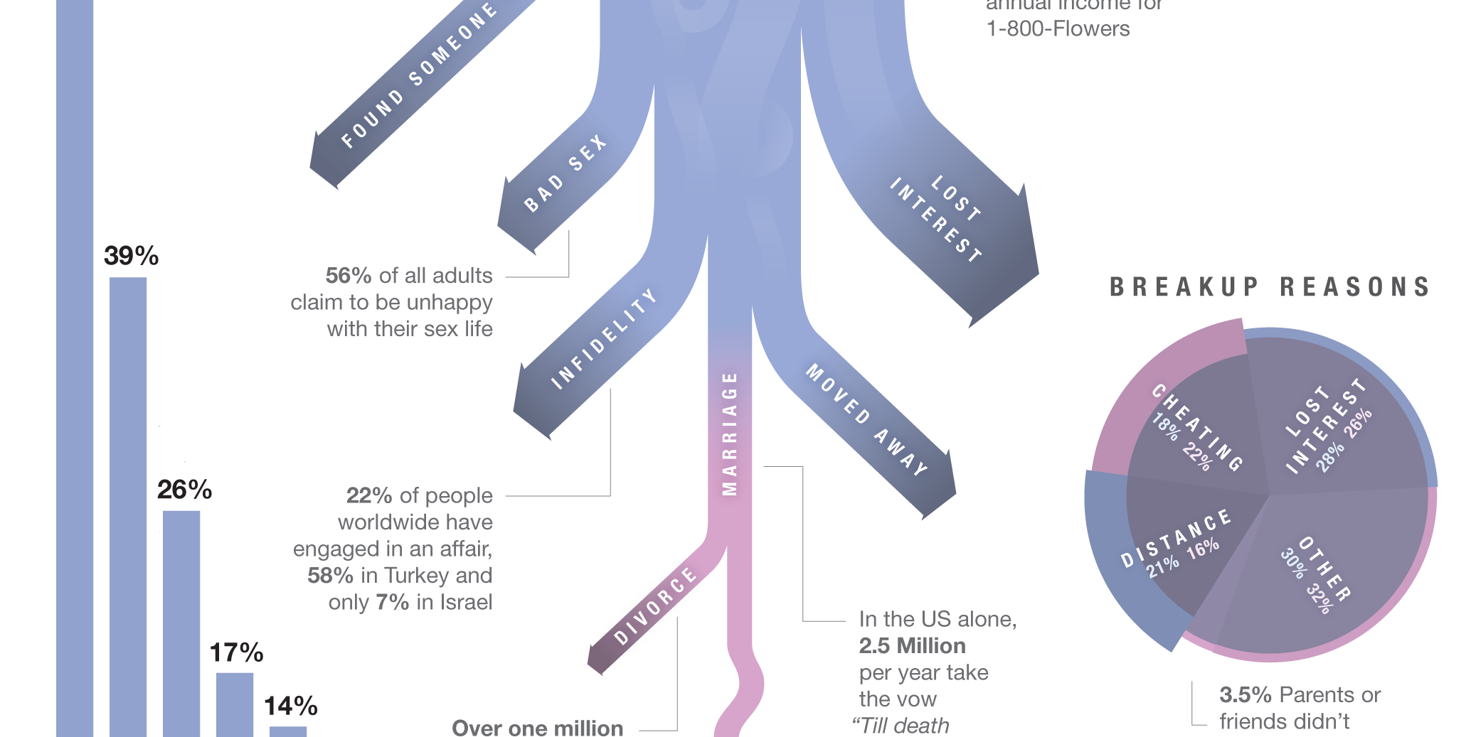
Credit for the piece goes to Lee Byron.
To celebrate, here’s a cropping from an infographic about breakups. From a whole series of graphics about breakups. You can thank me with some dead and rotting flowers.
Credit for the piece goes to Lee Byron.
This is an older piece from the fall, but with the talks going on about Syria this felt an appropriate time an infographic about sarin gas poisoning.
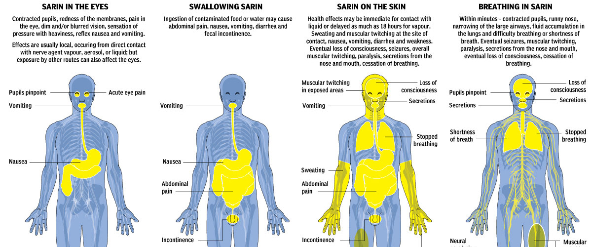
Credit for the piece goes to Jonathon Rivait, Mike Faille, and Richard Johnson.
Today’s post comes from a co-worker and looks at the increase of speed in speed skating in the Winter Olympics since 1924. It does a nice job of showing the increase in the speed. Because to a degree, the increase has not been linear. Instead, it really only increased in two spurts and recently has remained fairly constant.
Then to show how slight differences in speed impact an actual race. The times are plotted against the distance in a simulated race. That shows that seemingly incremental increases in speed can have a drastic impact on where one finishes a race.
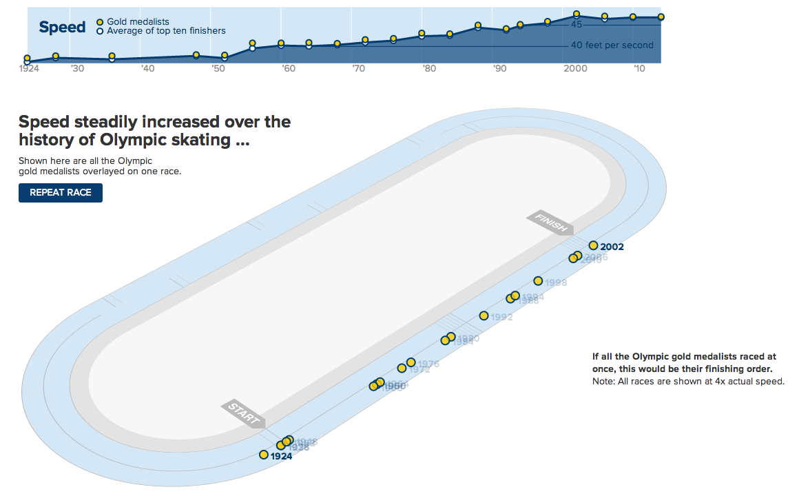
Credit for the piece goes to Andrew Garcia Phillips.
This piece from the Washington Post examines the idea of economic mobility. That is, what is the likelihood that children born and raised in an impoverished family will surpass their parents’ standard of living.
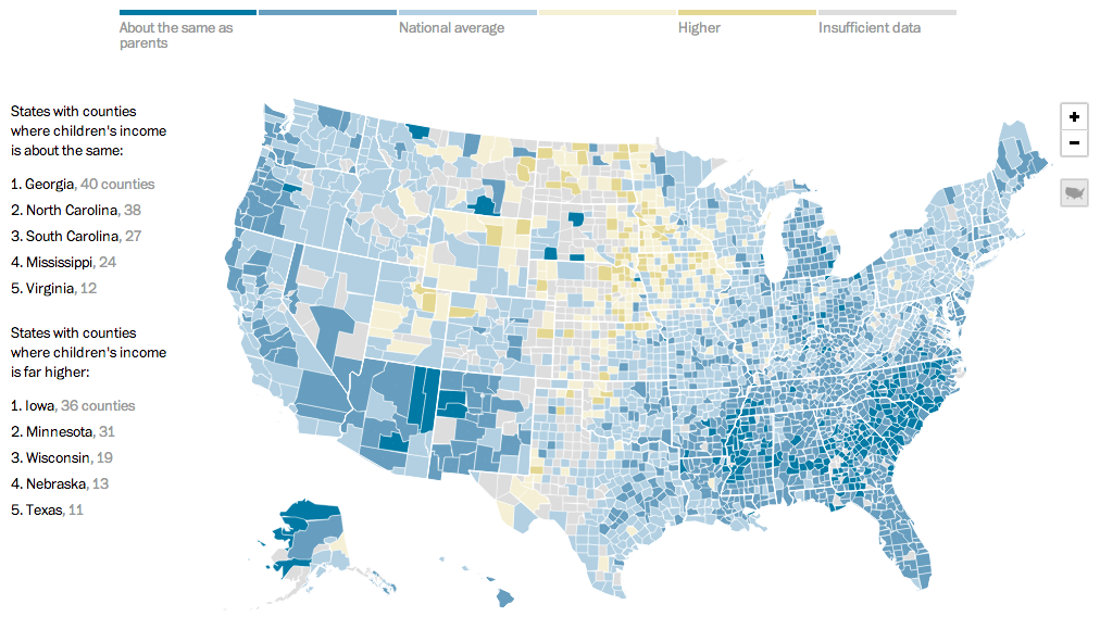
Credit for the piece goes to Darla Cameron and Ted Mellnik.
The Olympics opened in Sochi this past weekend. Many of us may well be familiar with photographs of urinals without piping, or unfinished hotel rooms, or many other infrastructure problems, but there is a bigger issue facing Sochi. It exists on what the New York Times terms the edge of a war zone. Their overall piece is more text-heavy than graphic-heavy, but several maps lend context to this complicated region of the Russian Federation. If you’re curious to better understand the region, this is a good primer.
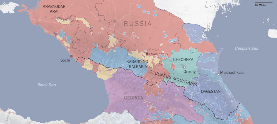
Credit for the piece goes to the New York Times graphics department.
The inability of people to understand geography beyond their own borders is not new. But today’s post uses that to create a new map—albeit from a limited sample. The creator of this map merged 30 different, hand-drawn maps into one to reveal the world as imagined by his sample.
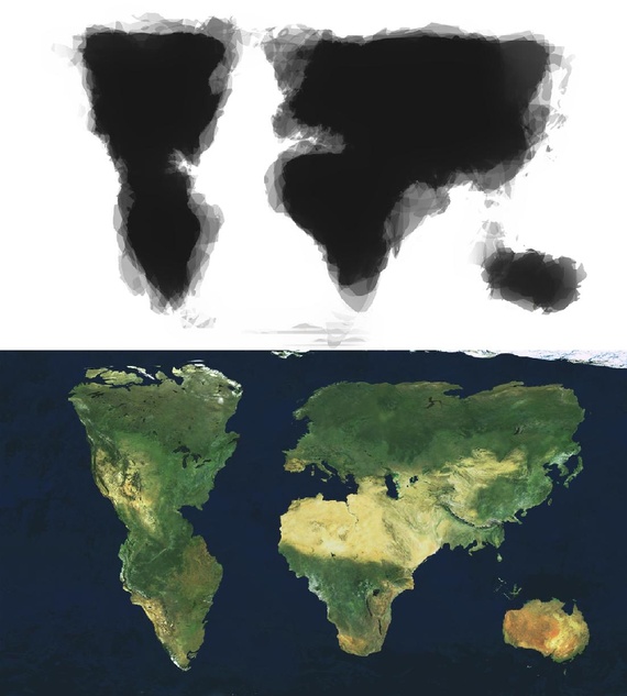
Credit for the piece goes to Zak Ziebell.
Today’s post is more about a means of illustrating radiation, less about quantifying it. Unfortunately the article is in German and I speak none of it. But, the context is that of the Fukushima Disaster. Make sure you click through to see the illustrations in action.
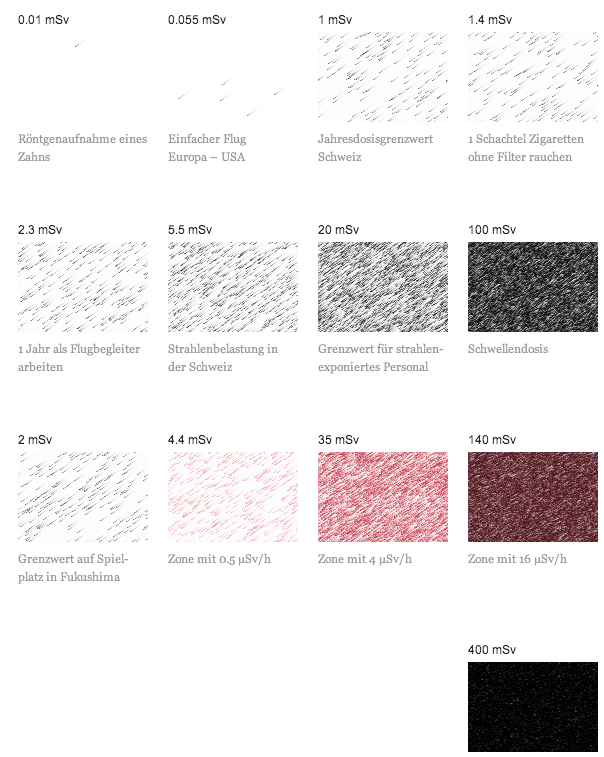
Credit (I think) goes to Interactive Things and Neue Zürcher Zeitung.
So yeah, the Super Bowl thing. Apparently tickets are expensive? Earlier, Bloomberg Businessweek took a look at average prices for the most expensive events of 2013. The only sentence supporting the graphic was that the most expensive event was not the Super Bowl. Okay, so what was?
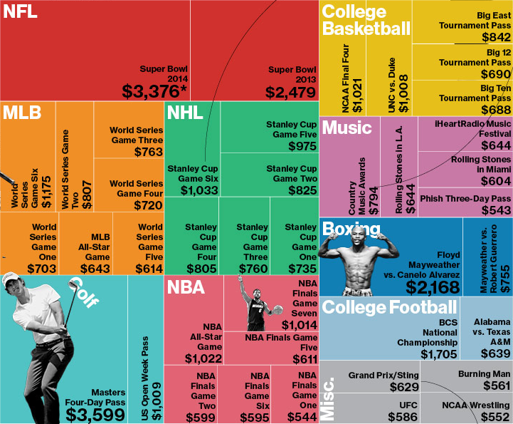
I think this graphic actually makes it more difficult to tell. But beyond that, the decision to use the tree map confuses me. We are already looking at a subset of ticket prices—not all, but only the “most expensive”. What criteria determined that selection? After all, from my own experience and personal knowledge I know that Red Sox–Yankees game are also incredibly expensive. But those are not present in this set. And then if the idea is to undermine the common thought that the Super Bowl is the most expensive ticket, should the user be forced to find through each square—and no, the events are not squarified very nicely—the highest value?
So I took an hour before the game to try a quick stab at quickly identifying the most expensive tickets. It turns out that the glorious bar chart more than suffices. It also then shows how quickly the remainder of the prices become quite comparable. (Ridiculous I suppose depends upon your preference for sport/event/disposable income.)
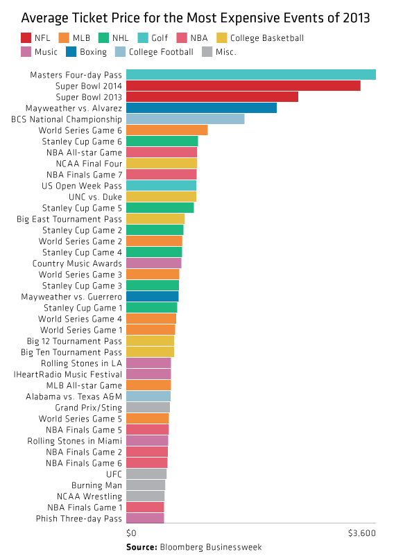
Credit for the original piece goes to Bloomberg Businessweek.
As I noted in my Friday post, I spent last week in Lithuania for work. That same Friday night, I had a conversation with a few coworkers over dinner and a beer about credit cards. They teased me that for all of America’s technological advances and advantages, even in Lithuania they were using more secure forms of bank card payment: chipped cards. And that story seems a perfect segue into today’s post from the Washington Post.
Through a combination of charts, maps, and illustrations—a cropping of which is shown below—the Post details the advantages of using microchipped cards in preventing certain types of fraud. Additionally, because of the integration of the visuals with the written explanations, text can be used to provide longer anecdotes to explain exceptions and outliers when and where necessary.
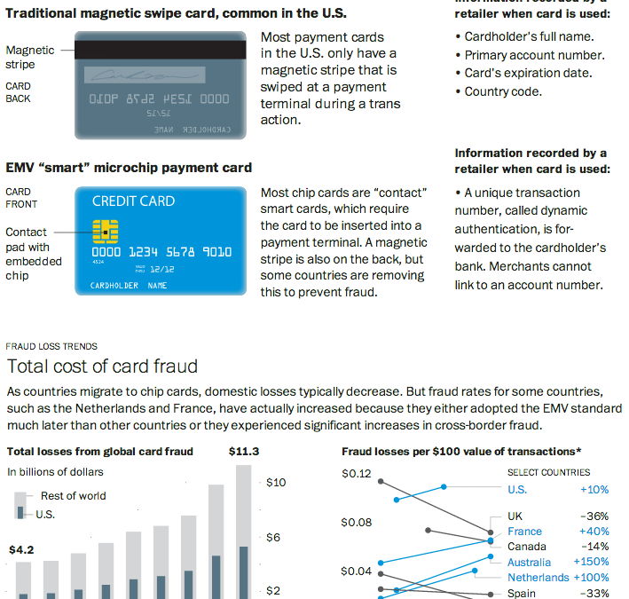
Credit for the piece goes to Todd Lindeman.
Last night the United States enjoyed a little (American, not rest-of-the-world) football match wherein two squadrons competed upon the pitch for the glory of their squadron colours. Thankfully for those of us who wanted a preview of the match on data’s terms, well, the Guardian put together a fantastic piece breaking down some of the numbers.
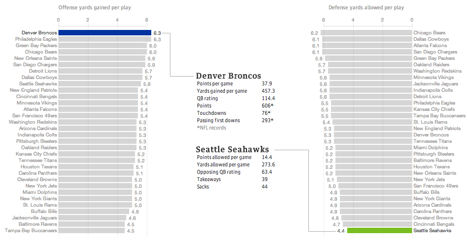
The data is not terribly complicated—I still think baseball makes the most use of advanced metrics, though it helps they play more than 10 times as many games per season. The Guardian looked at yards gained or lost per play by the offence or defence, respectively. Click through the link to explore the other charting forms used, in particular the four quadrant scatter plot and the small multiples that follow. Also, a sophisticated and restrained colour palette allows the user to clearly understand when he or she is viewing the Denver–Seattle matchup or the historic match-ups of the NFL.
Regardless of the quality of the presentation, we shall see Monday morning—I am writing this Sunday afternoon—whether this piece will still hold with its talk of the best match-up ever.
And hey, for all this talk about the best offence, look at which squadron is ranked second. Fly, Eagles, fly.
Credit for the piece goes to the Guardian’s US Interactive Team.