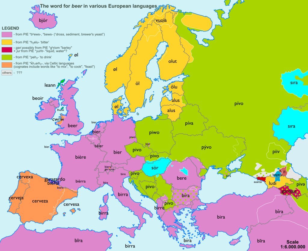
Today’s post comes via Business Insider. They linked to work by reddit user sp07 who mapped out words used for common objects across Europe and then looked at those words by their origin. But of all words, this is probably the most important.
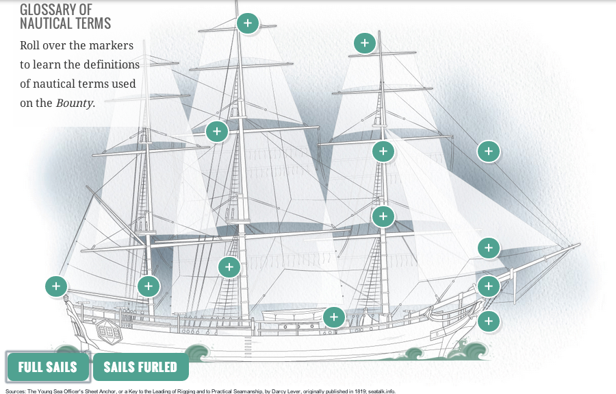
This time last year, the Northeast began to pick up what was left from Hurricane Sandy. There was a lot of rain, a lot of wind, flooding, and electrical outages. But not all the damage was ashore. In an excellent long-form narrative piece, the Tampa Bay Times covered the story of the Bounty, a functional replica of HMS Bounty from that famous story of a mutiny. This Bounty was used in the 1960s movie and had sailed ever since until it sank off Cape Hatteras, North Carolina.
A diagram of the Bounty
The piece doesn’t makes use of some charts and graphics to explain positioning and familiarise the reader with terminology. It’s a fascinating though ultimately tragic story. And like so many of these long-form pieces, the credit list is extensive.
Credit for the piece goes to Michael Kruse, Don Morris, Maurice Rivenbark, Carolyn Edds, Caryn Baird, Barbara Moch, Mike D’Andrea, Bill Duryea, Alexis N. Sanchez, and Lee Glynn.
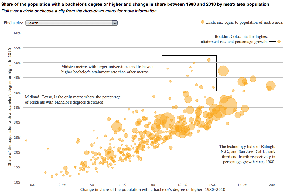
Today’s piece comes from the National Journal. It is an interactive bubble chart that compares the educated class of cities in 1980 to those in 2010 (educated meaning the share of population with at least a bachelor’s degree).
College graduate cities
Not a whole lot to say about this one, in a good way. A nice summation at the top with clearly presented data below while annotations on the plot call out particular objects in the series worth noting. And then for those who want to find themselves, a drop down filter at the top allows users to select a particular city.
Credit for the piece goes to Brian McGill and Nancy Cook.
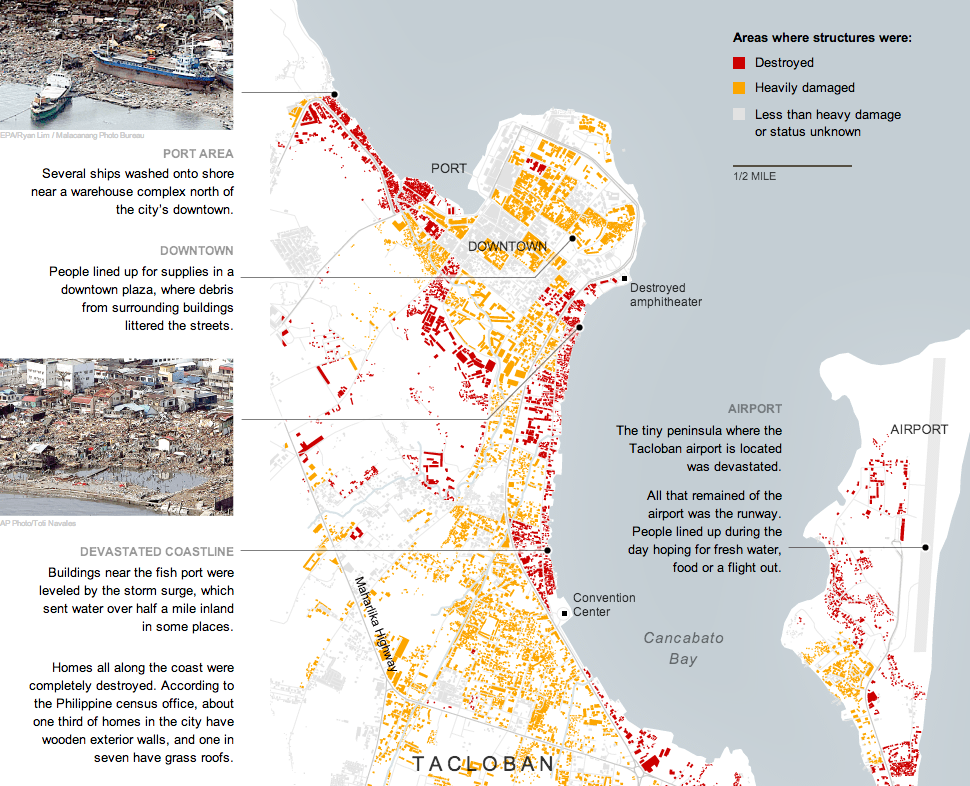
On 8 November, Typhoon Haiyan made landfall in the Philippines, killing what may well be 10,000 people. The New York Times covered much of the damage in Tacloban, perhaps the hardest hit city, in this interactive graphic.
Structural damage in Tacloban
Credit for the piece goes to the New York Times graphics department.
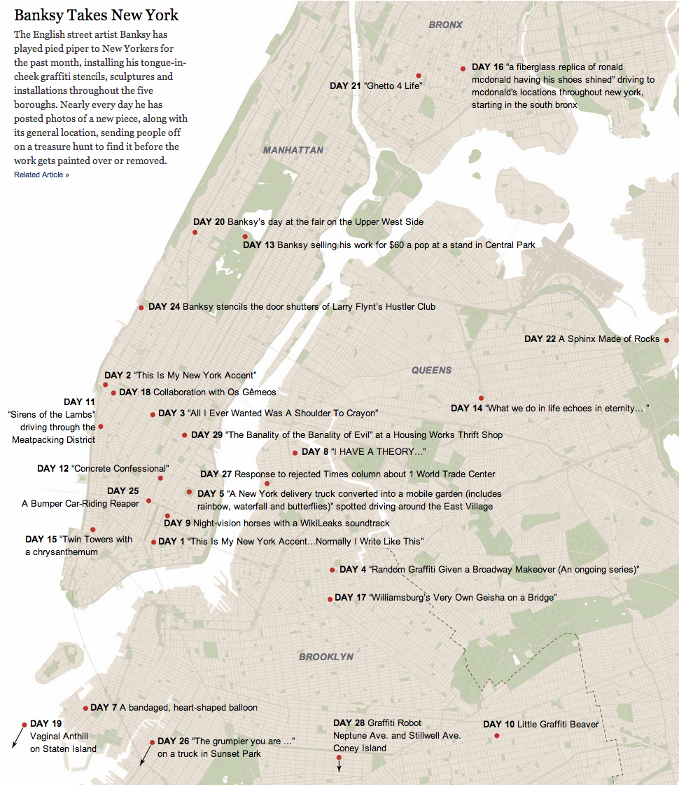
The English artist Banksy has been in New York the past month. Consequently, the interest in his work prompted the New York Times to map the works across the city.
Banksy in New York
Credit for the piece goes to the New York Times graphics department.
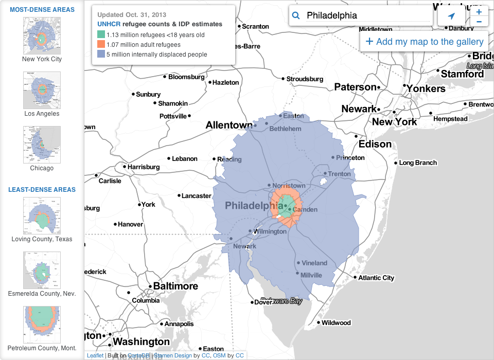
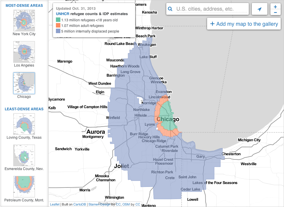
So that civil war in Syria thing, yeah, it’s still going on, folks. And lots of people—7,000,000 of them—have been forced to flee to either external or internal locations. Al Jazeera has attempted to put that number into context for Americans using US census data and maps.
Here is a look at both Philadelphia and Chicago for comparison’s sake. The interactive application has a few pre-selected options, or you can find your own US locale.
Syrian refugees based on Philadelphia’s populationSyrian refugees based on Chicago’s population
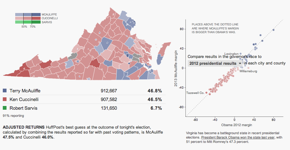
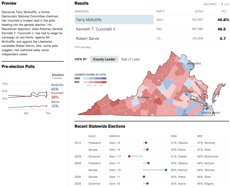
Last night was election night. Okay, maybe not the big midterm, but there were still a few interesting races. The one I want to look at it, however, is the gubernatorial race in Virginia. Maps are pretty much the default in big, statewide races like these and it is no surprise that the three screenshots here are use a map as an anchor component.
The Huffington Post uses a scatterplot to compare the margin of victory for Terry McAuliffe to that of Barack Obama in 2012. A technical flaw places the drop down menu atop the plot, unfortunately, but the component works to show differences in just one year.
Huffington Post results
Over at the New York Times, the Virginia results were given a nice overview. Here they used a text summary to explain the race in short. They used a small amount of space to show polling results over time. And then beneath the map they looked at recent elections across the state.
New York Times results
The Washington Post, which reports to the northern counties of Virginia, had a much simpler piece. They used solely a map to present the data.
Washington Post results
Credit for the Huffington Post piece goes to Aaron Bycoffe, Jay Boice, and Hilary Fung.
Credit for the New York Times piece goes to the New York Times’ graphics department.
Credit for the Washington Post piece goes to the Washington Post’s graphics department.
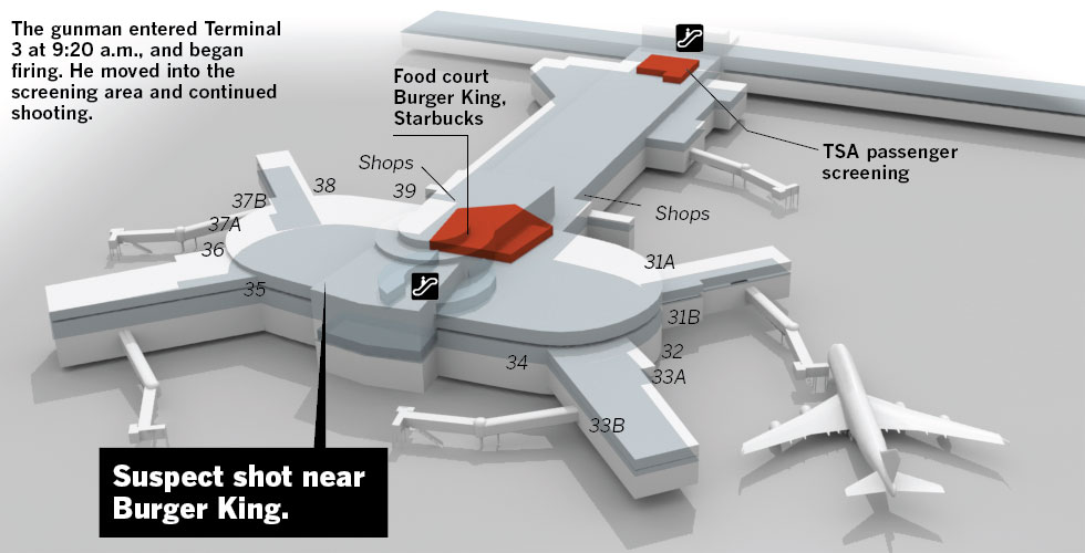
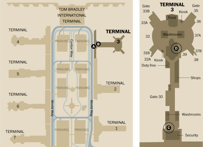
I didn’t see a lot of informative graphics regarding the shooting at LAX. But, here are two pieces. The first is from the Los Angeles TImes. Terminal 3 is rendered in three dimensions. Different buttons add views of the remainder of the airport.
Los Angeles Times’ terminal diagram
The Washington Post opted for a flat, two-dimension drawing in one graphic with both all of LAX and Terminal 3 in the same graphic.
Washington Post’s terminal diagram
The thing about the three-dimensional rendering is that it adds too much complexity whereas the two-dimensional schematic strips most of it out. Is it important to know the specific details of a building? Or is it more important to see its general shape and an area inside of it?
Credit for the Los Angeles Times piece goes to Javier Zarracina, Raoul Ranoa, Lorena Iniguez, and Anthony Pesce.
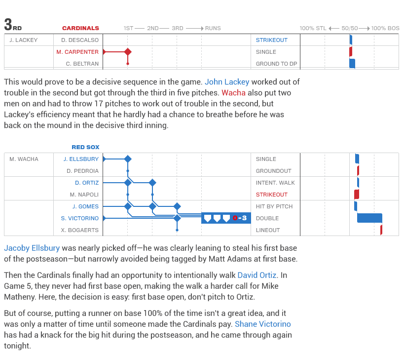
Last week the Boston Red Sox won the 2013 World Series. I did a wee bit of celebrating and so I did not have the chance to post today’s post until, well, today. A company called Statlas charted each game of the World Series. One of my coworkers pointed me in the direction of these visualisations, unfortuantely I missed out on most of them for the playoffs. Here, though, is when I started feeling a lot less nervous about Boston’s chances for winning Game 6.
When the Red Sox won the game and the World Series
There is a lot to see and look at in these games. And I will be curious to see where Statlas takes these—if they take them anywhere—for the 2014 season. Baseball is a game rich with statistics and data and teams and fans are increasingly using them to play and understand the play in the games. It’s about time somebody starts doing some valuable visualisations.