Budget Sequestration and US Austerity

First things first, the verb is to sequester. The noun is sequestration. 1 March is not when the sequester begins. It is when the sequestration begins.

Now that we have the preliminaries out of the way, much is made of high government spending relative to revenue. However, this conversation still misses the point that government spending has fallen significantly. The New York Times charted that recent fall in spending in this graphic. This contraction is the largest drop in over 50 years. Along with the bars indicating recessions, I perhaps would have indicated major US military conflicts given the emphasis the introduction places on those events.

Government spending
Government spending

The piece also looks at government employment, which has been atypically lower than pre-recessionary figures. Taken in sum, the two sets of data point to an extant condition of austerity that shall only be worsened by…c’mon everyone…that’s right, the sequestration.

Credit for the piece goes to Alicia Parlapiano.

Historical Chicago Snowfall

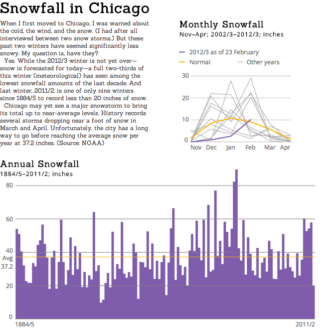
Snow should fall upon Chicago this afternoon and it may measure up to a few inches in depth. But much of this winter has been below average. And that is much the same from last year when snowfall did not even reach 20 inches.

I went through NOAA data to look at the last decade of monthly snowfall to see just how little snow has fallen this winter. (Not a lot.) And then I looked at the entirety of the NOAA records to see where 2011/2 fit in the span of winters. (One of the least snowy.) This graphic is the result.

Historical Chicago Snowfall

Setting Up a Snowstorm

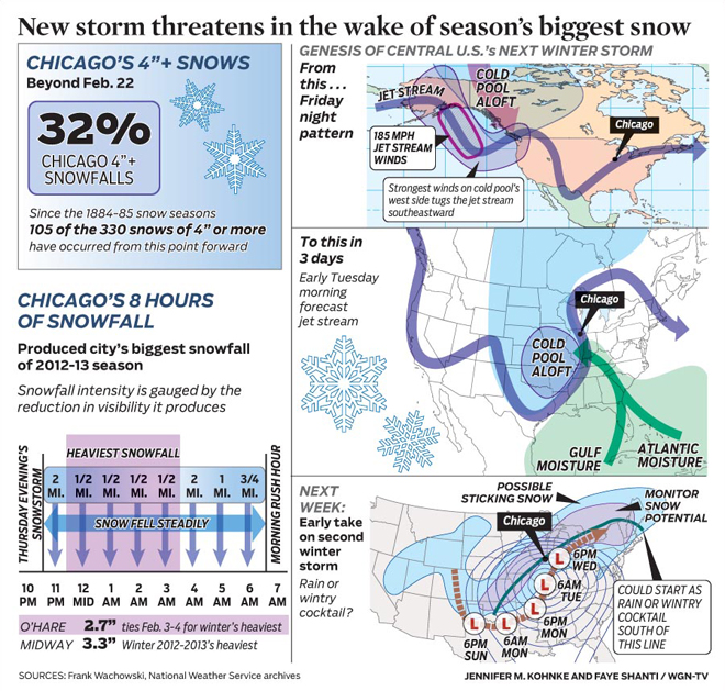
This weekend I researched meteorological data for a graphic that I will post tomorrow. But in doing that research I came across a series of weather infographics from WGN that are better than the average. The one below details the snowstorm due to impact the Chicago area and how it will form (along with the storm that brought a few inches of snow last week).

The setup for this week's snowstorm in Chicago

Credit for the piece goes to Jennifer Kohnke and Faye Shanti.

Counting Zombie Kills in the Walking Dead

I watched the first season of the Walking Dead, but I have not followed the show closely since. That is not to say it is a bad show or is not entertaining, I just haven’t had the time. Fortunately Richard Johnson and Andrew Barr of the National Post have been following along. Otherwise, they would have not been able to create the infographic from which this cropping comes.

Who Killed What When and How

The piece examines which character killed which zombie and with what weapon. They then pivot the data to examine the total kills by type and by character. What is interesting, however, is that when the image is reduced and rotated, you get a quick overview of the amount of carnage.

Reducing the image and rotating it provides a concise view of the carnage

Credit for the piece goes to Richard Johnson and Andrew Barr.

Rebuilding After Hurricane Sandy

Hurricane Sandy caused a lot of devastation, especially along the Jersey Shore. I covered some of the infographics coming out of the storm last year when I happened to be home in Pennsylvania for the storm. But as the region begins to rebuild, many property owners are likely to face hardships in brining their constructions up to the newer FEMA codes. Last week the New York Times looked at some of those new regulations—along with damage and flood zones—for the northern section of the Jersey Shore.

The impact on Seaside Heights

Credit for the piece goes to the New York Times.

How Film Trailers Are Crafted

It’s Oscar time. And not in the it’s time for grouchy, can-living commentary. It’s as in movie award time.

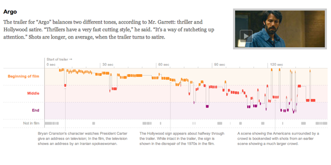
How are films promoted? Often through trailers and teasers. But how are those made? Well, the New York Times dissected trailers for five of the nine films up for best film. The piece looks at where the films are cut and spliced to create a 120-second-long overview without ruining the plot. And as it turns out, different types of trailers have different systems for cutting up those films.

Argo's Trailer
Argo's Trailer

The piece is made even better through the annotations associated with different segments of the different films. This paired with the introductory text makes the diagram of the film trailers intelligible to the reader. And then of course you can click on the still and see the actual trailer. A solid piece, all around.

Credit for the piece goes to Shan Carter, Amanda Cox, and Mike Bostock.

Long-term Unemployment

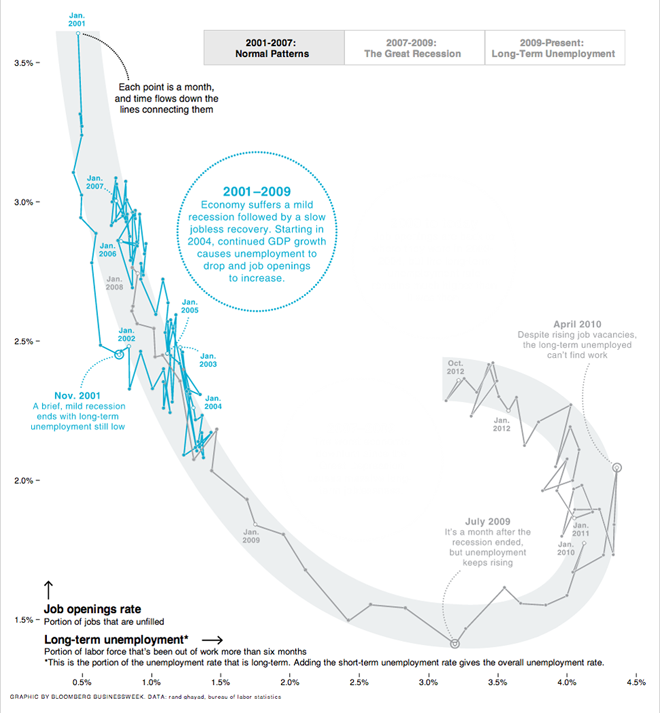
Two weeks ago Bloomberg published a really great example of annotating what some would find a complex infographic.

On occasion I hear concerns that charting two variables on a scatter plot is confusing. Further confusing people is to then plot the data over time, connected by a line. The approach is really no different than what I hear called “combo” charts. Those take two separate variables and plot them in the same space but use one axis to represent the two different variables—often without respect to scales and implicit meanings in the positioning of the two data series.

I find separating those two series onto separate axes and connecting them over time far clearer. And that’s just what the designers at Bloomberg did. But to allay any concerns about confusion—or so I assume—a series of annotations were made, guided by the buttons in the upper-right. These explain succinctly the view presented to the reader in the highlighted section of the overall graphic.

Normal patterns from 2001 to 2007 are highlighted here

Overall a strong piece of data visualisation and analysis tied into effort.

Credit for the piece goes to Peter Coy, Evan Applegate, and Jennifer Daniel.

Presidential Popularity Redux

This time last year I used some data published by Public Policy Polling upon presidential popularity (alliterative, right?) to create a graphic looking at said popularity. So here it is again for Presidents Day. Next time I’ll try to remember the holiday is coming a bit further in advance and work on something newer.

Presidential popularity

A minor point, someone asked why the bar runs past 100 for some presidents yet stops before 100 for others. The data was rounded and some things didn’t add to 100. I saw no need to manipulate the numbers for aesthetic purposes.

The Battle of Hoth, an Imperial Disaster

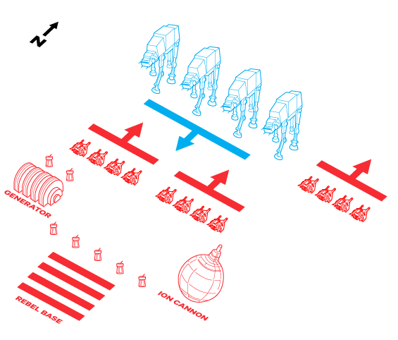
Military history can offer us numerous examples of graphics, maps, and illustrations to explain significant battles. Today’s graphics from Wired are no exception. Wired explores the future’s past—not today—by looking at the Battle of Hoth from Star Wars and arguing that the battle was a tactical victory but strategic blunder.

The Imperial Ground Assault on Rebel Lines

The author reasons his argument well. But apparently the argument caused quite the controversy and so for you very interested folks, the argument continued onto a subsequent post (alas, sans graphics).

Credit for the article goes to Spencer Ackerman. Credits for the illustrations go to Simon Lutrin, Ross Patton, and Dennis Crothers.

Influenza

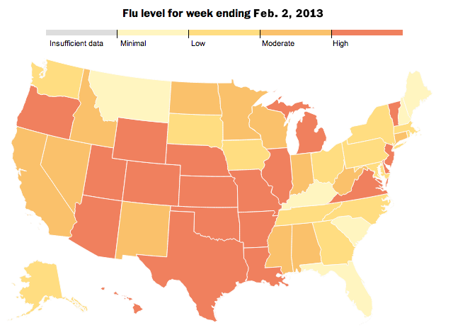
The Washington Post has an interactive infographic piece out about the spread of the flu. The big draw is of course the map—people like maps and they are easy to navigate. However, this time the map actually can serve a useful purpose because a virus spreads through the contact of people and communities. And when illustrated over time, the user can see a general spread from the deep south to the Mid-Atlantic than the west before becoming a national problem.

The geographic distribution of the flu

But a really sharp component that I enjoy is the index of flu cases from the four most recent flu seasons. While half the years displayed have seen a gradual increase in the number of hospitalisations, the 2012–13 season became quite troublesome quite quickly. It has even surpassed the 2009–10 levels that were affected by the H1N1 pandemic.

An indexed look at the rampancy of influenza outbreaks

Lastly, not shown here, is an illustration of just what the flu is—a virus—and how it spreads and where anti-viral drugs work.

Credit for the piece goes to Darla Cameron, Dan Keating and Alberto Cuadra.