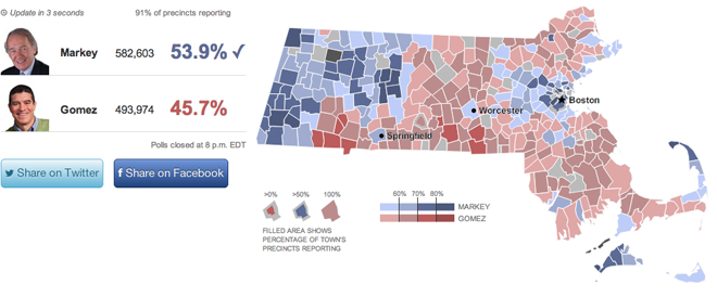
As I have been blogging the past several days, today the Supreme Court will announce its rulings on the two gay marriage cases. But, I have already looked at that twice now. Today I want to look at the results of the Massachusetts special election for the US Senate, necessitated by John Kerry resigning from the seat to become Secretary of State.
This work comes from the Huffington Post. It offers the usual map fare with towns coloured by the victor and tinted by the share of the vote. Though do note the interesting—is this novel?—means of filling in the town with colour to represent the percent of the town reporting. My screenshot is a bit late, but check out Warren near Springfield or Boston and Cambridge—a bit harder to see because of their size and shape.

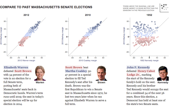
However, the fascinating thing is the use of the small multiples of scatter plots to look at historic elections. The designers included a small key in the upper-right explaining that dots above the line represent towns where Ed Markey, the Democrat who won, outperformed the historic Democrat. I have not seen anybody attempt to portray the data in this fashion before.

Credit for the piece goes to Aaron Bycoffe and Jay Boice.
