The Affordable Care Act You Likely Know as Obamacare

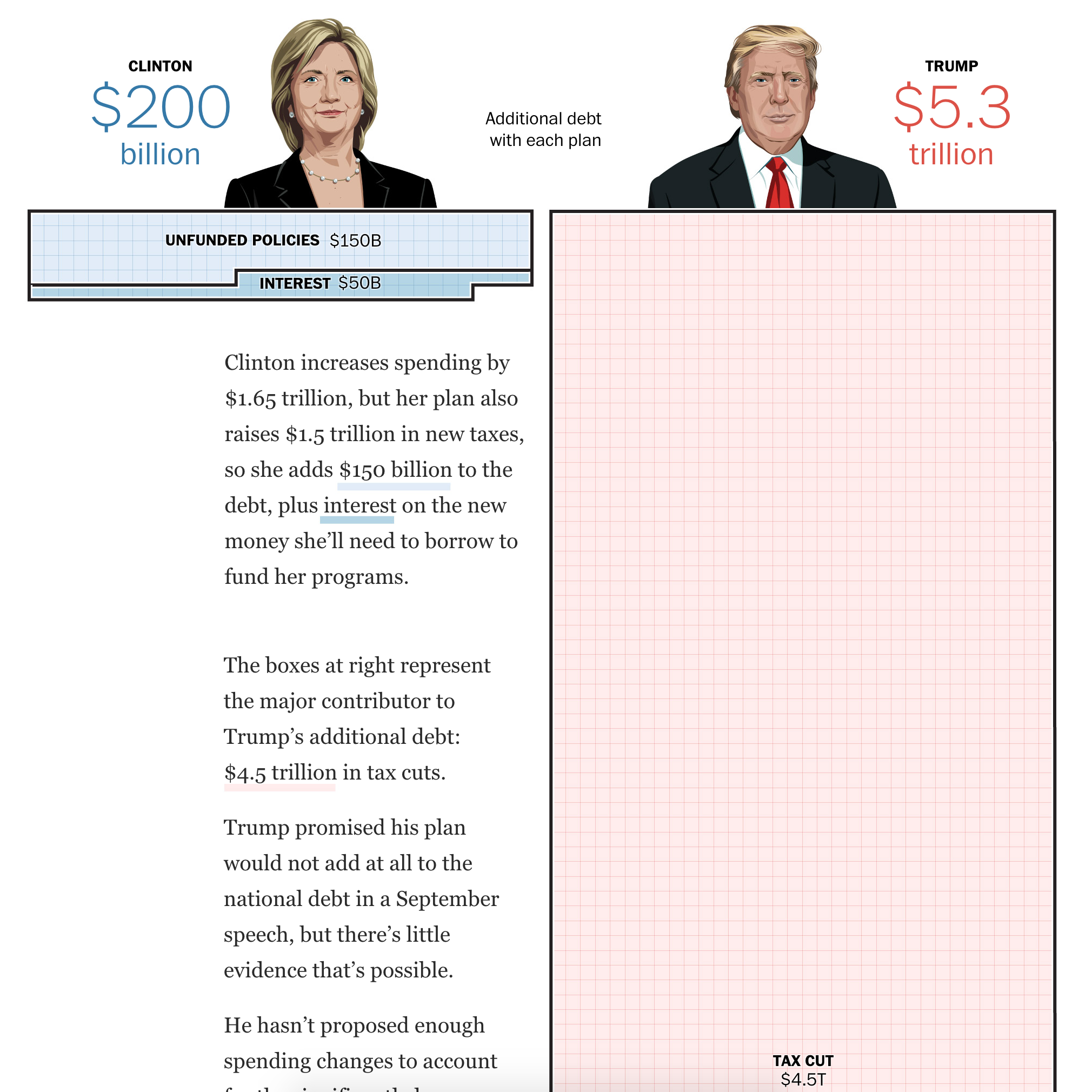
It just won’t die. Grandma, that is, in front of the death panels of Obamacare. Remember those? Well, even if you don’t, the Affordable Care Act (the actual name for Obamacare) is still around despite repeated attempts to repeal it. So in this piece from Bloomberg, Obamacare is examined from the perspective of leaving 27 million people uninsured. In 2010, there were 47 million Americans without insurance and so the programme worked for 20 million people. But what about those remaining 27?

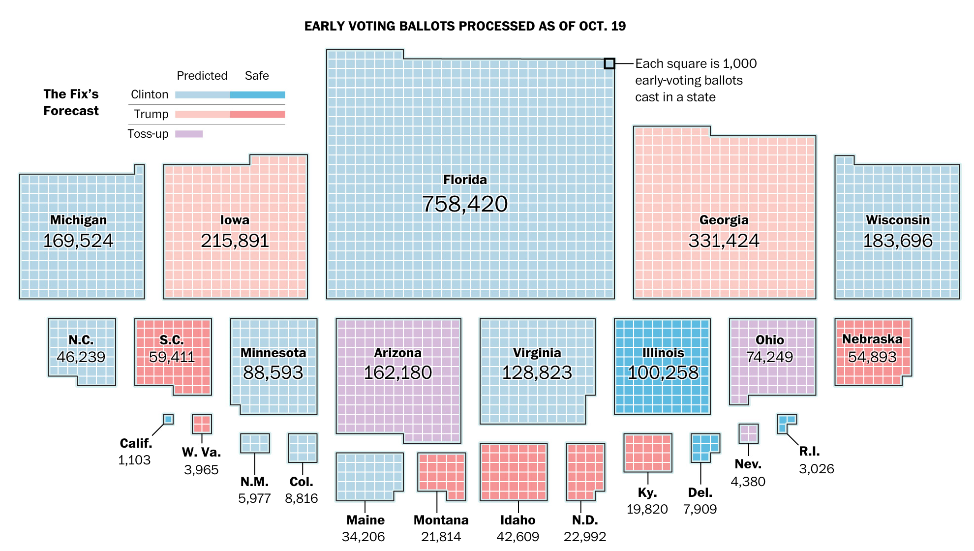
I am not usually a fan of tree maps, because it is difficult to compare areas. However, in this piece the designers chose to animate each section of the tree as they move along their story. And because the data set remains consistent, e.g. the element of the 20 million who gained insurance, the graphic becomes a familiar part of the article and serves as a branching off point—see what I did there?—to explore different slices of the data.

This is a tree map I actually think works well

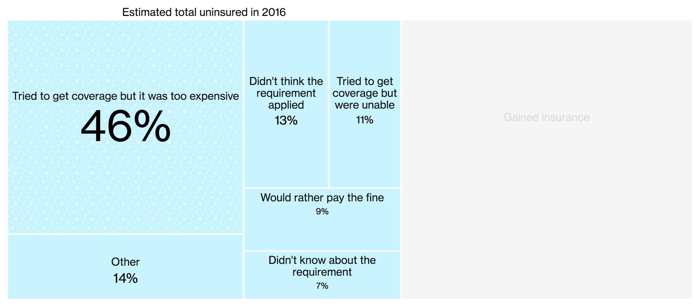
So in the end, this becomes one of those cases where I actually think the tree map worked to great effect. Now there is a cartogram in the article, that I am less sure about. It uses squares within squares to represent the number of uninsured and ineligible for assistance as a share of the total uninsured.

I'm not sure the map is necessary here
I’m not sure the map is necessary here

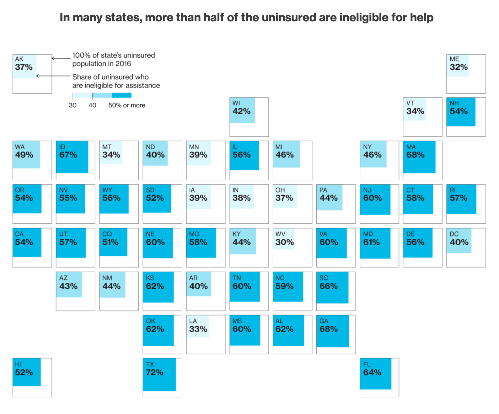
Some of the visible patterns come from states that refused to expand Medicaid. It was supposed to cover the poorest, but the Supreme Court ruled it was optional not mandatory and 19 states refused to expand the coverage. But surely that could have been done in a clearer fashion than the map?

Credit for the piece goes to Jeremy Scott Diamond, Zachary Tracer, and Chloe Whiteaker.

The National Debt

One of the things discussed during the election season—though very minorly compared to other things—is the national debt. Debt itself is not scary. Look at student loans, home loans, auto loans, &c. Look at the credit cards in your wallet. But running a country is far more difficult and complex than a household budget. That said, our national debt is high, though of late it has been trending in a positive direction, i.e. flattening out its growth curve.

So what would electing either Clinton or Trump do to the debt? Well, nothing great. According to this piece from the Washington Post, we would be talking about increasing the debt because of plans that are not fully funded or revenue cuts that fail to match spending cuts. But as the graphic shows with a really nice piece of layout between text and image, one option is far worse than the other for the issue of the national debt.

The graphic is clear, and emphasised by the layout of the text

The opening graphic above draws the reader into the overall piece, but the remainder of the piece breaks down policies and implications with additional graphics. If you want to understand the differences between the candidates and the impact of those differences, this is a good read.

Credit for the piece goes to Kevin Uhrmacher and Jim Tankersley.

Pennsylvania’s Polls

Again, the election is next week. And since I have moved from Chicago to Philadelphia, I now find myself in a contested state. This piece comes from the New York Times and explores the polling results across the blue-leaning-but-still-a-swing-state. I find it particularly interesting just how much red and purple there is in the suburban counties of Delaware, Chester, Montgomery, and Bucks all surrounding Philadelphia. But that will only make my vote matter more than it would have had were I still living in Chicago.

But you should also check out the piece for some updates on the Senate race we have going on here. The Republican Pat Toomey is running for re-election against the Democrat Katie McGinty. The race can be described as a tossup as the polls seem to be flipping back and forth. But there is some interesting polling data to be found in the article.

Pennsylvania's pre-election support
Pennsylvania’s pre-election support

In about a week we will see just how Pennsylvania goes for both the presidential election and the Senate election.

Credit for the piece goes to Nate Cohn.

The Asian Arms Race

In case you missed it, two weeks ago President Duterte of the Philippines had some interesting things to say regarding the relationship between the Philippines and the United States. “America has lost” and “separation from the U.S.” were among the two big lines he spoke to a Chinese audience. But the Philippines are an important part of President Obama’s pivot to Asia strategy as we have been spending money and time improving defence ties. Naturally issues like the the pivot underpin Trump’s claims about poor judgment when it comes to the Obama/Clinton foreign policy.

The pivot’s improving defence ties come at a time of region-wide increases in defence spending. Thankfully Bloomberg put together an article with some nice graphics earlier this year. As someone who has always had an interest in naval things if not military things, see my numerous posts on that here, I thoroughly enjoyed reading the article and digesting the graphics. The one below compares the strengths of the Chinese fleets to those American fleets permanently assigned to the Pacific Ocean region.

The Chinese Navy vs (part of) the US Navy

Of course the question becomes, beyond making our military stronger, just what would Trump do to counter or affect the arms race in the Asia Pacific region?

Credit for the piece goes to the Bloomberg graphics department.

Tracking Polls One Week Out

Well the election is next Tuesday, and last Friday and this past weekend was…interesting. So one(ish) week to go, and we are going to turn to a few posts that use data visualisation and graphics to explore topics related to the election.

Today we start with the latest tracking polls, released on Friday. The piece comes from the Washington Post and highlights the closing gap between Clinton and Trump with a sudden spike in Republican candidate support. But what I really like about the piece is the plot below. It displays the 0 axis vertically and plots time with the most recent date at the top. And then support for the various demographics can be filtered by selectable controls above the overall plot.

Saturday's polling numbers
Saturday’s polling numbers

Of course the really interesting bit is going to be how much this changes in the next seven days. And then what that means for the results when we all wake up on Wednesday morning.

Credit for the piece goes to Chris Alcantara, Kevin Uhrmacher, and Emily Guskin.

Early Voting So Far

70+ million people watched the debate last week. But, 2.5 million people have already voted. Me? Well in Pennsylvania there is no early voting, so you queue up on Election Day. But that also means I will have had the full election season to brush up on candidates for president and all the other offices. But what about early voters? Well the Washington Post put together an article last week about the numbers of early voters—hence my figures in the opening—and the amount of information they might have missed.

The number of early votes cast

From a design standpoint, it is a really nice article that blends together large centre-piece graphics such as the above to smaller in-line graphics to margin graphics. None are interactive; all are static. But in these cases, users do not need the freedom to interact with the charts. Instead, the designers have selected the points in time or data points more relevant to the story.

Overall the piece is solid work.

Credit for the piece goes to Kevin Uhrmacher and Lazaro Gamio.

Baselines Are Important

Last week the Washington Post published a fascinating article on the data visualisation work of the Donald Trump media campaign. In my last job I frequently harped on the importance of displaying the baseline and/or setting the baseline to zero. When you fail to do so you distort the data. But maybe that is the point of this, for lack of a better term, political data visualisation.

Baselines are important

My favourite author is George Orwell of 1984 and Animal Farm fame. But Orwell also penned numerous essays, one of which has struck me as particularly relevant in this election cycle: Politics and the English Language. In concluding the essay Orwell wrote:

Political language…is designed to make lies sound truthful and murder respectable, and to give an appearance of solidity to pure wind.

And so political data visualisation? Well I believe it exists to serve the same purpose. The article goes into detail about how the designers behind the graphics fudged the numbers. Now did the campaign intend to mislead people with the data visualisation graphics? It is hard to say, because some of their graphics actually diminish leads that Trump has among certain demographics. Could it be the designer behind the graphics simply does not understand what he or she is doing? Perhaps. We clearly cannot know for certain.

Either way, it points to a need for more understanding of the importance and value of data visualisation in the political discourse. And then the natural follow-up of how to best design and create said visualisations to best inform the public.

But I highly recommend going to the Post and reading the entirety of the article.

Credit for the original work goes to the Trump campaign graphics department, the criticism to John Muyskens of the Washington Post.

When America Votes by Goat

Last week Twitter went a wee bit crazy when Donald Trump’s son posted an image about how the Republican nominee had gained ground. Except that it turns out the image was from FiveThirtyEight and looked only at a demographic split by gender—it was what the map would look if only men voted. Suffice it to say, yeah, the Twitterverse went a wee bit crazy. Thankfully the BBC put together this really great recap with some of the best of it.

What the map would look like if goats voted

Happy Friday, all.

Credit for the pieces goes to the various original authors and designers.

Pardon the Interruptions

Well that does it for the three presidential debates. Didn’t they seem very presidential with all those interruptions and interjections? Thankfully after the debate, FiveThirtyEight put together a quick graphic highlighting the total number of each per candidate per debate.

Wait, but, stop
Wait, but, stop

Credit for the piece goes to the FiveThirtyEight graphics department.

Trump’s Support

The debate was Sunday and here we are on Wednesday. The infamous video is, well, still infamous, but not garnering as much attention half-a-week later. On Monday, the Economist published this piece taking a look at how Trump’s support shifted in the hours and days following the video’s release.

Trump's support fell off really the following day
Trump’s support fell off really the following day

Credit for the piece goes to the Economist’s Data Team.