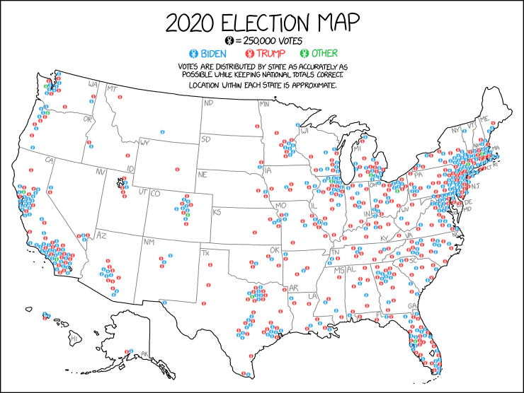
It’s Friday and we’ve made it all to the end of the week. A little while back xkcd posted about the 2020 US election, showing where the votes for both candidates are approximately located.
This isn’t quite funny like I normally might post on a Friday, but it felt appropriate after this week we had with the impeachment.
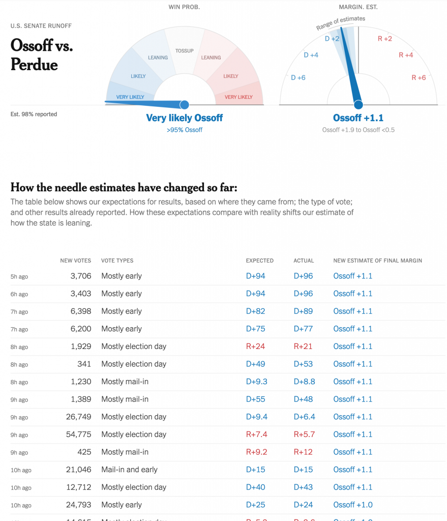
Yesterday was maybe the last election day for the 2020 US General Election. (There are still a few US House seats yet to be called, most notably a contested race in upstate New York.) These were a pair of runoff elections in Georgia for the state’s two US Senate seats (one for a full, six-year term, the other to finish out the final two years of a retiring senator).
I spent most of the night eating pizza and tracking results. One thing that I keep tabs on (in the sense of open tabs in the browser) is the New York Times needle forecast. It has its problems, but I wanted to highlight something I think was new last night. Or, if it wasn’t, I didn’t notice it back in November.
Below the needle was a simple table of results.
The needle speaks
In the past, the needle was a bit opaque and it consumed data and spat out forecasts without users having a sense of what was driving those forecasts. Back in November, there were a few instances where states published incorrect data—that they later fixed—and when the needle consumed it, the needle forecast incorrect results.
But now we have a clear record of what data the forecast consumed in the table below the needles. It’s fairly straightforward as tables go. But tables don’t have to be sexy to be clear and effective.
The table lists the time when the data was added, the number of votes added, the type of vote added, and then the actual data vs. what was expected. And ultimately how that changed the needle. This goes a long way towards data transparency.
Simple colour use, bright blues and reds, show when the result/data favoured the Republican or Democrat. Thin, light strokes instead of heavy black lines for rows and columns place the visual emphasis on the data. And smaller type for the timestamp places the less important data at a lower level of importance.
It’s just very well done.
Credit for the piece goes to Michael Andre, Aliza Aufrichtig, Matthew Bloch, Andrew Chavez, Nate Cohn, Matthew Conlen, Annie Daniel, Asmaa Elkeurti, Andrew Fischer, Will Houp, Josh Katz, Aaron Krolik, Jasmine C. Lee, Rebecca Lieberman, Jaymin Patel, Charlie Smart, Ben Smithgall, Umi Syam, Miles Watkins and Isaac White.
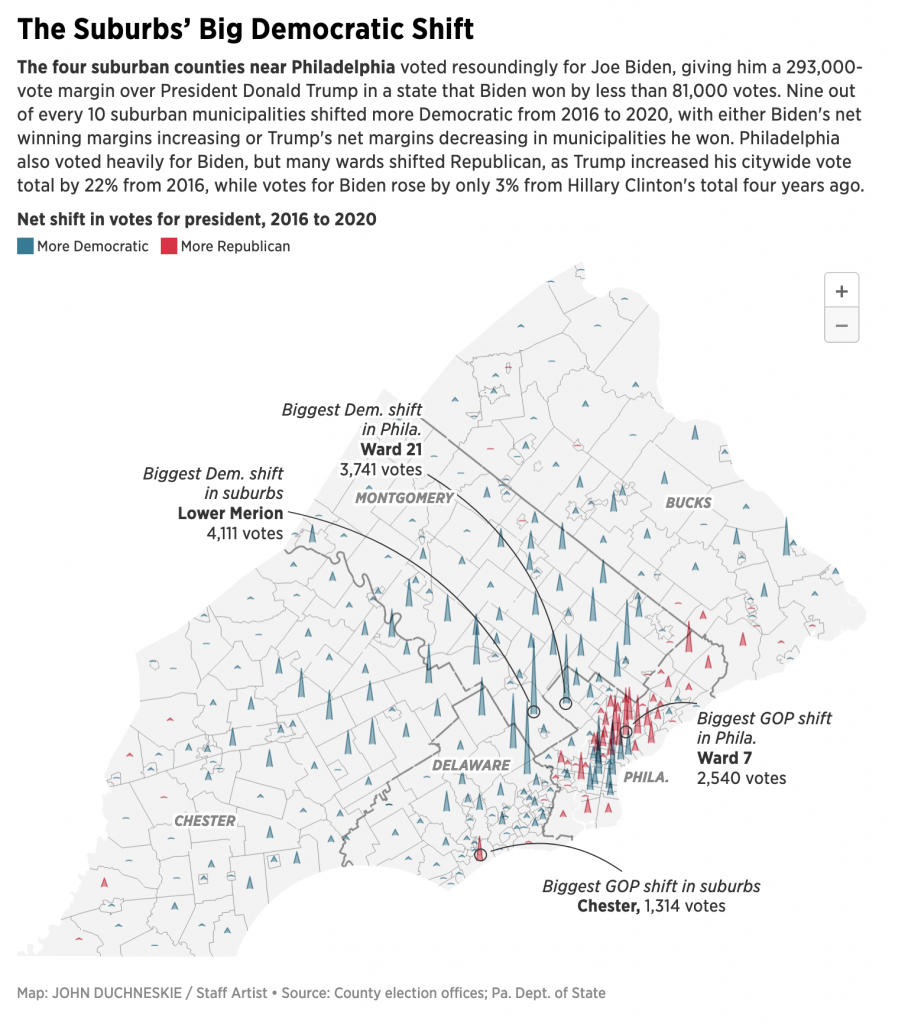
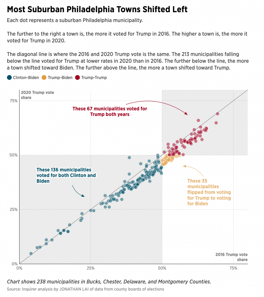
Yesterday we looked at an article from the Inquirer about the 2020 election and how Biden won because of increased margins in the suburbs. Specifically we looked at an interactive scatter plot.
Today I want to talk a bit about another interactive graphic from the same article. This one is a map, but instead of the usual choropleth—a form the article uses in a few other graphics—here we’re looking at three-dimensional pyramids.
All the pyramids, built by aliens?
Yesterday we talked about the explorative vs. narrative concept. Here we can see something a bit more narrative in the annotations included in the graphic. These, however, are only a partial win, though. They call out the greatest shifts, which are indeed mentioned in the text. But then in another paragraph the author writes about Bensalem and its rightward swing. But there’s no callout of Bensalem on the map.
But the biggest things here, pun intended, are those pyramids. Unlike the choropleth maps used elsewhere in the article, the first thing this map fails to communicate is scale. We know the colour means a county’s net shift was either Democratic or Republican. But what about the magnitude? A big pyramid likely means a big shift, but is that big shift hundreds of votes? Thousands of votes? How many thousands? There’s no way to tell.
Secondly, when we are looking at rural parts of Bucks, Chester, and Montgomery Counties, the pyramids are fine. They remain small and contained within their municipality boundaries. Intuitively this makes sense. Broadly speaking, population decreases the further you move from the urban core. (Unless there’s a secondary city, e.g. Minneapolis has St. Paul.) But nearer the city, we have more population, and we have geographically smaller municipalities. Compare Colwyn, Delaware County to Springfield, Bucks County. Tiny vs. huge.
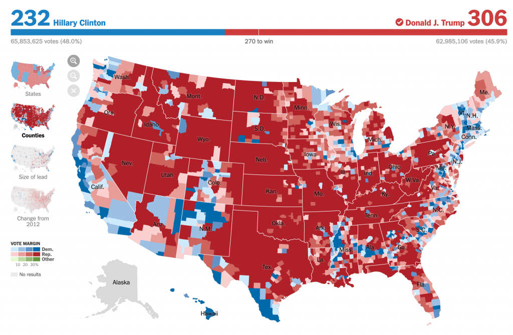
In choropleth maps we face this problem all the time. Look at a classic election map at the county level from 2016.
Wayb ack when…
You can see that there is a lot more red on that map. But Hillary Clinton won the popular vote by more then 3,000,000 votes. (No, I won’t rehash the Electoral College here and now.) More people are crowded into smaller counties than there are in those big, expansive red counties with far, far fewer people.
And that pattern holds true in the Philadelphia region. But instead of using the colour fill of an area as above, this map from the Inquirer uses pyramids. But we face the same problem, we see lots of pyramids in a small space. And the problem with the pyramids is that they overlap each other.
At a glance, you cannot see one pyramid beind another. At least in the choropleth, we see a tiny field of colour, but that colour is not hidden behind another.
Additionally, the way this is constructed, what happens if in a municipality there was a small net shift? The pyramid’s height will be minimal. But to determine the direction of the shift we need to see the colour, and if the area under the line creating the pyramid is small, we may be unable to see the colour. Again, compare that to a choropleth where there would at least be a difference between, say, a light blue and light red. (Though you could also bin the small differences into a single neutral bin collecting all small shifts be them one way or the other.)
I really think that a more straight forward choropleth would more clearly show the net shifts here. And even then, we would still need a legend.
The article overall, though, is quite strong and a great read on the electoral dynamics of the Philadelphia region a month ago.
The thing with election results is that we don’t have the final numbers for a little while after Election Day. And that’s normal.
There are a few things I want to look at in the coming weeks and months once my schedule eases up a bit. But for now, we can use this nice piece from the Philadelphia Inquirer to look at a story close to home: the vote in the Philadelphia suburbs.
It’s all happening in the yellow.
I’ve already looked at some analysis like this for Wisconsin and I shared it on my social. But there I looked at the easy, county-level results. What the Inquirer did above is break down the Pennsylvania collar counties of Philadelphia, i.e. the suburbs, into municipality level results. It then plotted them 2020 vs. 2016 and the results were—as you can guess since we know the result—Biden beat Trump.
What this chart does well is colours the municipalities that Biden flipped yellow. It’s a great choice from a colour standpoint. As the third of the primaries, with both blue and red well represented, it easily contrasts with the Biden- and Trump-won towns and cities of the region. The colour is a bit “darker” than a full-on, bright yellow, but that’s because the designers recognised it needs to stand out on a white field.
Let’s face it, yellow is a great colour to use, but it’s difficult because it’s so light and sometimes difficult to see. Add just the faintest bit of black to your mix, especially if you’re using paints, and voila, it works pretty well. So here the designer did a great job recognising that issue with using yellow. Though you can still see the challenge, because even though it is a bit darker, look at how easy it is to read the text in the blue and the red. Now compare that to the yellow. So if you’re going to use yellow, you want to be careful how and when you do.
The other design decision here comes down to what I call the explorative vs. the narrative. Now, I don’t think explorative is a word—and the red squiggle agrees—but it pairs nicely with narrative. And I’ve been talking about this a lot in my field the last several works, especially offline. (In the non-blog sense, because obviously all my work is done online these days. Oh, how I miss my old office.)
Explorative works present the user with a data set and then allow them to, in this case, mouse over or tap on dots and reveal additional layers of information, i.e. names and specific percentages. The idea is not to tell a specific story, but show an overall pattern. And if the piece is interactive, as this is, potentially allow the user to drill down and tease out their own stories.
Compare that to the narrative, my Wisconsin piece I referenced above is more in this category. Here the work takes you through a guided tour of the data. It labels specific data points, be them on trend or outliers and is sometimes more explicit in its analysis. These can also be interactive—though my static image is not—and allow users to drill down, and critically away, from the story to see dots of interest, for example.
This piece is more explorative. The scatter plot naturally divides the municipalities into those that voted for Biden, Trump, and then more or less than they voted for Trump in 2016. The labels here are actually redundant, but certainly helpful. I used the same approach in my Wisconsin graphic.
But in my Wisconsin graphic, I labelled specific counties of interest. If I had written an accompanying article, they would have been cited in the textual analysis so that the graphic and text complemented each other. But here in the Inquirer, it’s a bit of a missed opportunity in a sense.
The author mentions places like Upper Darby and Lower Merion and how they performed in 2020 vis-a-vis 2016. But it’s incumbent on the user to find those individual municipalities on the scatter plot. What if the designer had created a version where the towns of interest were labelled from the start? The narrative would have been buttressed by great visualisations that explicitly made the same point the author wrote about in the text. And that is a highly effective form of communication when you’re not just telling, but also showing your story or argument.
Overall it’s a great article with a lot to talk about. Because, spoiler, I’m going to be talking about it again tomorrow.
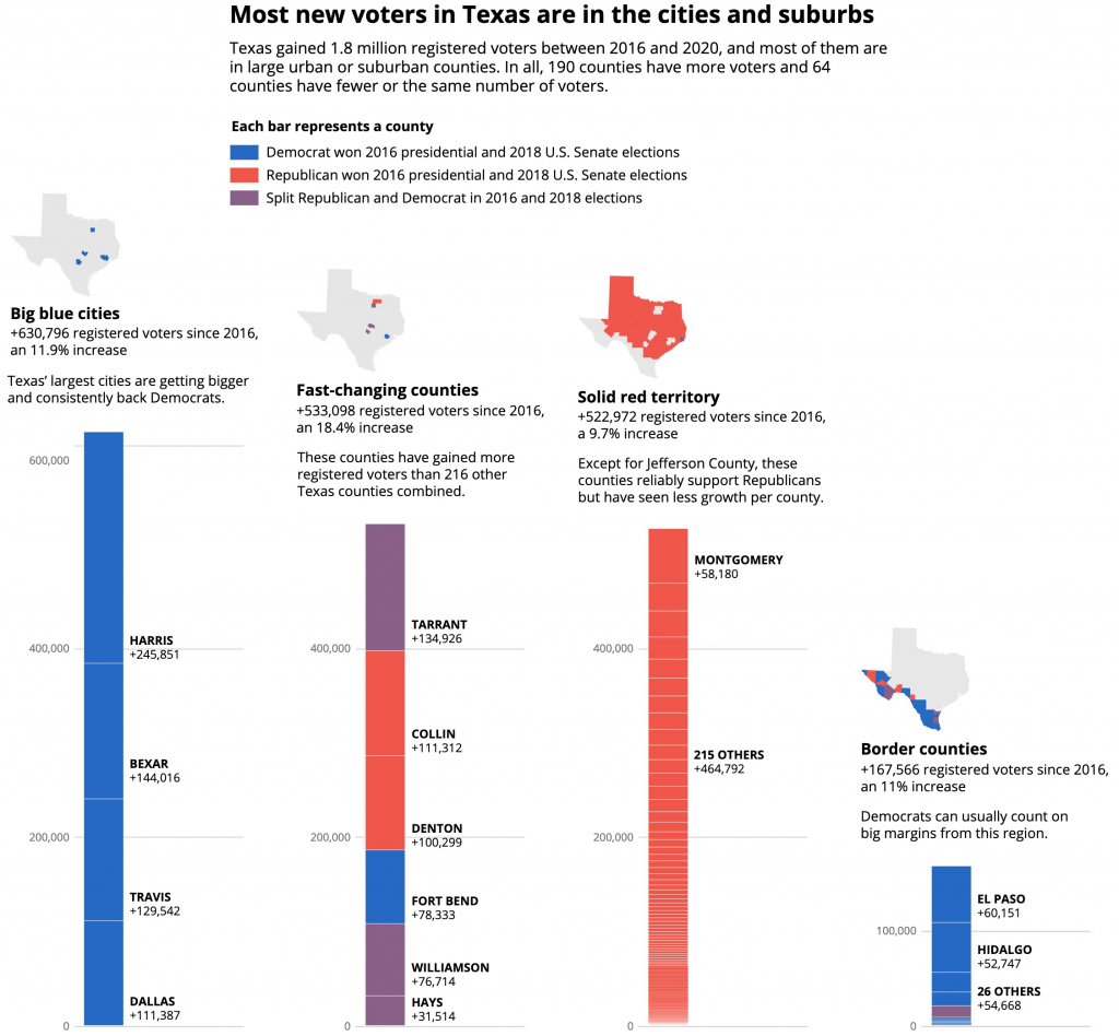
One story I’m following on Tuesday night is Texas. The state’s early voting—still with Monday to go—has surpassed the state’s total 2016 vote. Polling suggests that early votes lean Biden due to President Trump’s insistence that his supporters vote in person on Election Day as he lies about the integrity of early and mail-in voting.
The Texas Tribune looked at what we know about that turnout and what it may portend for Tuesday’s results. And, to be honest, we don’t—and won’t—really know until the votes are counted. They put together a great piece that divided Texas counties into four groups (their terminology): big blue cities, fast-changing counties, solidly red territory, and border counties. They then looked at the growth in registered voters in those counties from 2016, and looked at how they voted in the 2016 presidential election (Hillary Clinton vs. Donald Trump) and the 2018 US Senate election (Beto O’Rourke vs. Ted Cruz).
The piece uses the above stacked bar chart to show that Texas’ 1.8 million new registered voters’ largest share belongs to the big blue cities. The second largest group is the competitive suburbs in the fast-changing counties. The third largest, though quite close to second, was the solidly red territory. The border counties, still important for the margins, ranks a distant fourth.
I’m not normally a fan of stacked bar charts, because they do not allow for great comparisons of the constituent elements. For example, try comparing any of of those solidly red territory counties to one another. But here, the value is more in the stacked set as a group rather than the decomposition of the set, because you can see how the big blue cities have, as a group, a greater number of those 1.8 million new voters.
Those fast-changing counties include a lot of the suburbs for Texas’ largest cities. And those are areas where, across the country, Republicans are losing voters by the tens of thousands to the Democrats. As battlegrounds, these presented a challenge, because as swing counties, they split their votes between Clinton and Cruz and Trump and Beto. And so the designers chose purple to represent them in the stacked design. I think it’s a solid choice and works really well here.
But in terms of the story, I’ll add that in 2016, Trump won Texas by 807,000 votes. Texas added 1,800,000 new voters since then. And turnout before Election Day is already greater than it was in 2016.
It’s still a state likely to go for Trump on Tuesday. But, if Biden has a good night, it’s not inconceivable that Texas flips. FiveThirtyEight’s polling average has Trump with only a 1.2 point lead.
Credit for the piece goes to Mandi Cai, Darla Cameron and Anna Novak.
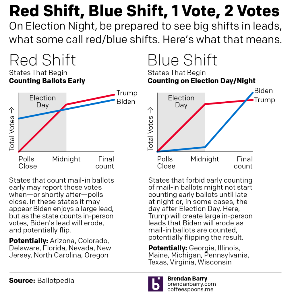
Last night I published a graphic on Instagram that I think people may find helpful if they try to follow Election Day results on Tuesday. I wanted to explain the concept of a red shift or blue shift. (I’ve also seen it described as states having a red mirage or a blue mirage.)
For my non-American readers, it’s important to understand that while this is a national election, the United States’ federal system means that each state runs its own election with its own rules and they can vary some state to state. For example, early or mail-in voting can vary significantly from state to state with some states allowing it only in emergencies (and some of those this cycle will not allow people to cite COVID-19 as an emergency).
Another factor for everyone to consider is that polling indicates President Trump’s fraudulent messaging about, well, voting fraud has shifted a normally split use of early/mail-in voting to a Democratic advantage. In other words, Democrats are far more likely to vote early, either in person or by post. Republicans are far more likely to vote on Election Day.
Combine those two factors and we get Red Shift vs. Blue Shift.
Some states allow election officials to begin counting their early votes prior to Election Day. Other states forbid counting until Election Day morning, or in some cases until after the polls close.
In states where early votes can be counted—the swing states Arizona, Florida, and North Carolina are among this group—it is possible that when the polls close, or shortly thereafter, we will see an instant and enormous lead for Joe Biden. But, as the states begin to count in-person day-of votes, which again favour Republicans, Trump may begin to eat into those margins. The question will be, can Trump’s numbers eat in so much that when the final counts are complete, he can overtake those Biden numbers? This is the Red Shift.
Conversely we have the Blue Shift. In these states—swing states like Georgia, Michigan, Pennsylvania, Texas, and Wisconsin are in this group—election officials cannot begin to count early votes either until the morning or when the polls close. In these states we may see the in-person day-of votes, largely expected to be for Republicans, run up to high totals fairly quickly. At that time, Trump may have a significant lead. Then when officials pivot to counting the early votes, Biden will begin to eat into those margins. And again, the question will be, can Biden eat into those margins sufficiently to shift the outcome after all the votes are counted?
Be prepared to hear about these scenarios Tuesday night.
In case you weren’t aware, the US election is in less than a week, five days. I had written a long list of issues on the ballot, but it kept getting longer and longer so I cut it. Suffice it to say, Americans are voting on a lot of issues this year. But a US presidential election is not like many other countries’ elections in that we use the Electoral College.
For my non-American readers, the Electoral College, very briefly, was created by the country’s founding fathers (Washington, Jefferson, Adams, Franklin, et al.) to do two things. One, restrict selection of the American president to a class of individuals who theoretically had a broader/deeper understanding of the issues—but who also had vested interests in the outcome. The founders did not intend for the American people to elect the president. The second feature of the Electoral College was to prevent the largest states from dominating smaller states in elections. Why else would Delaware and Rhode Island surrender their sovereignty to join the new United States if Virginia, Pennsylvania, and New York make all the decisions? (The founders went a step further and added the infamous 3/5 clause, but that’s another post.)
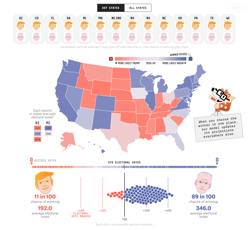
So Americans don’t elect the president directly and larger states like California, New York, and Texas, have slightly less impact than smaller states like Wyoming, Vermont, and Delaware. Each state is allotted a number of Electoral College votes and the key is to reach 270. (Maybe another time I’ll get into the details of what happens in a 269–269 tie.) Many Americans are probably familiar with sites like 270 To Win, where you can determine the outcome of the election by saying who won each state. But, even though the US election is really 50 different state elections, common threads and themes run through all those states and if one candidate or another wins one state, it makes winning or losing other states more or less likely. FiveThirtyEight released a piece that attempts to link those probabilities and help reveal how decisions voters in one state make may reflect on how other voters decide.
The interface is fairly straightforward—I’m looking at this on a desktop, though it does work on mobile—with a bunch of choices at the top and a choropleth map below. There we have a continually divergent gradient, meaning the states aren’t grouped into like bins but we have incredibly subtle differences between similar states. (I should also point out that Maine and Nebraska are the two exceptions to my above description of the Electoral College. They divide their votes by congressional district, whoever wins the district gets that Electoral College vote and then the state overall winner receives the remaining two votes.)
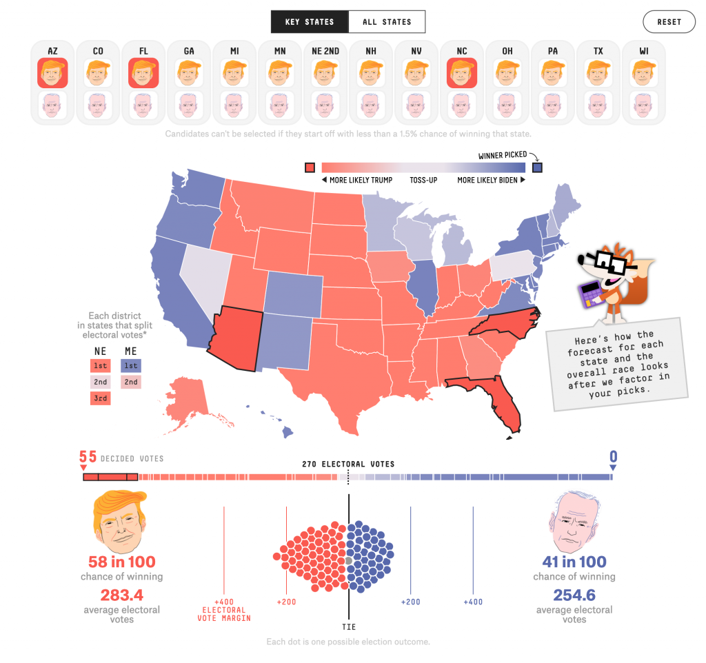
Below that we have a bar chart, showing each state, its more/less likely winner state and the 270 threshold. Below that, we have what I’ve read/heard described as a ball plot. It represents runs of the simulation. As of Thursday morning, the current FiveThirtyEight model says Trump has an 11 in 100 chance of winning, Biden, conversely, an 89-in-100 chance.
But what happens when we start determining the winners of states?
Well, for my non-American readers, this election will feature a large number of voters casting their ballots early. (I voted early by mail, and dropped my ballot off at the county election office.) That’s not normal. And I cannot emphasise this next point enough. We may not know who wins the election Tuesday night or by the time Americans wake up on Wednesday. (Assuming they’re not like me and up until Alaska and Hawaii close their polls. Pro-tip, there’s a potentially competitive Senate race in Alaska, though it’s definitely leaning Republican.)
But, some states vote early and/or by mail every year and have built the infrastructure to count those votes, or the vast majority of them, on or even before Election Day. Three battleground states are in that group: Arizona, Florida, and North Carolina. We could well know the result in those states by midnight on Election Day—though Florida is probably going to Florida.
So what happens with this FiveThirtyEight model if we determine the winners of those three states? All three voted for Trump in 2016, so let’s say he wins them again next week.
We see that the states we’ve decided are now outlined in black. The remainder of the states have seen their colours change as their odds reflect the set electoral choice of our three states. We also now have a rest button that appears only once we’ve modified the map. I’m also thinking that I like FiveyFox, the site’s new mascot? He provides a succinct, plain language summary of what the user is looking at. At the bottom we see what the model projects if Arizona, Florida, and North Caroline vote for Trump. And in that scenario, Trump wins in 58 out of 100 elections, Biden in only 41. Still, it’s a fairly competitive election.
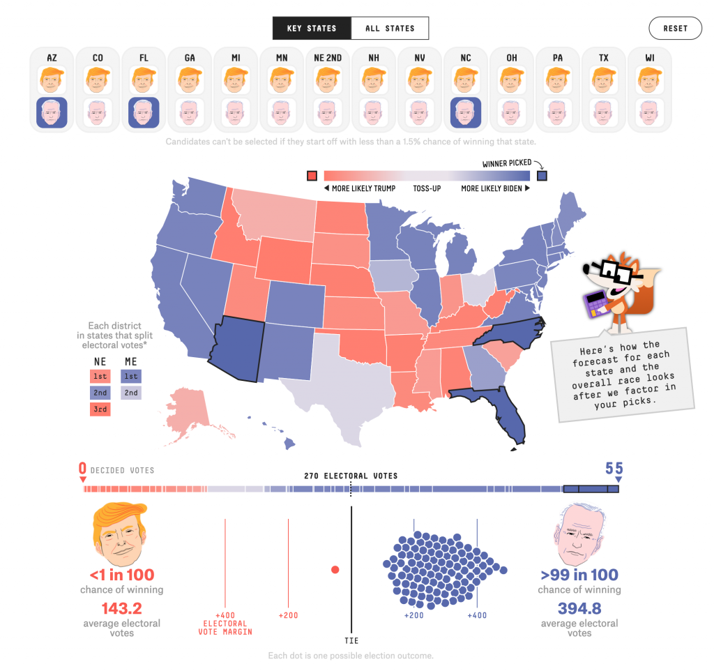
So what happens if by midnight we have results from those three states that Biden has managed to flip them? And as of Thursday morning, he’s leading very narrowly in the opinion polls.
Well, the interface hasn’t really changed. Though I should add below this screenshot there is a button to copy the link to this outcome to your clipboard if, like me, you want to share it with the world or my readers.
As to the results, if Biden wins those three states, Trump has less than a 1-in-100 chance of winning and Biden a greater than 99-in-100.
This is a really strong piece from FiveThirtyEight and it does a great job to show how states are subtly linked in terms of their likelihood to vote one way or the other.
Credit for the piece goes to Ryan Best, Jay Boice, Aaron Bycoffe and Nate Silver.
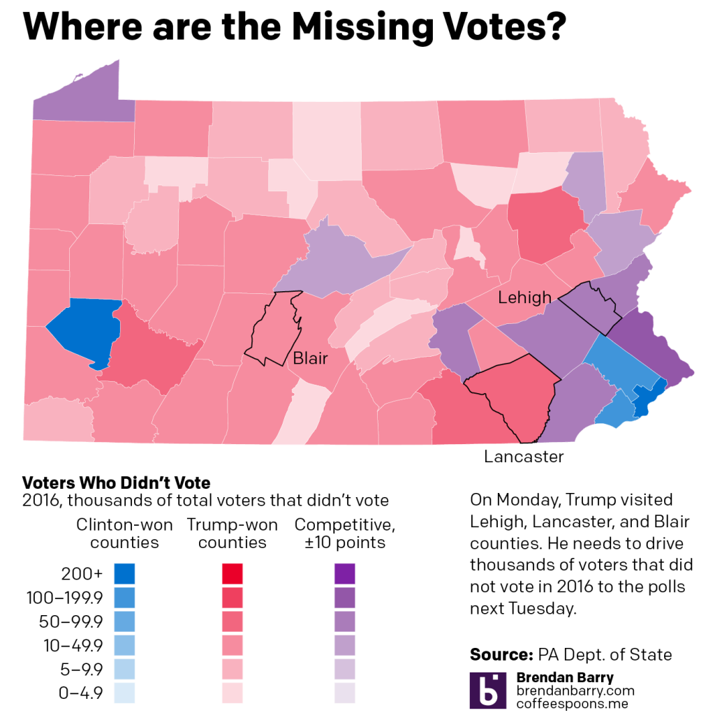
I’m not working for a good chunk of the next few days. But, I did want to share with my readers an analysis of Pennsylvania’s missing votes. Broadly, Trump needs to win the Commonwealth of Pennsylvania next week—yes, the US election is now one week away. Though, Pennsylvania allows mail-in ballots postmarked on Election Day to arrive within a few days and still be counted. So we may not have final tallies for the state until the weekend or Monday after Election Day.
Pennsylvania, of course, narrowly voted for Donald Trump over Hillary Clinton in 2016 with 44,000+ votes making the difference. In 2020, polling has consistently placed Joe Biden above Donald Trump by 5+ points. But, can Trump again pull off an upset victory?
I argue that yes, he can. And fairly easily too. (If you want to see why I think Pennsylvania is really Trumpsylvania, I recommend checking out my longer, more in-depth analysis.) So where would the votes come from? I mapped the 2016 difference between votes cast and registered voters, i.e. people who could have voted, but did not for whatever reason. I then coloured the map by the county’s winner in 2016. Red counties voted for Trump by more than 10 points and blue for Clinton by more than 10 points. The purple counties are those that were competitive, plus or minus 10 points for either candidate.
In the purple counties, both candidates will want to drive out as many voters as possible. But in the blue counties, Biden has reliably Democratic votes and in red Trump has reliably Republican votes. So why on Monday did Trump visit Allentown, Lititz, and Martinsburg? Because that’s where those votes are.
Allentown, in Lehigh County, is competitive. In fact, neighbouring Northampton Co. will be a key swing county next week and one I will be following closely as the returns come in. But Lititz, Lancaster Co., and Martinsburg, Blair Co., are in reliably red counties. (Though in my Trumpsylvania piece I argue Lancaster Co. is undergoing a transition to a competitive, albeit lean Republican county.)
In Lancaster Co., which went to Trump by nearly 20 percentage points in 2016, there were still just short of 100,000 voters who didn’t vote in 2016. Not all of those voters would have voted for Trump, but for sake of argument, just say 50% would have. That makes just short of 50,000 potential Trump votes—more than Trump’s entire state margin.
Blair Co. is in the Pennsyltucky region of the state, relatively rural, but in Blair’s case, its county seat Altoona is the state’s 10th largest city. While the total number of votes—and the total number of non-voting voters—are smaller than in Lancaster Co., add up all the available votes and it’s a large number.
If you add up all those red counties’ missing votes, you get a total of just shy of 840,000 missing votes. Far more than enough to drastically swing the Commonwealth to Trump in 2020.
Of course, Biden’s counting on driving out turnout in Philadelphia and Pittsburgh and their suburbs, along with other cities in the state, like Allentown, Scranton, Harrisburg, and Erie. In those blue counties, there were 927,000 missing votes, so the potential for a Biden win is also there.
But, if Democratic voters don’t vote again in 2016, Trump has plenty of potential votes to pick up across the state.
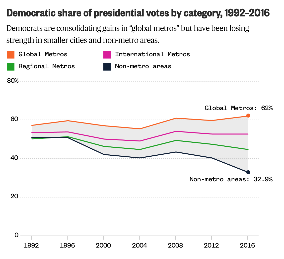
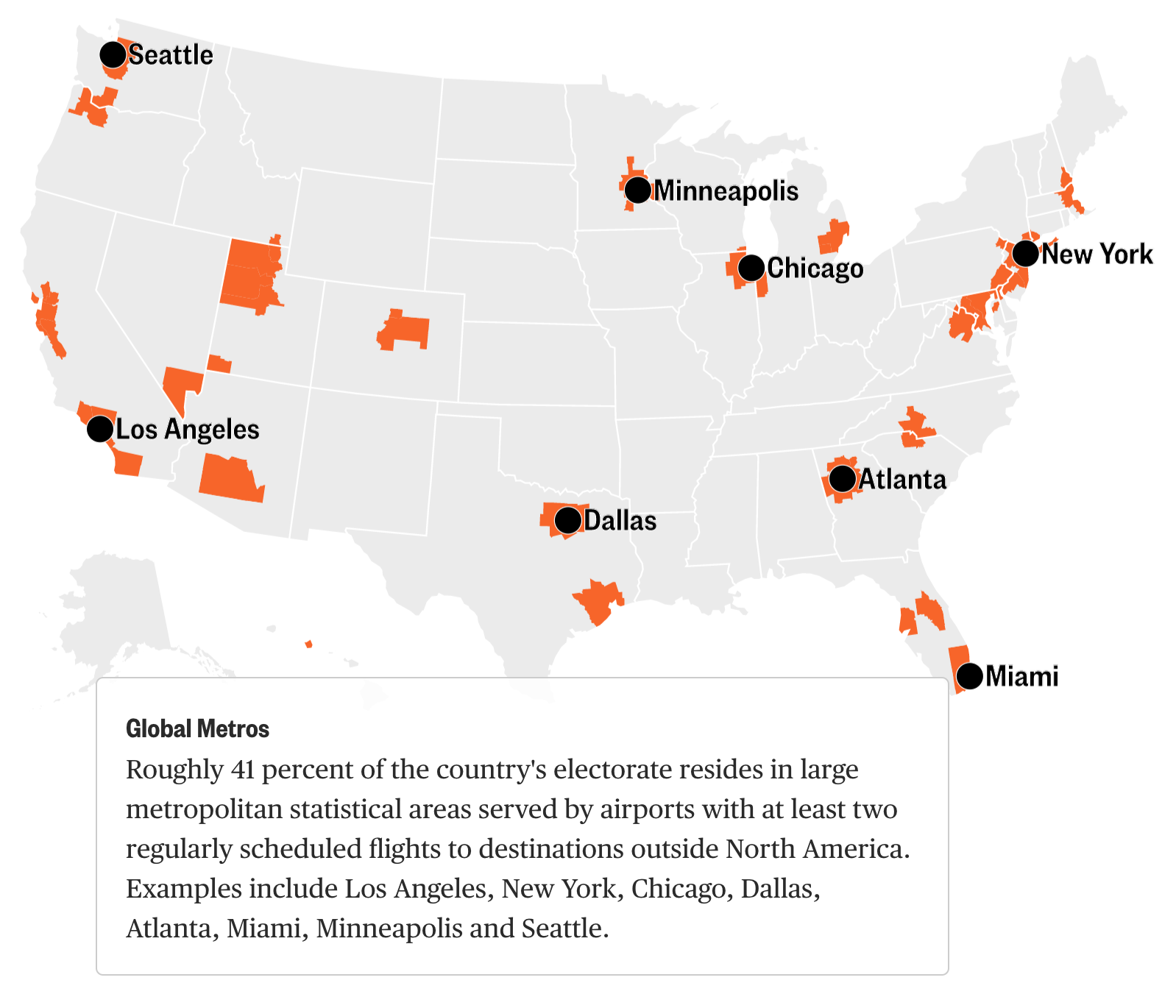
Just before Halloween, NBC News published an article by political analyst David Wasserman that examined what airports could portend about the 2020 American presidential election. For those interested in politics and the forthcoming election, the article is well worth the read.
The tldr; Democrats have been great at winning over cosmopolitan types in global metropolitan areas in the big blue states, e.g. New York and California. But the election will be won in the states where the metropolitan areas that sport regional airports dominate, i.e. Pennsylvania, Michigan, Wisconsin, and North Carolina. And in those districts, support for Democrats is waning.
The closing line of the piece sums it up nicely:
…to beat Trump, Democrats will need to ask themselves which candidates’ proposals will fly in Erie, Saginaw and Green Bay.
But what about the graphics?
We have a line chart that shows how support for Democrats has been increasing amongst those in the global and international airport metros.
Democrats aren’t performing well with the non-global and international types of metros
It uses four colours and I don’t necessarily love that. However, it smartly ties into an earlier graphic that did require each series to be visualised in a different colour. And so here the consistency wins out and carries on through the piece. (Though as a minor quibble I would have outlined the MSA being labelled instead of placing a dot atop the MSA.)
A lot of these global metros are in already blue states
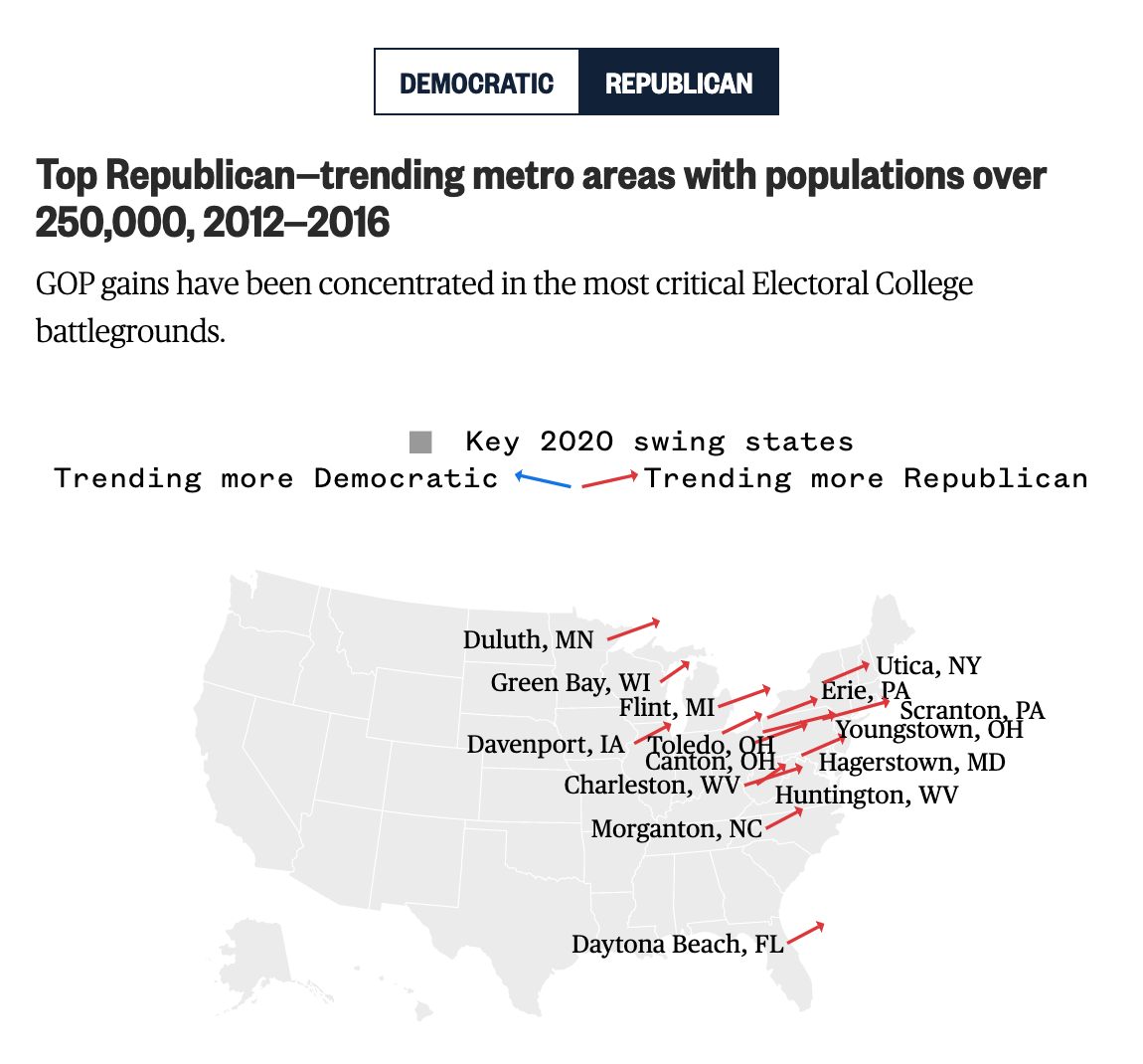
The kicker, however is one of those maps with trend arrows. It shows the increasing Republican support by an arrow anchored over the metropolitan area.
Lot of Trump support in the battleground states
The problem here is many-fold. First, the map is actually quite small in the overall piece. Whereas the earlier maps sit centred, but outside the main text block, this fits neatly within the narrow column of text (on a laptop display at least). That means that these labels are all crowded and actually make it more difficult to realise which arrow is which city. For example, which line is Canton, Ohio? Additionally with the labels, because they are set in black text and a relatively bolder face, they standout more than the red lines they seek to label. Consequently, the users’ focus falls not on the lines, but actually on the labels—the reverse of what a good graphic should do.
Second, length vs. angle. If all lines moved away from their anchor at the same angle, we could simply measure length and compare the trending support that way. However, it is clear from Duluth and Green Bay that the angles are different in addition to their sizes. So how does one interpret both variables together?
Third, I wonder if the map would not have been made more useful with some outlines or shading. I may know what the forthcoming battleground states are. And I might know where they are on a map. But Americans are notorious for being, well, not great when it comes to geography. A simple black outline of the states could have been useful, though it in this design would have conflicted with the heavy black labelling of the arrows. Or maybe a purple shading could have been used to show those states.
Overall, the piece is well worth a read and the graphics generally help tell the narrative visually. But that final graphic could have used a revision or two.
Credit for the piece goes to Jiachuan Wu and Jeremia Kimelman.