I had something else for today, but this morning I opened the door and found my morning paper. Nothing terribly special. No massive headline. No large front-page graphic. See what I mean?
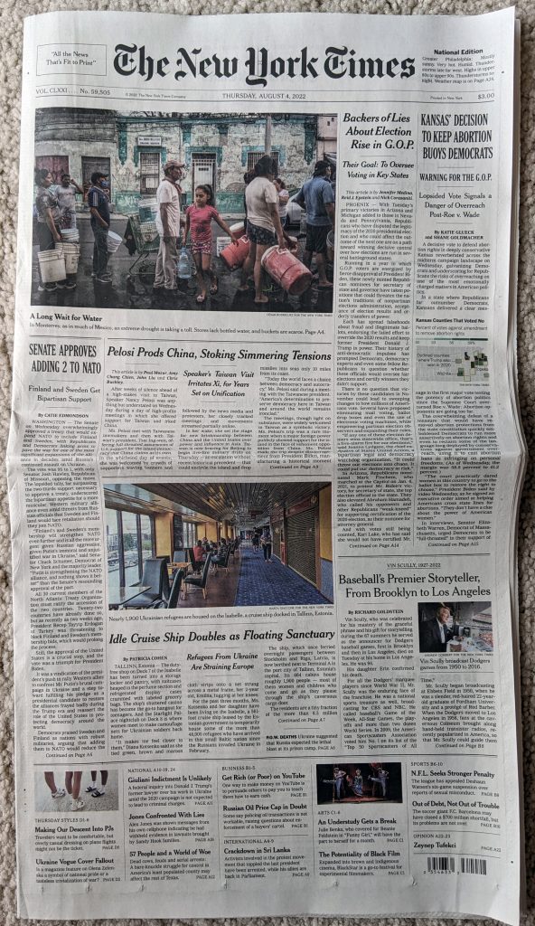
But then as I bent down to pick it up, I spotted a little tree map. But it turned out it wasn’t a tree map. It was a rectangle, largely, but it was actually a county map of Kansas. It was so small it fit within a single column.
The map showed those counties that had a majority vote in favour of keeping abortion rights. And then those counties that also voted for Trump in 2020 were outlined in orange—a good colour pairing. Turned out a number of counties did.
Without wading into the politics of it, because that’s a separate article, this was a great little map. It didn’t need to be crazy complicated or even large.
Credit for the piece goes to the New York Times graphics department.
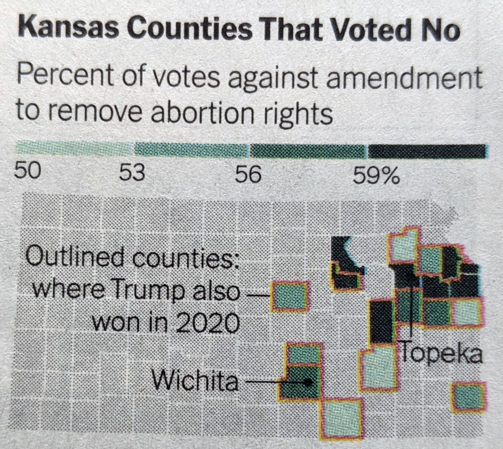
to be overturned by the Supreme Court, as seems likely, states have been busy passing laws to both restrict and expand abortion access. This article from FiveThirtyEight describes the statutory activity with the use of a small multiple graphic I’ve screenshot below.
Too much colour for my liking
Each little map represents an action that states could have taken recently, for example in the first we have states banning abortion before 13 weeks, i.e. a nearly total ban on abortion. It uses dots, for this map orange, to indicate legislative acts to that effect. But if states have passed multiple legislative acts, e.g. South Dakota when it comes to banning specific types or reasons for abortion, multiple dots are used.
I generally like this, but would have liked to have seen an overview map either at the beginning or end that would put all the states together in context. Dot placement, especially for states like Kentucky, would be tricky, but it would go a way to show how complex and convoluted the issue has become at the state level.
Last night we had breaking news on two very big fronts. The first is that somebody inside the Supreme Court leaked an entire draft of the majority opinion, written by Justice Alito, to Politico. Leaks from inside the Supreme Court, whilst they do happen, are extremely rare. This alone is big news.
But let’s not bury the lede, the majority opinion is to throw out Roe v. Wade in its entirety. For those not familiar, perhaps especially those of you who read me from abroad, Roe v Wade is the name of a court case that went before the United States Supreme Court in 1971 and was decided in 1973. It established the woman’s right to an abortion as constitutionally protected, allowing states to enact some regulations to balance out the state’s role in concern for women’s public health and the health of the fetus as it nears birth. Regardless of how you feel about the issue—and people have very strong feelings about it—that’s largely been the law of the United States for half a century.
Until now.
To be fair, the draft opinion is just that, a draft. And the supposed 5-3 vote—Chief Justice Roberts is reportedly undecided, but against the wholesale overthrow of Roe—could well change. But let’s be real, it won’t. And even if Roberts votes against the majority he would only make the outcome 5-4. In other words, it looks like at some point this summer, probably June or July, tens of millions of American women will lose access to reproductive healthcare.
And to the point of this post, what will that mean for women?
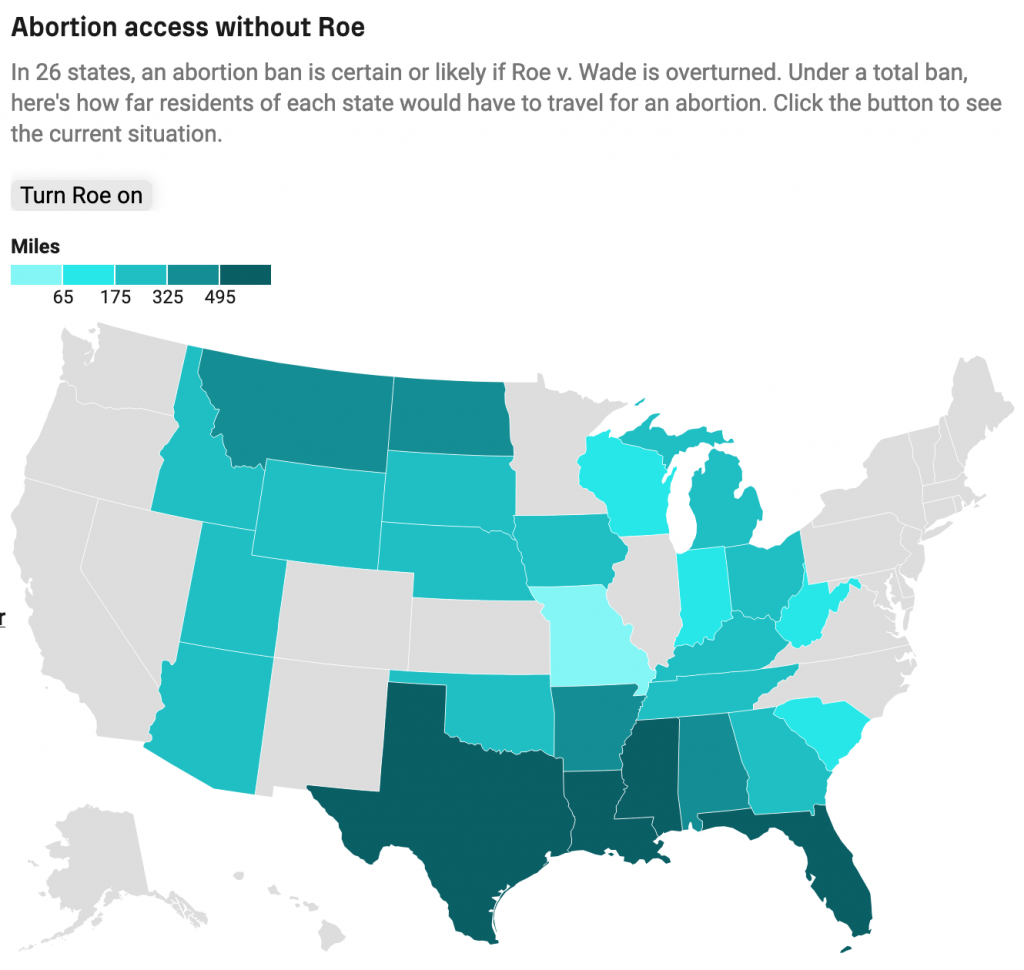
This article by Grid runs down some of the numbers, starting with laying out the numbers on who chooses to have abortions. And then ultimately getting to this map that I screenshot.
That’s pretty long distances in the south…
The map shows how far women in a state would need to travel for an abortion with Roe active as law and without. I’ve used the toggle to show without. Women in the south in particular will need to travel quite far. The article further breaks out distances today with more granularity to paint the picture of “abortion deserts” where women have to travel sometimes well over 200 miles to have a safe, legal abortion.
I am certain that we will be returning to this topic frequently in coming months, unfortunately.
In case you did not hear, earlier this week Alabama banned all abortions. And for once, we do not have to add the usual caveat of “except in cases of rape or incest”. In Alabama, even in cases of rape and incest, women will not have the option of having an abortion.
And in Georgia, legislators are debating a bill that will not only strictly limit women’s rights to have an abortion, but will leave them, among other things, liable for criminal charges for travelling out of state to have an abortion.
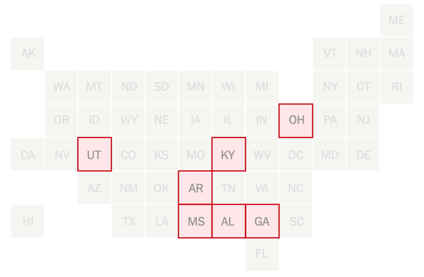
Consequently, the New York Times created a piece that explores the different abortion bans on a state-by-state basis. It includes several nice graphics including what we increasingly at work called a box map. The map sits above the article and introduces the subject direct from the header that seven states have introduced significant legislation this year. The map highlights those seven states.
We’ve been calling these box maps. It’s growing on me.
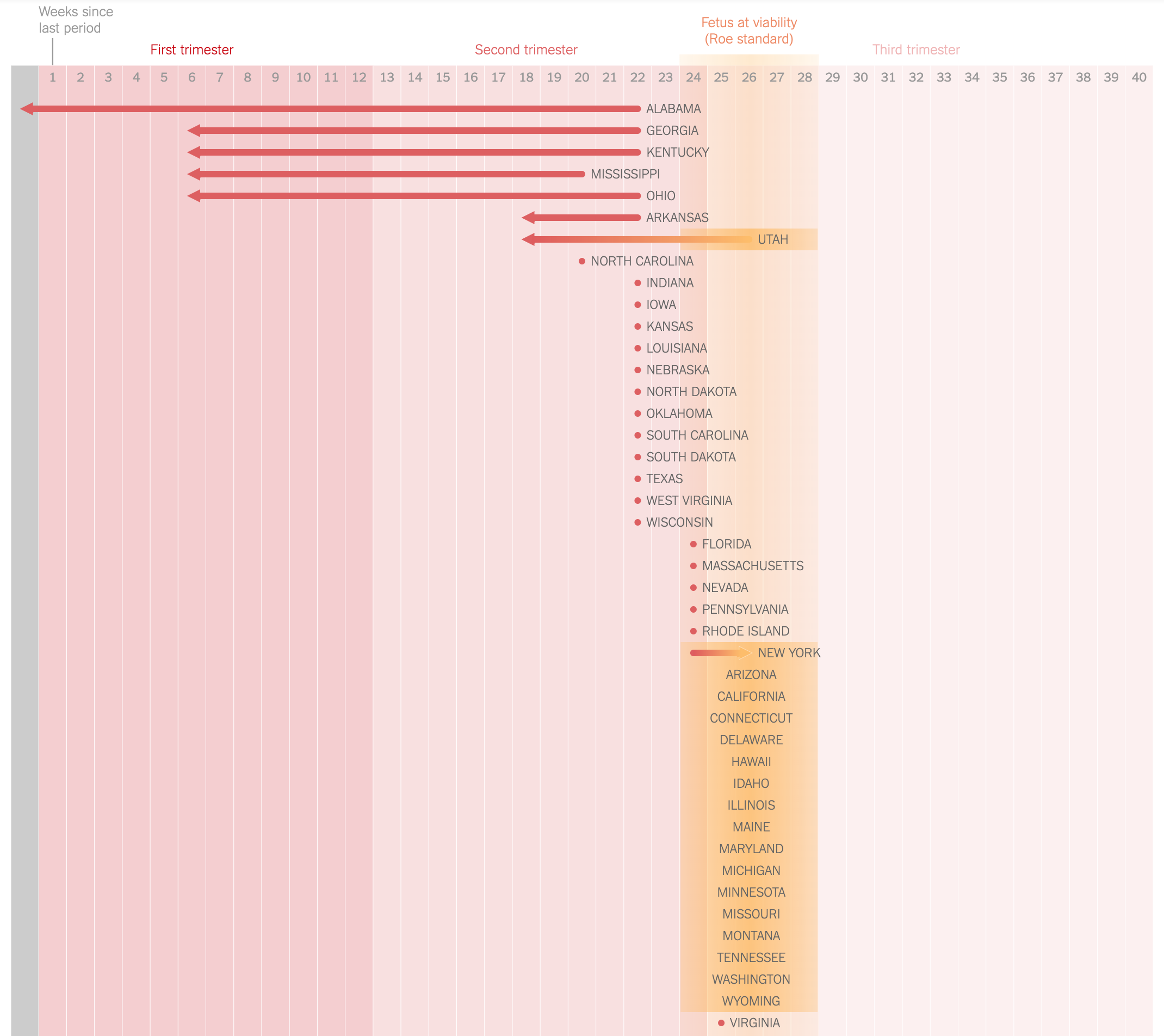
The gem, however, is a timeline of sorts that shows when states ban abortion based on how long since a woman’s last period.
There are some crazy shifts leftward in this graphic…
It does a nice job of segmenting the number of weeks into not trimesters and highlighting the first, which traditionally had been the lower limit for conservative states. It also uses a nice yellow overlay to indicate the traditional limits determined by the Roe v. Wade decision. I may have introduced a nice thin rule to even further segment the first trimester into the first six week period.
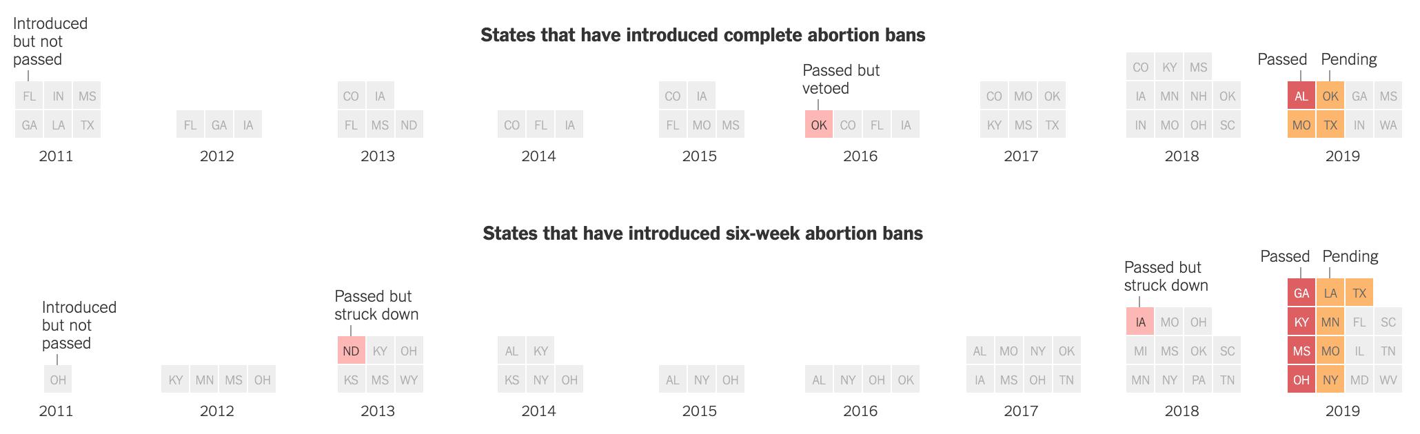
We also have a nice calendar-like small multiple series showing states that have introduced but not passed, passed but vetoed, passed, and pending legislation with the intention of completely banning abortion and also completely banning it after six weeks.
Far too many boxes on the right…
This does a nice job of using the coloured boxes to show the states have passed legislation. However, the grey coloured boxes seem a bit disingenuous in that they still represent a topically significant number: states that have introduced legislation. It almost seems as if the grey should be all 50 states, like in the box map, and that these states should be in some different colour. Because the eight or 15 in the 2019 column are a small percentage of all 50 states, but they could—and likely will—have an oversized impact on women’s rights in the year to come.
That said, it is a solid graphic overall. And taken together the piece overall does a nice job of showing just how restrictive these new pieces of legislation truly are. And how geographically limited in scope they are. Notably, some states people might not associate with seemingly draconian laws are found in surprising places: Pennsylvania, Illinois, Maryland, and New York. But that last point would be best illustrated by another box map.
If you have heard enough about the Affordable Care Act, well, you could be listening to the desire to defund Planned Parenthood. Because, while that organisation cannot use any federal funding for abortions, it is the nation’s largest provider of that service. So if you follow that logic, you must strip all federal funds from the organisation.
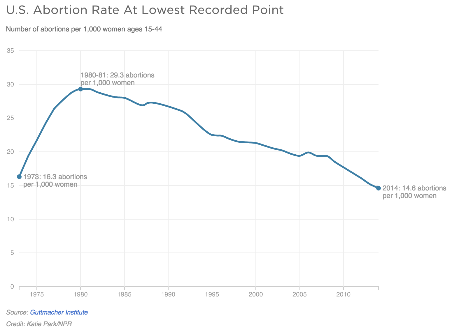
Yeah, it makes no sense. But whatever, those are part of the Republican plans. But, if you look at the data, abortion rates are now at the lowest level since Roe v. Wade in the 1970s.
The US abortion rate is at its lowest rate since Roe v. Wade
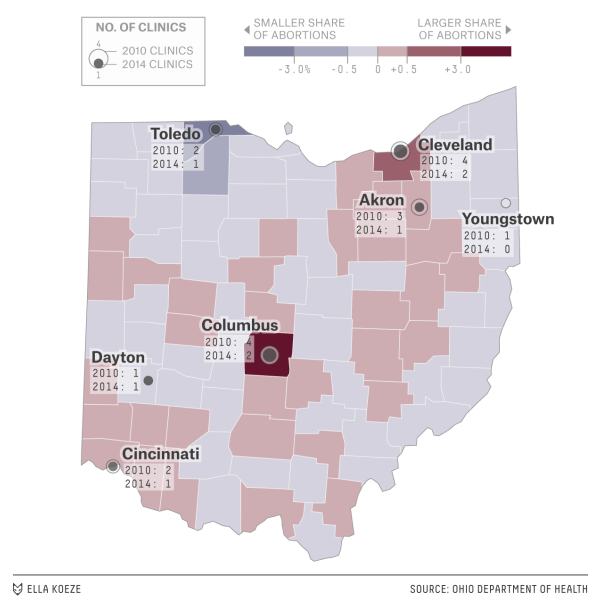
Last night contained one victory for John Kasich. The Ohio governor outlasted all but Trump and Cruz and therefore represents the only establishment candidate. He also supposedly represents the moderate wing of the Republican Party. But within an article on FiveThirtyEight is a map showing how he may not be as moderate as he claims. Kasich has signed legislation creating difficult conditions for clinics and so many have closed.