After twenty years out of power, the Taliban in Afghanistan are back in power as the Afghan government collapsed spectacularly this past weekend. In most provinces and districts, government forces surrendered without firing a shot. And if you’re going to beat an army in the field, you generally need to, you know, fight if you expect to beat them.
I held off on posting anything about the Taliban takeover of Afghanistan simply because it happened so quick. It was not even two months ago when they began their offensive. But whenever I started to prepare a post, things would be drastically different by the next morning.
And so this timeline graphic from the BBC does a good job of capturing the rapid collapse of the Afghan state. It starts in early July with a mixture of blue, orange, and red—we’ll come back to the colours a bit later. Blue represents the Afghan government, red the Taliban, and orange contested areas.
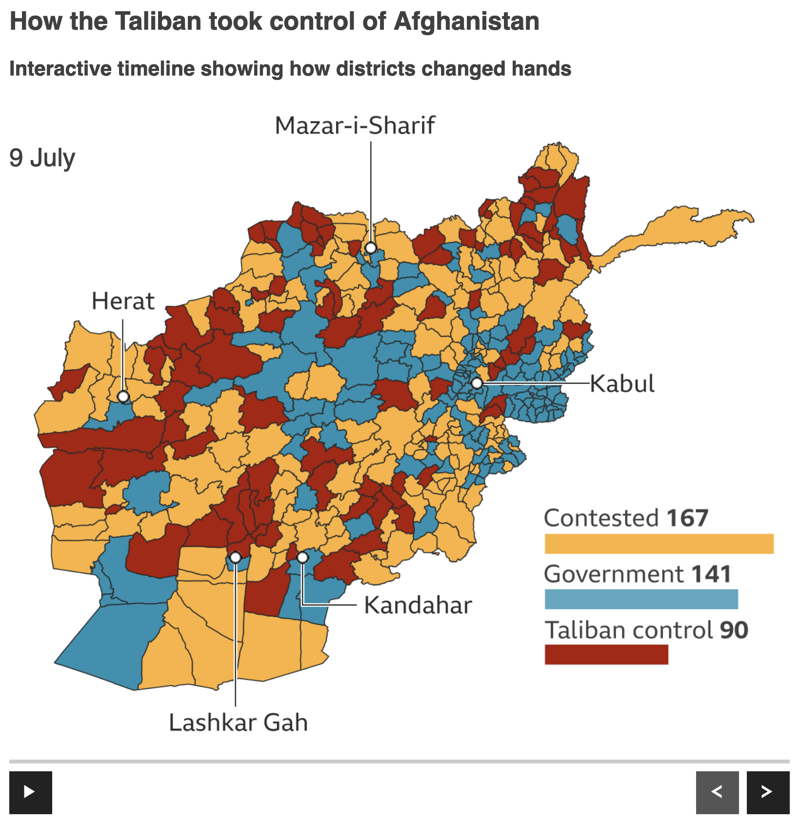
The graphic includes some controls at the bottom, a play/pause and forward/backward skip buttons. The geographic units are districts, sub-provincial level units that I would imagine are roughly analogous to US counties, but that’s supposition on my part. Additionally the map includes little markers for some of the country’s key cities. Finally in the lower right we have a little scorecard of sorts, showing how many of the nearly 400 districts were in the control of which group.
Skip forward five weeks and the situation could not be more different.
Almost all of Afghanistan is under the control of the Taliban. There’s not a whole lot else to say about that fact. The army largely surrendered without firing a shot. Though some special forces and commando units held out under siege, notably in Kandahar where a commando unit held the airport until after the government fell only to be evacuated to the still-US-held Hamid Karzai International Airport in Kabul.
My personal thoughts, well you can blame Biden and the US for a rushed US exodus that looks bad optically, but the American withdrawal plan, initiated by Trump let’s not forget, counted on the Afghan army actually fighting the Taliban and the government negotiating some kind of settlement with the Taliban. Neither happened. And so the end came far quicker than anyone thought possible.
But we’re here to talk graphics.
In general I like this. I prefer this district-level map to some of the similar province-level maps I have seen, because this gives a more granular view of the situation on the ground. Ideally I would have included a thicker line weight to denote the provinces, but again if it’s one or the other I’d opt for district-level data.
That said, I’d probably have used white lines instead of black. If you look in the east, especially south and east of Kabul, the geographically small areas begin to clump up into a mass of shapes made dark by the black outlines. That black is, of course, darker than the reds, blues, and yellows. If the designers had opted for white or even a light shade of grey, we would enhance the user’s ability to see the district-level data by dropping the borders to the back of the visual hierarchy.
Finally with colours, I’m not sure I understand the rationale behind the red, blue, yellow here. Let’s compare the BBC’s colour choice to that of the Economist. (Initially I was going to focus on the Economist’s graphics, but last minute change of plans.)
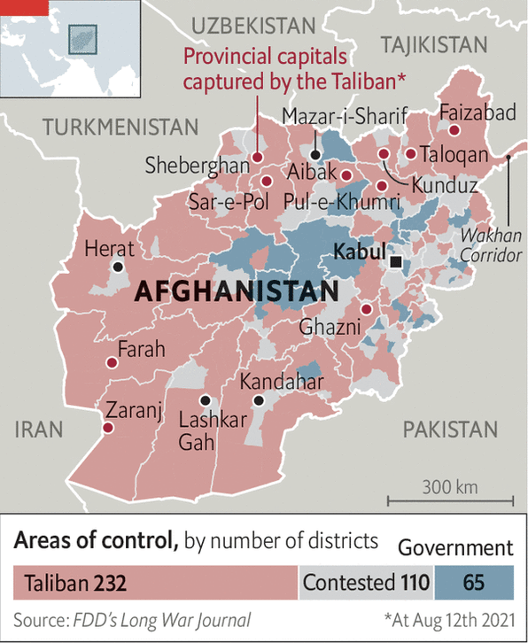
Here we see a similar scheme: red for the Taliban, blue for the government. But notably the designers coloured the contested areas grey, not yellow. We also have more desaturated colours here, not the bright and vibrant reds, blues, and yellows of the BBC maps above.
First the grey vs. yellow. It depends on what the designers wanted to show. The grey moves the contested districts into the background, focusing the reader’s attention on the (dwindling) number of districts under government control. If the goal is to show where the fighting is occurring, i.e. the contest, the yellow works well as it draws the reader’s attention. But if the goal is to show which parts of the country the Taliban control and which parts the government, the grey works better. It’s a subtle difference, I know, but that’s why it would be important to know the designer’s goal.
I’ll also add that the Economist map here shows the provincial capitals and uses a darker, more saturated red dot to indicate if they’d fallen to the Taliban. Contrast that with the BBC’s simple black dots. We had a subtler story than “Taliban overruns country” in Afghanistan where the Taliban largely did hold the rural, lower populated districts outside the major cities, but that the cities like the aforementioned Kandahar, Herat, Mazar-i-Sharif held out a little bit longer, usually behind commando units or local militia. Personally I would have added a darker, more saturated blue dot for cities like Kabul, which at the time of the Economist’s map, was not under threat.
Then we have the saturation element of the red and blue.
Should the reds be brighter, vibrant and attention grabbing or ought they be lighter and restrained, more muted? It’s actually a fairly complex answer and the answer is ultimately “it depends”. I know that’s the cheap way out, but let me explain in the context of these maps.
Choropleth maps like this, i.e. maps where a geographical unit is coloured based on some kind of data point, in this instance political/military control, are, broadly speaking, comprised of large shapes or blocks of colour. In other words, they are not dot plots or line charts where we have small or thin instances of colour.
Now, I’m certain that in the past you’ve seen a wall or a painting or an advert for something where the artist or designer used a large, vast area of a bright colour, so bright that it hurt your eyes to look at the area. I mean imagine if the walls in your room were painted that bright yellow colour of warning signs or taxis.
That same concept also applies to maps, data visualisation, and design. We use bright colours to draw attention, but ideally do so sparingly. Larger areas or fields of colours often warrant more muted colours, leaving any bright uses to highlight particular areas of attention or concern.
Imagine that the designers wanted to highlight a particular district in the maps above. The Economist’s map is better designed to handle that need, a district could have its red turned to 11, so to speak, to visually separate it from the other red districts. But with the BBC map, that option is largely off the table because the colours are already at 11.
Why do we have bright colours? Well over the years I’ve heard a number of reasons. Clients ask for graphics to be “exciting”, “flashy”, “make it sizzle” because colours like the Economist’s are “boring”, “not sexy”.
The point of good data visualisation, however, is not to make things sexy, exciting, or flashy. Rather the goal is clear communication. And a more restrained palette leaves more options for further clarification. The architect Mies van der Rohe famously said “less is more”. Just as there are different styles of architecture we have different styles of design. And personally my style is of the more restrained variety. Using less leaves room for more.
Note how the Economist’s map is able to layer labels and annotations atop the map. The more muted and desaturated reds, blues, and greys also allow for text and other artwork to layer atop the map but, crucially, still be legible. Imagine trying to read the same sorts of labels on the BBC map. It’s difficult to do, and you know that it is because the BBC designers needed to move the city labels off the map itself in order to make them legible.
Both sets of maps are strong in their own right. But the ultimate loser here is going to be the Afghan people. Though it is pretty clear that this was the ultimate result. There just wasn’t enough support in the broader country to prop up a Western style liberal democracy. Or else somebody would have fought for it.
Credit for the BBC piece goes to the BBC graphics department.
Credit for the Economist piece goes to the Economist graphics department.