Warming Towards Women Leaders

We are going to start this week off with a nice small multiple graphic that explores the reducing resistance to women in positions of leadership in Arab countries. The graphic comes from a BBC article published last week.

A lot of positive negative movement.

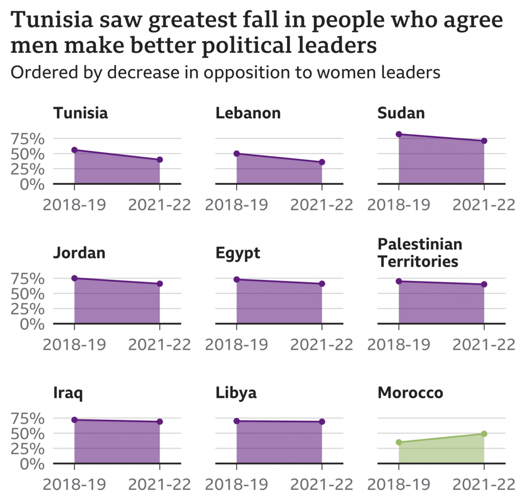
These kinds of graphics allow a reader to quickly compare the trajectory of a thing between a start and an endpoint. The drawback is it can obscure any curious or interesting trends in the midpoints. For example, with Libya, is its flat trajectory always been flat? You could imagine a steep fall off but then rapid climb back up. That would be a story worth telling, but a story obscured by this type of graphic.

I do think the graphic could use a few tweaks to help improve the data clarity. The biggest change? I would work to improve the vertical scale, i.e. stretch each chart taller. Since we care about the drop in opposition to women leaders, let’s emphasise that part of the graphic. There could be space constraints for the graphic, but that said, it looks like some of the spacing between chart header and chart could be reduced. And I think for most of the charts except for the first, the year range could be added as a data definition to the graphic and removed from each chart. Similar to how every row only once uses the vertical axis labels.

Another way this could be done is by reducing the horizontal width of each chart in an attempt to squeeze the nine from three rows down to two. That would mean two additional chart positions per row. Tight fit? Probably, but there is also some extraneous space to the right and left of each chart and a large gap between the charts themselves. This all appears to be due to those aforementioned x-axis labels. An additional benefit to reducing the horizontal dimensions of each chart is it increases the vertical depth of the chart as each line’s slope, its rise over run, sees its horizontal distance shrink.

Overall this is a really smart graphic that works well, but with a few extra tweaks could take it to the next level.

Credit for the piece goes to the BBC graphics department.

The Ebola Outbreak in the Congo

Ebola, which killed 11,000 people in West Africa in 2014 (which I covered in a couple of different posts), is back and this time ravaging the Congo region, specifically the Democratic Republic of the Congo (DRC). The BBC published an article looking at the outbreak, which at 1,400 deaths is still far short of the West Africa outbreak, but is still very significant.

That's looking like a tenuous border right now…
That’s looking like a tenuous border right now…

The piece uses a small multiples of choropleths for western Congo. The map is effective, using white as the background for the no case districts. However, I wonder, would be more telling if it were cases per month? That would allow the user to see to where the outbreak is spreading as well as getting a sense of if the outbreak is accelerating or decelerating.

The rest of the article features four other graphics. One is a line chart that also looks at cumulative cases and deaths. And again, that makes it more difficult to see if the outbreak is slowing or speeding up. Another is how the virus works and then two are about dealing with the virus in terms of suits and the containment camps. But those are graphics the BBC has previously produced, one of which is in the above links.

Credit for the piece goes to the BBC graphics department.

The Rising Tide of Jihadist Violence in Africa

The other day somebody mentioned to me that Africa is big, to which I agreed. It is big. It contains, depending upon how you count, about 55 countries and over one billion people. It stretches from Mediterranean climates and deserts in the north to rainforests around the equator and then back down through steppe climates to the southern coast of South Africa.

But in that vast territory also comes jihadist violence, and in this article by the Economist, it points out that despite that vastness, the violence can be found in two main areas: first, along the Mediterranean coast and, second, along the Sahel and savannah.

At least it's not spiking?
At least it’s not spiking?

The map uses dots to nice effect here, pinpointing the actual locations of violence and then providing additional detail by colouring the dots according to the perpetrators of the violence. But what I really enjoyed was the simple effect of tying together the dot colours to the stacked area chart in the lower left. It shows the number of people killer per year. And while significantly up from 2010, at least the number of people killed by Boko Haram is down from its heights in 2014–15.

But the reason I brought up the vastness at the beginning is that while these are all groups following a jihadist ideology, many are also driven by very local concerns. Consequently they likely have local solutions. And we need to be careful about how much lumping together we do about jihadist violence in Africa.

Credit for the piece goes to the Economist data team.

The Importance of Cartography

Today I wanted to share with you a piece from the BBC that explores the importance of cartography, or mapmaking, in relief efforts particularly in Malawi, a country located in southeastern Africa.

My favourite still, perhaps, was an image of a hand-drawn map

This is a still from a short video—it clocks in at just a tad under three minutes—that you can watch to see how volunteers are identifying and mapping villages that do not appear on today’s maps. The importance, as they explain, is that if the village does not appear, it is as if the village does not exist. Consequently it can be quite difficult for aid to reach these villages during disasters like the 2015 floods.

Credit for the piece goes to Ruth Evans.

Nambia

C’mon. You knew I was not going to let that one slip by.

President Trump, in a meeting with African leaders, twice name-dropped Nambia and in one mention held it up as having a nearly self-sufficient healthcare system. Funny thing to mention as the US is on the brink of eviscerating its healthcare system. But I digress. The point is that when you are speaking to the president of a country, you take a minute to learn how to pronounce the country’s name correctly. Even write it phonetically in the text if you have to. (I’ve done that.) So where is Nambia?

This was just too too good to pass up…

Do You Know Africa?

Beyond the fact that it isn’t a country? This week the White House hosted the US–Africa Summit. The Washington Post took the opportunity to quiz readers on their knowledge of African countries’ locations on a blank map. So this Friday, you get to take the quiz and post your results if you dare. A nice touch is that the map colours the countries by the number of guesses and then provides different colour outlines for your selection and the correct one—should you err.

Sierra Leone
Sierra Leone

I messed up Burundi—I always confuse it and Rwanda—and only got a 98%. /humblebrag

Credit for the piece goes to Kevin Schaul.

In the World of Damnit, Man

If you haven’t heard, there is a fairly significant outbreak of Ebola occurring in western Africa these days. The most attention has been drawn since the death of an American national in Nigeria. He had been working for the Liberian government and collapsed at the Lagos airport and died shortly thereafter. So the Centers for Disease Control has been reporting and advising on the outbreak and they have at least two graphics.

This first is good. It looks at the spread of the disease through different areas of several countries. It also identifies sites of interest for treating/containing the outbreak.

Outbreak map as of 3 August

The second, however, takes prominence as an “infographic” on the CDC homepage. How this qualifies as an infographic I have no idea. It is…just sad. I mean I get it, too many people do not understand how Ebola is transmitted. But to call this an infographic does disservice to other, real infographics.

The infographic
The infographic

Credit for the map goes to Elizabeth Ervin. For the “infographic”, no idea.

How Africa Tweets

Today’s piece is hit and miss. It comes from the World Economic Forum and the subject matter is the use of Twitter across Africa. I think the subject matter is interesting; mobile communication technology is changing Africa drastically. The regional trends shown in the map at the core of the piece are also fascinating. Naturally I am left wondering about why certain countries. Does spending on infrastructure, GDP per capita, disposable income levels have any sort of correlation if even only on a national and not city level?

How Africa tweets
How Africa tweets

But what really irks me is the content that wraps around the map. First the donut chart, I think my objections to donuts—at least the non-edible kind—are well known. In this case, I would add—or sprinkle on—that the white gaps between the languages are unnecessary and potentially misleading.

Secondly, the cities are eventually displayed upside down. Thankfully the labels are reversed so that city names are legible. However, the continually changing angle of the chart makes it difficult to compare Douala to Luanda to Alexandria. A neatly organised matrix of small multiples would make the data far clearer to read.

In short, I feel this piece is a good step in the right direction. However, it could do with a few more drafts and revisions.

Credit for the piece goes to Allan Kamau.

Ivory Poaching

The South China Morning Post had a fantastic infographic detailing the hunting of elephants for their ivory. Despite bans to make such hunting illegal, the problem continues and is worsening because of the Asian trade in ivory.

Cropping of the infographic

Credit for the piece goes to Adolfo Arranz.