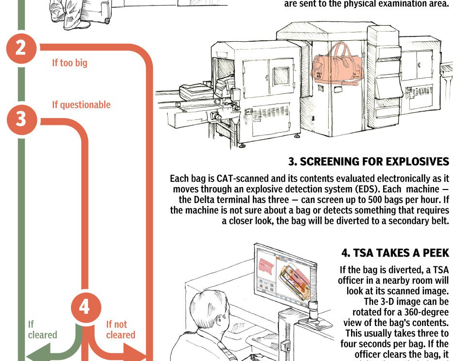
Another weekend, another weekend trip. This time I’m flying to Philadelphia for a quick trip back home. Naturally, I’m going to pack a suitcase so I can bring some things back to Chicago from civilisation. But what happens to my luggage between my checking it and it being loaded onto the aircraft? Thanks to the National Post, we have a graphic to explain just that.
Flow chart for your luggage
Credit for the piece goes to Bonnie Berkowitz and Alberto Cuadra.
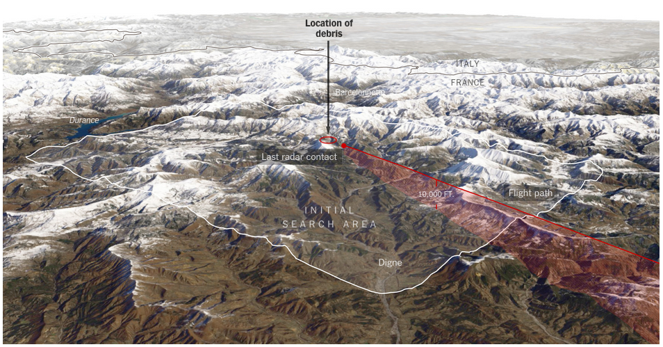
Yesterday an Airbus A320 operated by Germanwings, a subsidiary of Lufthansa, crashed in the French Alps with no survivors. This morning, I am showing the two best graphics I have come across thus far attempting to explain just what happened.
The first is from the New York Times. In a series of maps, it points out through satellite photography the roughness of the terrain and therefore the difficulty likely to be experienced by recovery crews. The final line chart plots the altitude of the flight, which fell from a cruising altitude of 38,000 feet to just over 6,000 feet in eight minutes. Overall, especially given the limited amount of information that we currently possess, not a bad piece.
The New York Times’ explainer map
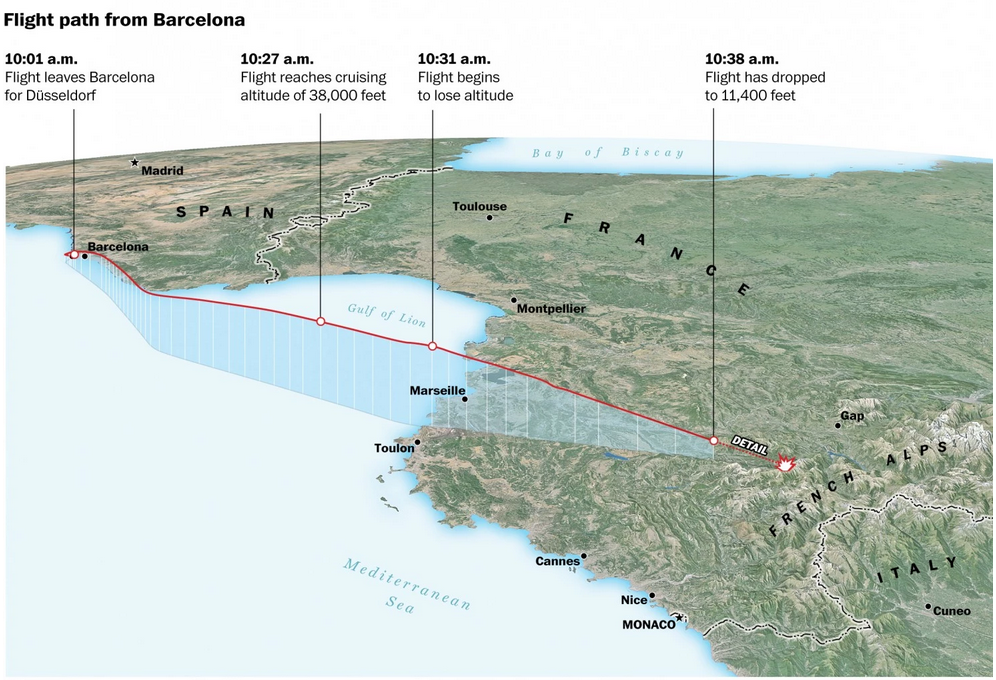
The second comes to us from the Washington Post. What I enjoy about this piece is that it combines the altitude chart with the map. This gives a bit context to the fact that despite being still 6,000 feet above sea level, the aircraft was in fact flying into the high mountains of the Alps.
The Washington Post’s explainer map
Credit for the New York Times piece goes to the New York Times graphics department. And credit for the Washington Post piece goes to Gene Thorp and Richard Johnson.
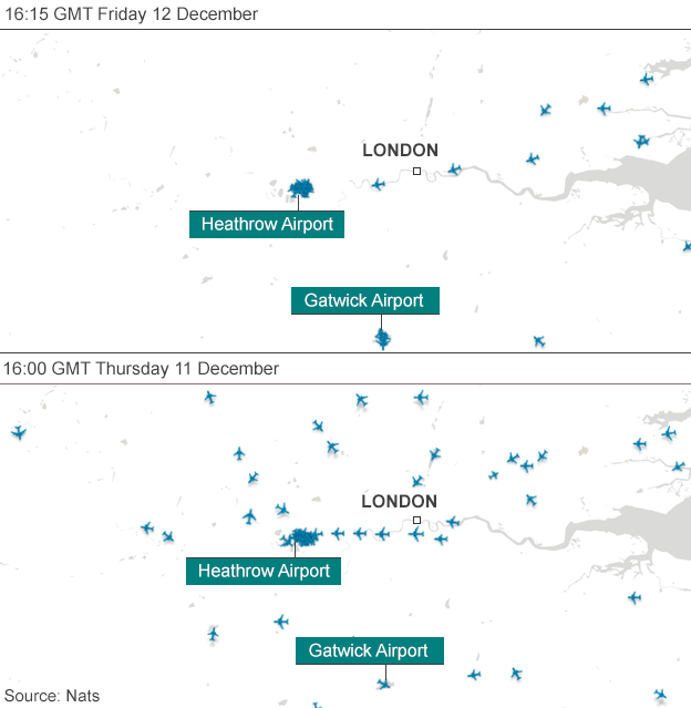
Last week, there was a disruption at the air traffic control centre for the United Kingdom. It caused many travel problems. And the BBC included a graphic showing how the problem was shutting down London air space.
Empty skies over London
Credit for the piece goes to the BBC graphics department.
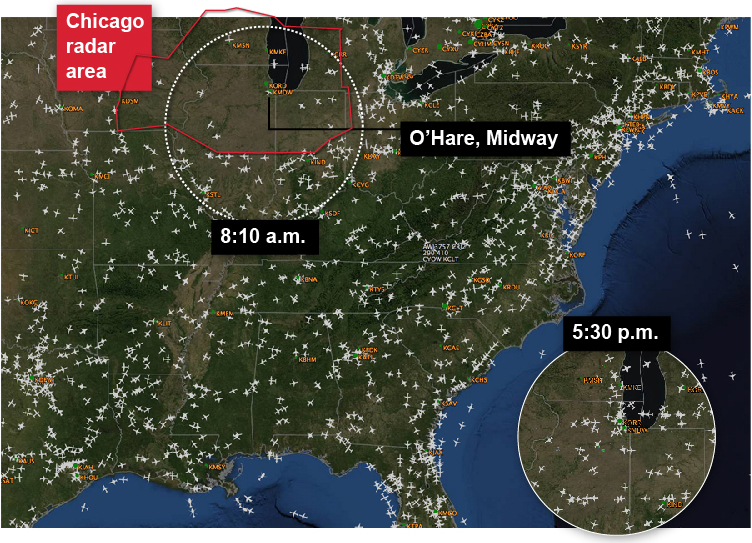
Last Friday a fire in an FAA centre in one of Chicago’s suburbs shut down air traffic in the Chicago area. You know, not a big deal. So the Chicago Tribune made a small graphic to show just how much of a difference a closure of air space can make.
Air traffic shutdown
Credit for the piece goes to the Chicago Tribune’s graphics department.
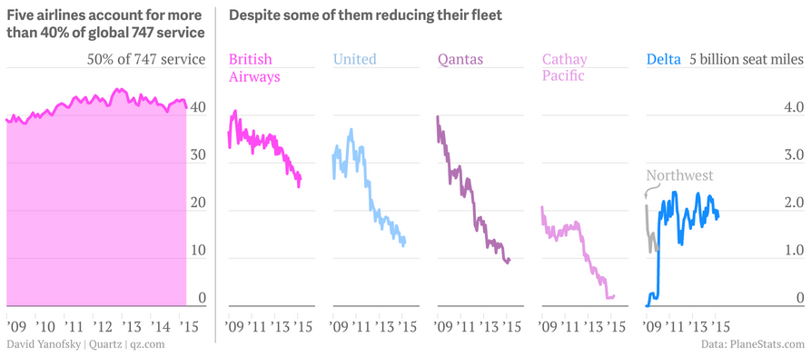
This weekend I flew to and from Philadelphia—that is when my flights were not delayed. So I decided to select an aircraft-related graphic for today’s piece, originally from Quartz. It looks at the phasing out of the iconic Boeing 747. (And as for me, well I was on a 737-900 and a CRJ-700—neither as iconic as the 747.)