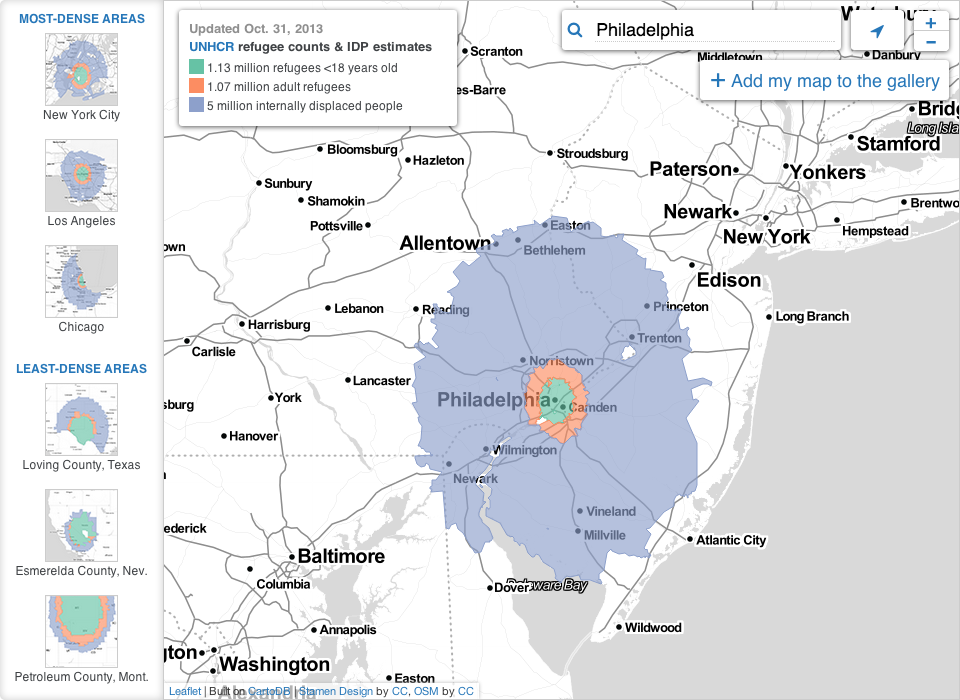
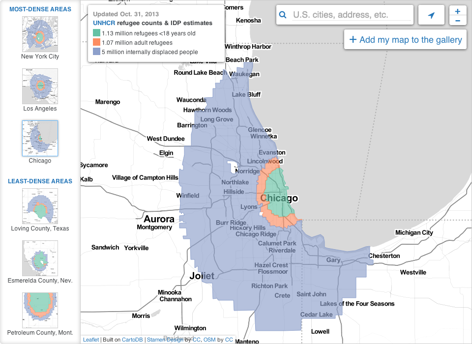
So that civil war in Syria thing, yeah, it’s still going on, folks. And lots of people—7,000,000 of them—have been forced to flee to either external or internal locations. Al Jazeera has attempted to put that number into context for Americans using US census data and maps.
Here is a look at both Philadelphia and Chicago for comparison’s sake. The interactive application has a few pre-selected options, or you can find your own US locale.
Syrian refugees based on Philadelphia’s populationSyrian refugees based on Chicago’s population
For those of you who did not know, the country of Mali held elections yesterday and results should be forthcoming. Those of you who regularly read or semi-frequently check my blog, you are likely familiar with the work I did covering the French-led intervention in Mali. I am a bit busy working on some other projects, so I did not have the time to prepare a graphic for the election as I had hoped. Nor did many others. Alas, the only graphic I have come upon is from Al Jazeera. And it is a mess.
Mali's election
That map only shows the provinces; the colours signify nothing. Nor is there any context for the factettes on the side. And while perhaps the intention was to show Mali in a snapshot, I think a piece about the challenges facing Mali could delve a bit into forecasted statistics. I credit the team behind the project with attempting to cover the story, but aside from biographies on the four leading candidates and overviews of the main militant groups, the piece lacks depth and substance.
Ultimately, after looking at the work, I am left wanting more. A lot more.
Credit for the piece goes to Alia Chughtai and Jacob Powell.