The Sun’s Over the Yardarm Somewhere

It’s been a little while since my last post, and more on that will follow at a later date, but this weekend I glanced through the Pennsylvania Liquor Control Board’s annual report. For those unfamiliar with the Commonwealth’s…peculiar…alcohol laws, residents must purchase (with some exceptions) their wine and spirits at government-owned and -operated shops.

It’s as awful as it sounds. Compare that to my eight years in Chicago, where I could pick up a bottle of wine at a cheese shop at the end of the block for a quiet night in or a bottle of fine Scotch a few blocks from the office on Whisky Friday for that evening’s festivities. Here all your wine and spirits come from the state store.

And whilst it’s awful from a consumer/consumption standpoint, it makes for some interesting data, because we can largely use that one source to get a sense of the market for wine and spirits in the Commonwealth. That is to say, you don’t need to (really) worry about collecting data from hundreds of other large vendors. Consequently, at the end of the fiscal year you can get a glimpse into the wine and spirit landscape in Pennsylvania.

So what do we see this year?

A choropleth map of per 21+ capita sales of wine and spirits in Pennsylvania.

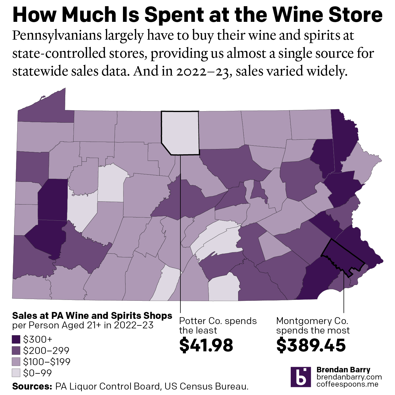
To start I chose to revisit a choropleth map I made in 2020, just before the pandemic kicked off in the United States. Broadly speaking, not much has changed. You can find the highest per 21+ year old capita value sales—henceforth I’ll simply refer to this as per capita—outside Philadelphia, Pittsburgh, and up in the northeast corner of the Commonwealth.

The great thing about per capita sales are that, by definition, it accounts for population. So this isn’t just that because Philadelphia and Pittsburgh are the largest two metropolitan areas they have the largest value sales—though they do in the aggregate as well. In fact, if we look at the northeast of the Commonwealth in places like Wayne County we see the second highest per capita sales, just under the top-ranked in Montgomery County.

Wayne County’s population, at least of the legal drinking age, is flat comparing 2018 to 2022: 0.0% or just six people. However, sales over that same period are up 20.2% per person. That’s the 15th greatest increase out of 67 counties. What happened?

A little thing called Covid-19. During the pandemic, significant numbers of higher-income people from New York and Philadelphia bought second properties in Wayne County and, surely, they brought some of that income and are now spending it on wine and high-priced spirits.

Wayne County stands out starkly on the map, but it does not look like a total outlier. Indeed, if you look at the highest growth rates for per capita sales from 2018 to 2022, you will find them all in the more rural parts of the Commonwealth. Furthermore, almost every county that has seen greater than 15% growth is in a county whose drinking-age population has shrunk in the last five years.

Overall, however, the map looks broadly similar to how it did at the beginning of 2020. The top and centre of the Commonwealth have relatively low per capita sales, and this is Appalachia or Pennsyltucky as some call it. Broadly speaking, these are more rural counties and counties of lower income.

I spend a little bit of time out in Appalachia each year and have family roots out in the mountains. And my experience casts one shadow on the data. Personally, I prefer my cocktails, whiskies, and gins. But when I go out for a drink or two out west, I often settle for a pint or two. That part of the Commonwealth strikes me as more fond of beer than wine or spirits. And this dataset does not include beer. I have to wonder how the data would look if we included beer sales—though lower price-point session beers would still probably keep the per capita value sales on the lower end given the broad demographics of the region.

Finally, one last note on that second call out, Potter County having the lowest per capita sales at just under $42 per person. The number struck me as odd. The next lowest county, Fulton, sits nearly $30 more per person. Did I copy and paste the data incorrectly? Was there a glitch in the machine? Is the underlying data incorrect? I can’t say for certain about the third possibility, but I did some digging to try and hit the bottom of this curiosity.

First, you need to understand that Potter County is, by population, the 5th smallest with just over 16,000 total people living there. And as far as I can tell, it had just three stores at the beginning of 2022. But then, before the beginning of the new fiscal year, one of the three stores closed when an adjoining building collapsed. It was never rebuilt. And so perhaps 1/3 of the local population was forced to head out-of-county for wine and spirits. Compared to 2018, per capita sales in Potter County declined by 62%, and most of that is within the last year as the annual report lists the year-on-year decline as just under 54%.

In coming days and weeks I’ll be looking at the data a bit more to see what else it tells us. Stay tuned.

Credit for the piece is mine.

Big Beer

A few weeks back, a good friend of mine sent me this graphic from Statista that detailed the global beer industry. It showed how many of the world’s biggest brands are, in fact, owned by just a few of the biggest companies. This isn’t exactly news to either my friend or me, because we both worked in market research in our past lives, but I wanted to talk about this particular chart.

Not included, your home brew

At first glance we have a tree map, where the area of each “squarified” shape represents, usually, the share of the total. In this case, the share of global beer production in millions of hectolitres. Nothing too crazy there.

Next, colour often will represent another variable, for market share you might often see greens or blues to red that represent the recent historical growth or forecast future growth of that particular brand, company, or market. Here, however, is where the chart begins to breakdown. Colour does not appear to encode any meaningful data. It could have been used to encode data about region of origin for the parent company. Imagine blue represented European companies, red Asian, and yellow American. We would still have a similarly coloured map, sans purple and green,

But we also need to look at the data the chart communicates. We have the production in hectolitres, or the shape of the rectangle. But what about that little rectangle in the lower right corner? Is that supposed to be a different measurement or is it merely a label? Because if it’s a label, we need to compare it to the circles in the upper right. Those are labels, but they change in size whereas the rectangles change only in order to fit the number.

And what about those circles? They represent the share of total beer production. In other words the squares represent the number of hectolitres produced and the circles represent the share of hectolitres produced. Two sides of the same coin. Because we can plot this as a simple scatter plot and see that we’re really just looking at the same data.

Not the most interesting scatter plot I’ve ever seen…

We can see that there’s a pretty apparent connection between the volume of beer produced and the share of volume produced—as one would (hopefully) expect. The chart doesn’t really tell us too much other than that there are really three tiers in the Big Six of Breweries. AB Inbev is in own top tier and Heineken is a second separate tier. But Carlsberg and China Resources Snow Breweries are very competitive and then just behind them are Molson Coors and Tsingtao. But those could all be grouped into a third tier.

Another way to look at this would be to disaggregate the scatter plot into two separate bar charts.

And now to the bars…

You can see the pattern in terms of the shapes of the bars and the resulting three tiers is broadly the same. You can also see how we don’t need colour to differentiate between any of these breweries, nor does the original graphic. We could layer on additional data and information, but the original designers opted not to do that.

But I find that the big glaring miss is that the article makes the point despite the boom in craft beer in recent years, American craft beer is still a very small fraction of global beer production. The text cites a figure that isn’t included in the graphic, probably because they come from two different sources. But if we could do a bit more research we could probably fit American craft breweries into the data set and we’d get a resultant chart like this.

A better bar…

This more clearly makes the point that American craft beer is a fraction of global beer production. But it still isn’t a great chart, because it’s looking at global beer production. Instead, I would want to be able to see the share of craft brewery production in the United States.

How has that changed over the last decade? How dominant are these six big beer companies in the American market? Has that share been falling or rising? Has it been stable?

Well, I went to the original source and pulled down the data table for the Top 40 brewers. I took the Top 15 in beer production, all above 1% share in 2020, and then plotted that against the change in their beer production from 2019 to 2020. I added a benchmark of global beer production—down nearly 5% in the pandemic year—and then coloured the dots by the region of origin. (San Miguel might not seem to fit in Asia by name, but it’s from the Philippines.)

Now I can use a good bar.

What mine does not do, because I couldn’t find a good (and convenient) source is what top brands belong to which parent companies. That’s probably buried in a report somewhere. But whilst market share data and analysis used to be my job, as I alluded to in the opening, it is no longer and I’ve got to get (virtually) to my day job.

Credit to the original goes to Felix Richter.

Credit for my take goes to me.

A Not so Dry January

January has ended, and with it for, apparently, a very few Britons, Dry January. The Economist looked at alcohol consumption, using a proxy of beer sales, and compared that against the number of times people searched for “Dry January” on Google.

Not so dry after all…

What I really like about this chart is that it does not try to combine the two series into one. Instead, by keeping the series separate on different plots, the reader can clearly examine the trends in both searches and consumption.

You also run into the problem of how to overlay two different scales. By placing one line atop the other, the user might implicitly understand that as higher or better than the lower series when, one, that may not be true. Or, two, the scales are so different they prevent the direct comparison the chart would otherwise imply as possible.

Here, the designers rightly chose to separate the two plots, and then highlighted the month of January. (I also enjoy the annotation of the World Cup.) I might have gone so far as to further limit the palette and make both series the same colour, but I understand the decision to make them distinct.

But, overall, as the piece points out, drinking in Britain seems to correlate to the weather/temperature. People go out to the pubs more on warmer days than colder. But regardless of any post-holiday hangover, they still consumer beer in January.

I’ll drink to that.

Credit for the piece goes to the Economist Data Team.

It’s Friday, Can I Drink Yet?

Happy Friday, everyone. We made it through to week’s end. And you know what that means. It’s time for a drink. Thanks to one of my best mates for sharing this comic from Saturday Morning Breakfast Cereal.

He shared it with the comment: “I now understand your love of gin.”

Funny but true
Funny but true

Credit for the piece goes to Zach Weinersmith.

London in Small Multiple Form

You all know that I love small multiples. And we have been seeing them more often as representations of the United States. But today we look at a small multiple map of London. The piece comes from the Economist and looks at the declining numbers of pubs in London. With the exception of the borough of Hackney, boroughs all across London are seeing declines, though the outer boroughs have seen the largest declines.

Mini London
Mini London

The only thing that does not work for me is the bubble in each tile that represents the number of pubs. That gets lost easily among the blue backgrounds. Additionally, the number itself might suffice.

Credit for the piece goes to the Economist graphics department.

Boston Beer Company

Boston Beer Company is the parent company of Sam Adams, which is definitely one of those beers I imbibe when I visit Boston. But, as one of the larger craft brewers in the United States, it finds itself under immense competition. This article from Bloomberg examines the situation the brewery finds itself in from a share price, growth, and revenue standpoint.

Small but high-margin

Credit for the piece goes to the Bloomberg graphics department.

Expensive Wines

Another Monday, another week, another post. But this week we will try to get by without any more Brexit coverage. So what better way to cure a hangover than with more booze? So let’s start with some fancy wine.

I meant to post this piece a little while back, but yeah that unmentionable thing occurred. Now we have the time to digest as we sip and not slam our beverage of choice—the Sun’s over the yardarm somewhere I figure. FiveThirtyEight took a look at expensive wines. It compares the pricing at various vintages for France, California, and other wine-producing regions. On the balance, a very smart piece with some great graphics.

But since I had to pick just one, since this isn’t a full-on critique, I opted for this set of small multiples. It compares the price vs. vintage for a number of California red wines. (One of which I had this weekend.)

California reds
California reds

Credit for the piece goes to Oliver Roeder.

Friday Baseball Drinking

Your humble author is out of town today. And unfortunately he is not watching a ball game. But if he were, he would be drinking a beer. And even more unfortunately, his favourite team and favourite ballpark has the most expensive beer. And most unfortunate, the other two teams he is perhaps most likely to watch have the…same most expensive beer. Business Insider charted the prices and the price per ounce. To be fair, I am often too busy scoring a game to get drunk during a game.

It's expensive getting drunk at Fenway. And Citizens Bank. And Wrigley.
It’s expensive getting drunk at Fenway. And Citizens Bank. And Wrigley.

Credit for the piece goes to Business Insider.

What Will You Have

Now that it’s Friday, it’s time for happy hour drinks. Well, maybe not quite yet. Let’s get through the workday first. But over at the Wall Street Journal, together with Yep, they looked at which cocktails are most popular in eight cities based on Yelp reviews. They do note that the metric is not perfect as people will complain about Manhattan in a New York bar review but not actually drink a Manhattan. But, honestly, when you’ve had a few cocktails, the maths are bound to get a bit fuzzy.

A cropping for the top ten in half the cities

Of course the next step would be to make an interactive version with links to recipes. And from the visualisation side, you could cluster the data by drink bases. And no, the martini should not start with vodka. Come on, people, you use gin.

Credit for the piece goes to Rani Molla.

America’s Most Popular Beers—And Almost All Are Crappy

Or so says Adweek. I would heartily disagree about their inclusion of Yuengling in their group of crappy. Though the other nineteen, yeah, I would tend to agree. Regardless, the infographic that sparked the Adweek post is quite blah. I do enjoy the illustrations of the bottles and labels, but the data visualisation below is weak.

The 20 best in table form

So because of Yuengling, I decided to take a quick stab at ways to improve it. My first finding in the data was that the different brands were assigned a Beer Advocate rating, and Yuengling rated the highest—though not terribly high overall. Still, unless you are looking to get drunk, it does offer a good taste/cost value among the consideration set.

Visualising some of the data

Credit for the infographic goes to VinePair.