No Matter What You Say, I’m Still Me

As many long-time readers know, I was long ago bitten by the genealogy bug and that included me taking several DNA tests. The real value remains in the genetic matches, less so the ethnicity estimates. But the estimates are fun, I’ll give you that. Every so often the companies update their analysis of the DNA and you will see your ethnicity results change. I wrote about this last year. Well yesterday I received an e-mail that this year’s updates were released.

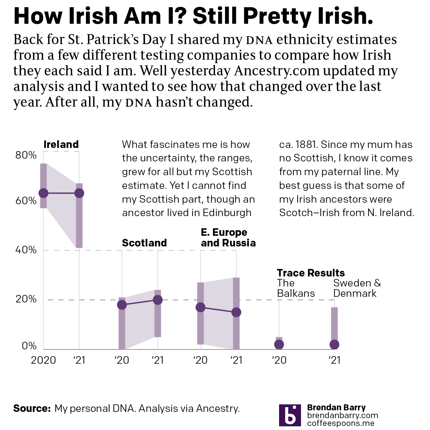
So you get another graphic.

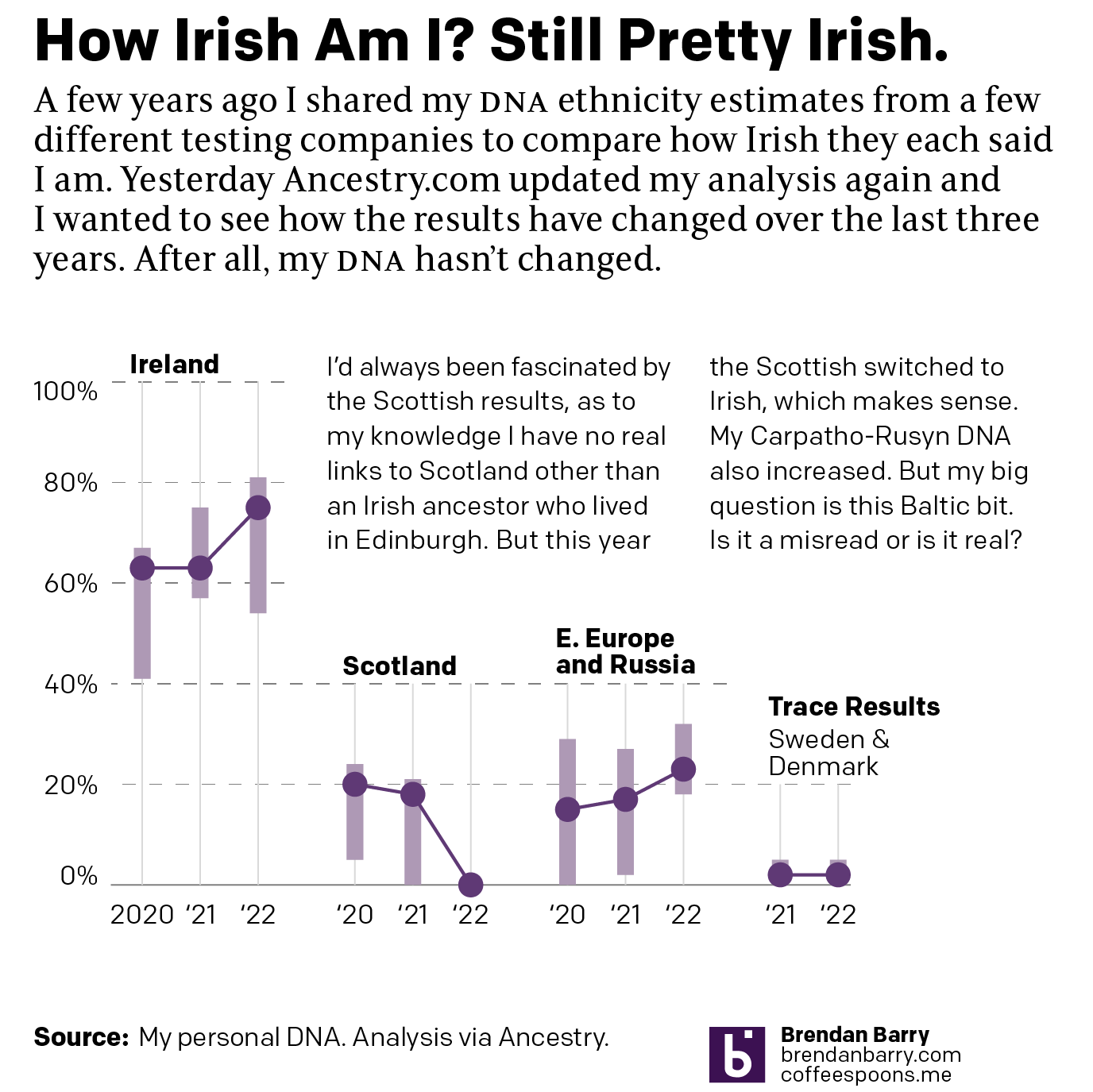
The clearest change is that the Scottish bit has disappeared. How do you go from nearly 20% Scottish to 0%? Because population groups in the British isles have mixed for centuries. When the Scottish colonised northern Ireland, they brought Scottish DNA with them. And as I am fairly certain that I have Irish ancestors from present-day Northern Ireland, it would make sense that my DNA could read as Scottish. But clearly with the latest analysis, Ancestry is able to better point to that bit as Irish instead of Scottish. And this shouldn’t surprise you or me, because those purple bars represent their confidence bands. I might have been 20% Scottish, but I also could have been reasonably 0% Scottish.

Contrast that to the Carpatho-Rusyn, identified here as Eastern European and Russian. That hovers around 20%, which makes sense because my maternal grandfather was 100% Carpatho-Rusyn—his mother was born in the old country, present-day Slovakia. We inherit 50% of our DNA from each of our parents, but because they also inherit 50%, we don’t necessarily inherit exactly 25% from our grandparents and 12.5% from our great-grandparents, &c.

But also note how the confidence band for my Carpatho-Rusyn side has narrowed considerably over the last three years. As Ancestry.com has collected more samples, they’re better able to identify that type of DNA as Carpatho-Rusyn.

Finally we have the trace results. Often these are misreads. A tiny bit of DNA may look like something else. Often these come and go each year with each update. But the Sweden and Denmark bit persisted this year with the exact same values. If I compare my matches, my paternal side almost always has some Swedish and Danish ethnicity, not so for my maternal side. And importantly, those matches have more. Remember, because of that inheritance my matches further up on my tree should have more DNA, and that holds true.

That leads me to believe this likely isn’t a misread, but rather is an indication that I probably have an ancestor who was from what today we call Sweden or Denmark. Could be. Maybe. But at 2%, assuming the DNA all came from one person, it’s probably a 4th to a 6th great-grandparent depending on how much I and my direct ancestors inherited.

Clearly there’s more work to do.

Updated DNA Ethnicity Estimates

Earlier this year I posted a short piece that compared my DNA ethnicity estimates provided by a few different companies to each other. Ethnicity estimates are great cocktail party conversations, but not terribly useful to people doing serious genealogy research. They are highly dependent upon the available data from reference populations.

To put it another way, if nobody in a certain ethnic group has tested with a company, there’s no real way for that company to place your results within that group. In the United States, Native Americans are known for their reluctance to participate and, last I heard, they are under-represented in ethnicity estimates. Fortunately for me, Western European population groups are fairly well tested.

But these reference populations are constantly being updated and new analysis being performed to try and sort people into ever more distinct genetic communities. (Although generally speaking the utility of these tests only goes back a handful of generations.)

Last night, when working on a different post, I received an email saying Ancestry.com had updated their analysis of my DNA. So naturally I wanted to compare this most recent update to last September’s.

Still mostly Irish

Sometimes when you look at data and create data visualisation pieces, the story is that there is very little change. And that’s my story. The actual number for my Irish estimate remained the same: 63%. I saw a slight change to my Scottish and Slavic numbers, but nothing drastic. My trace results changed, switching from 2% from the Balkans to 2% from Sweden and Denmark. But you need to take trace results with a pretty big grain of salt, unless they are of a different continent. Broadly speaking, we can be fairly certain about results at a continental level, but differences between, say, French and Germans are much harder to distinguish.

The Scottish part still fascinates me, because as far back as I’ve gone, I have not found an identifiable Scottish ancestor. A great-great-grandfather lived for several years in Edinburgh, but he was the son of two Ireland-born Irish parents. I also know that this Scottish part of me must come from my paternal lines as my mother has almost no Scottish DNA and she would need to have some if I were to have had inherited it from her.

Now for about half of my paternal Irish ancestors, I know at least the counties from which they came. My initial thought, and still best guess, is that the Scottish is actually Scotch–Irish from what is today Northern Ireland. But I am unaware of any ancestor, except perhaps one, who came from or has origins in Northern Ireland.

The other thing that fascinated me is that despite the additional data and analysis the ranges, or degree of uncertainty in another way of looking at it, increased in most of the ethnicities. You can see the light purple rectangles are actually almost all larger this year compared to last. I can only wonder if this time next year I’ll see any narrowing of those ranges.

Credit for the piece is mine.

Difficult Descendancy Charts

The holiday break is over as your author has burned up all his remaining time for 2020 and so now we’re back to work. And that means attempting to return to a more frequent and regular posting schedule for Coffeespoons.

I wanted to start with the death of Diego Maradona, a legendary Argentinian footballer. He died in December of a heart attack and left behind a complicated inheritance situation. To help explain the situation, the BBC created what in genealogy we call a descendancy chart. You typically use a descendancy chart to show the children, and sometimes grandchildren, of a person. (You can also attach people above the person of interest and show the person’s ancestral families.)

This is an example of a descendancy chart from my research into an unrelated family.

The descendants of Samuel Miller

You can see Samuel Miller married Sabra Clark and had at least nine children with her. And I followed one of them, another Samuel, who married Elizabeth Woodruff and they had four children. In this version, you can also see Samuel the elder’s parents and siblings.

But Diego presents a complicated situation. He was married and had two children, then divorced. That’s not terribly uncommon. But he then went on to have potentially eight children with potentially five different women. (I say potentially because some of the claims are still working their way through the courts via paternity tests.)

The above type of chart works well with one couple. In my own family, I have at least one ancestor who had potentially two husbands (the second marriage has not yet been confirmed, but she definitely had children with two different men). And when we use this chart type to look at my ancestor’s descendants, you can see it becomes tricky.

Mary Remington’s descendants

Her children’s fathers can be placed to either side and then the children flow out from that. But whereas in the first chart we could see all nine children in one glance, Mary Remington had four and we only see two in this same view.

So how do you deal with one person who has six total relationships that have offspring?

The BBC opted for a vertical chart that uses colour to link the couples. Diego and his ex-wife receive a red line, and that link moves vertically down from Diego with the two daughters shown as descendants on the right.

Diego Maradona’s descendants

Each subsequent relationship with offspring receives its own colour and continues to move vertically down the page, linking the mother on the left to the children on the right.

What I find interesting is the inconsistency within the chart, however. At the end, with the unidentified women, we have two instances of multiple children. Santiago Lara and Magali Gil, for example, descend from one stem. But note at the top how Diego’s two daughters Gianinna and Dalma each receive their own stem. Is there a reason for combining the two children from one unidentified mother into one branch?

And why the vertical format? You can see in my two examples, we are looking at a horizontal format. It works well when I am working on my desktop. The format is less useful on a mobile. I wonder if the BBC knows from their analytics that most people access their content like this via mobile phone and created a graphic that best uses that tall but narrow proportion. Because the proportions do not work well when the article is viewed on a desktop.

The vertical descendancy chart here is an intriguing solution to show descendants from multiple partners in a single mobile screen display. I am not sure how useful it would be as a new form, because I am not certain of how many times we would run into issues of children from six partners, but it could be worth exploring.

Credit for the images from my examples goes to the designers at Ancestry.com.

Credit for the BBC graphic goes to the graphics department of the BBC.