Hog Wild

So admittedly this post should have been up last week, but I liked the lunar cycle one too  much. But today is Friday and who cares. We made it to the end of the week.

In the wake of the shootings last week, someone on Twitter posed the question:

Legit question for rural Americans – How do I kill the 30-50 feral hogs that run into my yard within 3-5 mins while my small kids play?

And with that the Internet was off. Memes exploded across the social media verse. Thankfully the Washington Post took it seriously and found data on the expanding footprint of hogs in the United States.
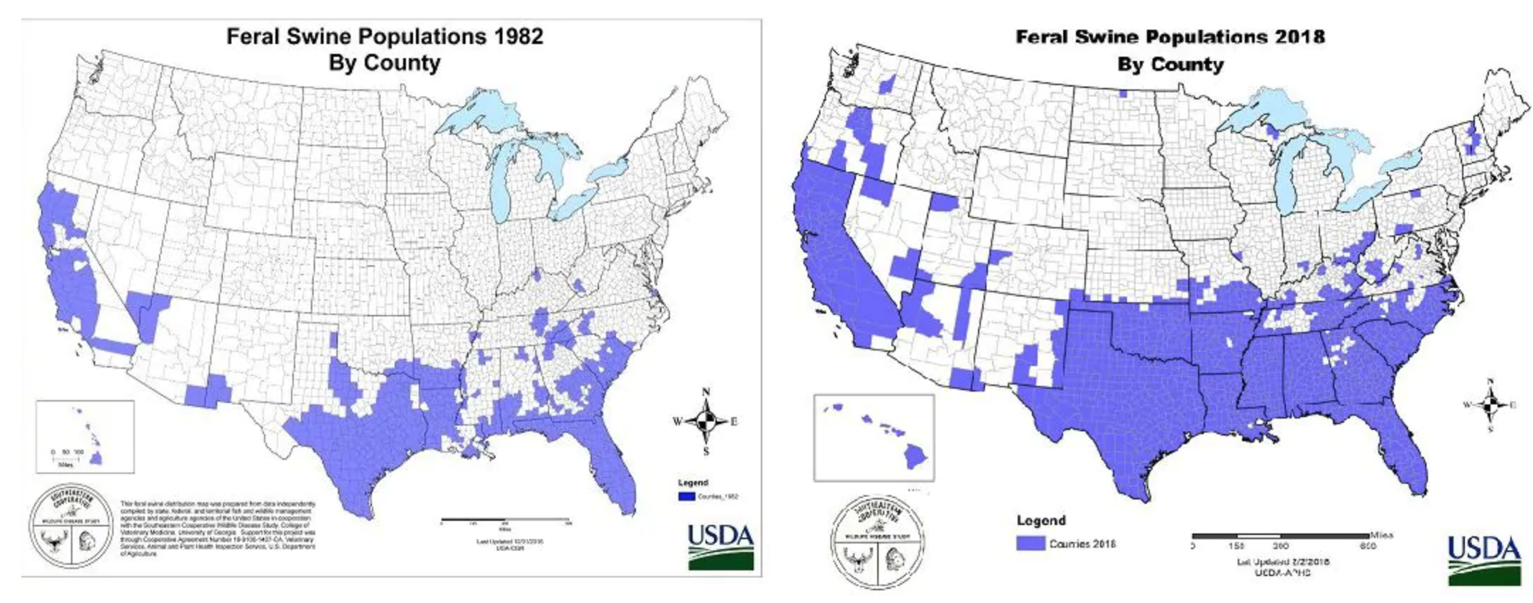
Pig problems
Pig problems

The article also points out, however, that the firearm that prompted the discussion, the now infamous AR-15, would also be a poor choice against feral hogs as its too small a calibre to effectively deal with the animals.

Credit for the piece goes to the US Department of Agriculture.

Man vs. Shark vs. Marlin vs. Every Other Animal

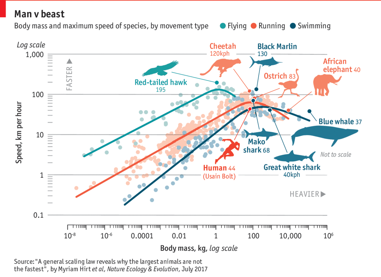
About two weeks ago, Michael Phelps raced a shark. What will they not do for television ratings? The Economist took the basic premise and then had an insightful piece about the speed of animals compared to their size. The whole notion of animals get faster the larger they get. Well, to a point, the Economist found. The graphic is a bit complex, perhaps, in their use of a log scale on both the x and y axes. But they have cute little illustrations of everyone’s favourite animals. So it all balances out in the end.

Man vs. Nature
Man vs. Nature

But there is real science in the piece and it is worth a quick read.

Credit for the piece goes to the Economist graphics department.

Failing to Whack the Mole

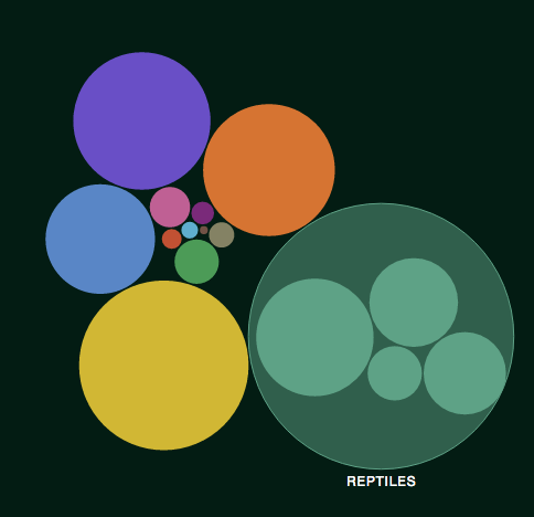
The story and data behind today’s graphic are worth telling. But, the execution leaves me feeling a bit empty. The piece kicks off a new series called Data Points from National Geographic. But, here in this piece we are looking for clear communication of data. So what do we get? Circles. Circles within circles within circles. My problem?

The overview view
The overview view

Well you can see from the first screenshot that we are missing the gap space, i.e. the space between the container circle and the data circle. The gap makes the container look larger than it really is. Granted, area is not a great way of comparing data points, but that aside, something like a tree map would probably be more accurate and still allow for the nesting that occurs, see below.

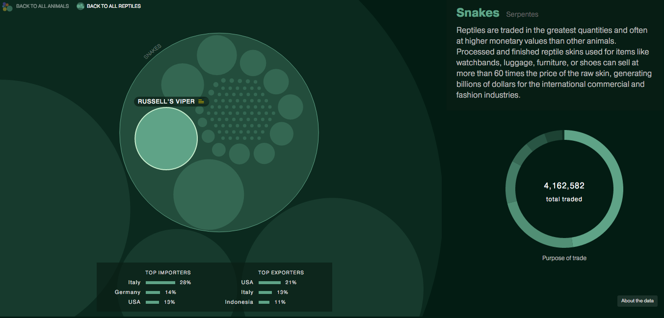
A nested view looking at snakes

The overall display includes nice ancillary data about top importers and exporters along with how the animals in question are used. Some animals even have trade notes that offer more context on how particular animals are used.

On the plus side, the piece’s title is great: Space Monkeys and Tiger Wine. I mean, how can you not read that? While they missed lots of the moles popping out of circles on this one, they did nail the title.

Credit for the piece goes to Katilin Yarnall and Fathom Information Design.

All the Goats

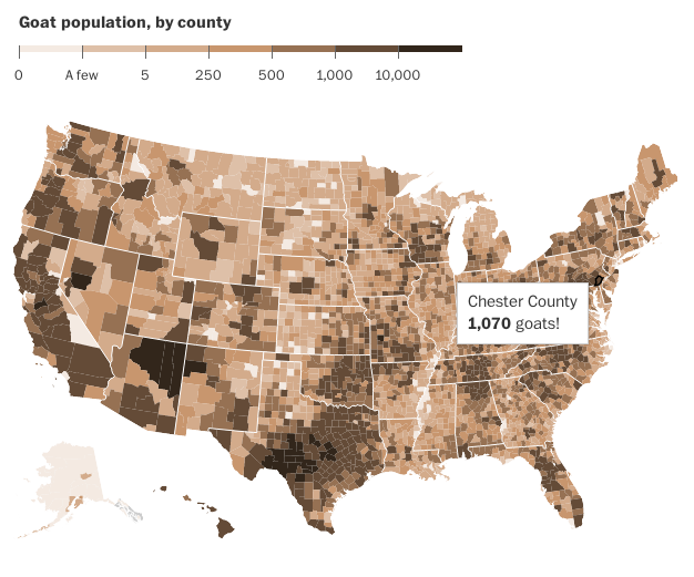
Today is Friday. And that means it is time for the seriousness. So here you go, folks. Goats. All the goats. The US Agricultural Census recorded all the goats as of 2012. And so people can map that out. Thankfully the Washington Post did it for me.

Note the exclamation point

Credit for the piece goes to the Washington Post graphics department.