iPhone Screen Size

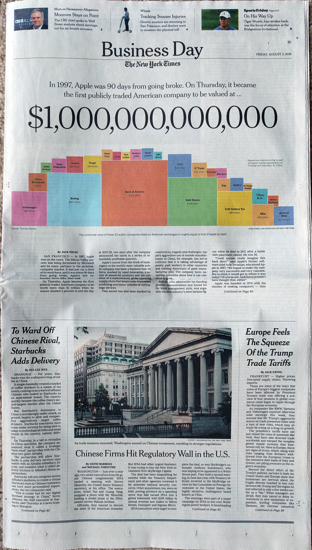
Your humble author has returned. And on my trip up to Boston I took plenty of photos with my Nexus 5X, a Google-designed smartphone. That is correct, this designer does not use an iPhone. But I am aware of the latest things coming out of Apple—after all this is being typed up on a Mac—and so the larger screen size caught my attention.

The Economist put together a piece looking at the screen sizes of the iPhone models over the years and then used that to project into the future the likely sizes of the phone’s display.

Bigger, and bigger, and bigger, and…

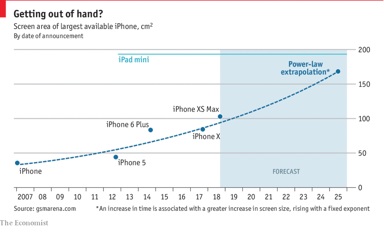
Now the article hints at what I would be particularly interested in: the screen sizes of comparable Android models. How have they changed over the years? I still cling to my smaller screen size mobile as I am not a fan of the phablet.

The chart itself is simple and well done, plotting the models without any fuss. But the most important part is the benchmark line of the iPad mini’s screen size. And the user can clearly see the forecast merger of the sizes.

Credit for the piece goes to the Economist Data Team.

Apple Hits One Trillion

Last Tuesday we looked at a print piece from the New York Times detailing the share price plunge of Facebook after the company revealed how recent scandals and negative news impacted its financials. Well, today we have a piece from last week that shows how large Apple is after it hit a market capitalisation of one trillion US dollars.

The piece itself is not big on the data visualisation, but it functions much like the Facebook piece, as a blend of editorial design and data visualisation. The graphic falls entirely above the fold and combines a factette and maybe we could classify it as a deconstructed tree map. It uses squares where, presumably, the area equates to the company’s value. And the sum total of those squares equals that of one trillion dollars, or the value of Apple.

Looking at the full page

In terms of design it does it well. The factette is large enough to just about stretch across the width of the page and so matches the graphic below it in its array of colours. Why the colours? I believe these are purely aesthetic. After all, it is unclear to me just what Ford, Hasbro, and General Mills all have in common. In a more straight data visualisation piece, we might see colour used to classify companies by industry, by growth in share price or market share. Here, however, colour functions in the editorial space to grab the reader’s attention.

The design also makes use of white space surrounding the text, much like the Facebook piece last week, to quiet the overall space above the fold and focus the reader’s attention on the story. Note that the usual layout of stories on the page continues, but only after the fold.

When we keep in mind the function of the piece, i.e. it is not a straight-up-explore-the-data type of piece, we can appreciate how well it functions. All in all this was a really nice treat last Friday morning.

Credit for the piece goes to Karl Russell and Jon Huang.