
It’s cool. In the darkness of space.
We made it to the end of the week, a big week for space news.
So with that, enjoy this illustration from xkcd about the James Webb Space Telescope.
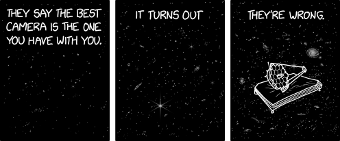
Credit for the piece goes to Randall Munroe.
It’s cool. In the darkness of space.
We made it to the end of the week, a big week for space news.
So with that, enjoy this illustration from xkcd about the James Webb Space Telescope.
Credit for the piece goes to Randall Munroe.
And by out there I mean 1150 light years away. One of the five amazing images out of the first day’s announcement by the James Webb Space Telescope (JWST) team was not a sexy photo of a nebula or a look back 13.5 billion years in time. Instead it was a plot of the amount of infrared light was blocked as exoplanet WASP-96b, a hot Jupiter, transited in front of its sun. A hot Jupiter is a gas giant roughly the size of Jupiter that orbits its sun so closely—often closer than Mercury does our Sun—its year takes mere days. WASP-96b is about half the mass of Jupiter and a year takes a little over three Earth days. Hot indeed.
The JWST means not just to take those images we saw, but to also capture data about the light passing through planetary atmospheres, just like WASP-96b. And showing the world Tuesday just how that works was a brilliant idea. What they shared was this graphic.
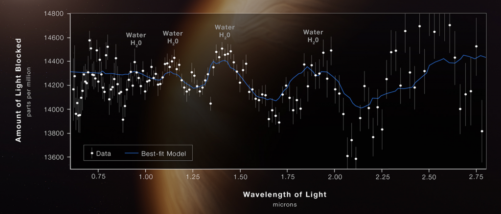
The original post explains the science behind it, but in short we see telltale signs of water vapor in the atmosphere. Remember that the planet is far too hit for liquid water to exist. But because the peaks and troughs were not as pronounced as expected, scientists can conclude that there are clouds and haze in the atmosphere. It did not detect any significant signs of oxygen, carbon dioxide, or methane, all of which would be noticeable if present as we expect in future exoplanets to be studied.
But later that day, the BBC published an article summarising the releases, but included a different version of the above graphic. Though the other four photos were unchanged. The BBC presented us with this.
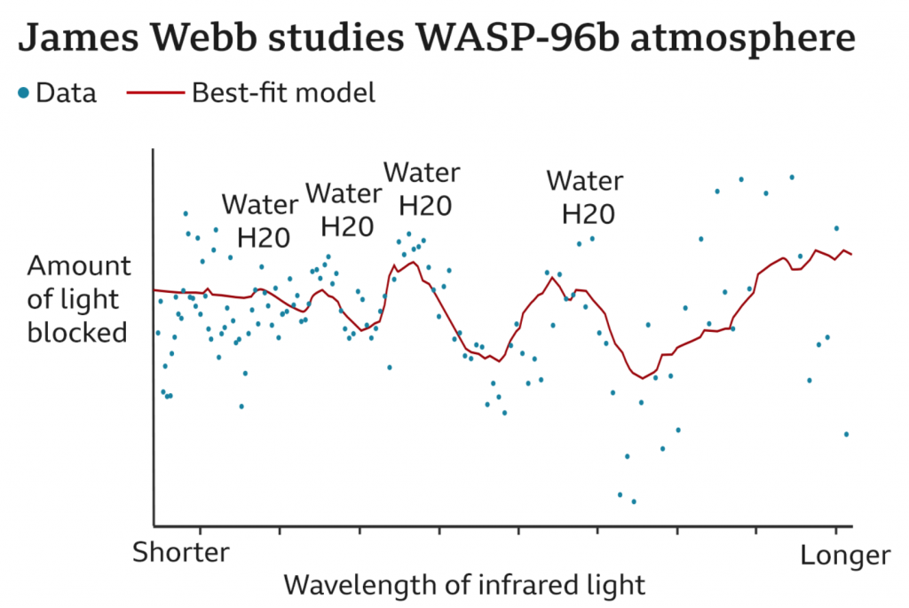
The most notable difference is the background. What was a giant illustration of a planet and then a semi-transparent chart background atop that on which the graphic sat is here replaced by a simple white background. Off the bat this chart is easier to read.
But then here we also lose some data clarity. Note on the original how we have axis markers for the wavelengths of light and the parts per million of light blocked. All are absent here. Instead the BBC opted to only put “Shorter” and “Longer” on the wavelength axis. I would submit that there was no real need to remove those labels, but that they could have been added to with these new ones. The new labels certainly explain the numbers to an audience that may not be as scientifically literate as perhaps the JWST’s audience was or was thought to be. There is certainly a value to simplifying and distilling things to a level at which your audience can understand. But there’s also a value in presenting more complex data, issues, and ideas in an attempt to educate and elevate your audience. In other words, instead of always trying to play to the lowest common denominator, it sometimes is worth it to lose a few in the audience if you ultimately increase the level of said denominator overall.
The other notable difference is that the data is presented without what I assume to be plots of the range of observations with their respective medians. You can see this in the original by how every wavelength has a line and a dot sitting in the middle of that line. In other words, over the 6+ hours the planet was observed, at each wavelength a certain amount of light was blocked. The average middle point over that whole time period is the dot. Then a line of best fit “connects” the dots to show the composition of the light streaming though that steamy atmosphere.
Again, I can understand the desire to remove the ranges and keep the median, but I also think that there is little harm in showing both. Though, the first graphic could like have used an explanation of what was shown, as I’m only assuming what we have and I could be way off. You can show more things and raise the level of the denominator, but you can only do so if you explain what your audience is looking at.
Overall both graphics are nice and capture not just the particular makeup of this one exoplanet’s atmosphere, but more broadly the potential power of the JWST and its impact on astronomy.
Credit for the original goes to the NASA, ESA, CSA, and STScI graphics teams.
Credit for the BBC version goes to the BBC graphics department.
Yesterday I received a question about where the new James Webb Space Telescope is located. Is it in orbit of the Earth, like Hubble? Is it out in deep space?
The answer is no, not really. Now I spent this morning trying to illustrate the answer to that question myself. However, it’s taking me too long. So we’re going to reference this great illustration from Scientific American.
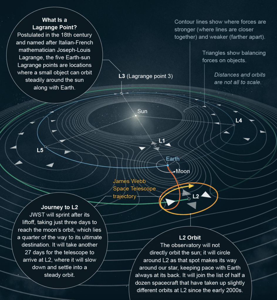
James Webb orbits around a point called the L2 Lagrange point, which sits in a line with Earth and the Sun. The telescope points out and away from the sun whilst the sun shield keeps the sunlight from warming the spacecraft while solar panels collect said light and power the spacecraft.
So if any of my other readers had a similar question, hopefully this goes some ways to answering the question.
Credit for the piece goes to Michael Twombly.
Two years ago I posted about how the Event Horizon Telescope Collaboration managed to take the first photograph of a black hole, in particular a supermassive black hole at the centre of the M87 galaxy, one of those galaxies far, far away that we see at a long time ago.
This morning, the same group of scientists released the first photograph of Sagittarius A*, the supermassive black hole at the centre of our very own Milky Way Galaxy. The BBC article I read this morning included the photo of the black hole, which you should definitely check out because of its importance in the history of astronomy. But, for our purposes here on Coffeespoons, I wanted to look at the diagram the designers at the BBC made to explain the photograph.
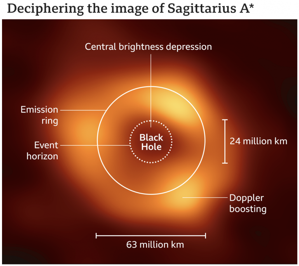
The designer used some simple white lines with a thicker stroke for the axis and defining features and a thinner line to point to elements of the photo. In particular I like the dotted line for the black hole, because there is no real way to photograph the hole itself since it consumes all the light we would need to image it. Instead, we photograph the “black hole” at the centre of the accretion disk, all the super heated gas and matter slowly swirling around and collapsing into the singularity. We also get two axes to show the size of the ring and that of the black hole itself. The ring measures a diameter of about 63 million kilometres. The distance from the Sun to Mercury, the closest planet to our Sun, is 58 million kilometres.
Supermassive indeed.
Well done, science. Well done.
Credit for the piece goes to the graphics team at the BBC.
Another week of amazing, happy, awesome news. So let’s keep it all in perspective with this graphic from xkcd.
We all made it to Friday, so enjoy your weekend, everyone.
Credit for the piece goes to Randall Munroe.
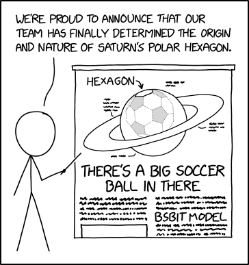
Well, it’s the end of another week. I’ll save the bigger posts I have planned for next week and instead end with this little astronomy/geometry gem from xkcd. It takes a look at Saturn’s polar storm that takes the shape of a hexagon, not a circle or anything else.
Credit for the piece goes to Randall Munroe.
Of course the inside threat are those little bodies of coronavirus causing Covid-19. We cover them a lot here. But there are also threats from little bodies outside, way outside. Like asteroids impacting us. And that was the news yesterday when NASA announced improved data from a mission to the asteroid Bennu allowed it to refine its orbital model.
And we have reason to ever just so very slightly worry. Because there is a very slight chance that Bennu will impact Earth. In 2182. The New York Times article where I read the news included a motion graphic produced by NASA to explain that the determining factor will be a near pass in 2135.
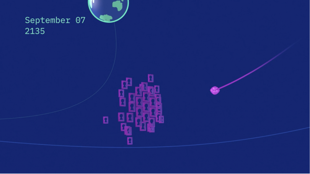
Essentially, the exact course Bennu takes as it passes Earth in 2135 will determine its path in 2182. But just a few slight variations could send it colliding into Earth. Though, to be clear, it’s only a 1-in-1750 chance.
NASA used the metaphor of keyholes to explain the concept. The potential orbits in 2135 function as keyholes and should Bennu pass into the right keyhole, it will setup a collision with Earth in 2182. Hence the use of little keyholes in the motion graphic that accompanied the article.
But who knows, if we’re lucky the United Federation of Planets will still be formed in 2161 and the starship Enterprise will gently nudge Bennu back into a non-threatening orbit.
Credit for the piece goes to NASA.
Yesterday I mentioned more about revolutions, well today we’re talking about Mars, a planet that revolves around the Sun. Late last week scientists working with the InSight lander on the Red Planet published their findings. Turns out we need to rethink what we know about Mars.
First, the planet is probably much older than Earth. Mars’ composition also differs from Earth in some significant ways. InSight mapped the interior of Mars by studying the seismic waves (think like sound waves but through the inside of planets) of marsquakes.
The Wall Street Journal published a great article spelling out the findings in detail that is well worth the read. It also included some nice graphics helping to support the piece. The one I wanted to highlight, however, was a brilliant comparison of Mars to Earth.
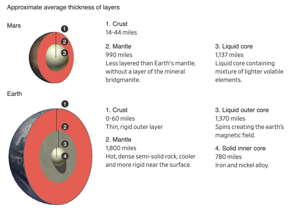
Conceptually this is important, because many diagrams and graphics I’ve seen about these findings only detail the interior of Mars. But what makes Mars important is how it differs from Earth, and let’s be honest, how many of us remember our Earth science classes at school and can diagram out the interior of Earth?
And right here the designer compares the smaller—and now older—brother of Earth. Again, read the article for the details, but in short, some of the key findings are that the core is larger, but also lighter, than we thought. Our planet’s core differs because Earth has two parts: a solid and heavy ball of iron and nickel surrounded by a liquid core that spins. That spinning core creates the magnetic fields that protect our planet from the Sun and have kept our atmosphere intact. Mars doesn’t have that. And that’s in part because, given the core is larger than we thought, the mantle is smaller.
A smaller mantle means that certain materials couldn’t form that insulate the Earth’s core. So while Earth’s core has been prevented from cooling and slowing down, Mars was not. And so while it did have a magnetic field at one point, that slowing, cooling core slowly dissipated the magnetic field. That may be why the planet, once rich in water, now is a barren rock exposed to the Sun.
Again, this is a big deal in terms of planetary science. Consider that Earth and Mars are broadly made of the same materials that orbited the Sun billions of years ago. But Mars took those same ingredients and made itself into a very different planet. And now we know quite a good deal more about the Red Planet.
One last point to make about the graphic above. Again, many illustrations will increase the size of the crust to make it more visible. Here the designer chose to keep it more in proportion to the scale of the planets’ interiors. (Even though Mars’ crust is quite a bit thicker than Earth’s.) I think that’s important because it puts us into perspective. We can build monuments like the Pyramids that last thousands of years and dig bore holes miles deep and tunnel out connections through mountain ranges, but that also just scratches the surface of the crust. But that crust is the thinnest of shells over the mantle and cores of these planets.
That life began and took hold on Earth, on that thinnest of shells protected by a magnetic field because of a spinning molten core buried at the centre of the planet…something to think about sometimes.
Credit for the piece goes to Merrill Sherman.
Nein?
Last week we ended the week with a Friday post looking at Covid-19 cases. And they are not trending in the right direction, to put it mildly. Now I’m not sure I like the Covid post being on Friday, but it also doesn’t make sense on Mondays any longer given the lack of data updates from Virginia and Illinois at the weekend.
I figured this week we could at least begin with a lighthearted post to balance out last week’s ending. And we have a great piece from Indexed that tackles two of my favourite subjects, astronomy and history. She titled the piece brilliantly, “Regarding both astrophysics and and the popularity of guillotines”.
And hopefully later this week I will address one of those two topics a little more in depth. But for now, begin your week with mirth because I will update you all with the new Covid data later this week. Spoiler: it’s not getting any better.
Credit for the piece goes to Jessica Hagy.
Damn you Neil deGrasse Tyson (but not really though)!
Because, you know, he advocated for de-planet-fying Pluto back in the oughts.
Which I mention because of this post from xkcd, which corrects common images of planets in the solar system accounting for their population.
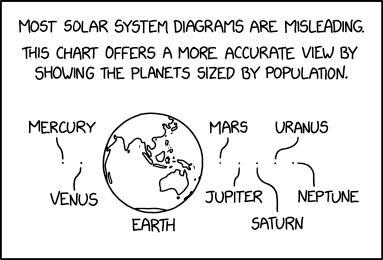
Credit for the piece goes to Randall Munroe.