We’re starting this week with an article from the Philadelphia Inquirer. It looks at the increasing number of guns confiscated by the Transportation Security Administration (TSA) at Philadelphia International Airport. Now while this is a problem we could discuss, one of the graphics therein has a problem that we’ll discuss here.
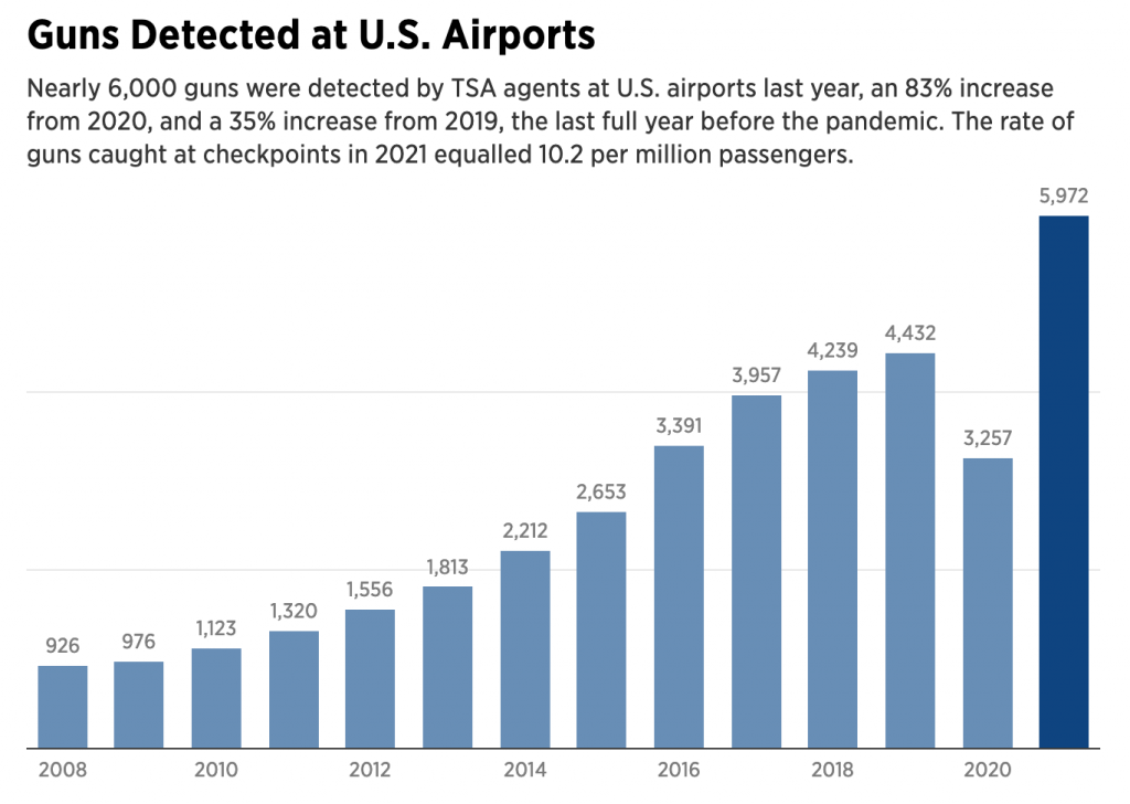
We have a pretty standard bar chart here, with the number of guns “detected” at all US airports from 2008 through 2021. The previous year is highlighted with a darker shade of blue. But what’s missing?
We have two light grey lines running across the graphic. But what do they represent? We do have the individual data points labelled above each bar, and that gives us a clue that the grey lines are axis lines, specifically representing 2,000 and 4,000 guns, because they run between the bars straddling those two lines.
However, we also have the data labels themselves. I wonder, however, are they even necessary? If we look at the amount of space taken up by the labels, we can imagine that three labels, 2k, 4k, and 6k, would use significantly less visual real estate than the individual labels. The data contained in the labels could be relegated to a mouseover state, revealed only when the user interacts directly with the graphic. Here it serves as a “sparkle”, distracting from the visual relationships of the bars.
If the actual data values to the single digit are important, a table would be a better format for displaying the information. A chart should show the visual relationship. Now, perhaps the Inquirer decided to display data labels and no axis for all charts. I may disagree with that, but it’s a house data visualisation stylistic choice.
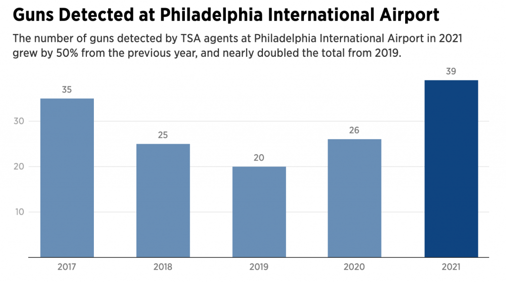
But then we have the above screenshot. In this bar chart, we have something similar. Bars represent the number of guns detected specifically at Philadelphia International Airport, although the time framer is narrower being only 2017–2021. We do have grey lines in the background, but now on the left of the chart, we have numbers. Here we do have axis labels displaying 10, 20, and 30. Interestingly, the maximum value in the data set is 39 guns detected last year, but the chart does not include an axis line at 40 guns, which would make sense given the increments used.
At the end of the day, this is just a frustrating series of graphics. Whilst I do not understand the use of the data labels, the inconsistency with the data labels within one article is maddening.
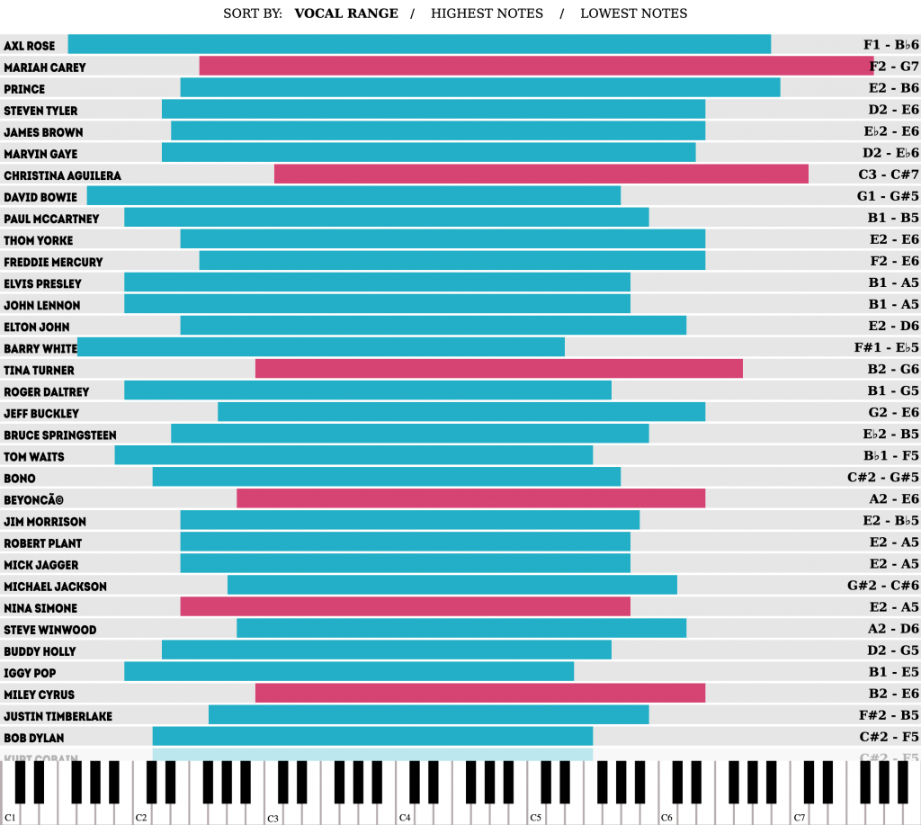
This is an older piece that I stumbled across doing some other work. I felt like it needed sharing. The interactive graphic shows the high and low note vocal ranges of major musical artists.
Good to see some of my favourite artists in the mix.
Interactive controls allow the user to sort the bars by the greatest vocal range, high notes, or low notes. Colour coding distinguishes male from female vocalists.
In particular I enjoy the bottom of the piece that uses the keyboard to show the range of notes. When the user mouses over a particular singer, the ends of the range display the particular song in which the singer hit the note.
Again, this is an older piece that I just discovered, but I did enjoy it. I would be curious to see how these things could change over time. As an artist ages, how does that change his or her vocal range? Are there differences between albums? This could be a fascinating point at which branching out for further research could be done.
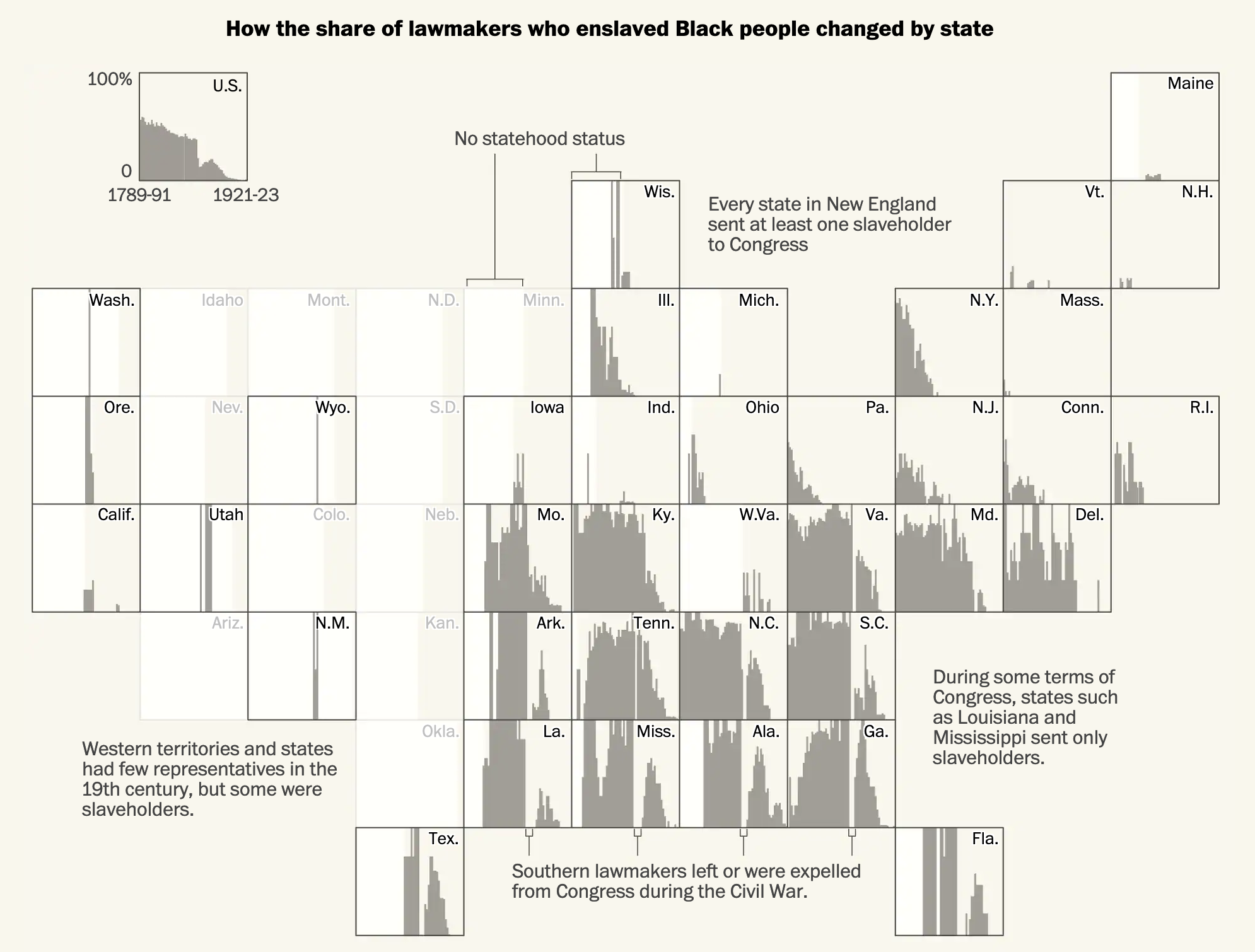
Taking a break from going through the old articles and things I’ve saved, let’s turn to a an article from the Washington Post published earlier this week. As the title indicates, the Post’s article explores slaveholders in Congress. Many of us know that the vast majority of antebellum presidents at one point or another owned slaves. (Washington and Jefferson being the two most commonly cited in recent years.) But what about the other branches of government?
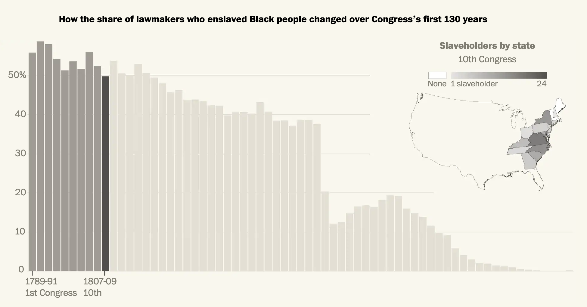
The article is a fascinating read about the prevalence of slaveholders in the legislative branch. For our purposes it uses a series of bar charts and maps to illustrate its point. Now, the piece isn’t truly interactive as it’s more of the scrolling narrative, but at several points in American history the article pauses to show the number of slaveholders in office during a particular Congress. The screenshot below is from the 1807 Congress.
That year is an interesting choice, not mentioned explicitly in the article, because the United States Constitution prohibited Congress from passing limits on the slave trade prior to 1808. But in 1807 Congress passed a law that banned the slave trade from 1 January 1808, the first day legally permitted by the Constitution.
Almost half of Congress in the early years had, at one point or another, owned slaves.
Graphic-wise, we have a set of bar charts representing the percentage and then a choropleth map showing each state’s number of slaveholders in Congress. As we will see in a moment, the map here is a bit too small to work. Can you really see Delaware, Rhode Island, and (to a lesser extent) New Jersey? Additionally, because of the continuous gradient it can be difficult to distinguish just how many slaveholders were present in each state. I wonder if a series of bins would have been more effective.
The decision to use actual numbers intrigues me as well. Ohio, for example, has few slaveholders in Congress based upon the map. But as a newly organised state, Ohio had only two senators and one congressman. That’s a small actual, but 33% of its congressional delegation.
Overall though, the general pervasiveness of slaveholders warrants the use of a map to show geographic distribution was not limited to just the south.
Later on we have what I think is the best graphic of the article, a box map showing each state’s slaveholders over time.
How the trends changed over time over geography.
Within each state we can see the general trend, including the legacy of the Civil War and Reconstruction. The use of a light background allows white to represent pre-statehood periods for each state. And of course some states, notably Alaska and Hawaii, joined the United States well after this period.
But I also want to address one potential issue with the methodology of the article. One that it does briefly address, albeit tangentially. This data set looks at all people who at one point or another in their life held slaves. First, contextually, in the early years of the republic slavery was not uncommon throughout the world. Though by the aforementioned year of 1807 the institution appeared on its way out in the West. Sadly the cotton gin revolutionised the South’s cotton industry and reinvigorated the economic impetus for slavery. There after slavery boomed. The banning of the slave trade shortly thereafter introduced scarcity into the slave market and then the South’s “peculiar institution” truly took root. That cotton boom may well explain how the initial decline in the prevalence of slaveholders in the first few Congresses reversed itself and then held steady through the early decades of the 19th century.
And that initial decline before a hardening of support for slavery is what I want to address. The data here looks only at people who at one point in their life held slaves. It’s not an accurate representation of current slaveholders in Congress at the time they served. It’s a subtle but important distinction. The most obvious result of this is how after the 1860s the graphics show members of Congress as slaveholders when this was not the case. They had in the past held slaves.
That is not to say that some of those members were reluctant and, in all likelihood, would have preferred to have kept their slaves. And therefore those numbers are important to understand. But it undermines the count of people who eventually came to realise the error of their ways. The article addresses this briefly, recounting several anecdotes of people who later in life became abolitionists. I wonder though whether these people should count in this graphic as—so far as we can tell—their personal views changed so substantially to be hardened against slavery.
I would be very curious to see these charts remade with a data set that accounts for contemporary ownership of slaves represented in Congress.
Regardless of the methodology issue, this is still a fascinating and important read.
Credit for the piece goes to Adrian Blanco, Leo Dominguez, and Julie Zuazmer Weil.
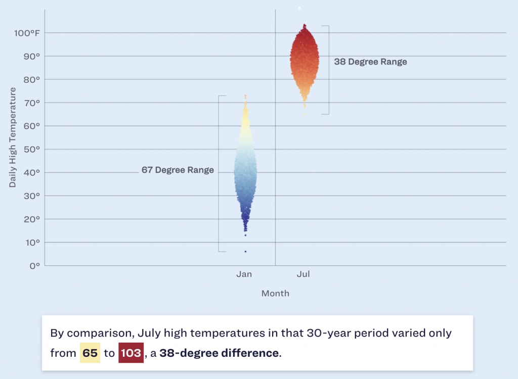
Winter is coming? Winter is here. At least meteorologically speaking, because winter in that definition lasts from December through February. But winters in Philadelphia can be a bit scattershot in terms of their weather. Yesterday the temperature hit 19ºC before a cold front passed through and knocked the overnight low down to 2ºC. A warm autumn or spring day to just above freezing in the span of a few hours.
But when we look more broadly, we can see that winters range just that much as well. And look the Philadelphia Inquirerdid. Their article this morning looked at historical temperatures and snowfall and whilst I won’t share all the graphics, it used a number of dot plots to highlight the temperature ranges both in winter and yearly.
Yep, I still prefer winter to summer.
The screenshot above focuses attention on the range in January and July and you can see how the range between the minimum and maximum is greater in the winter than in the summer. Philadelphia may have days with summer temperatures in the winter, but we don’t have winter temperatures in summer. And I say that’s unfair. But c’est la vie.
Design wise there are a couple of things going on here that we should mention. The most obvious is the blue background. I don’t love it. Presently the blue dots that represent colder temperatures begin to recede into and blend into the background, especially around that 50ºF mark. If the background were white or even a light grey, we would be able to clearly see the full range of the temperatures without the optical illusion of a separation that occurs in those January temperature observations.
Less visible here is the snowfall. If you look just above the red dots representing the range of July temperatures, you can see a little white dot near the top of the screenshot. The article has a snowfall effect with little white dots “falling” down the page. I understand how the snowfall fits with the story about winter in Philadelphia. Whilst the snowfall is light enough to not be too distracting, I personally feel it’s a bit too cute for a piece that is data-driven.
The snowfall is also an odd choice because, as the article points out, Philadelphia winters do feature snowfall, but that on days when precipitation falls, snow accounts for less than 1/3 of those days with rain and wintry mixes accounting for the vast majority.
Overall, I really like the piece as it dives into the meteorological data and tries to accurately paint a portrait of winters in Philadelphia.
And of course the article points out that the trend is pointing to even warmer winters due to climate change.
Credit for the piece goes to Aseem Shukla and Sam Morris.
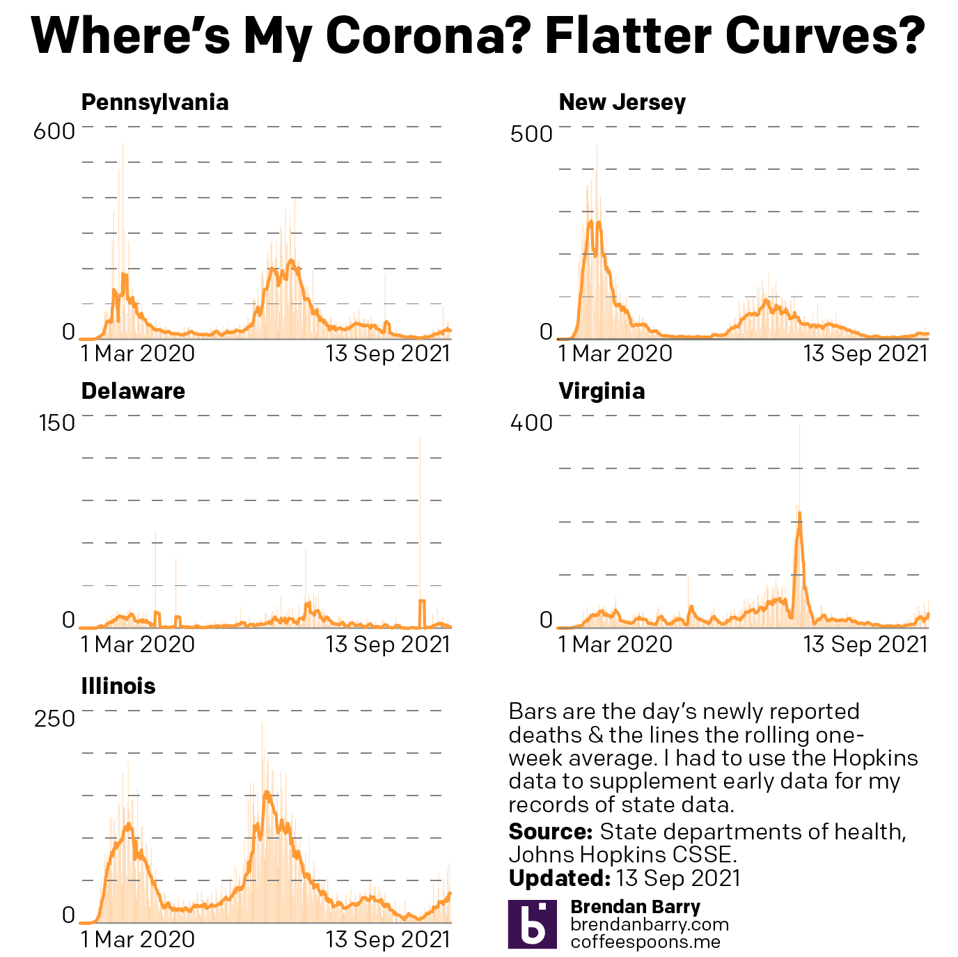
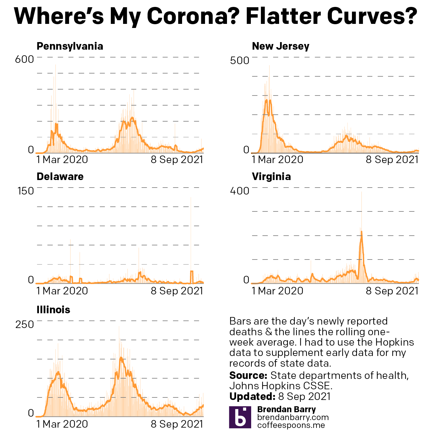
Last week when I wrote my update on Covid-19, we had seen a few signs for optimism, but in other states the news was hard to interpret or, in the case of Pennsylvania, not going the right way at all. So where are we this week? In some ways, not a lot has changed over the last seven days.
New case curves for PA, NJ, DE, VA, & IL.
Last week, we had positive developments in both New Jersey and Illinois. There cases had begun to noticeably and consistently fall with clear peaks in this fourth wave of infections. Their seven-day averages were decidedly below their recent peaks. That trend continued last week. In fact, in Illinois the seven-day average is now also below the peak from not just this fourth wave, but also the third wave. That’s good.
New Jersey’s fourth wave was nowhere near as impactful as its first three. It helps to have one of the highest vaccination rates in the United States. But the Garden State’s seven-day average is also falling, though not as quickly as in Illinois. You could even make the argument that over the last week cases have really remained flat, though the last few days I would contend are evidence of a slow slowdown.
Delaware had been a tricky state to judge given some recent volatility in its average. But as we can see over the last week the new case curve clearly has flattened. The flat line, however, remains just that, a flat line. This is more of a plateau shape than a descending hill shape. That means that cases are continuing to spread, but at a steady rate of about 450 new cases per day. This isn’t uncommon, but hopefully it precedes a fall in new cases rather than serving as a respite on an ever upward climb.
In Virginia I had mentioned some early indications of a potential flattening, the first step towards a decline in the average. That flattening appears to be taking hold. In the chart above you can clearly see a sharp decline beginning to take root in Old Dominion. The curve here most closely resembles Illinois in what, at least for now, is a fairly symmetrical increase and decrease.
Finally we have Pennsylvania. I was pretty short in my analysis last week, the state was headed in the wrong direction. The latest data shows that the Commonwealth may just be beginning to turn the corner and flatten the curve. However, after the pre-Labour Day slowdown that then erupted into a full-blown outbreak, I’m wary of saying anything definitive about Pennsylvania. All we can do is hope that these early trends hold true.
So what about deaths? Are we seeing any progress on that front? Last week I noted that it was almost all bad news. In all but Illinois we had death rates continuing to climb.
Death curves for PA, NJ, DE, VA, & IL.
That story, sadly, remains largely the same. Illinois, unfortunately has actually seen its seven-day average resume ticking upwards, although not by a significant degree. It’s enough that I think it fair to say deaths have largely plateaued and not necessarily begun to climb. And as I keep saying, that would track for a state where we have seen new cases falling for the last few weeks now.
Unfortunately, that’s about it. Deaths in New Jersey have remained fairly stable, though the average has moved from 19.3 to 17.4 as of yesterday. Perhaps that could be an indication of a falling death rate. But just a few days ago it was still nearer 19 than 18. I would want to see more data showing a consistent and persistent decline before saying New Jersey is headed the right way.
And in Pennsylvania, Delaware, and Virginia, deaths are headed the wrong way, plain and simple. At the beginning of the sample set, Delaware reported 14 deaths in one day, the most in a month. Consequently the average has jumped from 2.6 last week to 3.4 today. In Virginia we had seen deaths jump from 20 to 34. Well this week they jumped again, though by half the amount, to 41 deaths per day. Pennsylvania performed the worst, however. Deaths here climbed from 43 to 57 per day.
While we have seen new cases plateau in Delaware and begin to fall in Virginia, which should mean declining death rates in a few weeks, in Pennsylvania the numbers of new cases may only be beginning to flatten. Consequently, unless we begin to see a sharp decline in new cases, we will likely continue to see rising deaths in the Commonwealth. At least for a little while longer.
It’s been a little over a week now since my last update on Covid-19 in Pennsylvania, New Jersey, Delaware, Virginia, and Illinois. So where do we stand now, especially since last week we had seen a split with some good news and some not so good news?
Well let’s start with where we had good news last week: Illinois and New Jersey. In those two states we had the clearest evidence of the fourth wave peaking and beginning a slow descent.
New case curves for PA, NJ, DE, VA, & IL.
This week we can see that in Illinois the peak really does appear to have been reached as the seven-day average for new cases has been heading down slowly over the last week or so. In New Jersey we saw a sort of false peak, because new cases began to rise again not long after I posted. And with it the seven-day average did as well. However, in the last few days, the seven-day average has flattened ever so slightly, though it is still increasing.
Delaware is a bit harder to judge. When I last posted the seven-day average sat at 457 new cases per day. Yesterday? 454 new cases per day. If you look at the chart, you can see there was a brief spike that I had noted as a potential indicator of a peak for Delaware. After that brief decline however, you can see how the curve shot back up again, exceeding the earlier peak with an average of 470 new cases per day before cooling off slightly. New cases have been increasing for the last four days, but they are still below that 470 new cases number.
Virginia’s fourth wave long looked the worst. You can see some aberrant declines and spikes due to the extra day holiday in reporting—recall Virginia does not publish its weekend data. Since then however, there are some initial indications that Old Dominion may have peaked. Consider that when I last posted, the seven-day average sat at 4700 new cases per day. But over the last nine days, the average dropped to the 3600s for six days, then the 3500s for two days, and yesterday the average fell into the 3400s. That is the kind of flattening we want to see if there is a real peak.
Finally we have Pennsylvania. Right before Labour Day we had evidence of a slowing outbreak. But then after the holiday, new cases began to climb sharply. There was then a quick slowdown, but ever since we’ve continued to see rising numbers of new cases in the Commonwealth. At the time of my last post we had an average of 4100 new cases per day. Yesterday that was at 4700.
Pennsylvania looks like the only state we cover here that is clearly moving in the wrong direction.
But what about deaths?
Death curves for PA, NJ, DE, VA, & IL.
Well, here it’s almost all bad news. Before we can reasonably expect deaths to begin to slowdown, we need to see the spread of new cases slowdown. Remember that deaths are a lagging indicator as it can take weeks from infection to hospitalisation to death. And if most of our states have not yet clearly peaked, we shouldn’t really expect deaths to have peaked yet.
Here the only good news is Illinois where deaths peaked at 41 per day, but have since fallen to 31. Compare that to the shape of the curve in the new cases chart. We can clearly see the peak in new cases being followed by sometime by the peak in deaths.
In all the other states, however, we continue to see climbing numbers of deaths. In Pennsylvania over the last nine days we’ve seen the average climb from 24 deaths per day to 43. New Jersey increased a bit more slowly, from 13 to 19. And Delaware, again due to its small size, climbed, but only from 1.1 to 2.6. And in Virginia, we’ve seen the average number of deaths climb from 20 to 34.
If we are nearing peaks in New Jersey and Virginia, we should begin to see deaths cool down in the near future. The same holds true for Delaware, but there we have less evidence of a peaking outbreak.
Last week I wrote about how CBS News’ coverage of the California recall election featured a misleading graphic. In particular, the graphic created the appearance that the results were closer than they really were.
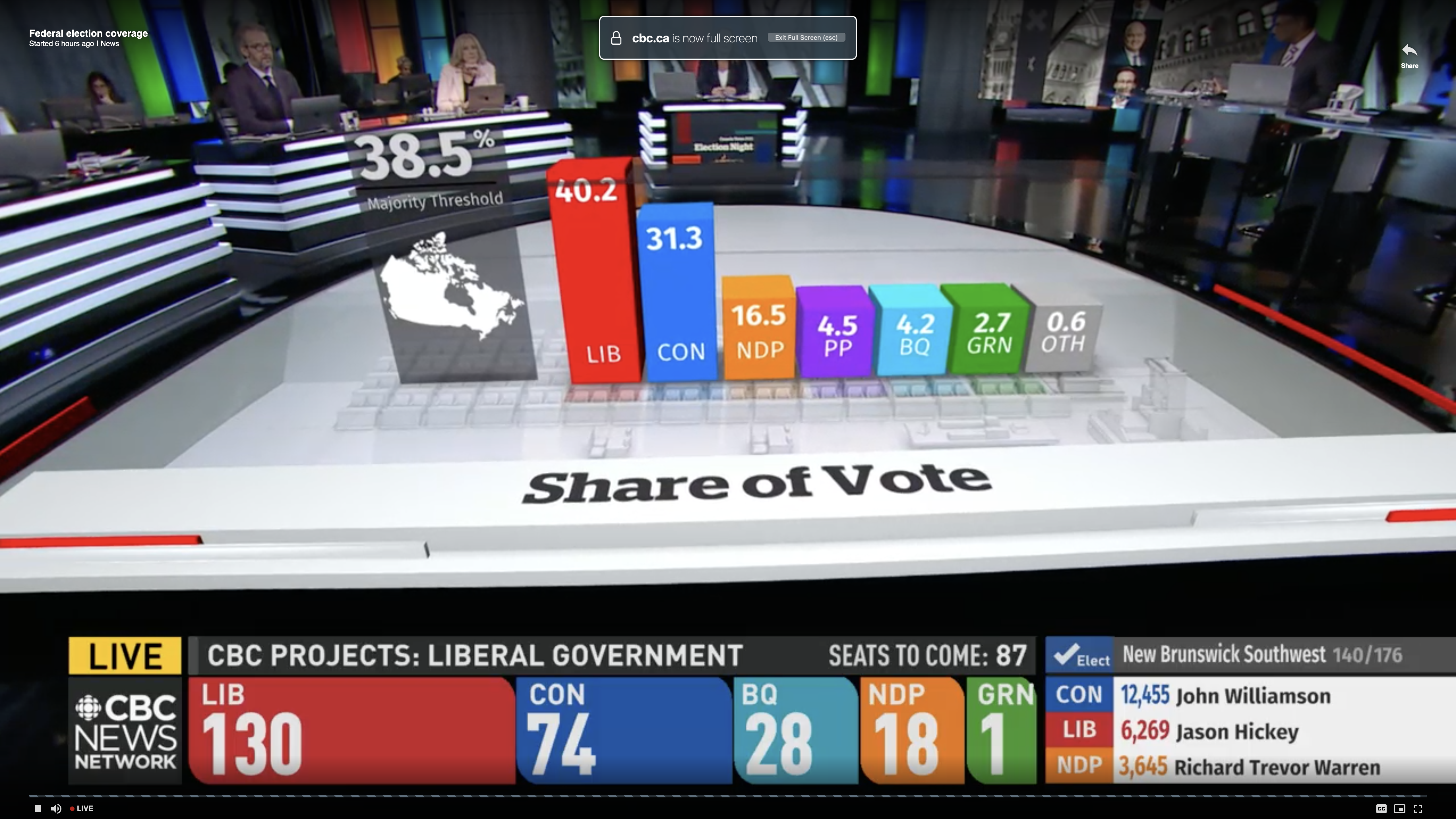
This week we had another election and, sadly, I find that I have to write the same sort of piece again. Except this time we are headed north of the border to Canada.
I was watching CBC coverage last night and I noticed early on that the vote share bar chart looked off given the data points. Next time it popped up I took a screenshot.
Look at the bars
First we need to note these are three-dimensional and the camera angle kept swinging around—not ideal for a fair comparison. This was the most straight-on angle I captured.
Second, at first glance, we have the Conservative share at a little more than 3/4 the Liberal vote share. That looks to be about right. Then you have the New Democratic Party (NDP) at roughly half the vote of the Conservatives. And the bar looks about half the height of the blue Conservative bar. Checks out. Then you have the People’s Party of Canada at roughly 1/4 the amount of NDP votes. But now look at the bar’s height. The purple bar is nearly the same height as the orange bar.
Clearly that is wrong and misleading.
The problem, I think, is that the designers artificially inflated the height of the bars to include the labels and data points for the bars. The designers should have dropped the labelling below the bars and let the bars only represent the data.
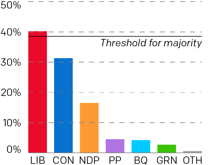
I created the following graphic to show how the chart should have looked.
And my take…
Here you can more clearly see how much greater the NDP victory was over the People’s Party. The labelling falls below the charts and doesn’t distort the height comparison between the bars. In some respects, it wasn’t even close. But the original graphic made it look else wise.
I just wish I knew what the designers were thinking. Why did they inflate the bars? Like with the CBS News graphic, I hope it wasn’t intentional. Rather, I hope it was some kind of mistake or even ignorance.
Credit for the original piece goes to the CBC graphics department.
One of the long-running critiques of Fox News Channel’s on air graphics is that they often distort the truth. They choose questionable if not flat-out misleading baselines, scales, and adjust other elements to create differences where they don’t exist or smooth out problematic issues.
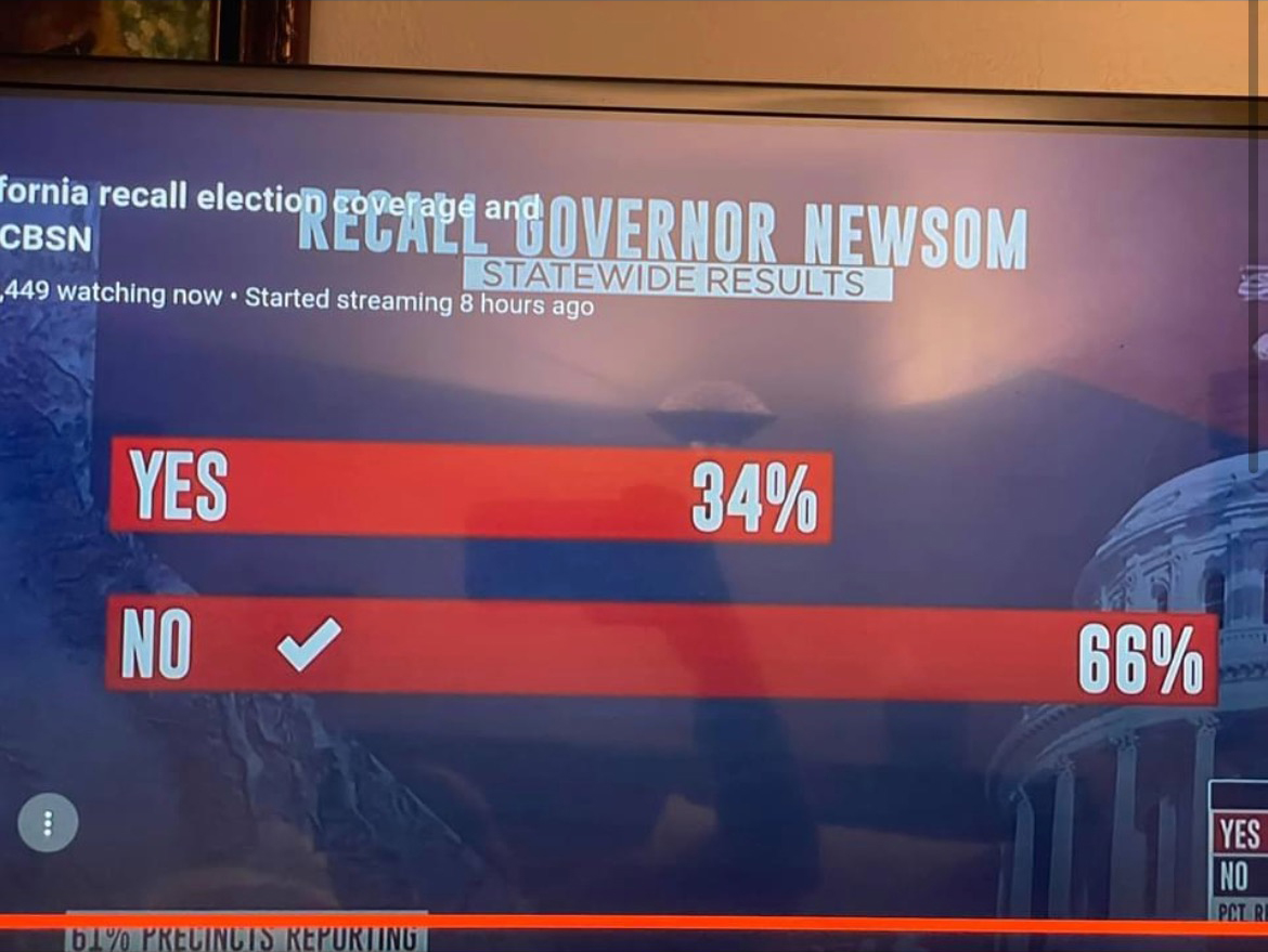
But yesterday a friend sent me a graphic that shows Fox News isn’t alone. This graphic came from CBS News and looked at the California recall election vote totals.
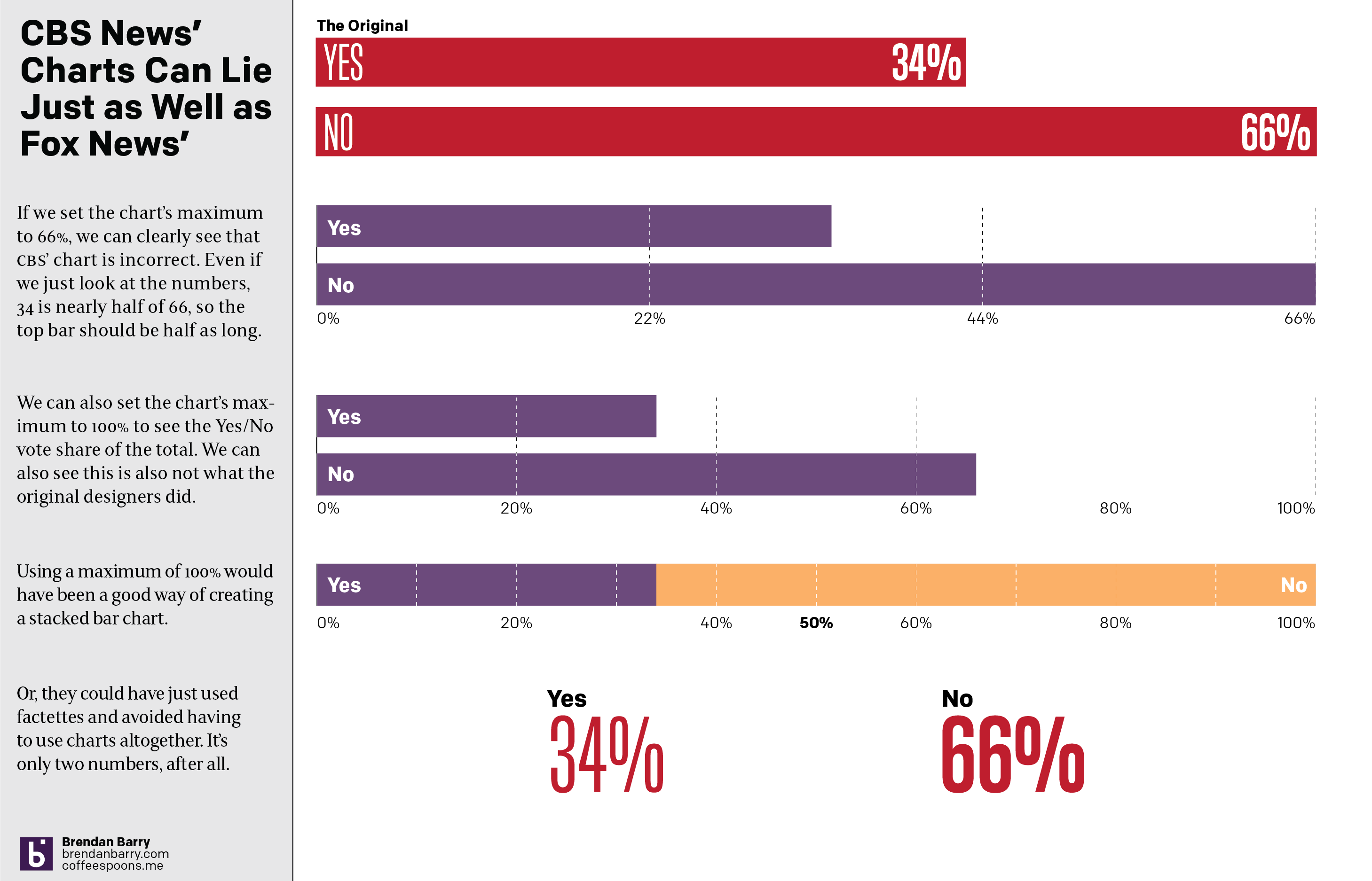
If you just look at the numbers, 66% and 34%, well we can see that 34 is almost half of 66. So why does the top bar look more like 2/3 of the length of the bottom? I don’t actually know the animus of the designer who created the graphic, but I hope it’s more ignorance or sloppiness than malice. I wonder if the designer simply said, 66%, well that means the top bar should be, like, two-thirds the length of the bottom.
The effect, however, makes the election seem far closer than it really was. For every yes vote, there were almost two no votes. And the above graphic does not capture that fact. And so my friend asked if I could make a graphic with the correct scale. And so I did.
One really doesn’t need a chart to compare the two numbers. And I touch on that with the last point, using two factettes to simply state the results. But let’s assume we need to make it sexy, sizzle, or flashy. Because I think every designer has heard that request.
A simple scale of 0 to 66 could work and we can see how that would differ from the original graphic. Or, if we use a scale of 0 to 100, we can see how the two bars relate to each other and to the scale of the total vote. That approach would also have allowed for a stacked bar chart as I made in the third option. The advantage there is that you can easily see the victor by who crosses the 50% line at the centre of the graphic.
Basically doing anything but what we saw in the original.
Credit for the original goes to the CBS News graphics department.
It’s been a little less than a week since our last Covid-19 update for Pennsylvania, New Jersey, Delaware, Virginia, and Illinois. At the time we had just come back from the Labour Day holiday here in the United States and that left us with two big questions. First, what would the data show after we began to process the tests after the extra time off? Second, would the holiday itself cause any increase in the numbers of new cases?
We also need to remember that last week we had seen some positive signs in some states. And we can start with those states today.
New case curves for PA, NJ, DE, VA, & IL
In New Jersey and Illinois we had the clearest evidence of this fourth wave peaking and new cases, whilst still climbing, slowing down with the seven-day average beginning to fall. The good news continues to be that both states continue to show signs their fourth waves have peaked. In fact, Illinois appears to be beginning a downward trajectory. New Jersey has flattened the curve, in other words exhibiting steady numbers of new cases each day.
Delaware appeared to have peaked, but after a brief dip following the holiday, the numbers have begun to shoot back up again. The seven-day average as of yesterday hit 457 new cases per day, exceeding that spike just prior to Labour Day. In other words, it appears that the fear of the holiday increasing rates of new cases, just as they appeared to be peaking came true in Delaware.
What about Virginia and Pennsylvania? Well in the former we had some indications prior to Labour Day that Virginia may have been approaching a peak of new cases. And now you can throw that out the window. Over the three-day holiday weekend, Virginia added just under 11,000 new cases. This past weekend, only two days, Old Dominion added just over 9,200. Not surprisingly the seven-day average spiked upward yesterday to 4,700 new cases per day. If the fourth wave continues at that pace, it will soon surpass the rates we saw last winter.
And in Pennsylvania the data is also not great. We had seen perhaps the beginning of a decline after a peak prior to Labour Day. In the week since? Well, the numbers of new cases have started climbing once again. In fact, yesterday the seven-day average climbed to just under 4,100 new cases per day. That is still below the spring peak and well below winter, but surpasses the numbers we saw just before Labour Day.
In other words, the fear of Labour Day creating new cases appears to have come true.
So then what about deaths? We know that deaths from any increase in cases won’t manifest in the data for a few weeks.
Death curves for PA, NJ, DE, VA, & IL.
Starting with good news, let’s look at Pennsylvania. Two days after Labour Day the Commonwealth’s seven-day average for deaths reached 30.1 deaths per day. In the almost week since that rate has steadily dropped to 24.3 per day. Ideally we would want to see that trend extend beyond five days. Because if the Labour Day surge persists, it wouldn’t be beyond belief to imagine deaths rising again in coming days.
But that’s also about it for good news. True, Delaware went from 0.9 deaths per day to just 1.0. But that’s more of a stable rate than anything. All the other states have seen their death rates continue to climb of late. Although, we would also expect deaths to peak sometime after the peak in new cases, so this trend makes sense.
In New Jersey deaths climbed from 12.4 to 13.1 per day. Not terrible, but again still an increase in deaths. The worst increases were in Illinois and Virginia. In Illinois deaths have continued to climb, rising from 30.7 last time we wrote to 34.7. But Virginia has seen the worst, despite an apparent dip around Labour Day. Instead people are dying at increasing rates, climbing from 16.7 deaths per day to 27.1 as of yesterday.
Unfortunately, until we see new cases truly peak in Virginia those numbers are likely to continue climbing in coming days and possibly weeks.
Last time we looked at the state of the Covid-19 pandemic in Pennsylvania, New Jersey, Delaware, Virginia, and Illinois we had some encouraging signs. In particular we had evidence of a potential slowdown in New Jersey, Delaware, and Illinois and I wrote that I would not be surprised if we saw a peak in new cases. Virginia was the only state where things were bad and getting worse, though the rate at which they were getting bad had begun to slow. Finally, Pennsylvania had some conflicting data with its new cases and I wanted to see another week’s worth of evidence.
So a week or later, where are we?
First, the obvious caveat that the Labour Day holiday may affect these numbers in both the short term collection of data and the medium term potential for a surge of new cases from gatherings and parties.
New case curves for PA, NJ, DE, VA, & IL.
If we look to last week’s good news states of New Jersey, Delaware, and Illinois, we do indeed see what we’ve long been waiting for since this summer: potential peaks in this fourth wave. New Jersey and Illinois. We can see the trend most clearly in New Jersey and Illinois where the beginnings of a decline from the peak appear as a slight dip from what we hope was the peak of the fourth wave. In Delaware that peak is still apparent, but the decline is less so.
Additionally for Delaware, over the last week the numbers rose above those of the third wave, i.e. in terms of cases the fourth wave is worse than the third wave of the spring. We had already seen Illinois reached that unfortunate milestone and fortunately for New Jersey the Garden State peaked at a point nearly half of the third wave’s peak.
What about last week’s bad news state? Well, Virginia, which does not report data on weekends, had an additional day of zero earlier this week. You can see that with the peak on Tuesday, which exceeded 10,000 new cases in one day. Of course, that’s really over three days and so we are talking about 3,000 per day. Unfortunately that extra holiday affected the seven-day average and caused a sudden fall. If we look closely at the data we can see that the trend probably points to a situation that continues to worsen. Two weeks ago the seven-day average was generally about 2800; last week it was about 3100; and heading into this week—excluding the Labour Day aberration—it looks to be about 3300. The very rough differences of 300 to 200 could point to a slowing rise in new cases, the necessary precursor to a peak, but we’d need to see how the rest of this week plays out before we can make any determination. But I’d probably say we are beginning to see the first signs of arriving at a peak in the coming weeks, maybe not next but perhaps in two or so.
And then we have Pennsylvania, where we had conflicting data and I wanted another week’s worth before making comment. I think the Commonwealth has indeed peaked, but unlike in New Jersey, Delaware, and Illinois, this peak looks more complicated. Note how we do have the recent spike I alluded to last week, but subsequent to that spike the numbers have been lower. I say complicated because in the aftermath of the holiday weekend we are seeing a slight tick upwards in the number of new cases, but it’s still below that spike. Consequently I’m reasonably confident we’ve just begun to peak here in Pennsylvania, but I’ll clearly want another week’s data before saying that with more authority.
What about deaths? How have those progressed over the last week?
Here too I’d be remiss if I failed to reiterate the caveats above that Labour Day can skew with the seven-day average—as we saw with Virginia—though any clustering of a surge of deaths would likely be weeks away given death’s status as a lagging indicator.
Death curves for PA, NJ, DE, VA, & IL.
Here, unfortunately, we have not reached peak deaths for the fourth wave, at least not for all five states.
Starting with the bad news, we have two states where the numbers continue to climb. In Pennsylvania and Illinois, the two largest states in the data set, we have deaths continuing to climb. Both states’ averages exceeded 30 deaths per day yesterday. For Pennsylvania that is the first time since early June. We need not go much further back for Illinois, which had last recorded an average of 30 deaths per day in late May.
In fact, Illinois yesterday reached an average of 30.7 deaths per day. The state’s peak during the third wave was not much higher, 31.7. Given that we are seeing higher numbers of new cases in the fourth wave than we saw in the third, I would expect the deaths to continue climbing and exceed the third wave’s death rate in coming days.
Pennsylvania’s seven-day average peaked at 51 deaths per day earlier this summer and the Commonwealth’s average of 30.1 yesterday is still far below that level. Given that this fourth wave appears to be less severe in terms of new cases than the third wave, I doubt we reach the level of 51 per day, but I wouldn’t put a level in the 40s out of reach.
Next we have three states where we probably have some good news. Delaware is probably the easiest to report. Since the state has so few people with which to begin, we can expect to see fewer deaths. Indeed, this fourth wave may have peaked and did so at only 3.4 deaths per day. But yesterday that number fell to 0.9. However, I wonder if that is due to the Labour Day holiday. I would want to see more data before saying with more authority that Delaware may have peaked in terms of deaths.
Virginia and New Jersey both present cases where the seven-day averages are now down from some high numbers about two weeks ago. In late August, New Jersey reached a level of 14.3 deaths per day and Virginia hit 21.4. Yesterday’s averages had each state at 12.4 and 16.6, respectively. That looks good. But we can also see that in the last two days both states reported their highest number of daily increases since the beginning of the fourth wave. Yesterday New Jersey reported an additional 29 deaths. Virginia reported 30 yesterday, not the highest, but for that we need look only to the day before when it reported 48.
In other words, I want to see if these recent high numbers of new deaths are the result of delays from Labour Day or if we are beginning to see an actual reversal in the trend. Both at this point appear plausible. I would suspect, however, that New Jersey, given its peaked number of new cases, is more likely to be on actual downward trend in deaths. That said, given the recentness of that peak, I would still expect deaths to rise. I want another week’s worth of data to better evaluate the Garden State.
Virginia seems pretty clear to me, the most likely cause in the dip in deaths of late relates to the holiday. With the numbers of new cases continuing to climb and a peak appearing to be at least a few weeks away, Virginia probably can expect deaths to resume climbing for a bit more time. And of course this wave is already worse, in terms of deaths, than the third wave. Unfortunately I think that story line will only get stronger.