The Urban Future

Today’s selection is a little old—dating from July of last year—but is still a nice example of an inline graphic supporting the premise of its accompanying article. The New York Times looks at what was then data published by the United Nations on urban growth out to 2030. The article talks about the growth of megacities in lower income countries and those in the tropical regions. So smack in the middle of the article are two stacked bar charts breaking down urban populations into those two categories.

Urban population makeup

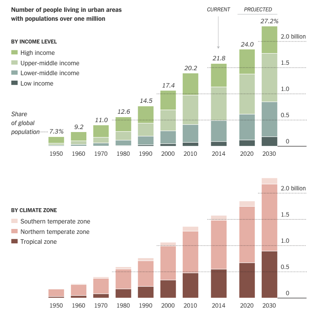
Personally I would have preferred a series of line charts to better compare the growth—the lack of a common baseline makes it very difficult to compare segments of the bars. But below the stacked bar charts we have a nice table. Those are always good to see. They organise information clearly and make it quick to find what is relevant.

Credit for the piece goes to the New York Times graphics department.

Stop the Music

I get that a lot of you like Christmas. That’s great. But for those of not terribly attached to it for more than the days off work, listening to music can switch from being relaxing to aggravating right quick. Thankfully we have FiveThirtyEight to examine just how ridiculous this all-Christmas-all-the-time trend has become.

The combined plays of two Christmas songs

Credit for the piece goes to Walt Hickey.

Hit-and-Run Cycling Accidents in Los Angeles

Today’s piece comes via a colleague. It is an article about hit-and-run cycling accidents in and around Los Angeles. The data visualisation in the article is not entirely complex—we are talking only about line charts and bar charts—but they support the arguments and statements in the article. And in that sense they are doing their job.

Locations of hit-and-run accidents in and around LA

Credit for the piece goes to Armand Emamdjomeh, Laura J. Nelson, and Joseph Serna.

White (Immigrant) People

This is an old map that saw the light of day a while back. Featured on Vox, the map supports the notion that some white people are whiter than other white people. The map explores immigrant populations. Using a map for spatial arrangement of integrated components, the data looks at immigrants’ ethnic origins, their workforce breakdown, and their recent growth.

A look at PA, my ancestors are in that data set

Credit for the piece goes to FS Howell. (I presume.)

Whence do US Retail Sales Come?

Today’s piece comes from the Wall Street Journal. It looks at US retail and foodservice spending through different types of stores.

Retail sales by store type

I take issue with a few things, firstly the tree map. Because it’s not really a tree map. Another thing I am not keen on is the comparison feature in the piece. The user can select up to three types of stores to compare. And while the result works in the line chart—three lines—the bar chart devolves into a near useless component. There is no easy way to compare the actual lengths of the individual bars short of mousing over and scribbling down each individual datapoint. In the particular case here, I likely would have changed from bars to line. Because that way I can compare the actual magnitude of each store type.

Credit for the piece goes to Dan Hill.

When is Hummus Not Hummus?

The subject matter of this one interested me. I am new to hummus. Well, sort of. I never ate it before moving to Chicago. But when I did, I understood it to be essentially a dip made from chick peas. According to an article from Quartz, It turns out that’s what most Americans believe. Even if they’re not necessarily buying it. Literally (sort of). Because some popular brands contain no chick peas. (Disclosure: I work for the company that provided some of the market sizing data used in the piece.)

Kind of needs chickpeas.

Credit for the piece goes to David Yanofsky.

Drawing Down America’s Presence in Afghanistan

The United States and its allies are slowly beginning to pull out of Afghanistan. While several thousand troops will remain, the total will be nowhere near the peak figure a few years ago. This graphic from the Washington Post details just how this transition has been occurring.

The anti-surge
The anti-surge

Credit for the piece goes to Richard Johnson.

Armistice Day

Today is Armistice Day, alternately known as Remembrance Day or Veterans Day. Originally the date remembered the armistice that ended World War I (hence those two names). The war ended at the 11th hour on the 11th day of the 11th month. But in the preceding years, millions of Europeans died along with just over a hundred thousand Americans. (We entered the war quite late.) This had a dramatic impact on the populations of European countries. In the United Kingdom, the Office of National Statistics put together a page for Remembrance Day 2014 that looks at four charts detailing the changes to the UK’s population structure. Suffice it to say there were lasting effects.

UK population in 1921

Credit for the piece goes to the ONS graphics department.

The Fall of the Berlin Wall

Yesterday marked the 25th anniversary of the fall of the Berlin Wall. But with the reunification of Germany a year later, has the former East Germany been able to catch up to what was West Germany? The Economist looks at the results in this graphic and the answer is yes. And no.

East vs. West. 1989 vs. 2013.

Credit for the piece goes to the Economist’s graphics department.

Twitter Language

An MIT report looks at, among other things, the words used in tweets based on whether they were tweeted at home or at work. And, well, Malcolm Tucker would be surely disappointed. Because somebody screwed up and switched the words home and work. Clearly they should be reversed.

A rose by any other name is still a f**king rose for f**k's sake, you t**t.
A rose by any other name is still a f**king rose for f**k’s sake, you t**t.

Credit for the piece goes to the report’s authors Morgan R. Frank, Jake Ryland Williams, Lewis Mitchell, James P. Bagrow, Peter Sheridan Dodds, and Christopher M. Danforth.