Carbon Emissions

President Obama announced new regulations to be enforced by the EPA that aim to reduce carbon emissions. Principally, the expected reduction will come through state-by-state measures to meet new federally mandated targets. Each state will have the ability to find different means of achieving the cuts, e.g. building more solar plants or nuclear plants or implementing cap-and-trade schemes.

Consequently, the New York Times published this interactive graphic that examines the carbon emissions and energy prices of states. The charts default to a highlight of several Northeast states already participating in a cap-and-trade scheme. The top component charts emissions on a per unit of energy over time while the bottom charts the price of energy.

Carbon emissions over time

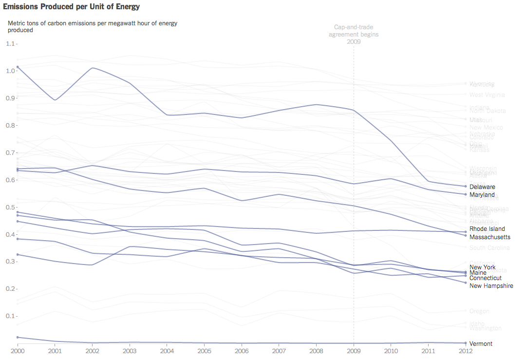
Credit for the piece goes to Hannah Fairfield and Derek Watkins.

Predicting the World Cup Winners

The World Cup is starting soon and that means predictions are also on their way. And snazzy graphics. Today’s snazzy graphic with predictions comes from Bloomberg. They have host Brazil winning the overall tournament. And if you want to investigate the matches further, you can do that by clicking on the match.

Brazil wins
Brazil wins

Credit for the piece goes to the Bloomberg graphics department.

Europe Votes

Sunday (and a few days preceding it) was election day in the European Union for the European Parliament. Unfortunately it was also a banner day for the far-right parties. In France the National Front (FN) took the top slot and in the United Kingdom that went to the UK Independence Party (UKIP). This graphic from the Economist looks at the results, highlighting the right-wing or eurosceptic parties.

Europe Tilts Right
Europe Tilts Right

Credit for the piece goes to K.N.C. and P.K.

Swiss Coffee Exports

While I hate coffee, I do like sankey charts. And this piece from Quartz makes use of one when discussing the exports of coffee. In particular, the article focuses on the value that coffee manufactures, e.g. Nestle, add to Swiss imports of un-roasted beans before exporting them roasted. (Increasingly in little pods.) Overall, the piece is of a digestible length and worth a read. If you like coffee. Personally, I’m sticking with tea.

Swiss coffee exports

Credit for the piece goes to David Yanofsky.

Wisconsin Politics

Today we dive into state-level politics north of Chicago, in the state of Wisconsin. The Milwaukee Journal Sentinel published an in-depth article looking at the political divide in the Milwaukee metropolitan area. While one could publish an article of that nature with just lots and lots of words, the Journal Sentinel chose to use maps and charts to support their arguments.

Comparing Milwaukee urban vs. suburban voting patterns

Credit for the piece goes to Craig Gilbert and Allan James Vestal.

Don’t Do This At Home…

In fact, don’t do this ever. Today’s bad chart comes from the Philadelphia Mayor’s Office of Transportation and Utilities. I saw it and could only shake my head and wonder why.

The Mayor's Office version
The Mayor’s Office version

Something more like this much more easily communicates the story.

My take on the data
My take on the data

Credit for the original piece goes to the Mayor’s Office of Transportation and Utilities.

Tax Day and Income Inequality

Tax Day for Americans seems like a great time to talk about income inequality. The article from which this chart comes talks about a recent book exploring the parallels of the 19th century’s inequality—as the article reminds us, the time of “Please, sir, may I have another?”—and the forecast for the 21st. Anyway, the graphic is a nice use of small multiples and highlights that despite the damage done to capital wealth by Great Depressions and two world wars, it is well on its way back to unequal levels.

Income inequality
Income inequality

Credit for the piece goes to the New York Times graphics department.

Motorcycle Helmet Laws

Today’s piece does not involve any particularly crazy graphics or forms of data visualisation. Instead, the piece is a novel way of telling a story. People are increasingly familiar with what we might call here scrolling stories. Scroll down the page and suddenly you have glossy photos or high-definition videos. The New York Times, however, has taken this idea in a different direction for a story about motorcycle helmet laws.

Instead of glossy photos, we have clear and concise charts. Instead of lots of text blocks, we have just a few sentences. The story is told by the charts and the text offers the necessary context or background. Not all stories will have the data behind them to allow the story to be told—or shown—in such dramatic fashion. But, I can hope they do.

Motorcycle helmet laws

Credit for the piece goes to Alastair Dant and Hannah Fairfield.

Recent Military Expenditure

The Crimean situation has highlight how much not just Ukraine is not ready to fight Russia, but also how much less Western Europe is prepared to fight. This piece from the Washington Post examines actual defence expenditure and then defence expenditure as a share of GDP. While Europe has remained steady or in decline, Russia has been ramping up its defence spending since the beginning of the 21st century.

Defence spending
Defence spending

Credit for the pieces goes to Patterson Clark.

Spilling the Oil

A few weeks ago, Bloomberg Businessweek published a nice graphic that summarised the last 25 years of oil spills. I’m finally getting around to posting it. But what it does really well is show just how bad the Deepwater Horizon spill was compared to the other big name disaster: Exxon Valdez. Of particular note is the bar chart at the bottom right comparing the millions of gallons of oil spilled.

Oil spills
Oil spills

Credit for the piece goes to Evan Applegate.