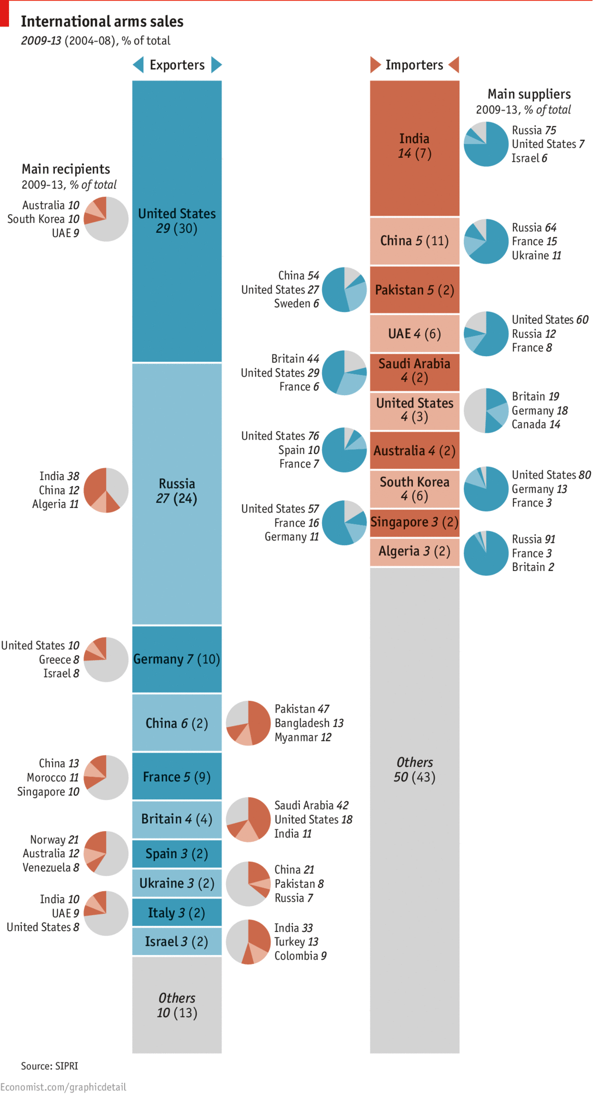
One of the possible set of sanctions against Russia by the United States and European Union would impact the country’s defence industries. This chart by the Economist shows how that might not have the most impact. Most of Russia’s arms exports go to China, India, and Algeria. None of whom are the United States or European Union.
International arms trade
Clearly I don’t love the pie charts. I would much rather have seen segmentation within the bars. Or a full-on Sankey diagram. But, the story is still worth telling.
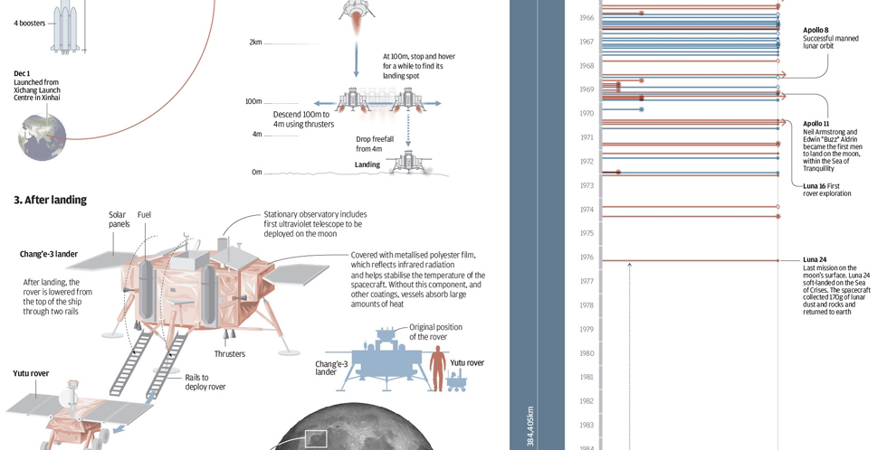
In December, China landed a rover named Jade Rabbit on the Moon. The South China Morning Post created a nice infographic to explain the lunar landing and place it in the context of other missions to the Moon.
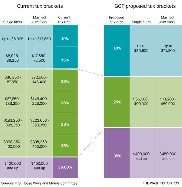
Republican congressman Dave Camp, Chairman of the House Ways and Means Committee (basically responsible for the tax code), wants to simplify the tax code. This nice graphic by the Washington Post basically sums up the changes.
Proposed bracket simplification
Credit for the piece goes to the Washington Post graphics department.
Today’s post is not news-related for a change. (Don’t worry, I’ll likely get back to that next week.) Instead, we have a new collection of mobile data visualisations curated by Sebastian Sadowski. You can choose to see either smartphone or tablet visualisations and then filter by visual form.
Smartphone Data Visualisation
Credit for the site goes to Sebastian Sadowski, to the various works to the various designers.
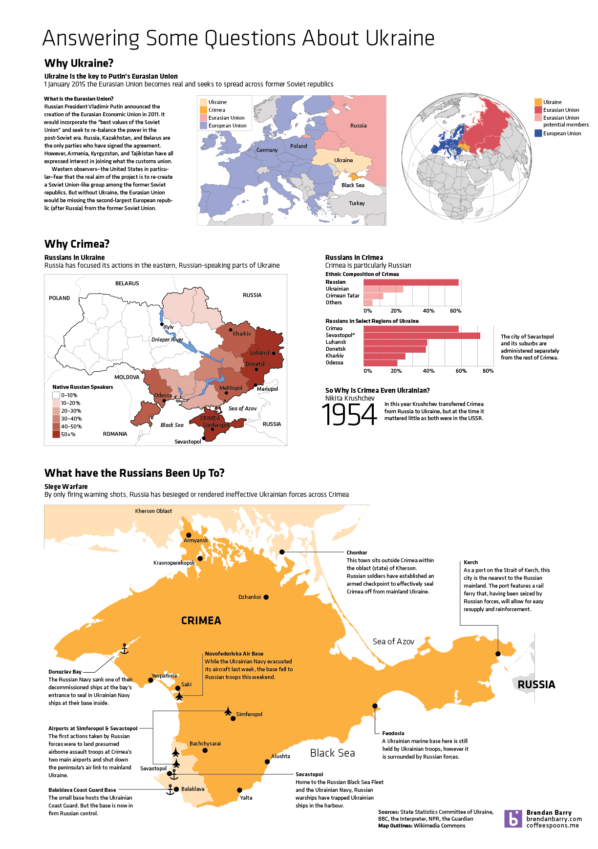
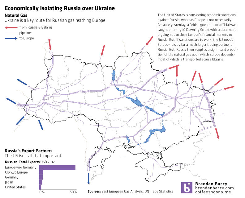
So Ukraine is even more of a mess and in less than a week’s time, the Crimean people will vote in a referendum on whether they want to remain a part of Ukraine or rejoin Russia. This graphic of mine is an attempt to answer some questions—though hardly all I wanted—about Ukraine, Crimea, and about what the Russians have been doing. (To be fair, the Russians still don’t admit that the troops and soldiers are theirs. But really, I mean come on, we all know they are.)
The West hesitates to use military force to push Russian troops out of Crimea. Likely with good reason as any such campaign would be neither cheap nor bloodless in addition to running the risk of spreading beyond the borders of Ukraine. So that leaves diplomatic and economic isolation. Diplomatic isolation is already underway—the G8 conference to be hosted in Sochi this summer is all but dead. But economic isolation is still being discussed.
Isolating Russia
The United States is generally in favour, but Europe—namely Germany—has been more cautious. But as my graphic shows, without Europe a sanctions regime would be largely toothless since half of Russia’s exports go to Europe. Except that Russia is also responsible for a significant proportion of Europe’s imported natural gas and sanctions on Russia could cause an interruption in that fuel to Western Europe. Naturally, most of that natural gas is, of course, transported through pipelines running across Ukraine.
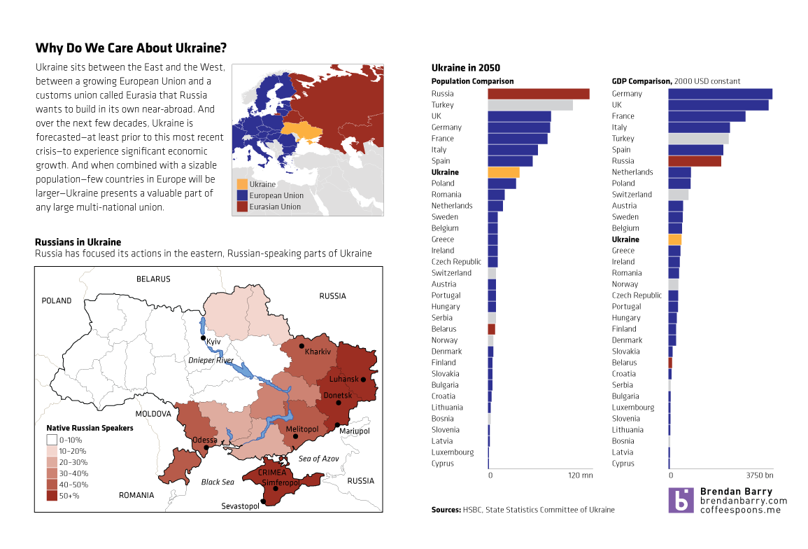
A lot of things happened in Ukraine this past weekend. Unfortunately, I was not able to quite capture all of the events and the background I wanted. So, until I do, this quick graphic will have to suffice. In short, Ukraine is a big European country, one of the largest prizes remaining in the struggle between the West/EU and the East/Russia. I took a look at the forecast for Ukraine in 2050 for both number of people and the size of the economy and put that in the context of Europe. And while forecasting that far out clearly has risks, one can see with a grain of salt that Ukraine is set to be an important middle-sized European nation.
A quick introduction to Ukraine
But, like I said, there is more to do. I just was not able to do it.
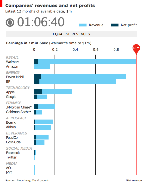
As the Winter Olympics continue, the Economist looks at a different kind of race. The race between companies reaching a certain amount of revenue—along with the net profit from said revenue. How long does it take a company to reach $1 million in revenue? When all companies have reached the same amount of revenue, what percentage is net profit? It’s a neat little interactive. Thankfully you can skip the race and get straight to the results, a nice design feature.
Race to $1 million
Credit for the piece goes to R.J., G.S. and K.N.C.
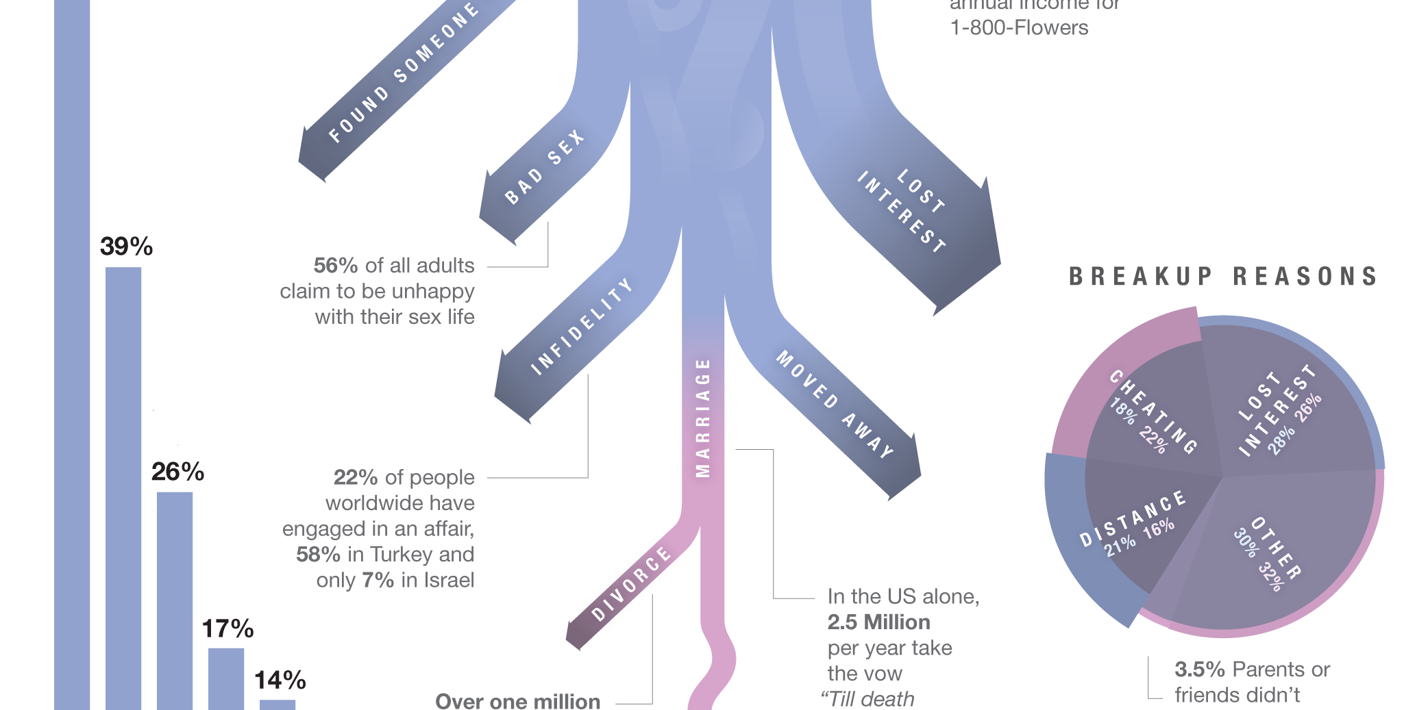
To celebrate, here’s a cropping from an infographic about breakups. From a whole series of graphics about breakups. You can thank me with some dead and rotting flowers.
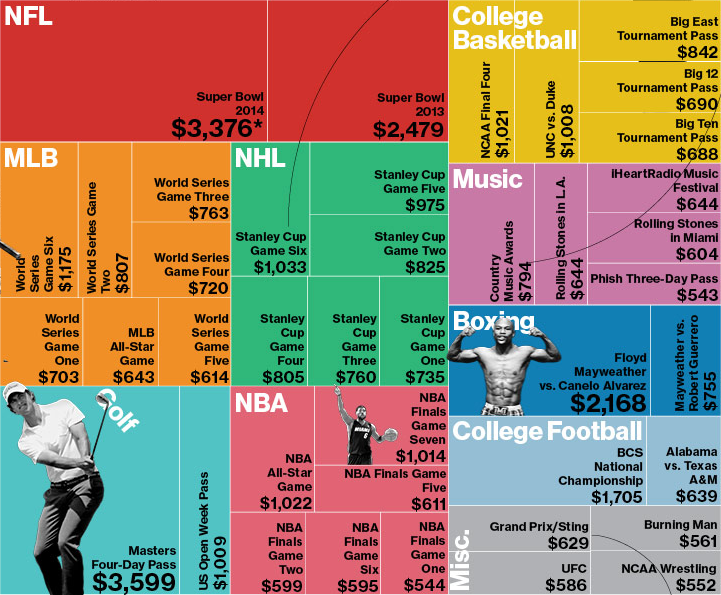
So yeah, the Super Bowl thing. Apparently tickets are expensive? Earlier, Bloomberg Businessweek took a look at average prices for the most expensive events of 2013. The only sentence supporting the graphic was that the most expensive event was not the Super Bowl. Okay, so what was?
Most Expensive Average Ticket Prices
I think this graphic actually makes it more difficult to tell. But beyond that, the decision to use the tree map confuses me. We are already looking at a subset of ticket prices—not all, but only the “most expensive”. What criteria determined that selection? After all, from my own experience and personal knowledge I know that Red Sox–Yankees game are also incredibly expensive. But those are not present in this set. And then if the idea is to undermine the common thought that the Super Bowl is the most expensive ticket, should the user be forced to find through each square—and no, the events are not squarified very nicely—the highest value?
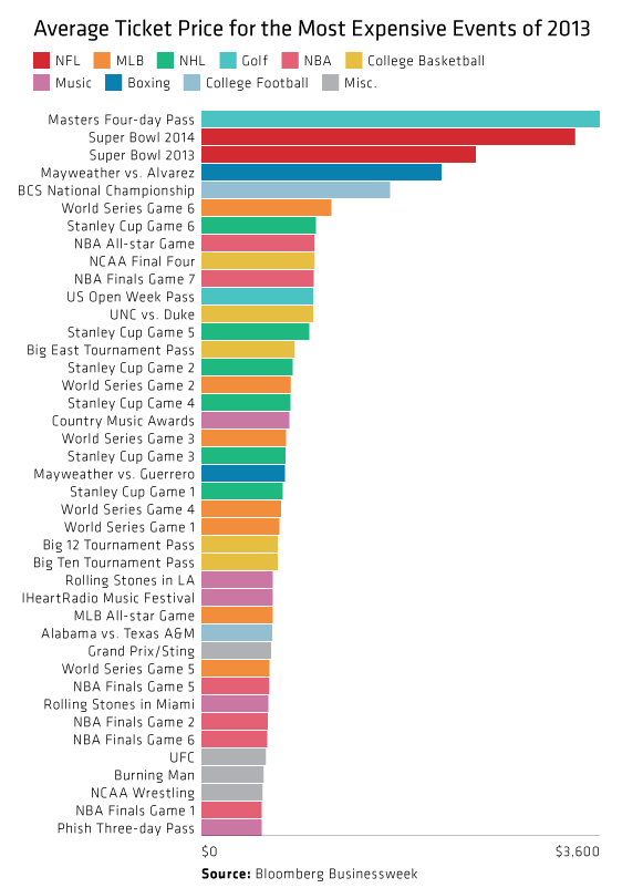
So I took an hour before the game to try a quick stab at quickly identifying the most expensive tickets. It turns out that the glorious bar chart more than suffices. It also then shows how quickly the remainder of the prices become quite comparable. (Ridiculous I suppose depends upon your preference for sport/event/disposable income.)
My quick take
Credit for the original piece goes to Bloomberg Businessweek.