Baseball Payrolls

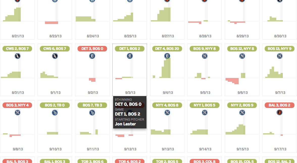
The World Series starts tomorrow night and for all but two teams, that means focusing on the upcoming 2014 roster. And rosters are often defined by payroll flexibility. A co-worker of mine forwarded along today’s interactive graphic that looks at team payrolls through stacked bar charts.

The Red Sox payroll
The Red Sox payroll

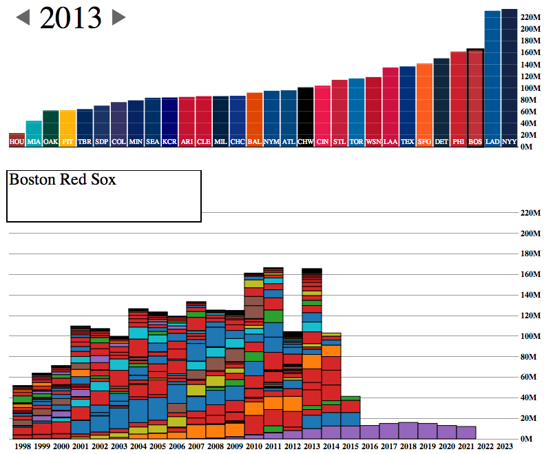
The design is certainly a bit clunky with heavy black outlines and garish colours. But the story told is clear, especially if you begin to look at different teams. Which teams have players locked up for the long-term and thereby have little flexibility?

The Red Sox, of course, sent most of that bar from 2011 to the Los Angeles Dodgers near the end of 2012. That allowed them to pick up the free agents like Mike Napoli, Johnny Gomes, Shane Victorino, and Koji Uehara. You know, the guys without whom the Red Sox would not have advanced to the World Series.

Credit for the piece goes to Phil Roth.

A Data-driven Web Application for Global Economic Statistics

In the interests of transparency and full disclosure, for my employer I design interactive web-based applications that display significant amounts of data on various countries and industries—along with other design things. So I am always curious to see how others handle similar types and quantities of data. This interactive application—I hesitate to call something like this an interactive infographic because of its scale and scope—comes from the Global Economic Dynamics project.

The GED application
The GED application

I commend the designers for opting not to use a map despite the nature of a dataset that focuses on countries. Especially in this application, where the full pattern of trade or migration would only be visible through multiple clicks to load maps of export/import markets of a particular country.

The user can add multiple countries, switch to a different dataset, change the year of the displayed data, currency, metrics, &c. There is quite a bit going on in this application and the controls are carefully placed in the margins of the piece.

And while I could probably write a lot more about this piece, I will end up the ability to share any insights made while using this application. Because what is the value of a kernel of knowledge if you cannot share it? Consequently, this piece offers a multitude of options. The usual social media options are present. You can also download a .png for use in a presentation, e.g. PowerPoint, or you can download the data. But fascinatingly, the application allows you to embed the piece into your own site.

Unfortunately, I cannot find any specific designers attached to the project. So credit goes to the Global Economic Dynamics project.

Name Dropping Brands

Happy Friday, everybody. Today’s post is a graphic from Vanity Fair that looks at the rapper Jay Z. (And for all those wondering, no, I have never intentionally listened to any of his music.) Specifically, this kind-of-stacked-bar-but-more-icon chart indicates how many times he name drops specific luxury brands in his albums.

Jay Z Brand Mentions

You can also file this under the graphics to which I cannot relate. Although maybe, just maybe, I once had a pair of Nike trainers. So at least Jay Z and I have that in common.

Credit for the piece goes to Philip Rhie.

The New American Center

NBC News and Esquire magazine published results from their August survey of some 2000+ respondents that attempted to define the New American Center, i.e. the political persuasions of the majority of the country excepting the radical right and the loony left. For the purposes of Coffee Spoons, I am most interested in looking at the data visualisation and the infographics that result.

Both NBC News and Esquire visualised the results. While I could write two long blog posts looking at both of them, for today, it is more important to look more at the fundamental design difference between the two.

NBC News opted for a design direction emphasising data first. Perhaps because NBC is a news platform, their focus was on the clean communication of the data. Looking

NBC News results
NBC News results

On the other hand, Esquire opted for a more sensationalised direction. The same data points used for the screenshot above creates this graphic below. Not only is less data is contained, less context given, less subtlety and nuance captured, it also is just difficult to read. Is the 59% supposed to be the area of the cross filled in? Its length? Why is it three-dimensional? Where are the Snowdens of yesteryear? At first glance, I ignore the horizontal wings and focus solely on the vertical length of the main bar.

Esquire results
Esquire results

For a useful representation of data, I think NBC News clearly wins. But that both organisations used the same data to craft their separate results, this story on the New American Center is useful for comparing two different design directions and the results thereof.

No designers are specifically mentioned, at least not that I could find, so credit for each piece goes to its respective owner, i.e. NBC News or Esquire.

The Future of Data Visualisation

Happy Friday, everyone. According to xkcd, I am failing the future test. That is to say, by 2019, I will be unable to communicate data through infographics or create data visualisations.

The future of data visualisation

Credit for the piece goes to Randall Munroe.

Where Medicaid is Not Expanding is Where it is Needed Most

Last summer, the Supreme Court ruled that most of the Affordable Care Act, also known as Obamacare, was constitutional. The one exception, however, was the plan to force states to expand their Medicaid coverage. Medicaid is the government plan tasked with helping to provide health insurance to the poor. But between the poverty level and the income level for subsidies for the new state exchanges, there is a gap. That gap was supposed to be covered by the state expansion of Medicaid.

Because the states are not being forced to expand their coverage, there now exists state-by-state gaps in health insurance coverage. This excellent interactive graphic from the New York Times looks at the poverty and insurance coverage segregated into those states that are and are not expanding their coverage. A good number of those states with high rates of poor and uninsured are Republican, deep-South states. If you’re really clever, you’ll compare this map to my map from earlier this week about the Conservative Party. Notice any overlaps?

States not expanding Medicaid

Credit for the piece Robert Gebeloff, Haeyoun Park, Matthew Bloch, and Matthew Ericson.

Boston’s 2013 Season

If you’re not a Boston Red Sox fan, what’s wrong with you? Well, okay, so long as you’re not a Yankees fan, you’re not that bad. Anyway, the Boston Globe looked at the 2013 Red Sox season. Game by game, inning by inning. And because Boston is now advancing to the American League Championship Series, and since they will probably face Detroit, here’s a screenshot of the great game that was Scherzer vs. Lester.

Red Sox 2013 season review

Credit for the piece goes to Chiqui Esteban.

The Conservative Party of America

We enter our second week of the government shutdown. Of course, blame for the shutdown falls largely upon a small number of conservative Republican members of the House, bolstered by Senator Cruz (R-TX) and his allies in the Senate. But we already know that there are a number of moderate Republicans who want to pass a clean budget resolution. So one way of looking at this new conservative faction is as a new minor party in a coalition government with Ted Cruz as Party Leader.

The idea is not mine. Ryan Lizza first wrote about the “Suicide Caucus”, a topic that Philip Bump expanded upon several days later. However, as a thought experiment, I was curious to see what would happen if this third party, a Conservative Party, would look in data visualisation terms. So here’s a quick stab at America’s newest third party.

The Conservative Party of America

Paying Federal Employees

The Washington Post put together this infographic looking at paydays for federal employees who will still be working during the shutdown, e.g. military service personnel. Of course, if the shutdown drags on, the paychecks for those still working would be delayed.

Paying essential personnel

Credit for the piece goes to Lisa Rein and Todd Lindeman.

Paying a Bribe

Some say bribes grease the wheels of business. But if that is the case, where are the greasiest wheels? This interactive piece from the BBC showcases an interesting story. It maps who has paid bribes and the value thereof. Then it looks at corruption in the different sectors of the country and which is perceived to be the most corrupt.

A look at bribery
A look at bribery

Aesthetically this is not the finest piece. Some of the most interesting countries to view are in Africa and Southeast Asia, i.e. geographies near the equator. Unfortunately the designers here chose a map projection that emphasises Siberia and Arctic Canada at the expense of those very countries. Also, where did Greenland go? I know that the ice is melting, but I don’t think it’s melted that quickly. Furthermore, if the user clicks the “List” option, he or she is presented only with a list of geographies. None of them are selectable nor do they encode data. So why is the list there?

In short, the interface is a bit clunky and strangely designed. Line lengths are too long and it looks ugly. But, there are two interesting things going on here worth noting. First the legend here actually does not just show the range for the choropleth, but it also encodes the number of countries that fall within that range.  

Second, by clicking on a particular bin for the legend, the map filters for the selection. I think that from a design perspective, a lighter grey and a lighter stroke outline would have made the filtering a bit more prominent, but the idea is interesting. Unfortunately, I found no way of easily returning to an all-bin view of the map.

A piece for the BBC that misses a few, but also hits a few.

Credit for the piece goes to the BBC graphics team.