Charting and Mapping Income Mobility

After two weeks out of the country, I come back and find early this morning (thanks, jet lag) an interactive article published by the New York Times on income mobility. What does that mean? From a medium side, a long narrative interspersed with charts and graphics with which the user can interact to uncover specific data about specific elements in the dataset. From a content side, income mobility means the movement of an individual from one group of money earned to another, e.g. a poor person becoming a millionaire. The piece is fantastic and you should take the time to go read and interact with it.

A map shows the broad context of the data to be looked at in the story

For some time now I have harped on about the need to annotate and contextualise datasets. Too often, large datasets paralyse people; their eyes glaze over and they simply gaze at a graphic without seeing the data, the story, the information. Little notes and blurbs of text can help people synthesise what they see with what they read with what they know to gain better understanding. But in this piece, by combining a lengthy article—very well written although that is not the focus of this post—with powerful interactive maps and graphics, the New York Times has created a powerful piece that states and then proves the point of the article. And while doing all of that, by making the datasets explorable, the Times also allows you to find your own stories.
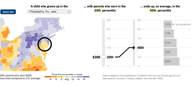
A story-like piece lets you choose an area and an income to see how the article's topic plays out

Lastly, in the credits section at the end you will see this piece required the input of eight individuals (though I know not in what particular capacities). Clearly, for the Times this is not about to become a regular type of infographic/datavis/journalism piece. But when will skill sets be democratised or dispersed enough that smaller teams can create similar scale projects? That will be interesting to see. However, the Times certainly leads the States if not the world in some of the best information design pieces and undoubtedly this will push other publishers of similar content in this direction.
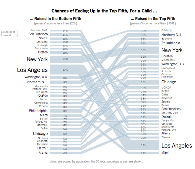
Ultimately people want to know who's best and who's worse and where they fall and this chart does that at the end of the piece

Credit for the piece goes to Mike Bostock, Shan Carter, Amanda Cox, Matthew Ericson, Josh Keller, Alicia Parlapiano, Kevin Quealy, and Josh Williams.

http://www.nytimes.com/2013/07/22/business/in-climbing-income-ladder-location-matters.html?smid=pl-share

The Carpatho-Rusyns of Slovakia

If all is going according to plan, I should be somewhere in the Carpathian Mountains at this point, specifically in the Presov region of Slovakia. So as a reminder of just what that means, here is a (recycled) piece I created this time last year about the Carpatho-Rusyns (sometimes known as Ruthenians) living in Slovakia. Click the image to go to the full infographic.

Cropping of the Rusyns of Slovakia

Credit goes to me for the piece, but to the statistics office of Slovakia for the data.

Hong Kong and Hongkonger Identity

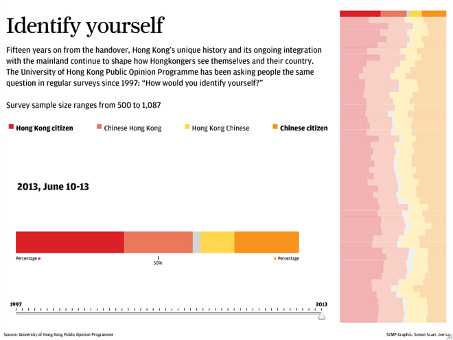
Hong Kong—and to a similar extent Macau—is part of China, but at times not so much. Because of the long history of British control through their colony, the people of Hong Kong, Hongkongers, are accustomed to a more liberal, democratic, and perhaps Western lifestyle than those of mainland China. Since the British handover, a local university has been asking the inevitable question of “Are you Hongkonger or Chinese?”. This interactive piece from the South China Morning Post looks at how that answer has evolved over nearly 20 years.

Hongkonger identity
Hongkonger identity

The piece presents a broad overview on the right with the specific survey results displayed larger on the left. Broadly speaking, the piece is successful. In particular, the decision to highlight the particular survey on the right brings that into focus without losing the context of the historical results. And providing a timeline beneath the larger stacked bar chart on the left offers a second means of choosing a survey of interest.

Yet I think the piece lacks two, perhaps three, elements that would improve the piece. First, sometimes I like to see the numbers for data visualisations. Adding a hover or mouseover state would help with that. Second, while the chart on the left includes a 50% line, I wonder if that would not also be helpful in the historical display on the right. Thirdly, and perhaps not too important for those not terribly interested in the data, the overall piece states the sample size for all surveys being within a range. People wanting more data on the survey responses might be interested in seeing the sample size per survey.

Credit for the piece goes to Simon Scarr and Joe Lo.

Gay Acceptance

Last week I looked at a piece from the Washington Post about the possible impact of the Supreme Court rulings on gay marriage in the United States. But with the rulings yesterday, we step back and look at globally how the progression of gay rights has taken steps forward or backward.

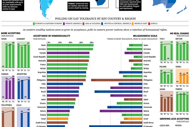
The National Post looked at the reversal of bans of gay marriage as well as polling from several countries to look at changing opinions and perspectives across the world. Fascinating/horrifying are some of the stories about specific countries in the map.

Gay acceptance
Gay acceptance

My only real criticism is that the colour-coding of regions seems a bit jarring. I wonder if grouping countries by region would not have allowed the same data to be presented in a bit quieter tone.

Credit for the piece goes to Richard Johnson.

Tax Breaks for the Wealthy

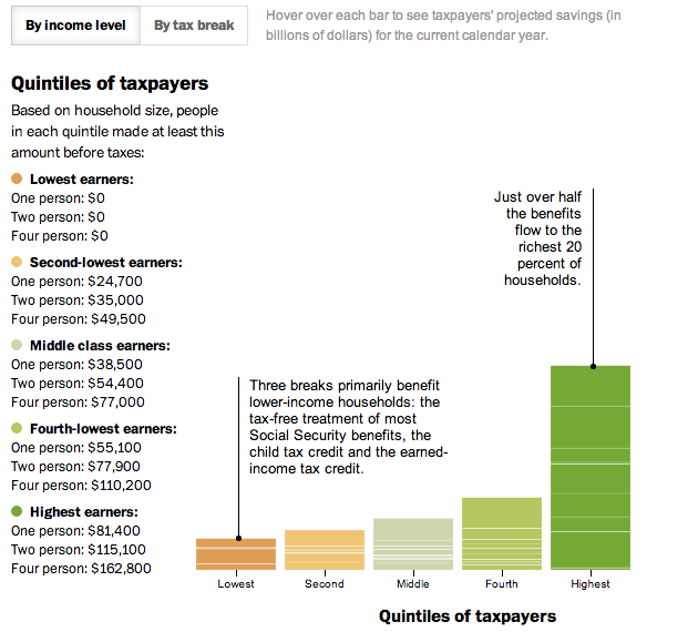
In today’s post we look at a small interactive piece from the Washington Post. Everybody pays taxes. And everybody seeks to find ways to pay less in taxes. This interactive stacked bar chart (and bar matrix) examines how much the different available tax benefits help Americans, grouped into income quintiles. The measure is dollars, not percentage of income (either personal or national), so clearly highest income Americans are the big winners in tax benefits while low income Americans lose out. For example, most low income people do not make enough money to invest in the stock market. Therefore they cannot reap the benefit of preferential tax treatment of dividend income as opposed to wage income.

A look at tax benefits in the US

Credit for the piece goes to Darla Cameron.

Plastic Surgery

This Friday we look at plastic or cosmetic surgery. Because you should always feel better about yourself before the weekend begins. The work comes from the National Post and it looks at the popularity of specific types of surgeries for men and women over the last several years.

Plastic surgery
Plastic surgery

It’s a nice use of small multiples, line charts, and bar charts to explore the issue. I take issue with only one chart near the end of the piece. It looks at minimally invasive procedures and uses bar charts to compare the numbers. However, the bars do not sit on a common baseline and but for the addition of data labels, they would be useless in comparing the numbers of procedures.

Unaligned bar charts

Credit for the piece goes to Mike Faille and Richard Johnson.

Campaign Contributions

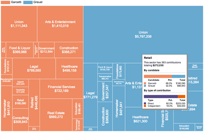
On 21 May, Angelenos went to the polls to elect the next mayor of Los Angeles. The contest followed an earlier vote that prompted the day’s run-off election. This graphic from the Los Angeles Times examined the contributions to the campaigns of the two finalists, Eric Garcetti and Wendy Greuel.

The overall piece features an interesting interactive component that allowed the user to switch from a scatter plot view to a stacked bar chart view and then filter those results based on whether they were direct or indirect contributions. Generally speaking, that element worked. However, I want to focus on the second big component: an interactive tree map.

Tree map with rollover

While not all tree maps have to be squarified, by converting datapoints to (roughly) similar shapes the user should have an easier time comparing the area of the objects. This tree map is not squarified and so the user must strain to convert all the different shapes into roughly equal shapes for a visual comparison. Nor is there an inherent ranking within the map—at least not that I can find. That would also help.

So while the tree map is not a success in and of itself, the rollover condition makes for a more interesting overview of the different sectors of contributions. But despite this added value in the rollover,  the data powering the tree map would still be better presented in a different format.

Credit for the piece goes to Maloy Moore and Anthony Pesce.

The Cost of Chicago’s Gun Violence

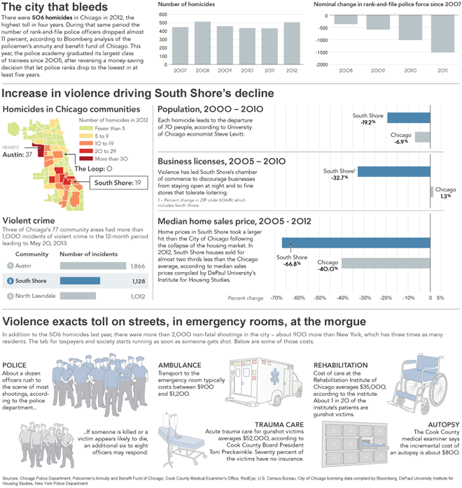
Today’s piece comes from Bloomberg and looks at the cost of Chicago’s gun violence epidemic. And when I write cost, I mean just that. While the lives lost are the most significant, Bloomberg’s article states that shootings cost Chicago $2.5 billion per year, or $2,500 per household. They supplemented their article with an infographic detailing and breaking down these costs by focusing on the South Shore in the city’s south side.

The cost of Chicago's gun violence on the South Shore

Credit for the piece goes to Chloe Whiteaker, John McCormick, and Tim Jones.

A (Time and) Space Race

First of all, I grew up a fan of Star Trek and not Star Wars. Star Trek is, after all, more science-y. Now, for today’s post, I could make references to the battlestar Galactica, the good ship Tardis, Planet Express deliveries, or avoiding the Alliance throughout the Verse. Instead I’ll just submit this interactive graphic from Slate.

Voyager 1 is slow
Voyager 1 is slow

It compares the times needed by various nerd-loved starships/spaceships/space vehicles to reach very distant (and real) stellar destinations. Don’t worry, there is a bar chart in the end with Voyager 1 thrown in for comparison to reality. (Though I suppose they could have just made it Voyager 6.)

Not accounting for differing technologies or laws of physics

See, a bar chart. It fits within the scope of this blog.

Credit for the piece goes to Chris Kirk, Andrew Morgan, and Natalie Matthews.

Bryce Harper

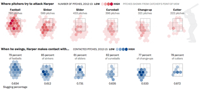
Bryce Harper is undoubtedly one of the best baseball players in the game today. To put it simply, he hits. And he hits well. And he hits well often. So the Washington Post put together an interactive, long form piece about Harper’s swing and hitting.

Pitching to Bryce Harper

The piece begins with a narrated video outlining the science behind Harper’s swing. Then the reader can down into the piece and learn more about Harper’s history and development and how he compares to other hitters. Statistics and data visualisation pieces show just how impressive Harper is as a hitter and how pitchers are trying to combat that.

Interactive long form articles are appearing more and more often online. But this is perhaps the most data- and science-intensive piece I have seen thus far. What is particularly nice about the format is that, as I have often noted, annotations and explanations are what make good infographics and what move data visualisation from presentational to informational. That this piece in particular happens to be about baseball, well, all the better.

Credit for the piece goes to Adam Kilgore, Sohail Al-Jamea, Wilson Andrews, Bonnie Berkowitz, Todd Lindeman, Jonathan Newton, Lindsay Applebaum, Karl Hente, Matthew Rennie, John Romero, and Mitch Rubin.