at least in terms of outflow.
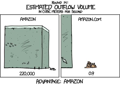
via xkcd of course.
Canada spends quite a bit of money on foreign aid. Last week a National Post infographic looked at the targets for that aid program and in particular highlighted Haiti, a country that has received large sums after the devastating earthquake three years ago.
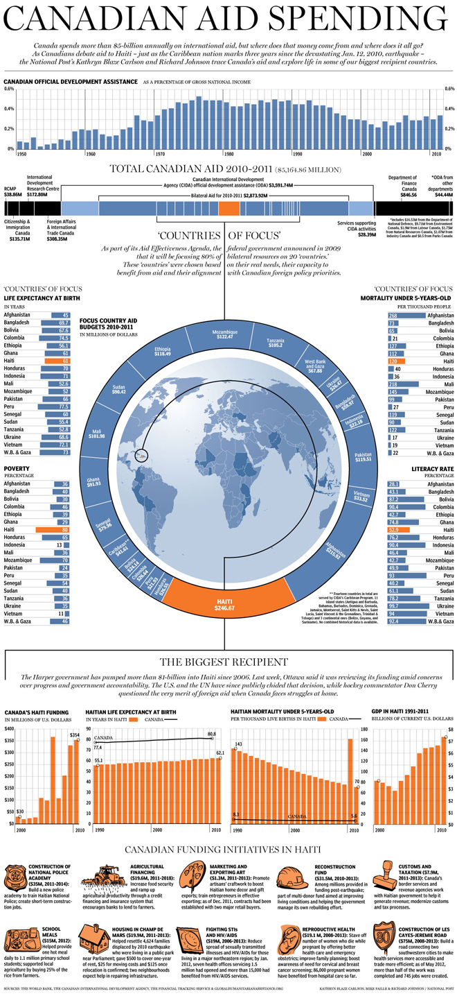
Credit for the piece goes to Kathryn Blaze Carlson, Mike Faille, and Richard Johnson.
2012 was the hottest year since 1895. That’s 117 years by my count. Of course just being the hottest year ever recorded does not mean everywhere was warmer than usual. Some places were cooler. And the New York Times looked at the US pattern of warmer and cooler than average temperatures. Below the map are small multiples of charts recording the number of days above or below the normal for that day.
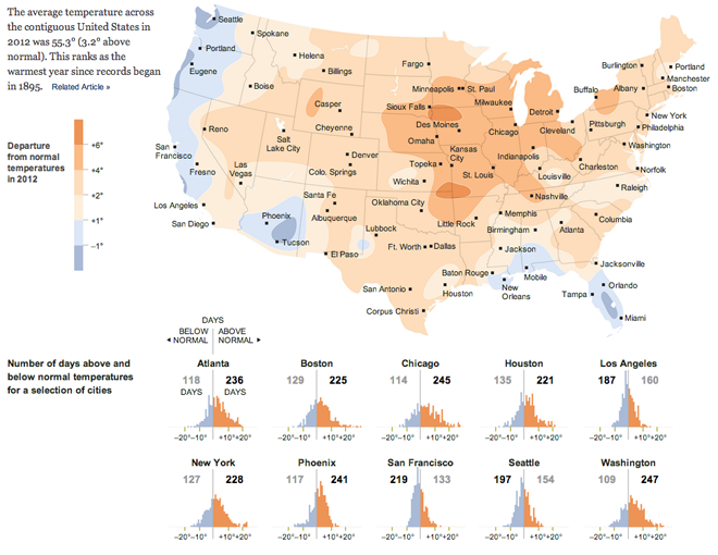
And for anecdotal evidence, I will say that this past summer was godawfully hot in Chicago.
Don’t worry, you don’t need to answer. But a survey of Canadians did. And these are the results, as visualised in this infographic from the National Post.
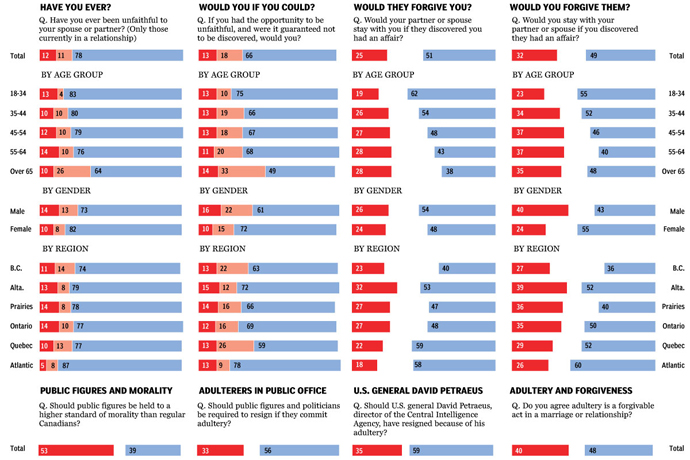
Credit for the piece goes to Richard Johnson.
The New York Times looks at who controlled the redistricting of US congressional seats because of the 2010 census. It then showed an example in North Carolina where Republican control led to the state being less competitive in the past for Democrats. In 2010, Democrats held 7/13 seats in North Carolina. But after the redistricting, in 2012 the Democrats held only 4/13. And all of this is done in a small, compact space. This is a very effective graphic.
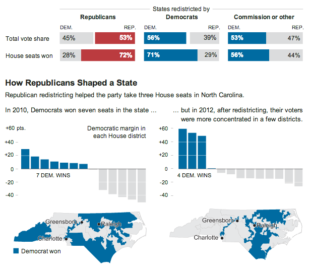
Credit for the piece goes to Tom Giratikanon.
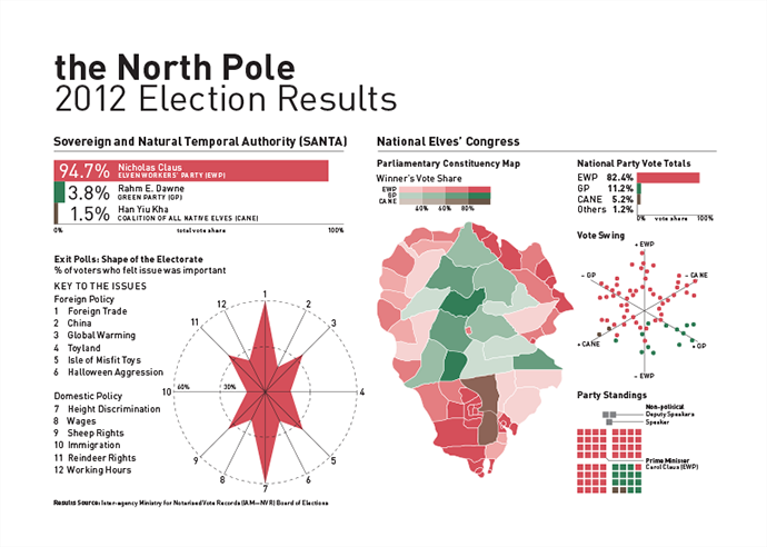
What words are more synonymous with Christmas than data visualisation? Okay, well probably any other words. For most people. But for family, friends, and co-workers I printed my usual infographic Christmas card. But for those of you who only come to my blog, I created a digital, online version.
With Palestine admitted to the United Nations as a non-member observer state, the Middle East tensions between Israel and Palestine have reached a new level. Regardless, Palestine may now have access to international institutions and is closer to being a recognised, sovereign state. Toronto’s National Post published a large infographic looking at the state of Palestine and how the two non-contiguous territories of the West Bank and the Gaza Strip compare to each other.
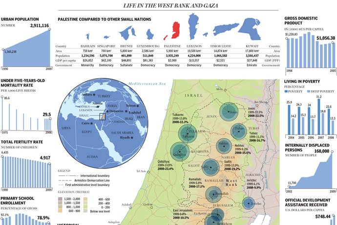
Credit for the piece goes to Richard Johnson.
Let’s face it, governments need money to function. If you want a large military, you have to fund it. If you want pension system, you have to fund it. If you want medical care for the old, the sick, and the poor, you have to fund it. If you want to give everyone unicorns made of rainbow beams, you have to fund it. And…well…nevermind.
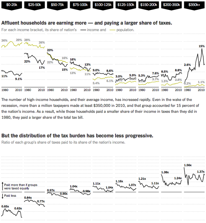
The point is taxes. After an election that focused so heavily on them, we’re still debating them. But here are some facts about them from the New York Times. The designers, Mike Bostock, Matthew Ericson, and Robert Gebeloff used small multiples of line charts—and lots of them—to look at who pays taxes by income band and how they pay different types of taxes. I found particularly interesting the points made near the bottom of the piece about how the progressive tax system is increasingly less so.
But how do these taxes compare to spending? In a separate graphic for the same article, a stacked bar chart compares revenue to expenditure. With the exception of the balanced budget during President Clinton’s administration, we have been outspending our revenue since 1980. While statements to the effect of the US national budget needs to be managed like a US household budget are both overly simplistic and naive, there is a truth in a long-term mismatch between revenue and expenditure might cause problems. That is why many see the deficit and our debt as a medium-term problem facing the United States.
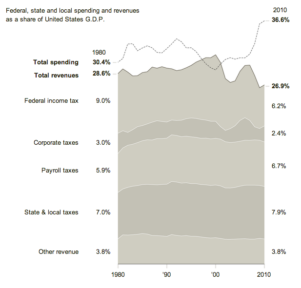
Credit for the first piece goes to Mike Bostock, Matthew Ericson, and Robert Gebeloff.
Despite the claims of a select few, President Obama’s victory in the electoral college last week was not narrow. While it was not a blowout landslide, it was a clear and convincing win. But to show how it compared across American political history, I quickly charted electoral college results since the time of George Washington.
It is worth keeping in mind that prior to 1804, electors did not distinguish their votes between president and vice president, so those numbers look a little bit different than they might seem today.

So my airport card still is not working on my laptop. And I am heading back east into the cold embrace of Sandy so who knows if I’ll have access to the internet while on holiday. But because of those two things, this is my official forecast for the election on 6 November. Granted, a big disaster (such as a $1 billion dollar storm) or a big gaffe (anything that Joe Biden says) could change the race, but that’s becoming increasingly less likely as we wrap up the final days of the campaign.
So thanks to the Huffington Post’s election map dashboard (click here or the image to go and make your own):
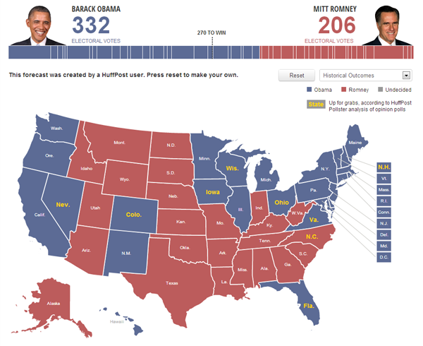
In short, I think Obama holds most of the states he won in 2008, but drops Indiana and North Carolina. He might still lose Florida, but with the better-than-expected economic growth figures out earlier today, I suspect that will halt Romney’s gains and perhaps roll them back just a bit.