For those of you not baseball fans, Tuesday is Major League Baseball’s trading deadline. By that evening, trades of players between teams are sort of over for the year. (Yes, I understand this is the non-waiver deadline and the waiver deadline is at the end of August, but that is complicated to explain.) And so as the end of July approaches, trades can reach a frenetic pace as teams try and fill the holes in their rosters before the playoffs begin in October.
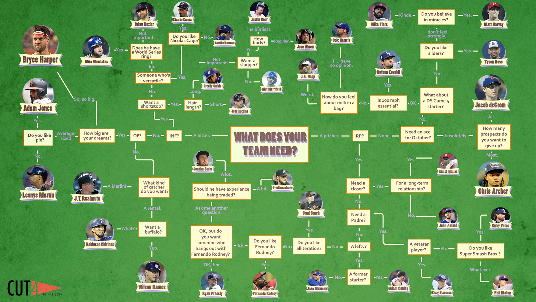
Thankfully the folks over at Cut 4 put together a flow chart to help teams figure out how to fill those needs.
A lot of these have paths have already been closed.
Of course by this point, a number of these players have already switched sides. In terms of design, this is more like a Friday post. Just enjoy it.
Credit for the piece goes to Jake Mintz and Jordan Shusterman.
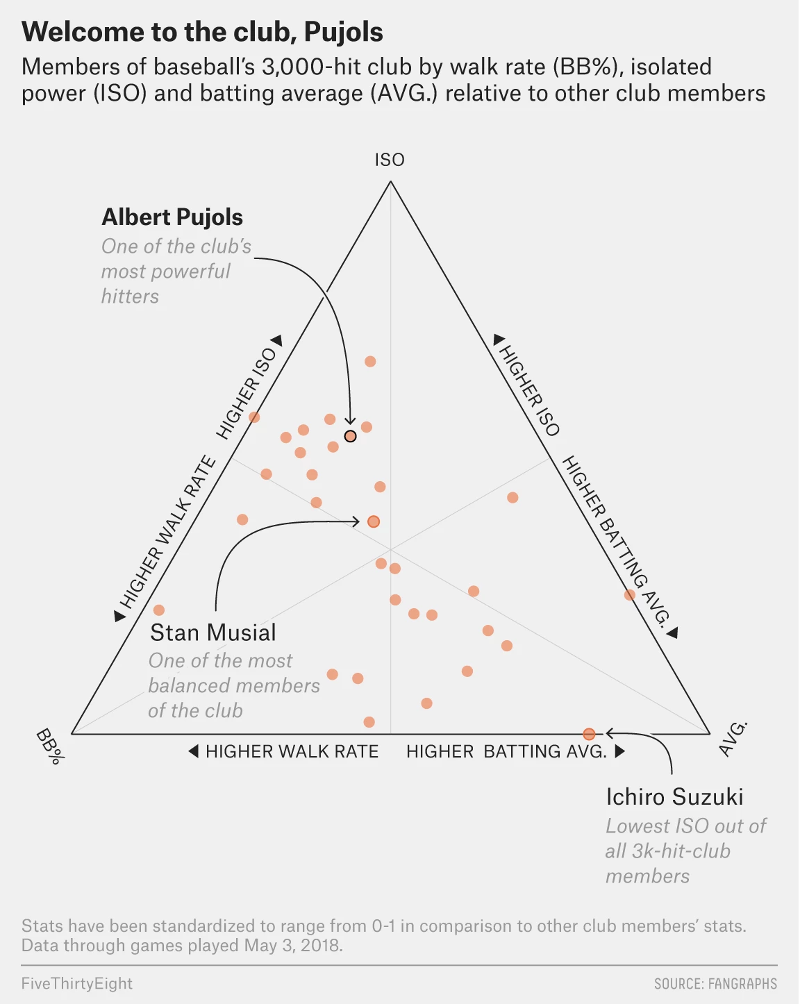
On Friday Albert Pujols joined the very elite club of baseball players who have managed 3000 hits in their career. Thankfully FiveThirtyEight covered it with a few graphics in an article that pointed out just how hard it is to do. Especially because, and I did not know this, Pujols did it in a not terribly common fashion. (Funny story, I had to explain this past weekend how Randy Johnson was a ridiculous pitcher, in the lots-of-strikeouts-and-also-exploded-a-bird way.)
My video game version of me would probably be on there if only those games lasted more than one season…
The piece uses a ternary plot, which we can also just call a triangle chart because it is, you know, in the shape of an equilateral triangle, to look at three components of Pujols’ hit skill.
There are different types of hitters in baseball. The guys who crush home runs all the time, the guys who hit singles all the time, guys who walk a lot. (Technically a walk is not a hit, but they are still getting on base.) There are fancy metrics that can be used to tease out just how much power is in a person’s game, and when you compare that to the batting average and to their walk rate, you can see clusters of players.
These kind of charts can be difficult to read—what does it mean for a player in a certain area of the chart? But what the designer did real well here is label an example of the type of player. Ichiro, called out for being a singles machine, is notable because he just sort-of-retired last week. He also has something like another 1500 hits back in Japan. That guy can hit.
Credit for the piece goes to Neil Paine and Rachael Dottle.
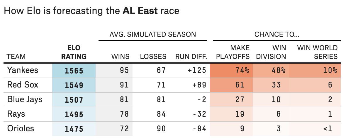
The 2018 season starts today with I think every team playing—the Red Sox open down in St. Petersburg against the Rays. So today’s post is on the light side as I could not find the awesomest baseball graphic. But FiveThirtyEight did at least preview the season and ran some projections. Naturally, I disagree with their projections. But I think finally this year the Yankees will be more of a threat to the Red Sox than they have been in years. The rivalry is back. (Though it never really went away in my mind.)
Switch numbers one and two and I think this might be okay…
The above is the screenshot for the American League East, because Boston. But, the rest of the AL is on that page as well. For those of you from my more National League-following cities like Philadelphia and Chicago, FiveThirtyEight also previewed the NL divisions here.
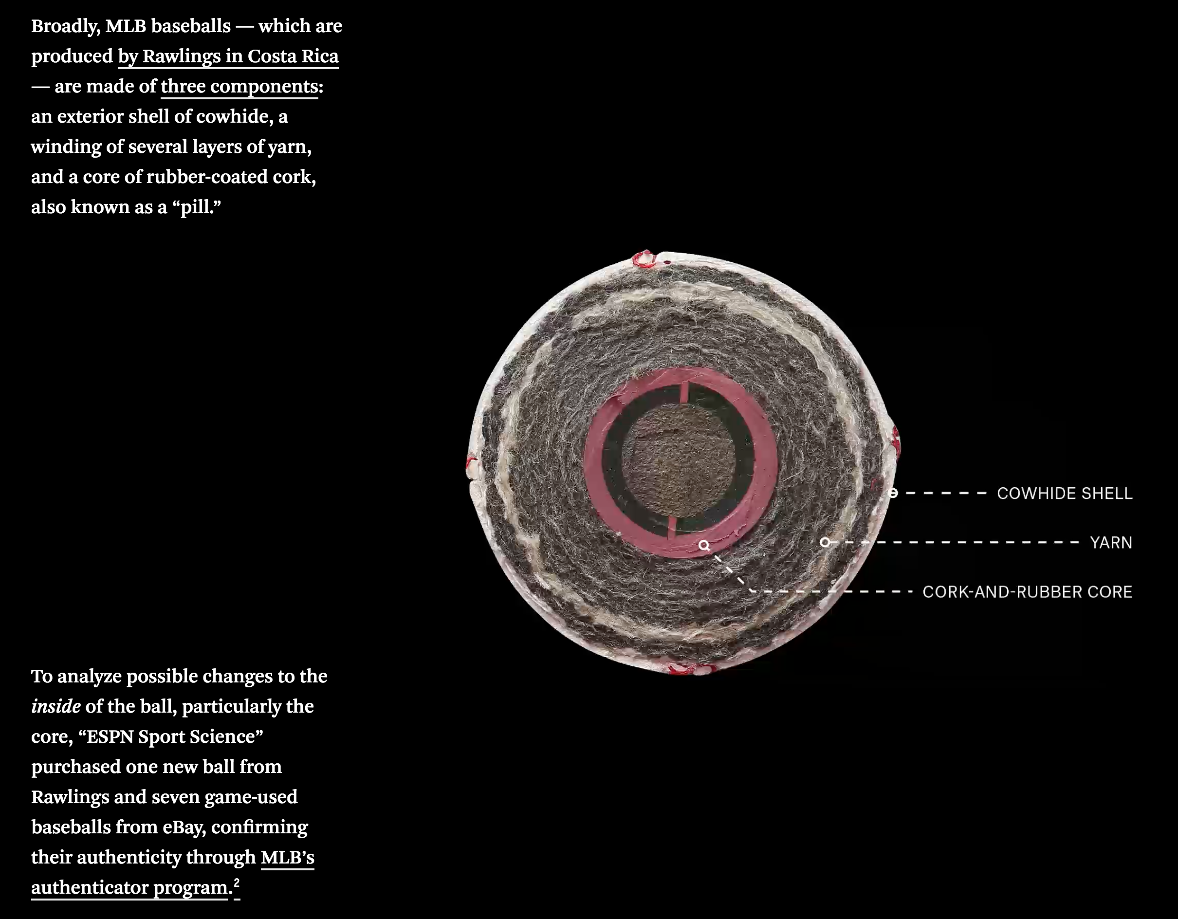
Baseball is finally back as Spring Training continues to push through March, getting us closer to Opening Day. But one lingering question from last year remains: why the increase in power and home runs? While Major League Baseball (MLB) says there has been no change to the baseball, many think otherwise.
FiveThirtyEight published a piece looking at the insides of eight baseballs, four predating the power surge, which began after the 2015 All Star Game, and three balls since in addition to a newly manufactured and unused ball.
The piece uses a few graphics to showcase the differences, including this cutaway diagram highlighting the different layers of a baseball.
What’s inside a baseball?
But the real gem is the X-ray photography done to examine the balls without cutting into them. Thankfully for those of us unfamiliar with x-rays, the designers provided a legend showing the clearly different core densities in the balls.
Old balls vs. new balls
If you are interested in baseball, and in particular the increase in home runs, the whole article is worth the short read. And if you’re not, well, the x-ray views of baseballs are still pretty neat.
Credit for the piece goes to Rob Arthur and Tim Dix.
Baseball season begins next week. For different teams it starts different days, but for the Red Sox at least, pitchers and catchers report to Spring Training on Tuesday. But the Red Sox, along with many other teams throughout baseball, have holes in their roster. Why? Arguably because nearly 100 free agents remain unsigned.
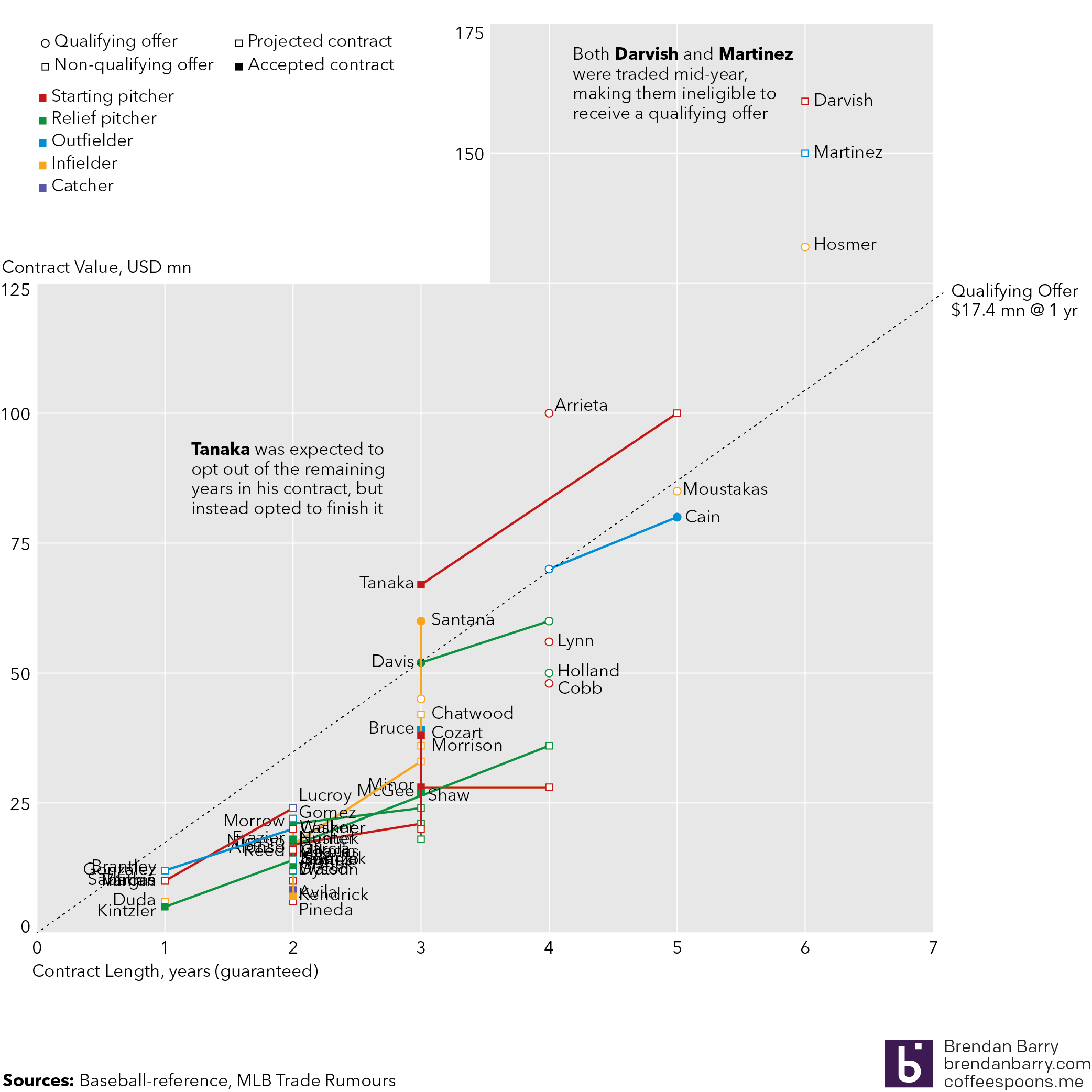
I do not intend to go into the different theories as to why, but this has been a remarkably slow offseason. How do we know? Well using MLB Trade Rumours listing of the top-50 free agents this year, and the signings reported on Baseball Reference, we can look at the upper and middle, or maybe upper-middle, tiers of free agency.
The upper tiers of baseball’s free agent market, as of 9 February
Kind of messy to look at with all the player labels, but we can see here the projected contracts, in both length and total value, along with the contracts players signed, if they have. And for context we can see how those contracts compares to the Qualifying Offer (QO). What’s that? Complicated baseball stuff that is meant to ensure teams that lose stars or highly valuable players are compensated, especially since they might come from smaller market teams that cannot afford superstar prices. The QO is meant to help competitiveness in the sport. How does it do that? Let’s just say complicated baseball stuff. We should also point out that some players, most notably the Yankees’ Masahiro Tanaka, were expected to opt out of their contracts and try the free market. Tanaka did not, which is why his projection was so far off.
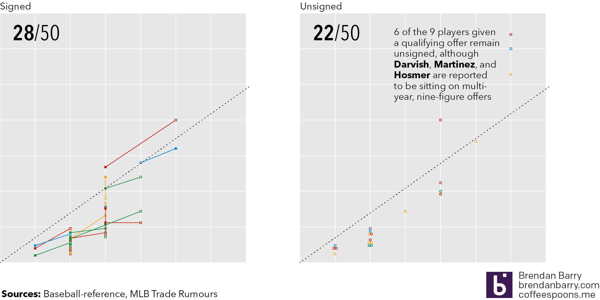
Comparing the signed to the unsigned free agents
So is it true that free agency is or has moved slowly? Consider that approximately 100 free agents remain unsigned as of late Thursday night—please no big signings tomorrow morning—and that of the top 50, 22 of them remain unsigned. And if we take the QO as a proxy for the best players in the game, add in two players who were exempt because baseball stuff, we can say that 8 of the 11 best players remain unsigned. Though, in fairness to ownership, three of those players are reportedly sitting on multi-year offers in the nine-figure range.
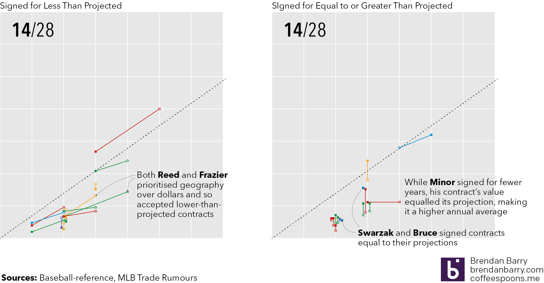
But if players are unsigned, does that mean they are competing for lower value contracts? Possibly. If we use MLB Trade Rumours’ projected contracts, because in years past they have proven smart at these things, we can see that for the 28 who have signed, it’s a roughly even split in terms of the number of players who have signed for more or less than their projection. Sometimes however, non-monetary factors come into play. Two notable free agents, Todd Frazier and Addison Reed, both reportedly signed lesser value contracts to play closer to a specified geography, in Frazier’s case the Northeast and in Reed’s the Midwest.
How are the signed players doing versus their contract projections
But the telling part in that graphic is not necessarily the vertical movement, i.e. dollars, but the horizontal movement. (Though we should call out the cases of Carlos Santana and Tyler Chatwood, signed by the Phillies and Cubs respectively, who did far better than projected.) Consider that a team might not have a lot of money to spend and so might extend a contract over additional years, offering job security to a player. Or in a bidding war, the length of the contract might be what leads a player to pick one team over another. In those cases we would expect to see more left-to-right movement. So far we have only had one player, Lorenzo Cain, who signed for more years than expected. Most players who have signed for less have also signed for fewer years. Note the cluster of right-to-left, or shorter-than-expected, contracts in the lower tiers versus the small, vertical-only cluster in the same section for those signing greater than projected contracts.
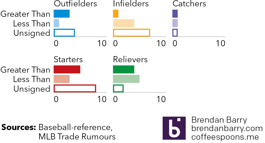
Lastly, are these trends hitting any specific positional type of player? Well maybe. Ignoring the market for catchers because of how small the pool was—though the case of Jonathan Lucroy as the unsigned catcher is fascinating—we can see that the market has really been there for relief pitchers as there are few of the top-50 remaining on the market. Starting pitchers and outfields, while with quite a few still on the market, have generally done better than projected. But infielders lag behind with numerous players unsigned and those that have signed, most have signed for less than projected.
Are there any trends at the position level
But at the same time, I would fully expect that once these higher level free agents come off the board—while one would think they would certainly be signed, who knows in such a weird offseason as this—the unsigned middle and lower tiers will quickly follow suit.
Of course none of this touches upon age. (Largely because lack of time on my part.) Though, in most cases, getting to free agency in and of itself makes a player older by definition the way baseball’s pre-arbitration and arbitration salary periods work. (Again, more baseball stuff but suffice it to say your first several years you play for peanuts and crackerjacks.)
Hopefully by this afternoon—Friday that is—some of these players will have signed. After all, baseball starts next week. If we are lucky this post will be outdated, at least in terms of the dataset, come Monday. Regardless, it has been a fascinating albeit boring baseball offseason.
Credit for the data goes to MLB Trade Rumours and Baseball Reference.
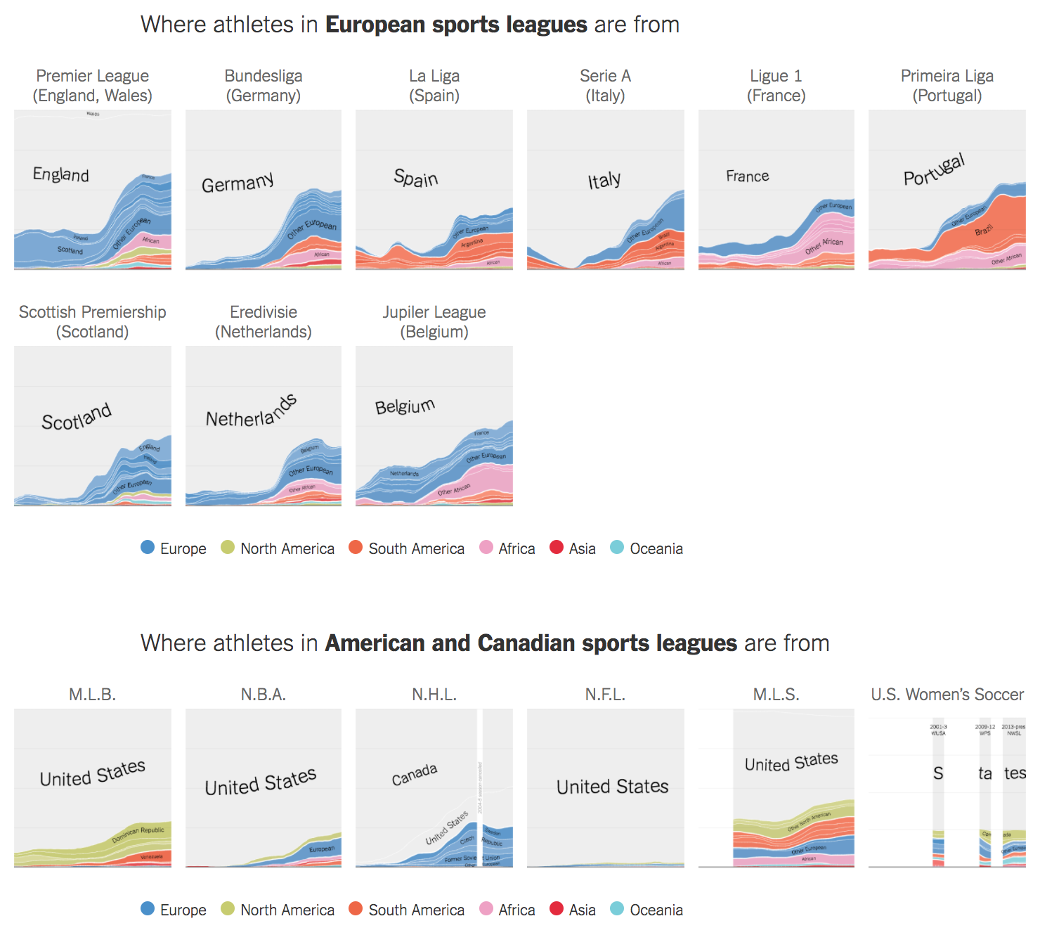
Whilst away, I came upon this piece in the following of my offseason baseball news. The New York Times published it between Christmas and New Years and the piece looks at the origins of sports persons in European football leagues compared to several American sports leagues, including American football, baseball, and basketball.
I was most confused by US women’s football, which I had not realised has not been a single continuous organisation
The piece features an opening set of small multiples comparing all the leagues. Maddeningly, I wanted details and mouseovers and annotations at the start. Fortunately, as the reader continues through the article, each small multiple becomes big and the reader can explore the details of the league.
Credit for the piece goes to Gregor Aisch, Kevin Quealy, and Rory Smith.
This week I covered a lot of Red Sox stuff. (And I received some great feedback from people, so maybe more baseball-related stats things will be forthcoming.) But, since it is Friday, I wanted to keep today late. So over breakfast I worked on a flowchart to help you choose whom to root for in the playoffs now that Boston, Colorado, Arizona, Minnesota, Washington, and Cleveland have all been eliminated.
To be fair, my second choice was good old Terry Francona and the Indians (like last year). But, the Evil Empire is returning.
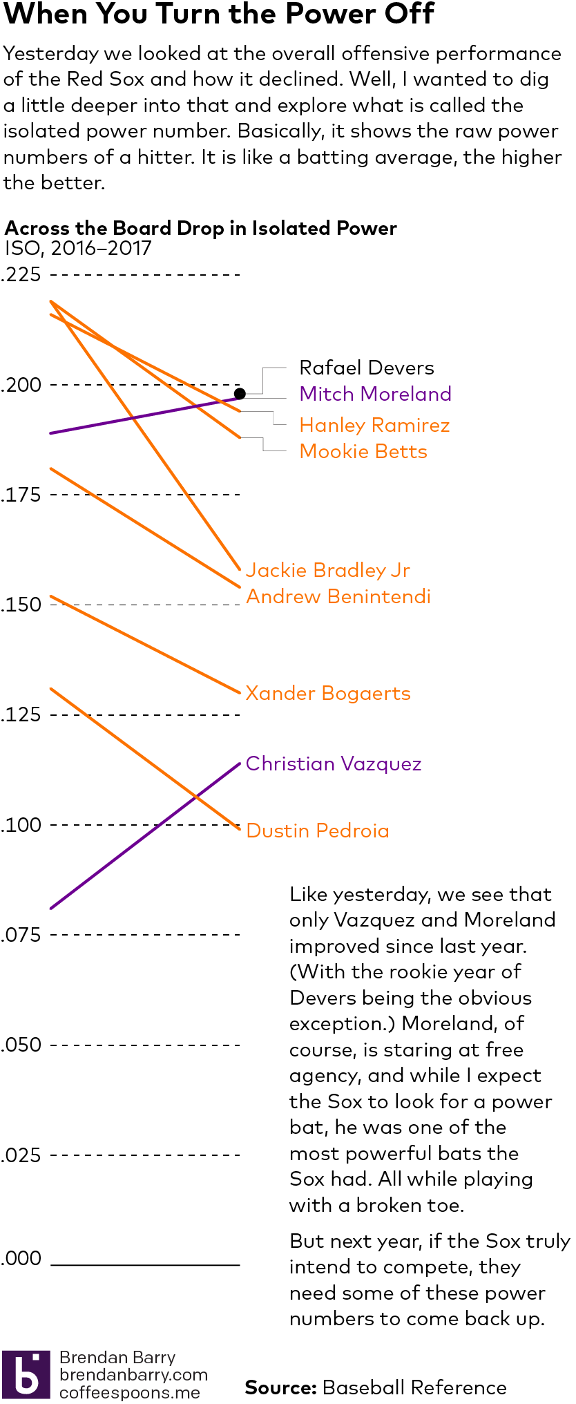
Following on yesterday’s post about the Red Sox offence, I wanted to follow up and look into their power numbers. So here we have a smaller scale graphic. Nothing too fancy, but the data backs what my eyes saw all year. A definite power drain up and down the Red Sox lineup in 2017.
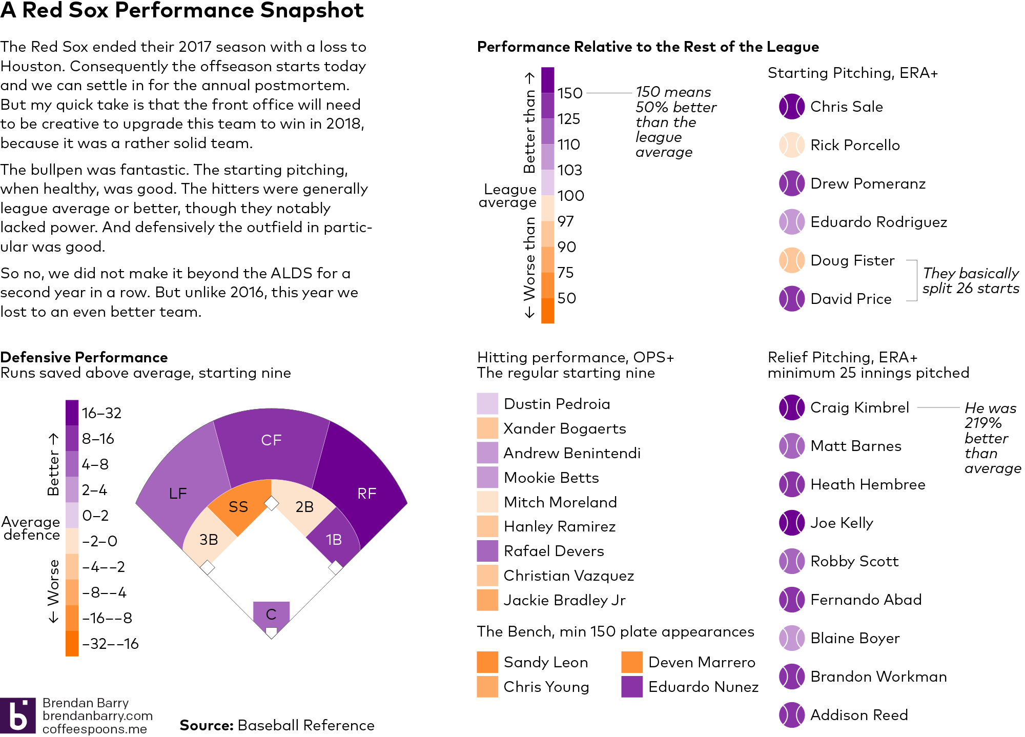
Well the 2017 season ended yesterday afternoon for my Boston Red Sox as we lost 5–4 to the Houston Astros and they took Game 4 of the ALDS. So this morning we will surely see the critiques and hot takes on what to do to improve the team begin to make the internet rounds.
But before we get into all of that, I wanted to take a look at the 2017 season from a data perspective. At least, the regular season. After all, we can see how Sale in Game 1 and Kimbrel in Game 4 just had poorly timed bad days. But what about the other 162 games? After all, we will need to win a lot of them if we want to make it back to the playoffs in 2018.
I just pulled a couple quick stats from Baseball Reference. Now we can quibble about which stats are best another time, but from my experience the more sabremetric datapoints are lost on a general audience. So here we are using OPS, basically a hitter’s average combined with his power/slugging ability, and ERA, the amount of runs a pitcher can be expected to allow every nine innings. I also threw in defensive runs saved above average, i.e. is the player saving more runs than an average player.
You can read the graphic for the details, but the takeaway is that Boston, we need not panic. The 2017 Red Sox were a good team. Far from perfect—here is looking at you lack of middle-of-the-order power—but a solid lineup, good rotation, good defence, and a fantastic bullpen. How can we add without subtracting too much?
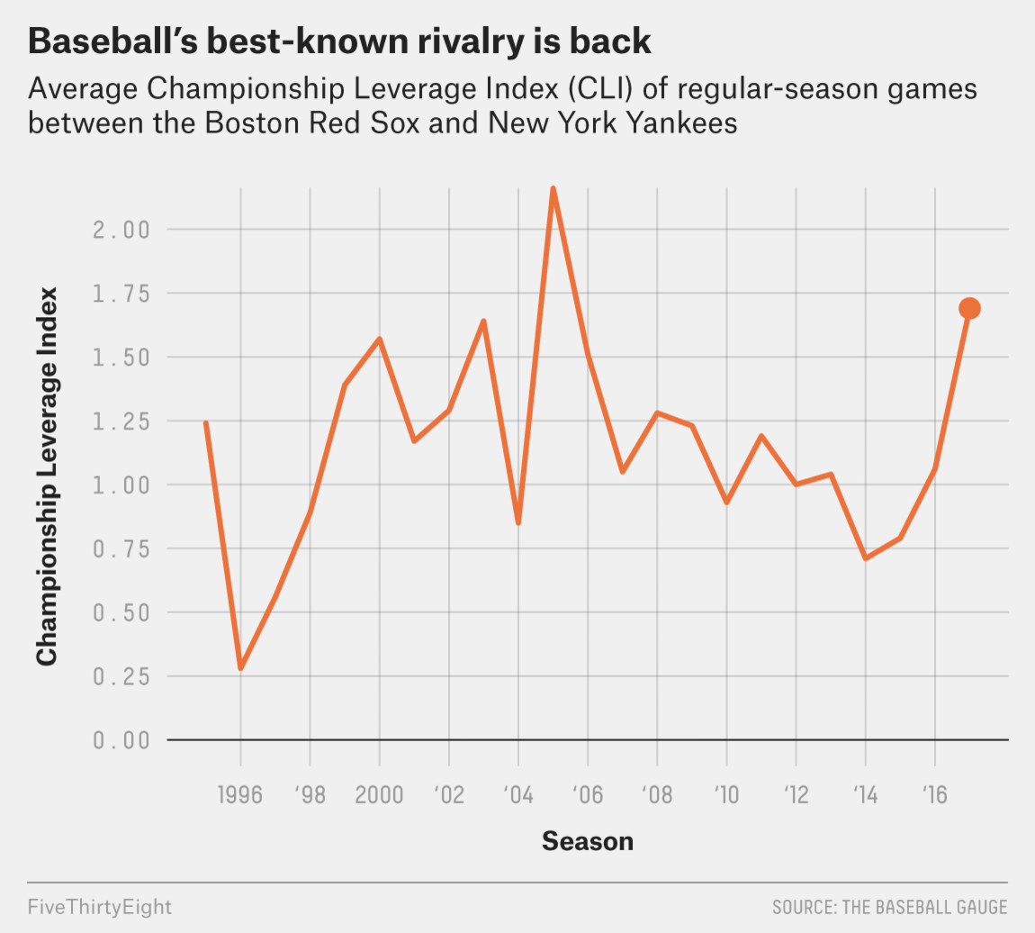
But to be honest, it never really went anywhere. As you know, your humble author visited Boston this past weekend and got to see two games of his Red Sox against Tampa Bay. Tampa, of course, is not the rivalry to which I am referring, but things were heated back in the days when Maddon managed Tampa.
No, I am of course talking about the Red Sox–Yankees rivalry. Two weeks ago FiveThirtyEight posted an article about the rivalry and how it has returned. Admittedly, they meant not from the perspective of bitter hatred for all things Yankees, but rather that the Yankees are attempting to be good again.
This chart from the article is nothing more than a line chart. But I just wanted to point out that the rivalry lives, though in my mind it never really went away.
Down with the Empire…
Credit for the piece goes to the FiveThirtyEight graphics department.