Baseball’s Pace of Play and ESPN’s Pie in Their Face

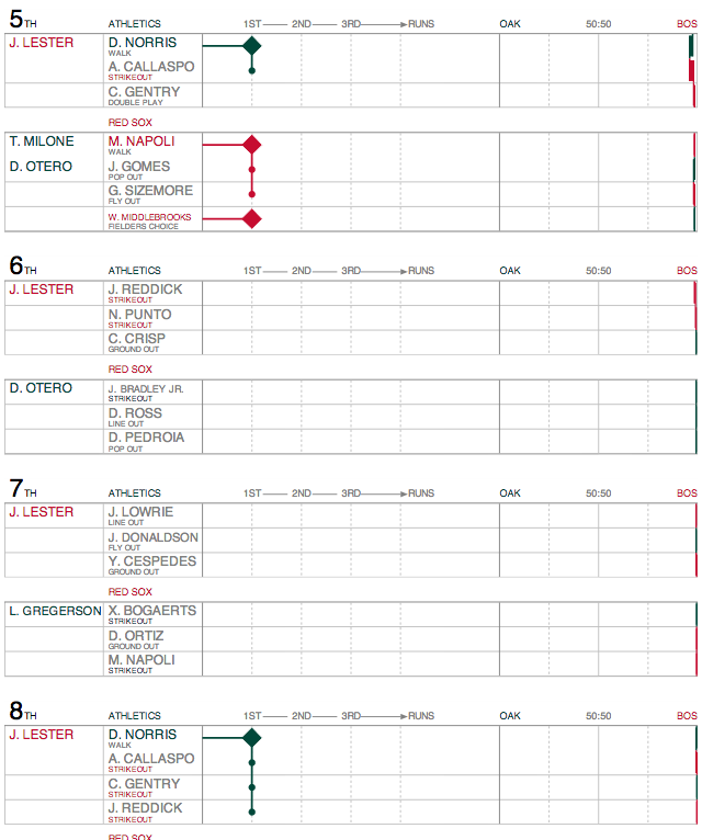
Baseball is my sport. I love it. Some of my favourite games are the four-hour long matches between my Red Sox and the scourge of the Earth, the Yankees. Games can take a long time for a number of reasons. But in an increasingly fast-paced world, critics argue that younger generations do not have the patience for even three-hour games. So Major League Baseball this year is actively trying to reduce the time of games through pace-of-play improvements. To do this, they are looking at and collecting more of baseball’s copious amounts of data.

Unfortunately, ESPN in an article about the improvements for this year took the data and did nothing with it.

For the love of god, why?

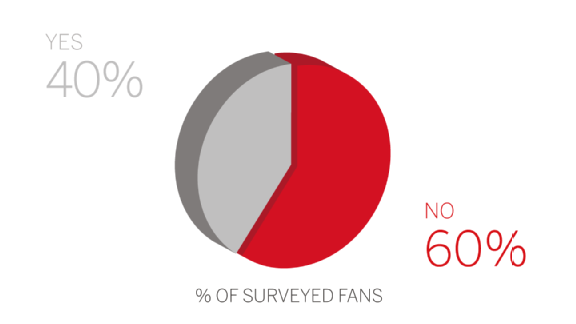
Above we have survey results. I want to vomit in my mouth. Wait, hold on…sorry about that, I am back now. Some organisations have done some really nice visualisations with baseball data, of which we have a lot because the sport plays 162 games per year. We surely could be looking at more timing data. But, instead we get three-dimensional pie charts from ESPN. The rest of the article is not much better, though their styling of bar charts still leaves things to be desired.

Credit for the piece goes to ESPN’s graphics department.

Where to Catch Foul Balls

As we established yesterday, baseball is rumbling back to life with Spring Training. That means it is time to start buying tickets for games. But if, like me, you have never caught a foul ball or home run, you may want to sit in a location where you can optimise your chances. Where is that? Well, now we have an app for that, Ideal Seat, as covered by Time. It uses interactive maps of stadiums and data on where hit balls land to generate an average number of balls per game—an average of about 30 foul balls per game.

Safeco Field as a sample

Credit for the piece goes to Ideal Seat.

Baseball Is (Almost) Back

As the title says, baseball is almost back. Red Sox spring training games begin as the Red Sox take on Northeastern today. The off-season is perhaps the hardest part of the year for a fan, because unless you take super interest in trades, there is no baseball. But what about on Twitter? Well, today’s piece is an article from Fangraphs that looks at team-by-team off-season Twitter use.

Twitter engagement
Twitter engagement

Personally, I am not really a fan of the graphic. As a static image, it does not allow me to easily compare the different retweets or favourites. But, in the aggregate, you can see that the Seattle Mariners are perhaps the most active Twitter account.

Credit for the piece goes to Sean Dolinar.

Big Dollar Baseball Pitchers

For those knowing baseball, Max Scherzer has almost officially signed with the Washington Nationals for lots and lots of cold hard cash. Over $200 millions’ worth. But how do these big dollar contract pitchers compare over the years? Thankfully the Washington Post took a look at that for us.

A few of the $100 mn plus contract pitchers

Credit for the piece goes to Todd Lindeman.

Baseball Transaction Trees

Baseball’s Winter Meetings often provide fans with lots of trade news and free agent signings. As a Red Sox fan, one of the unfortunate signings was the Cubs picking up Jon Lester. For my friends back in Philly, Jimmy Rollins is headed to Los Angeles. But then for Boston, at the time of writing it appears a deal may be imminent for Arizona’s Wade Miley in exchange for Allen Webster and Rubby de la Rosa.

The reason I mention all those names is that they reminded me of a series of graphics from last month that looked at the longest transaction trees for each team. Put simply, how far back can one guy being traded for another guy being signed as compensation for another guy leaving get you back in history. The following graphic tracks a different Red Sox trade, of Anthony Ranaudo and Brandon Workman in 2014 back to the signing of Ken Ryan in 1986.

The transaction tree for Ranaudo and Workman

But what reminded me more specifically was the note that followed the above graphic that had Allen Webster as the longest trade-only tree for Boston. That starts because of the Hanley Ramirez signing in 2000—who returned to Boston only a few weeks in a free agent signing. Similarly, Jimmy Rollins was the longest transaction tree for the Phillies since his signing back in 1996. But that will now change once the players in exchange for Rollins are made clear.

Credit for the piece goes to Ben Lindbergh.

Some of the Best Baseball I’ve Ever Seen

Was ten years ago this time in October. Boston was on their way to winning their World Series in 86 years. But to get there, they had to go through the New York Yankees. And they did it in dramatic fashion, winning a riveting best-of-seven series. Why riveting? Because it had never been done before. (Nor since, actually, but that’s not included in the graphic.)

The improbable comeback

Hitting a Baseball

Tonight is Game 5 of the National League Championship Series. For those of you who do not follow baseball, this is the semi-finals for the national championship called the World Series. Anyway, hitting a baseball is hard because you have so little reaction time. The Wall Street Journal has an article about how some baseball teams are beginning to experiment with neuroscience. The idea is to better train hitters to recognise pitches earlier, in essence, giving them said reaction time. The article is accompanied by an illustration showing just how little time there is to hit a pitch.

Think quickly
Think quickly

Credit for the piece goes to Mike Sudal.

Ballpark Beer

This evening I am going to be taking in a game at Fenway. So I leave you with today’s blog post comparing beer at different ballparks.

Fenway vs. Citizens Bank

Credit for the piece goes to Kevin Schaul, Kelyn Soong, and Dan Steinberg

Tommy John Surgery

Time for some sports. Okay, I’m admittedly thinking of it because company softball started up again. And for some reason, the teams have a horrible habit of horrendous injuries. So what better way to commemorate (a week late, whatever) the start of the season than a nice illustration of Tommy John surgery. For those of you unfamiliar with it, in baseball the injury that requires the procedure typically befalls pitchers—though not always—and keeps them away from the game for at least a year.

Tommy John surgery
Tommy John surgery

Credit for the piece goes to Bonnie Berkowitz and Alberto Cuadra.

John Lester Dominates

This past weekend was some good Red Sox baseball. Okay, so we only won two of three from Oakland, but that second game was fantastic. John Lester dominated. Last fall I mentioned a studio called Statlas that was visualising the World Series. They continue to update and tweak their product and so it was great to see Lester’s performance documented.

Lester dominates
Lester dominates

Though, as you can see, Lester so dominated the Athletics, you can see almost nothing happening from Oakland’s batters. But, I will skip the near ninth-inning implosion of Boston’s relief corps that nearly cost us the game. Mostly because the visualisations of the game tell a great story. And so if you like baseball and data visualisation, you should check it out.

Credit for the piece goes to Statlas.