Boston: Sportstown of the 21st Century

Tonight the Boston Celtics play in Game 1 of the NBA Finals against the Golden State Warriors, one of the most dominant NBA teams over the last several years. But since the start of the new century and the new millennium, more broadly Boston’s four major sports teams have dominated the championship series of those sports. In fact tonight marks the 19th championship series a New England team has played since 2001. And in those 18 series thus far, Boston teams have a 12–6 record.

Let’s go Celtics.

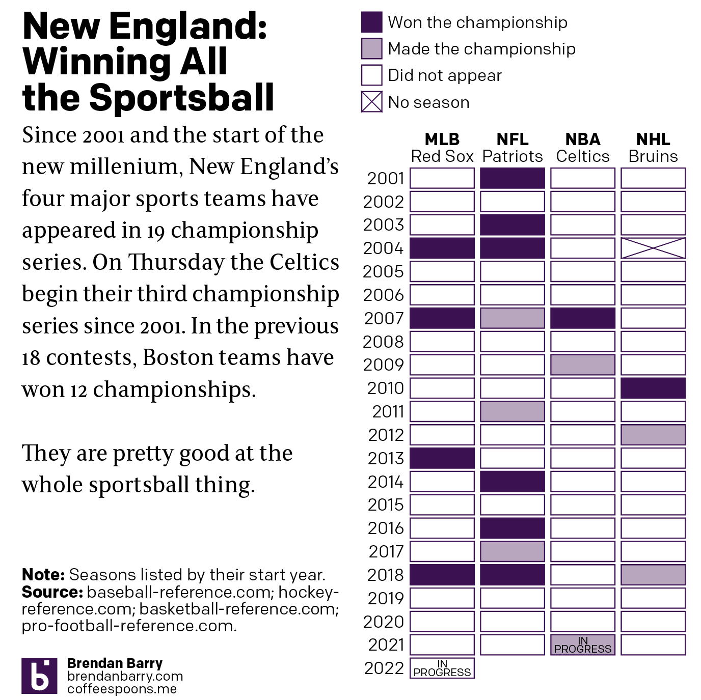
Of the 12 titles won, the New England Patriots account for half with six Super Bowl victories out of nine appearances. The Boston Red Sox have won all four World Series they have played in since 2001. Rounding out the list, the Celtics and Bruins have each won a single championship with the Bruins appearing in three Stanley Cups and the Celtics in two NBA Finals. Tonight begins their third.

Credit for the piece is mine.

Golden Buttered Popcorn

We are in the midst of basketball playoffs right now. And one of the teams participating is the Golden State Warriors. They are pretty good at this whole basketball thing. One of the reasons is their star player Steph Curry. And it turns out that he is an enormous fan of popcorn. So much so that despite the widespread focus on power foods and healthy eating and wellness lifestyle, he devours the stuff before matches. So much so that NBA minders had to remove it from his hands during an all-star match last year.

He agreed to a request from the New York Times to rank each stadium, from 1 to 29, on the best popcorn. But he then went further and suggested that he rank the popcorn on a five-point scale on five different metrics: freshness, saltiness, crunchiness, butter and presentation. Naturally, the Times agreed. And he prepared a dataset that the Times turned into this heat map.

He's so honest, his own stadium doesn't rank in the top five.
He’s so honest, his own stadium doesn’t rank in the top five.

The whole article is well worth a read for more insights into the player and his take on popcorn. I don’t know a thing about basketball, but if a player agrees to a request to rank stadiums based on their popcorn, but then goes further to create additional data that can be used to turn into a visualisation, he’s probably my favourite player. If only someone had asked this of Pedro, Nomar, or Big Papi back in the day. Here’s looking at you, Laser Show.

Happy Friday, everyone.

Credit for the piece goes to Steph Curry and Marc Stein.

Be Like Mike?

Back in 2012 the New York Times ran what is a classic data visualisation piece on Mariano Rivera. It tracked the number of saves the legendary Yankees closer had over his career and showed just how ridiculous that number was—and how quickly he had attained it. Last week, the Washington Post ran a piece that did something very similar about LeBron James, a future basketball legend, and Michael Jordan, definitely a basketball legend.

They might have game.

The key part of the piece is the line chart tracking points scored, screenshot above. It takes the same approach as the Rivera piece, but instead tracks scored points. Unlike the Rivera piece, which was more “dashboard” like in its appearance and function, allowing users to explore a dataset, this is more narratively constructed. The user scrolls through and reads the story the authors want you to read. Thankfully, for those who might be more interested in exploring the dataset, the interactivity remains intact as the user scrolls down the article.

While the main thrust of the piece is the line chart, it does offer a few other bar and line charts to put James’ career into perspective relative to the changing nature of NBA games. The line chart breaking down the composition of James’ scoring on a yearly basis is particularly fascinating.

But, don’t ask me about how he fits into the history of basketball or how he truly compares to Michael Jordan. Basketball isn’t my sport. But this is a great piece overall.

Credit for the piece goes to Armand Emamdjomeh and Ben Golliver.

Basketball Tournament Locations

My apologies to those of you who are big fans of basketball. Since it is not really my sport of choice, I had no idea that March Madness started yesterday. Otherwise, I would have posted this earlier.

FiveThirtyEight analysed the locations of basketball conferences’ tournaments relative to the geographic centres of said conferences. As it turns out many conferences do not play near their centre. The article goes on to suggest cities near their conference centre.

All the locations…
All the locations…

As a geography nerd, I found the whole exercise fascinating. I only have a few peccadillos with this. I would have loved to see a follow-up map with their suggested locations plotted against the centre and the actual tournament location.

Secondly, the first three maps highlight how the tournaments are being played in New York. But in the first they label it as Brooklyn. Then the next two just use NYC. Since Brooklyn is part of New York, why use Brooklyn instead of NYC? Or instead of NYC, use Manhattan.

Again, my apologies for not realising this should have been up earlier this week. So for those of you who do participate in the bracket challenges, hopefully your brackets are still more or less intact. And best of luck with the rest of the tournament.

Credit for the piece goes to Neil Paine and Ella Koeze.

The Internationalism in Sport

Whilst away, I came upon this piece in the following of my offseason baseball news. The New York Times published it between Christmas and New Years and the piece looks at the origins of sports persons in European football leagues compared to several American sports leagues, including American football, baseball, and basketball.

I was most confused by US women's football, which I had not realised has not been a single continuous organisation
I was most confused by US women’s football, which I had not realised has not been a single continuous organisation

The piece features an opening set of small multiples comparing all the leagues. Maddeningly, I wanted details and mouseovers and annotations at the start. Fortunately, as the reader continues through the article, each small multiple becomes big and the reader can explore the details of the league.

Credit for the piece goes to Gregor Aisch, Kevin Quealy, and Rory Smith.

Contextual Scatter Plots

I know I mentioned that I would review the coverage of the Orlando shootings this week in more depth than I did on Monday. But, allow me an interruption for a nice little piece that I wanted to get to last week. If anything, it’s far less serious.

Scatter plot
Scatter plot

My apologies for my focus of late on small graphics, but I really think they are underappreciated component of providing context to written analysis. And this piece from FiveThirtyEight about the point scoring accompanies some good analysis that actually made some sense to this non-basketball fan.

Note the two finals-playing teams are highlighted—and importantly how the text is cleared with interrupted chart lines, a very nice touch—while other teams remain visible but unidentified for context.

Credit for the piece goes to Neil Paine.

Basketball Finals

So the basketball finals begin tonight with the Cleveland Cavaliers taking on the Golden State Warriors. This is also the part of the post where I fully admit I know almost nothing about basketball. I did, however, catch this so-labelled infographic from ESPN contrasting the two teams.

Point differential
Point differential

What I appreciate at this piece is that ESPN labelled it an infographics. And while the data might be at times light, this is more a data-rich experience than most infographics these days. Additionally the design degrades fairly nicely as your browser reduces in size.

The chart formats themselves are not too over-the-top (that seemed like a decent basketball pun when I typed it out) with bars, line, and scatter plots. Player illustrations accent the piece, but do not convey information as data-encoded variables. I quibble with the rounded bar charts for the section on each team’s construction, but the section itself is fascinating.

I might not know most of the metrics’ definitions, but I did not mind reading through the piece.

Go Red Sox.

Credit for the piece goes to Luke Knox and Cun Shi.

Nova Beats the Buzzer

As you may know, while I presently live in Chicago, I hail from Philadelphia. I grew up there and most of my best mates did too. And some of them attended a small school called Villanova. And as you may know, their men’s basketball programme just won the national championship in dramatic fashion. So today’s post shares with you a graphic from the Wall Street Journal that explains how Villanova won the game in the final few seconds.

The final shot won it all

Credit for the piece goes to the Wall Street Journal graphics department.

LeBron James in the NBA Finals

I really do not know much about basketball. I did not realise that the finals had been going on. But, rest assured, they were. The Washington Post looked at whether or not LeBron James had the best finals match performances since 1985. It turns out, not so much. For those of you from the Chicago area, you may instead take solace that one of those guys from that Chicago team represents well.

The top five performances since 1985

Credit for the piece goes to Todd Lindeman and Richard Johnson.

Basketball Data Visualisation

I really am only a one sport kind of guy. Basketball is not that sport. However, similar to baseball, it is a sport that plays many games and has many in-game actions, which allows for data collection and analysis. This Washington Post piece looks at the season for some player named Bradley Beal. Ask me to interpret the data, and that’s a different story. But, I am sure it will make sense to you basketball fans out there.

Whence good and bad shots came

Credit for the piece goes to Todd Lindeman and Lazaro Gamio.