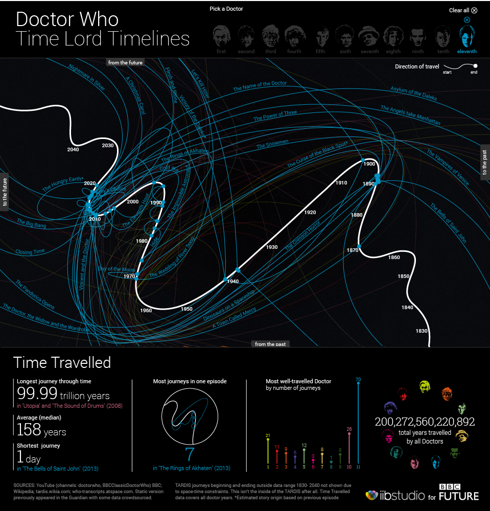
Following last week’s post about Doctor Who comes another because, since this is the last post of the week, you might as well enjoy it. This interactive graphic from the BBC looks at the Doctor travelling across time. And while you might dismiss it as being silly fun, pay close attention to the layering of timelines and the information provided in each line, i.e. click on one. Additionally, the bottom panel contains some broader context. Overall, this is a very smart piece.
The Doctor’s Travels
Credit for the piece goes to iibStudio and the BBC graphics department.
Doctor Who? Exactly. This weekend, Saturday in fact, is the 50th anniversary of British sci-fi show Doctor Who. That is not to say it has been airing for 50 years. In the 1990s and early 2000s the show was off the air, living on only in audio broadcasts and novelisations. But in 2005, the show was relaunched and it slowly began to acquire a new generation of followers. Some, like your author, have watched it in the States first via SyFy since 2006.
Still 50ish years of television about time travelling through space in a blue police box makes for lots of data. And so back in March Simon Rogers created this infographic to explain some of the history of the show.
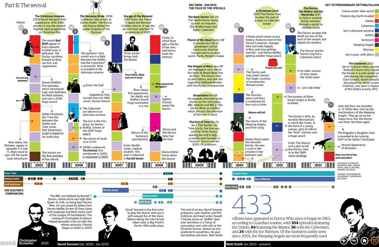
The Guide to Doctor Who
If you intend on watching the 50th special this weekend—or Monday in some movie theatres here in the States—and you want to brush up on the timeline of the Doctor and his travelling companions, the Guardian also has this graphic.
The Guardian’s gallery of Doctors
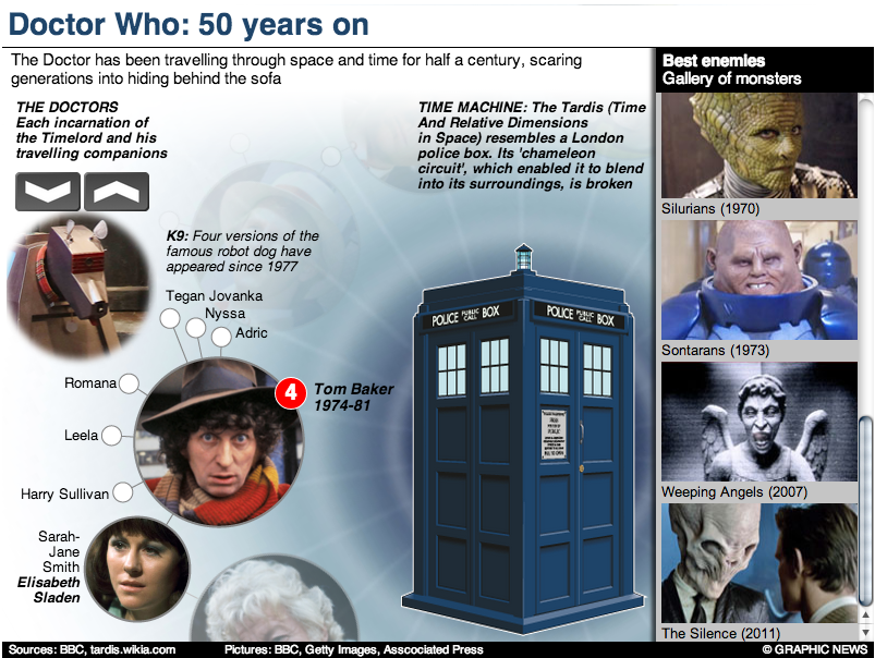
But of course the BBC, which produces Doctor Who, has a more in-depth site about the history of the character and the show. Did I mention the content is displayed within the TARDIS? I know, it’s bigger on the inside.
The BBC’s inside the TARDIS
Have you ever watched the show? Do you have a favourite Doctor? A favourite companion?
Credit for the first Guardian piece goes to Simon Rogers.
Credit for the second Guardian piece goes to the Guardian’s Graphic News team.
Credit for the BBC piece goes to Christopher Ashton, Christine Jeavans, Helene Sears, Tian Yuan, Nick Davey, and Ben Fell.
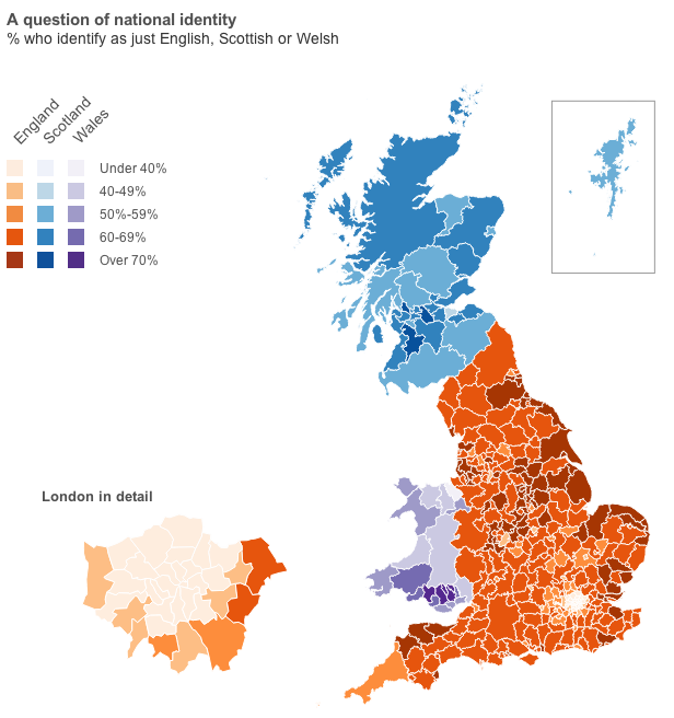
Well, you will have to click through to the article for that data visualisation. But, I will provide you with the choropleth map of national identities. That is, how English do citizens in English authorities consider themselves? Scottish in Scotland? Welsh in Wales?
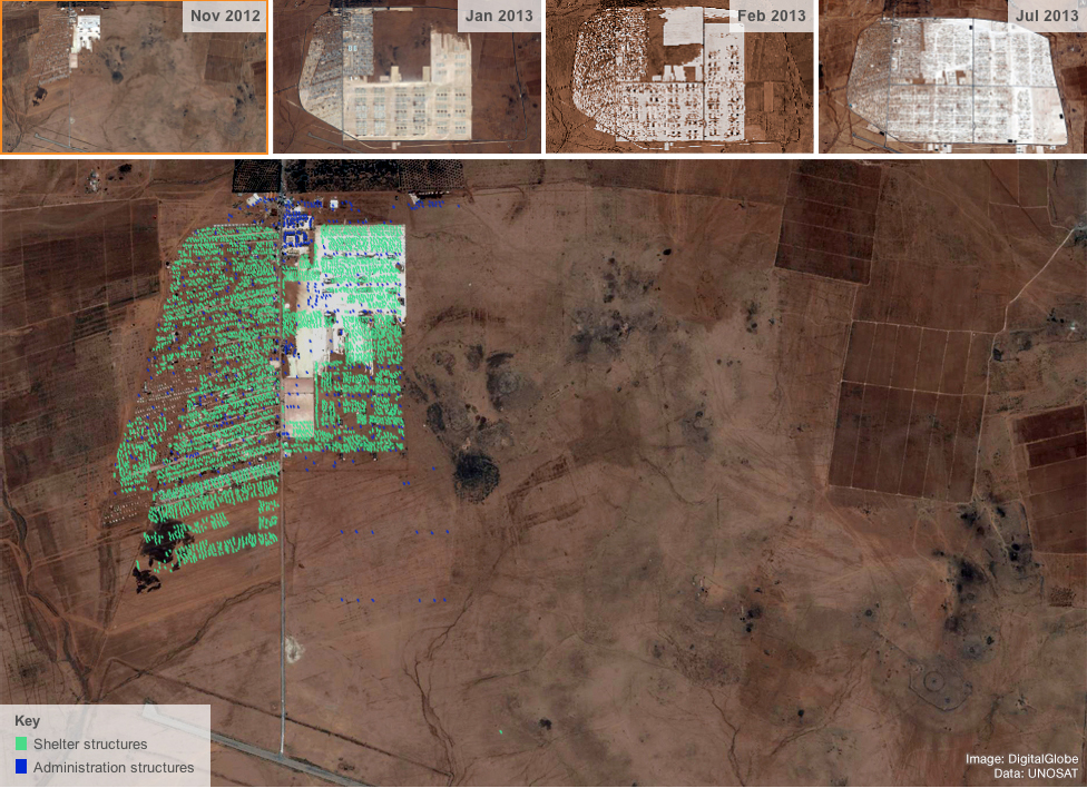
The Syrian crisis is pushing people out of Syria. Unfortunately, most of the refugees are fleeing to places not wholly equipped or supplied to handle such large numbers. In this interactive piece of journalism, the BBC explores the difficulties in just one camp, Zaatari in the desert of Jordan.
My favourite element is this interactive map. It uses four satellite photographs taken at a few months interval and compares the growth of the camp; the growth is striking. The piece contains a diagrammatic view of the camp, identifying key areas, e.g. education areas, as well as a comparison to a new refugee camp named Azraq to host the overflow population. Fortunately, that camp is being designed with the lessons learned from Zaatari.
Zaatari Camp in November 2012
Credit for the piece goes to the BBC graphics team.
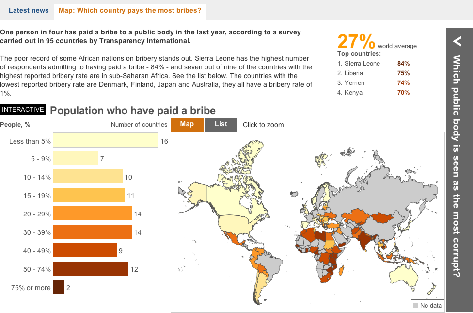
Some say bribes grease the wheels of business. But if that is the case, where are the greasiest wheels? This interactive piece from the BBC showcases an interesting story. It maps who has paid bribes and the value thereof. Then it looks at corruption in the different sectors of the country and which is perceived to be the most corrupt.
A look at bribery
Aesthetically this is not the finest piece. Some of the most interesting countries to view are in Africa and Southeast Asia, i.e. geographies near the equator. Unfortunately the designers here chose a map projection that emphasises Siberia and Arctic Canada at the expense of those very countries. Also, where did Greenland go? I know that the ice is melting, but I don’t think it’s melted that quickly. Furthermore, if the user clicks the “List” option, he or she is presented only with a list of geographies. None of them are selectable nor do they encode data. So why is the list there?
In short, the interface is a bit clunky and strangely designed. Line lengths are too long and it looks ugly. But, there are two interesting things going on here worth noting. First the legend here actually does not just show the range for the choropleth, but it also encodes the number of countries that fall within that range.
Second, by clicking on a particular bin for the legend, the map filters for the selection. I think that from a design perspective, a lighter grey and a lighter stroke outline would have made the filtering a bit more prominent, but the idea is interesting. Unfortunately, I found no way of easily returning to an all-bin view of the map.
A piece for the BBC that misses a few, but also hits a few.
Credit for the piece goes to the BBC graphics team.
It’s Friday. So what else could you want but cat videos?! On the internet?!
But seriously, that’s what I have for you today. But with a twist. The BBC and the Royal Veterinary College collaborated to document a day in the life of cats by attaching collars with micro-cameras and GPS trackers to several felines in one English village. Cats are selected by illustration at the top of the graphic. Their day’s walking path is traced out over the village while video clips of some of the more interesting parts of the day are available to watch.
A day in the life of Phoebe the cat
Credit for the piece goes to Steven Atherton, Chris Finch, Alex Ranken, Lucy Rodgers, Helene Sears, Marina Shchukina, and Noah Veltman.
The United Kingdom is one of eight, probably nine nuclear powers. (Israel has never confirmed that it has tested/operates nuclear weapons.) Unlike most countries, the UK only uses one delivery system to operate its weapons: submarines using Trident ballistic missiles.
A triad power is a country with all three delivery systems
The British Trident system became an issue in the coalition government. While it was supported by both the previous Labour government and the Conservatives, the programme had to be reviewed per the coalition agreement. The review has been completed and it will be made public. But to explain to the public how Trident works, the BBC created this graphic. It does a really good job of showing the reach of the British submarines from one location, but then showing why an adequate replacement would need at least three to four submarines.
The British Trident programme
Credit for the Trident graphic goes to the BBC. The table is my own work.
Dornier was a German aircraft manufacturer active during World War II. One of their more interesting designs was the Do-17 bomber, nicknamed the Pencil Bomber because of its unusually thin fuselage. All surviving examples of the aircraft were thought destroyed until one was found on the floor of the English Channel. Yesterday the Royal Air Force Museum raised it from the seafloor to preserve it and eventually display it as a museum piece.
The BBC created this interactive piece or illustration to explore the aircraft. The illustration is not the greatest, but this does appear to be a new type of interactive piece for their design team. Accompanying the piece is a bit of text asking for feedback.
Dornier Do-17
Credit for the piece goes to Tian Yuan, George Spencer, Paul Sargeant and Mark Bryson.
Earlier this week, the Office of National Statistics in the United Kingdom released census results for England and Wales. (Northern Ireland and Scotland are reported separately.) England has more people than expected, most likely because of undercounting of immigrants, and Wales is now some three million and counting. There are fewer Christians than expected—and fewer Jedi than I expected—as the ranks of the non-religious grow. But from of course all of this comes a bevy of visualisations. These are but a few, but if anybody finds others worth nothing, please feel free to send them my way.
Straight from the source is a set of interactive mapping applications from ONS that compare 2001 data to 2011 data. As best it can, census districts are compared on a one-to-one basis, but with boundary changes that isn’t always possible. Clicking on district provides one with details about the responses for that area.
% Christian across England and Wales% Christian in North Devon
Perhaps the one thing missing from these—and it may well owe to the aforementioned boundary changes—is a map of changes to see which areas have been most impacted. Or a map of the results compared to the average to see where the average can be found and where the positive and negative extremes can be found.
An infographic from the Guardian looks at the overall dataset with quite a few maps and then circle-y things. While the large map is the white population in 2011, the remaining maps are before and after comparisons. Again, an interesting look would have been perhaps deviations from the average or of the actual change per district.
UK Census results visualised
I appreciate the impact of the main story, the increasing diversity of England and, to a lesser extent, Wales. London in particular is now minority white. However, I am less keen on the circle-y things and that data could probably have been presented in a clearer, more direct fashion. I am not a fan of red, yellow, and green traffic light colours, but I also recognise that the Guardian is working within their brand on this.
Unfortunately this interactive map of Northern Ireland’s national identity does not quite work for me. I appreciate the toggle between the different response options, however, I find the responses themselves hard to compare. The colours remain the same, but the scales for the results change. For those identifying as Northern Irish, the top value is clearly less than those identifying as either British or Irish. But I would have liked to have seen the scales for British and Irish to closer match. I also find the black background distracting and overwhelming the colours. I wonder how the result would have worked if treated with the above aesthetic.
British identity in Northern Ireland
The BBC took a stab too with a section devoted to the results. Unlike the ONS visualisation above, however, the side-by-side comparison is forced to be smaller with the included text. And when one zooms into a particular district, the map degrades into crude polygons—a particular pet peeve of mine—that would be unrecognisable to someone familiar with the intimate geographic details of their home region. (Yes, simple shapes make the files smaller for overview maps, but when seen up-close, they lose their value by making ugly maps.) Also, the colours and bins in this particular view are not as informative as in the view above.
Christianity in England and WalesChristianity in North Devon
The BBC, however, did create a small graphic for an article that showed population changes in the districts, alas the colours did not work as well as one would hope.
Population Change
That’s a lot for people to digest, but, overall I think the clearest visualisations go to the ONS. They lack the commentary that can be brought by journalism organisations, e.g. the BBC, but one needs a clear and powerful visualisation before one can start writing an analysis.
Credit for the ONS results goes to the ONS Data Visualisation Centre, for the Guardian infographic credit goes to Paul Scruton and Mark McCormick, for the Northern Ireland piece credit goes to John Burn-Murdoch, and credit for the BBC goes to the BBC.
Perhaps the greatest danger now facing NATO and US troops in Afghanistan is the age-old wolf in sheep’s clothing, the insurgent dressed in Afghan Army fatigues. As the graphic below shows, the number of fatalities has been increasing along with the number of attacks. The silver lining in the cloud (to mix metaphors) is that the average lethality of the attacks is on the decline as fewer ISAF soldiers are killed per attack.