Two weeks ago I posted about an article from the BBC that used graphics about which I was less than thrilled. Inconsistent use of axis lines, centring the graphic were two of the things that irked me. Two weeks hence, I do want to draw some positive attention to another article in the BBC. This one discusses the, for many of us, impending return to the office. (I’ve also heard the phrase “return to work”, although a coworker of mine pointed out that’s not a great phrase because many of us never stopped working when we decamped for our flats and houses.)
The article discusses why some think the return to a five-day office week will occur within the next few years. There is some sound logic to the idea and for those like your author who are closely following the issue, I recommend the article.
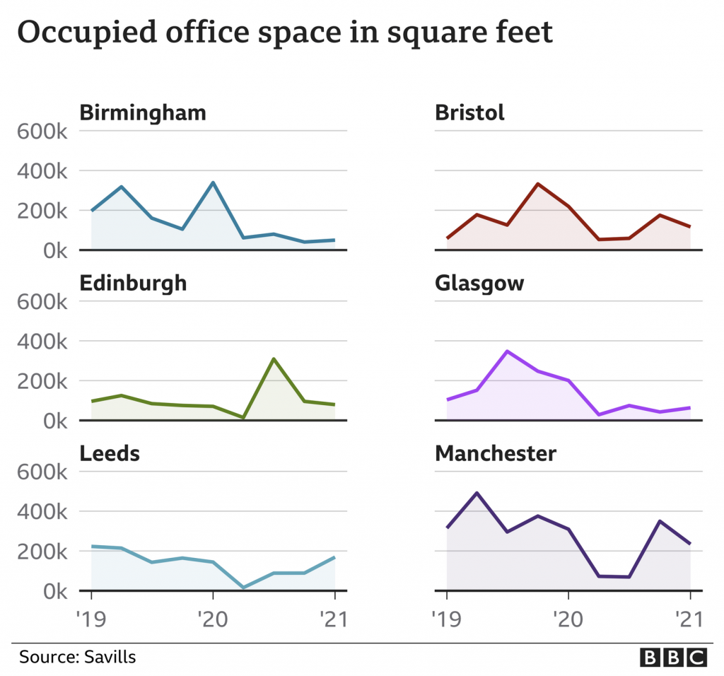
But that’s not why we’re here, instead I wanted to focus on the one data visualisation graphic in the piece. It displays the amount of office space used in the city centres of six different UK cities outside London.
But what about Slough?
Here we have small multiples with the same fixed y-axis display. Axis lines are present and consistent and the baseline is distinct from the other lines. Solid improvement over what we discussed two weeks ago.
My only quibble? The colours here are not necessary. A single colour would work because each city’s graphic exists apart from the rest. The charts also all represent the same type of data, occupied office space. If the chart were doubling or tripling up cities somehow—though I wouldn’t want to see this as a stacked area chart—I would buy the need for colours to differentiate the cities. This, however, represents an opportunity to use a single, BBC-branded colour to define the experience whilst not negatively impacting the communication from the data visualisation standpoint.
Again, though, that’s a minor quibble. Of course, the BBC puts out copious amounts of content daily and I see only a fraction, but it is nice to see an improvement. Furthermore, at the end of the article I also spotted a graphic credit, which I don’t often see—and honestly cannot recall when I last saw period—from the BBC.
I wonder if moving forward the BBC intends to highlight the contributors to articles who are not solely the writers, i.e. the people creating the graphics? Of course, if we did that, we should also probably take a look at the copy editors who also play a role. Especially for an online article as opposed to say a print newspaper or magazine where space is money.
Two weeks ago I was reading an article in the BBC that fact checked some of President Biden’s claims about the economy. Now I noted the other day in a post about axis lines and their use in graphics. Axis lines help ground the user in making comparisons between bars, lines, or whatever, and the minimum/maximum/intervals of the data set.
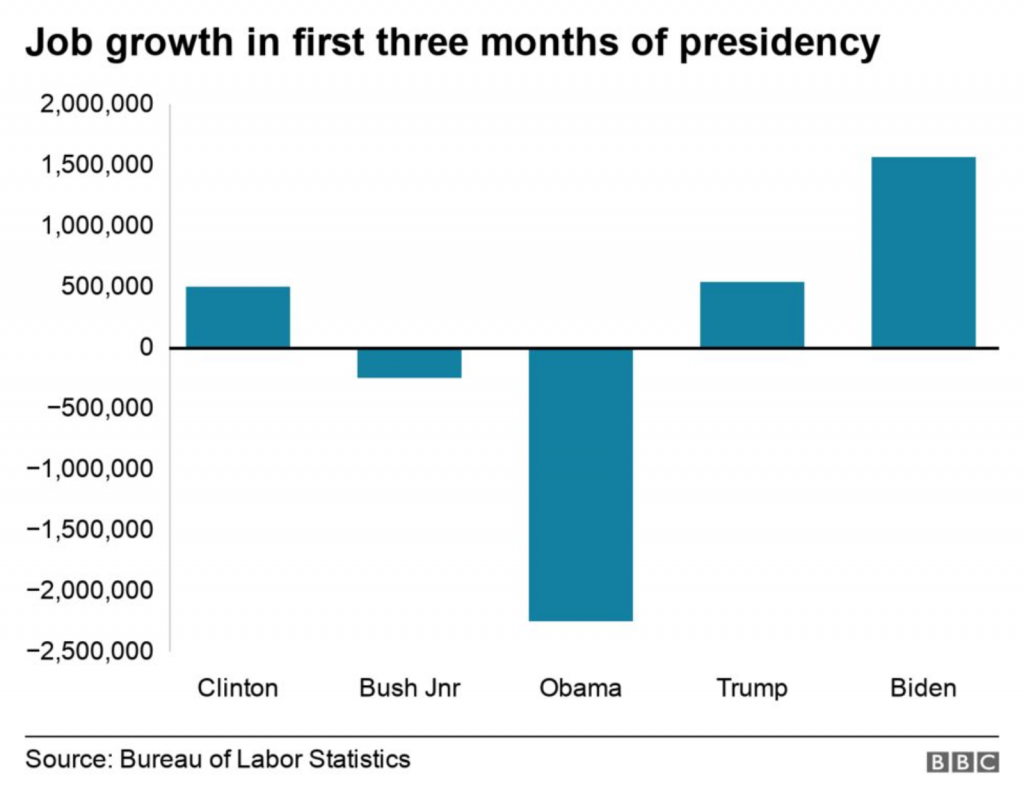
I was reading the article and first came upon this graphic. It’s nothing crazy and shows job growth in the aggregate for the first three months of a presidential administration. A pretty neat comparison in the combination of the data. I like.
Pay attention to what you see here. There will be a quiz.
I don’t like the lack of grid lines for the axis, however. But, okay, none to be found.
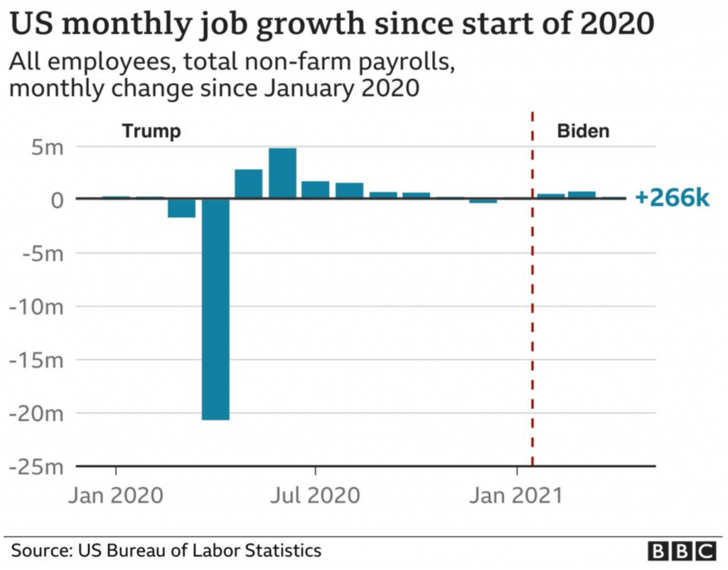
I keep reading the article. And then a couple of paragraphs later I come upon this graphic. It looks at the monthly figures and uses a benchmark line, the red dotted one, to break out those after January 2021 when Biden took office.
Spot the differences.
But do you notice anything?
The lines for the y-axis are back!
The article had a third graphic that also included axis lines.
I don’t have a lot to say about these graphics in particular, but the most important thing is to try and be consistent. I understand the need to experiment with styles as a brand evolves. Swap out the colours, change the styles of the lines, try a new typeface. (Except for the blue, we are seeing different colours and typefaces here, but that’s not what I want to write about.)
First, I don’t know if these are necessarily style experiments. I suspect not, but let’s be charitable for the sake of argument. I would refrain from experimenting within a single article. In other words, use the lines or don’t, but be consistent within the article.
For the record, I think they should use the lines.
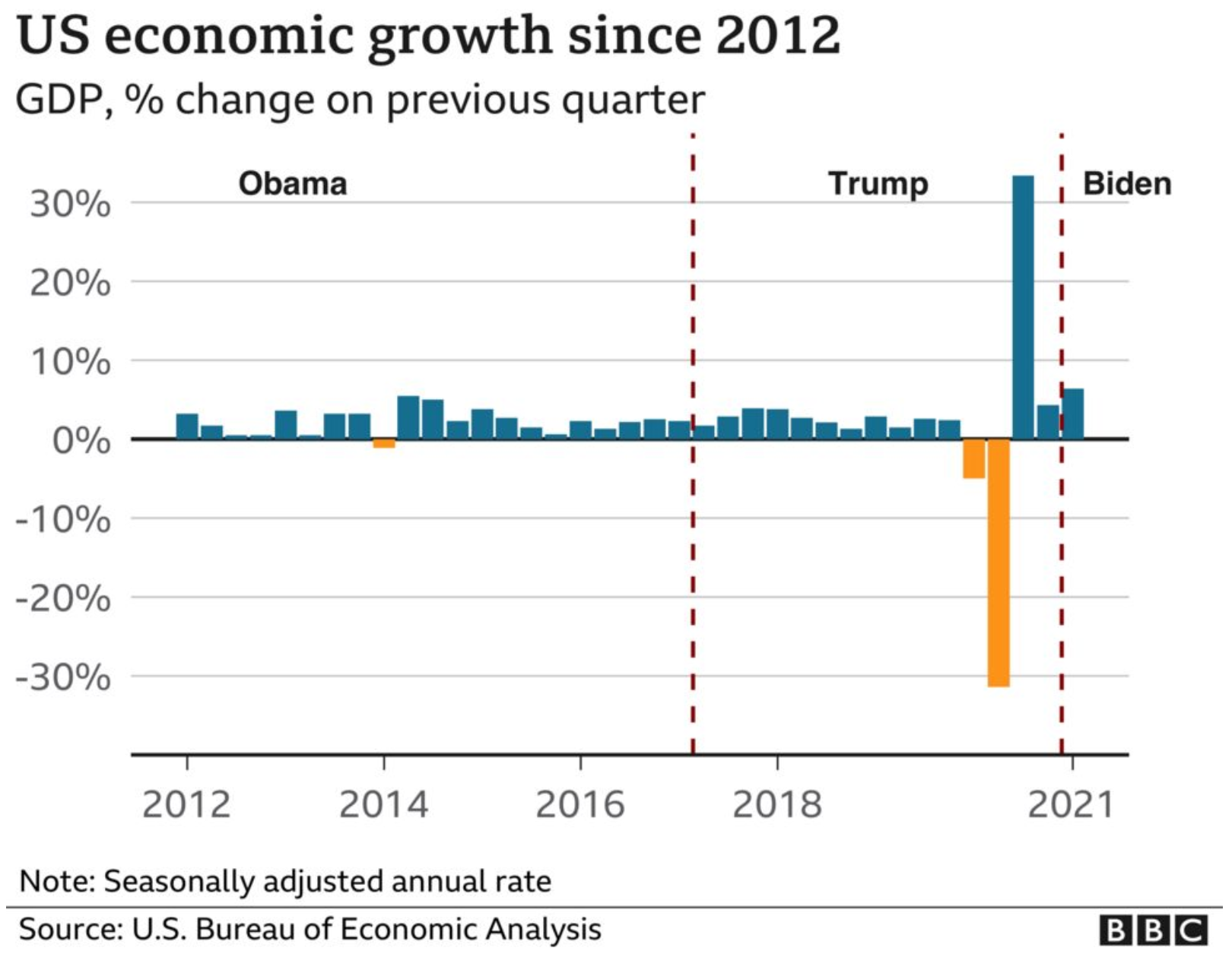
Another point I want to make is with the third graphic. You’ll note that, like I said above, it does use axis lines. But that’s not what I want to mention.
At least we have lines.
Instead I want to look at the labelling on the axes. Let’s start with the y-axis, the percentage change in GDP on the previous quarter. The top of the chart we have 30%. As I’ve said before, you can see in the Trump administration, the bar for the initial Covid-19 rebound rises above the 30% line. It’s not excessive, I can buy it if you’re selling it.
But let’s go down below the 0-line. Just prior to the rebound we had the crash. Similarly, this extends just below the -30% line. But here we have a big space and then a heavy black line below that -30% line. It looks like the bottom line should be -40%, but scanning over to the left and there is no label. So what’s going on?
First, that heavy black line, why does it appear the same as the baseline or zero-growth line? The axis lines, by comparison, are thin and grey. You use a heavier, darker line to signify the breaking point or division between, in this case, positive and negative growth. Theoretically, you don’t need the two different colours for positive and negative growth, because the direction of the bar above/below that black line encodes that value. By making the bottom line the same style as the baseline, you conflate the meaning of the two lines, especially since there is no labelling for the bottom line to tell you what the line means.
Second, the heaviness of the line draws visual attention to it and away from the baseline, especially since the bottom line has the white space above it from the -30% line. Consider here the necessity of this line. For the 30% line that sets the maximum value of the y-axis, we have the blue bar rising above the line and the administration labels sit nicely above that line. There is no reason the x-axis labels could not exist in a similar fashion below the -30% line. If anything, this is an inconsistency within the one chart, let alone the one graphic.
Third, is it -40%? I contend the line isn’t necessary and that if the blue bar pokes above the 30% line, the orange bar should poke below the -30% line. But, if the designer wants to use a line below the -30% line, it should be labelled.
Finally, look at the x-axis. This is more of a minor quibble, but while we’re here…. Look at the intervals of the years. 2012, 2014, 2016, every two years. Good, make sense. 2018. 20…21? Suddenly we jump from every two years to a three-year interval. I understand it to a point, after all, who doesn’t want to forget 2020. But in all seriousness, the chart ends at 2021 and you cannot divide that evenly. So what is a designer to do? If this chart had less space on the x-axis and the years were more compressed in terms of their spacing, I probably wouldn’t bring this up.
However, we have space here. If we kept to a two-year interval system, I would introduce the labels as 2012, but then contract them with an apostrophe after that point. For example, 2014 becomes ’14. By doing that, you should be able to fit the two-year intervals in the space as well as the ending year of the data set.
Overall, I have to say that this piece shocked me. The lack of attention to detail, the inconsistency, the clumsiness of the design and presentation. I would expect this from a lesser oganisation than the BBC, which for years had been doing solid, quality work.
The first chart is conceptually solid. If Biden spoke about job creation in the first three months of the administration vs. his predecessor, aggregate the data and show it that way. But the presentation throughout this piece does that story a disservice. I wish I knew what was going on.
Credit for the piece goes to the BBC graphics department.
Sunday night, news broke that a number of European football clubs were creating a rogue league, the European Super League. My British and European readers—and Americans who follow football—will know the names of Manchester United, Liverpool, AC Milan, Juventus, Real Madrid, and the others.
To put this in perspective for my American readers, imagine the Yankees, Dodgers, Red Sox, Astros, Padres, Mets, Cardinals, Phillies, Angels, and Nationals saying that they were leaving Major League Baseball to go and form their own new baseball league. That they were doing so to “save the sport”. But in so doing, they also guarantee they all make the playoffs every year.
My frequent readers and those who know me will know I’m a fan of the Boston Red Sox. I should point out that the owner of the Red Sox, John Henry, owns both the Red Sox and Liverpool through his company Fenway Sports Group.
Of course, the analogy doesn’t quite hold up, because there are some significant differences between American sports and European football. Relegation is a big one. Personally, I wish American sports had some way of using relegation to incentivise teams to not intentionally suck.
The basic premise of relegation. Take English football. You have four levels of play and in theory any team can exist in any level. Each year, the worst teams move from their current level down one whilst the best teams move up. And for the top level, the top teams get to compete in lucrative European-wide matches. That is a bit simplistic, but imagine that at the end of last year, the Pirates, Rangers, Tigers, and Red Sox became AAA minor league teams and the four best AAA minor league teams became MLB teams. MLB teams would theoretically try to do everything they could to stay in the MLB and not drop to AAA, because that would mean a loss of money. After all, the Yankees would no longer be heading to Fenway nor the White Sox to Detroit. Would seeing the Detroit Tigers play the Woo Sox really be worth the ticket prices you pay at Comerica Park?
But that’s not how American sports work. And so a few American owners, namely those of Manchester United, Arsenal, and Liverpool, want to ensure a steady stream of money. By creating their own league where their teams cannot be relegated, they guarantee that revenue stream.
In other words, this is all about the owners of these Super League teams making even more money.
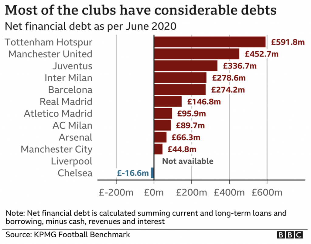
Because, during the last year, teams have been hurting without fans in attendance. And that gets us to why I can write this up. Because the BBC in an article about this new league addressed the fact that most of these teams are heavily in debt.
This graphic, however, is a bit misleading. Look at Liverpool. There is no available data for how much financial debt the club holds. So why is it placed between Chelsea and Manchester City? It could well have more debt than Tottenham. Liverpool should really be left off this chart and included in the note, because its placement suggests that it has little debt, when that may well not be the case. This is a really misleading graphic when it comes to how Liverpool fits with the other 11 clubs.
From a design standpoint, I’m also not clear on why the x-axis line extends beyond the labels for £-200m and £600m.
I’m not going to touch all the data labels. That’s for another piece I’ve been working on off and on for a little while now.
At this point I should point out that I was going to post this article later, but in the last 18 hours or so the whole thing has fallen apart as the English teams, followed by the others, have been dropping out under immense pressure from the sport and their fans. To bring back my analogy above, imagine MLB retaliating and saying that if those teams created their own league, the players would not be allowed to play in any other matches and the teams would be locked out from all other competitive baseball games. It’s a mess.
Credit for the piece goes to the BBC graphics department.
Yesterday I wrote about Covid-19 here in five states of the US. I mentioned how I am concerned about the levelling out of new cases in certain states, notably Pennsylvania and New Jersey. In Italy, the government issued a new round of lockdowns in an attempt to contain a new wave before it swamps their healthcare system.
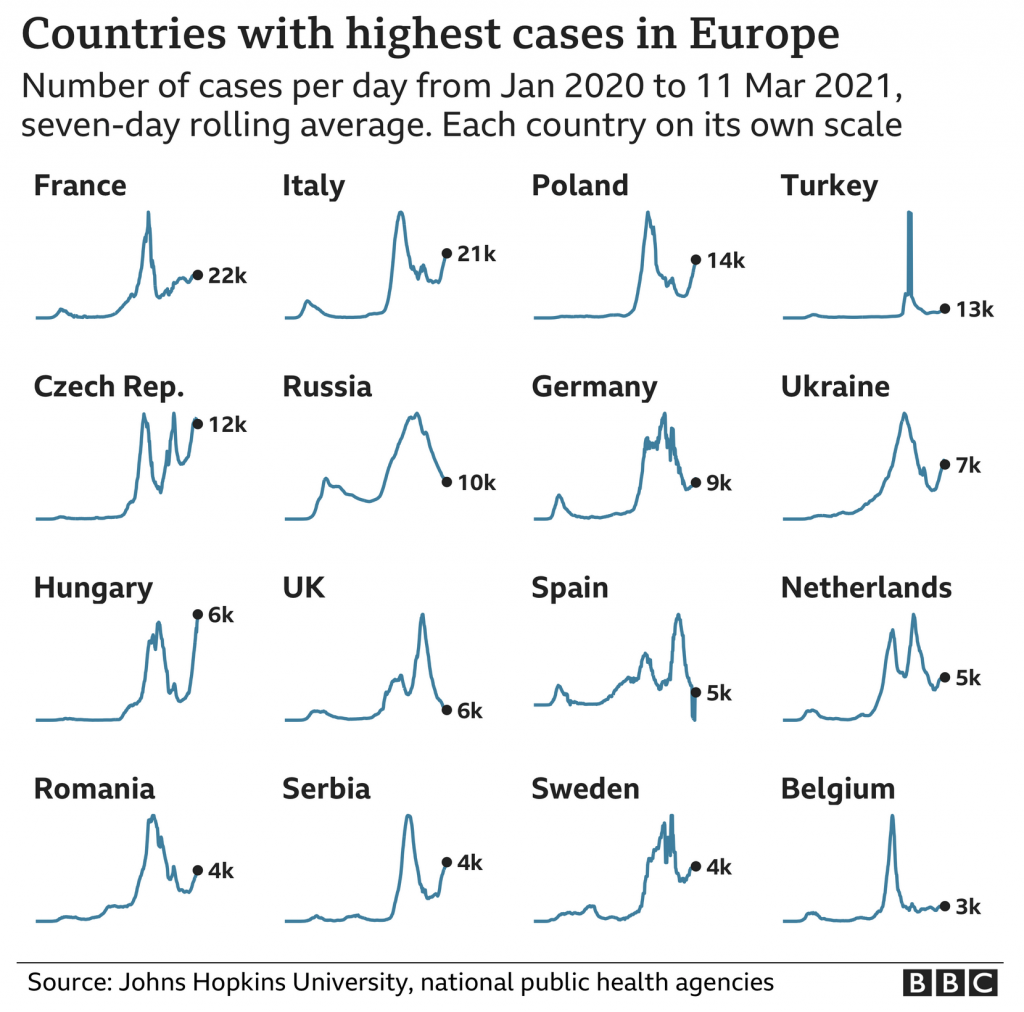
At the end of that BBC article, they used a small multiples graphic showing the seven-day average in several European countries. Today is the 16th, and so the data is now a few days old, but the concept remains important.
New cases curves for several European countries.
From a design standpoint, we are seeing a few things here. First, each country’s line chart exists with its own scale. Unfortunately this makes comparing country-to-country nigh impossible. We know from the title that in the present these are the countries with the highest new case rates in Europe. But, how do these rates today compare to earlier peaks? Without axis lines or a baseline, it’s difficult to say.
Of course, the point could well be just to show how in places like Italy, France, Poland, &c. we are seeing an emergent surge of new cases since the holiday peak.
If that is the goal, I think this chart works well. However, if the goal is to provide more context of the state of the pandemic in these select countries, we need some additional context and information.
Credit for the piece goes to the BBC graphics department.
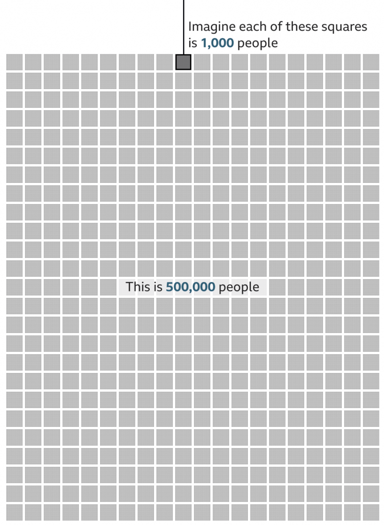
Yesterday we looked at how the New York Times covered the deaths of 500,000 Americans due to Covid-19. But I also read another article, this by the BBC, that attempted to capture the scale of the tragedy.
Instead of looking at the deaths in a timeline, the BBC approached it from a cumulative impact, i.e. 500,000 dead all in one go. To do this, they started with an illustration of 1,000 people. Then they zoomed out and showed how that group of 1,000 fit into a broader picture of 500,000.
We’re going to take a look at this in reverse, starting with the 500,000.
Half a statistic.
I think this part of the graphic works well. There’s just enough resolution to see individual pixels in the smaller squares, connecting us to the people. And of course the number 500 stacks nicely.
My quibble here might be whether the text overlay masks 8,000 people. Initially, I thought the design was akin to hollow square, but when I looked closer I could see the faint grey shapes of the boxes behind a white overlay. Perhaps it could be a bit clearer if the text fell at the end of all the boxes?
But overall, this part works well. So now let’s look at the top.
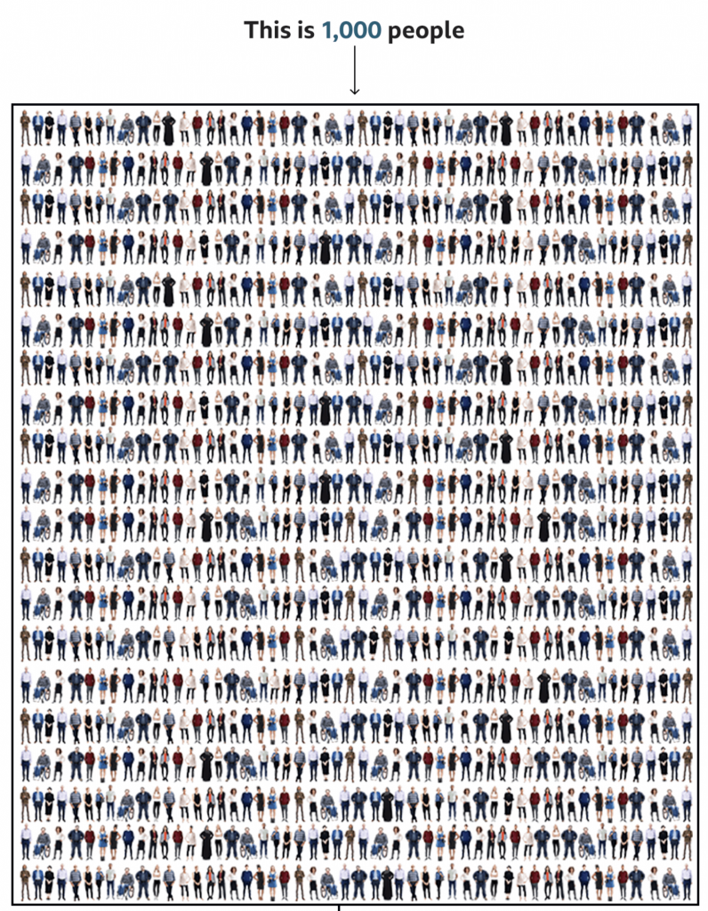
1,000 tragedies
This is where I have some issues.
When I first saw this, my eyes immediately went to the visual patterns. On the left and right there are rivers or columns of what look like guys in white t-shirts. Of course, once I focused on those, I saw other repeated patterns, the guy in the black jacket with his arms bent out, hands on his hips. The person in the wheelchair occupies a different amount of area and has a distinct shape and so that stood out too.
Upon even closer inspection, I noticed the pattern began to repeat itself. Every other line repeated itself and with the wheelchair person it was easy to see the images were sometimes just flipped to look different.
Now, allow me to let you in on a secret, unless you gave a designer a budget of infinite time, they wouldn’t illustrate 1,000 actual people to fill this box. We don’t have time for that. And I’ll also admit that not all designers are good illustrators—myself first and foremost. A good design team for an organisation that uses illustration should have either a full-time illustrator, or a designer who can capably illustrate things.
But this gets to my problem with the graphic. I normally can distance myself from reading a piece to critiquing it. But here, I immediately fixated on the illustrations, which is not a good sign.
There are three things I think that could have been done. The first two are relatively simple fixes whilst the third is a bit grander in scope.
First, I wonder if a little more time could have been spent with the illustrations. For one, white t-shirt guy, I don’t see his illustration reused, so why not change the colour of his t-shirt. Maybe in some instances make it purple, or orange, or some other colour. I think re-colouring the outfits of the people could actually solve this problem a good bit.
But second, if the patterns still appear visible to readers, mix it up a bit. I understand the lack of desire to spend time creating an individualised row for each row. Crafting each row person by person probably is out of the time requirements—though maybe the people above the designer(s) should know that content takes time to create. So what about repeating smaller blocks? I counted 20 rows, which means there should be 50 people per row. Make each row about ten blocks, and have several different blocks from which you can choose. Ideally, you have more blocks than you need per row, so not all figures are repeated, but if constrained, just make sure that no two rows have the same alignment of blocks.
Thirdly, and here’s the one that would really have required more time for the designer to do their job, make the illustrations meaningful. In a broad sense, we do have some statistics on the deaths in the United States. According to the CDC, 63% of deaths have been by white non-Hispanics, 15% by Black non-Hispanics, and 12% by Hispanic/Latino, 4% by Asian Americans, 1% by Native Americans, 0.3% by Hawaiian and Pacific Islander, and 4% by multiple non-Hispanic. Using those numbers, we would need 630 obviously white illustrations, 150 obviously Black, and so on.
If the designer had infinite time, the illustrations could also be made to try and capture age as well. Older people have been hit harder by this pandemic, and the illustrations could skew to cover that cohort. In other words, few young people. According to the CDC, fewer than 5% of deaths have been by people aged under 40. In other words, no baby illustrations needed.
That’s not to say babies haven’t died—87 deaths of people between 0 and 4 have been reported—but that when creating a representative average, they can be omitted, because that’s less than 0.1%, or not even 1 out of 1000.
To reiterate though, that third concept would take time to properly execute. And it would also require the skills to execute it properly. And I am no illustrator, so could I draw enough representative people to fake 1,000? Sure, but time and money.
The first two options are probably the most effective given I’d bet this was a piece thought up with little time to spare.
Credit for the piece goes to the BBC graphics team.
The holiday break is over as your author has burned up all his remaining time for 2020 and so now we’re back to work. And that means attempting to return to a more frequent and regular posting schedule for Coffeespoons.
I wanted to start with the death of Diego Maradona, a legendary Argentinian footballer. He died in December of a heart attack and left behind a complicated inheritance situation. To help explain the situation, the BBC created what in genealogy we call a descendancy chart. You typically use a descendancy chart to show the children, and sometimes grandchildren, of a person. (You can also attach people above the person of interest and show the person’s ancestral families.)
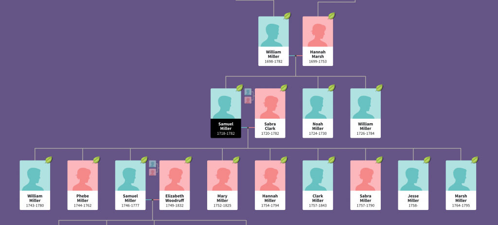
This is an example of a descendancy chart from my research into an unrelated family.
The descendants of Samuel Miller
You can see Samuel Miller married Sabra Clark and had at least nine children with her. And I followed one of them, another Samuel, who married Elizabeth Woodruff and they had four children. In this version, you can also see Samuel the elder’s parents and siblings.
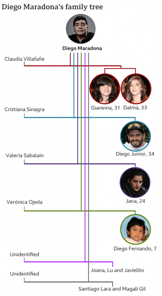
But Diego presents a complicated situation. He was married and had two children, then divorced. That’s not terribly uncommon. But he then went on to have potentially eight children with potentially five different women. (I say potentially because some of the claims are still working their way through the courts via paternity tests.)
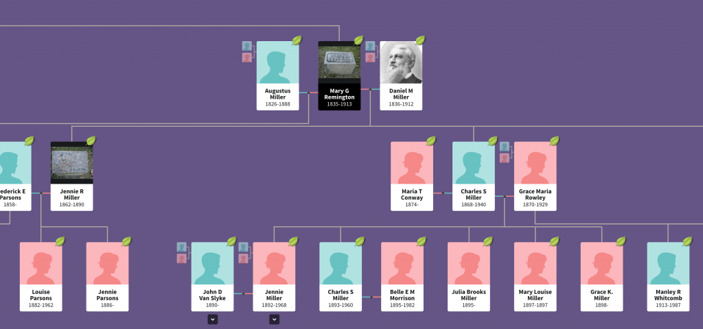
The above type of chart works well with one couple. In my own family, I have at least one ancestor who had potentially two husbands (the second marriage has not yet been confirmed, but she definitely had children with two different men). And when we use this chart type to look at my ancestor’s descendants, you can see it becomes tricky.
Mary Remington’s descendants
Her children’s fathers can be placed to either side and then the children flow out from that. But whereas in the first chart we could see all nine children in one glance, Mary Remington had four and we only see two in this same view.
So how do you deal with one person who has six total relationships that have offspring?
The BBC opted for a vertical chart that uses colour to link the couples. Diego and his ex-wife receive a red line, and that link moves vertically down from Diego with the two daughters shown as descendants on the right.
Diego Maradona’s descendants
Each subsequent relationship with offspring receives its own colour and continues to move vertically down the page, linking the mother on the left to the children on the right.
What I find interesting is the inconsistency within the chart, however. At the end, with the unidentified women, we have two instances of multiple children. Santiago Lara and Magali Gil, for example, descend from one stem. But note at the top how Diego’s two daughters Gianinna and Dalma each receive their own stem. Is there a reason for combining the two children from one unidentified mother into one branch?
And why the vertical format? You can see in my two examples, we are looking at a horizontal format. It works well when I am working on my desktop. The format is less useful on a mobile. I wonder if the BBC knows from their analytics that most people access their content like this via mobile phone and created a graphic that best uses that tall but narrow proportion. Because the proportions do not work well when the article is viewed on a desktop.
The vertical descendancy chart here is an intriguing solution to show descendants from multiple partners in a single mobile screen display. I am not sure how useful it would be as a new form, because I am not certain of how many times we would run into issues of children from six partners, but it could be worth exploring.
Credit for the images from my examples goes to the designers at Ancestry.com.
Credit for the BBC graphic goes to the graphics department of the BBC.
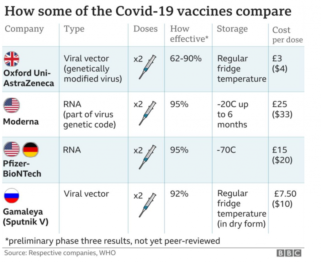
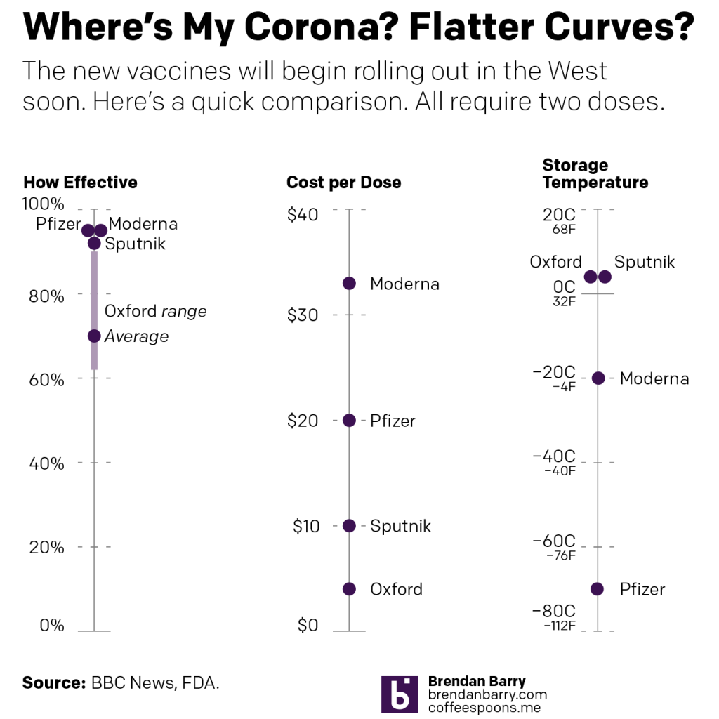
With the rollout of the first vaccination programme in the United Kingdom, the BBC had a helpful comparison table stating the differences between the four primary options. It’s a small piece, but as I often say, we don’t necessarily need large and complex graphics.
A nice little comparison table
Since there are only four vaccines to compare and only a handful of metrics, a table makes a lot of sense.
But I wanted to take it a step further and so I threw together a quick piece that showed some of the key differences. In particular I wanted to focus on the effectiveness, storage temperatures (key to distribution in the developing world), and cost.
My quick take
You can pretty quickly see why the United Kingdom’s vaccine developed by Oxford University and produced by AstraZeneca is so crucial to global efforts. The cost is a mere fraction of those of the other players and then for storage temperature, along with Russia’s Sputnik vaccine, it can be stored at common refrigerator temperatures. Both Pfizer’s and Moderna’s need to be kept chilled at temperatures beyond your common freezer.
And in terms of effectiveness, which is what we all really care about, they’re fairly similar, except for the Oxford University version. Oxford’s has an overall effectiveness of 70%. (In)famously, it exhibited a wide range of effectiveness during trials of between just over 60% and 90%.
The 60-odd% effectiveness was achieved when using the recommended dosage. However, in one small group of trial participants, they erroneously were given a half-dosage. And in that case, the dosage was found to be far more effective, approximately 90%. And this is why we would normally have longer, wider-ranging trials, to dial in things like doses. But, you know, pandemic and we’re trying to return to some sense of normalcy in a hurry.
All that said, Oxford’s will be crucial to the developing world, where incomes and government expenditures are lower and cold-storage infrastructure much less, well, developed. And we need to get this coronavirus under control globally, because if we don’t, the virus could persist in reservoirs, mutating for years until the right mutation comes along and the next pandemic sweeps across the globe.
I know we’re presently all fighting about wearing masks, but when we get to having vaccines available to the public, let’s really try to not make that a political issue.
I remember hearing and reading stories as a child about the Thames in London freezing over and hosting winter festivals. Of course most of that happened during what we call the Little Ice Age, a period of below average temperatures during the 15th through the early 19th century.
But those days are over.
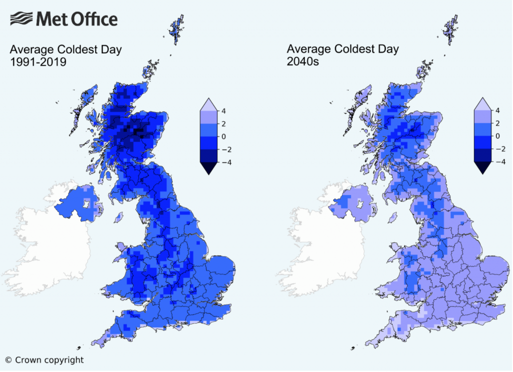
The UK’s Meteorological Office, or the Met for short, released some analysis of the impacts of climate change to winter temperatures in the United Kingdom. And if, like me, you’re more partial to winter than summer, the news is…not great.
Winter warming
Broadly speaking, winters will become warmer and wetter, i.e. less snowy and more rainy. Meanwhile summers will become hotter and drier. Farewell, frost festivals.
But let’s talk about the graphic. Broadly, it works. We see two maps with a unidirectional stepped gradient of six bins. And most importantly those bins are consistent between the maps, allowing for the user to compare regions for the same temperatures: like for like.
But there are a couple of things I would probably do a bit differently. Let’s start with colour. And for once we’re not dealing with the colour of the BBC weather map. Instead, we have shades of blue for the data, but all sitting atop an even lighter blue that represents the waters around the UK and Ireland. I don’t think that blue is really necessary. A white background would allow for the warmest shade of blue, +4ºC, to be even lighter. That would allow greater contrast throughout the spectrum.
Secondly, note the use of think black lines to delineate the sub-national regions of the UK whilst the border of the Republic of Ireland is done in a light grey. What if that were reversed? If the political border between the UK and Ireland were black and the sub-national region borders were light grey—or white—we would see a greater contrast with less visual disruption. The use of lines lighter in intensity would allow the eye to better focus on the colours of the map.
Then we reach an interesting discussion about how to display the data. If the purpose of the map is to show “coldness”, this map does it just fine. For my American audience unfamiliar with Celsius, 4ºC is about 39ºF, many of you would definitely say that’s cold. (I wouldn’t, because like many of my readers, I spent eight winters in Chicago.)
The article touches upon the loss of snowy winters. And by and large, winters require temperatures below the freezing point, 0ºC. So what if the map used a bidirectional, divergent stepped gradient? Say temperatures above freezing were represented in shades of a different colour like red whilst below freezing remained in blue, what would happen? You could easily see which regions of the UK would have their lowest temperatures fail to fall below freezing.
Or another way of considering looking at the data is through the lens of absolute vs. change. This graphic compares the lowest annual temperature. But what if we instead had only one map? What if it coloured the UK by the change in temperature? Then you could see which regions are being the most (or least) impacted.
If the data were isolated to specific and discrete geographic units, you could take it a step further and then compare temperature change to the baseline temperatures and create a simple scatterplot for the various regions. You could create a plot showing cold areas getting warmer, and those remaining stable.
That said, this is still a really nice piece. Just a couple little tweaks could really improve it.
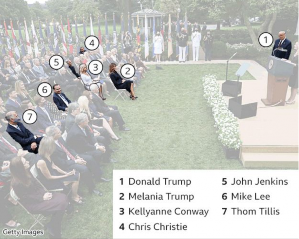
If you were unaware, in the wee hours of Friday, President Trump announced that he had tested positive for the coronavirus that causes Covid-19. It should be stated in the just three days hence, there is an enormous amount of confusion about the timeline as the White House is not commenting. From the prepared statement initially released it seems Trump first tested positive Wednesday. But that statement was then changed to fit the diagnosis in the wee hours of Friday morning. But just last night I saw reporting saying that test was actually a second, confirmatory test and the president first tested positive earlier Thursday.
The timeline is also important because it would allow us to more definitively determine when the president was infected. The reporting indicates that he caught the virus at a Rose Garden ceremony at the White House to introduce his Supreme Court nominee, Amy Coney Barrett. This BBC graphic does a great job showing who from that ceremony has tested positive with the virus.
The photo also does a great job showing how the seven people there were situated. Six of the seven did not wear masks, only North Carolina Senator Thom Tillis did. There is no social distancing whatsoever. And not shown in this photo are the indoor pre- and post-ceremony festivities where people are in close quarters, mingling, talking, hugging, shaking hands, all also without masks.
It should be noted others not in the photograph, e.g. campaign manager Bill Stepien, communications advisor Hope Hicks, and body man Nicholas Luna, have also now been confirmed positive.
The final point is that this goes to show how much the administration does not take the pandemic seriously. Right now the Covid data for some states indicates that the virus is beginning to spread once again. And so maybe this serves as a good reminder to the general public.
Just because you are socialising outdoors does not make you safe. Outdoors is better than indoors. No gatherings is better than small gatherings is better than large, well attended garden parties. Masks are better than no masks. Rapid result test screening is better than no test screening. Temperature checks are better than no temperature checks.
But the White House only did that last one, temperature checks, in order to protect the president before admitting people to the Rose Garden. Compare that to how they protect the president from other physical threats. He has Secret Service agents standing near him (or riding with him in hermetically sealed SUVs for joyrides whilst he is infected and contagious); he has checkpoints and armed fences further out to secure the perimeter. Scouts and snipers are on the White House roof for longer range threats. And there is a command centre coordinating this with I presume CCTV and aerial surveillance to monitor things even further out. In short, a multi-layered defence keeps the president safe.
If you just take temperatures; if you just hang out outside; if you just wear masks; if you just do one of those things without doing the others I mentioned above, you are putting yourself—and through both pre-diagnostic/pre-symptomatic and asymptomatic spreading, others—at risk.
But on Sunday night, Trump campaign strategist went on television said that now that President Trump has been infected, been hospitalised, he is ready to lead the fight on coronavirus. Great. We need leadership.
But where was that leadership seven months ago when your advisors told you in January about the impact this pandemic would likely have on the United States? Where was the leadership in February saying the coverage was a hoax? Where was it in March when he said the virus would go away in April with the warmer weather? Where was it in April when it didn’t go away, when things continued to get worse? Where was it in May when thousands of Americans were dying? Where was it in June when states began to reopen even though the virus was still out-of-control and testing and contact tracing was less available than necessary to contain outbreaks? Where was it in July? And August? And September? Where was the leadership at a Rose Garden party celebrating the nomination of a Supreme Court justice, a party where at least seven people have been infected and one of them, the president of the United States, has been hospitalised with moderate to severe symptoms?
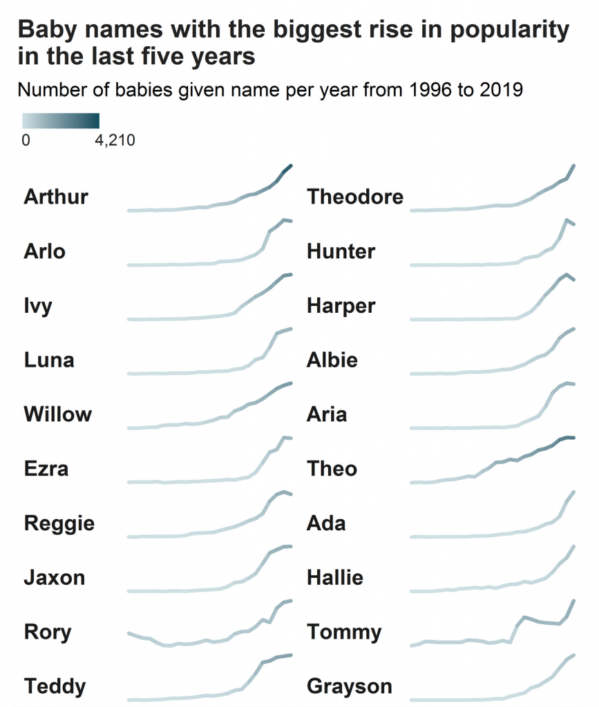
Today’s piece comes from a BBC piece that visualises the most popular baby names in the UK along with the largest winners and losers in name popularity. The article leads with the doubling of babies with the name Dua, from a singer named Dua Lipa, and more than doubling those with the name Kylo, from a character in Star Wars. Of course, those are not the most popular names in the United Kingdom. For boys it’s presently Oliver and for girls, Olivia.
Naturally the piece has a bar chart for each sex and their ten most popular names. But later on in the piece we see two set of graphics that look at those names with the fastest rises or declines in popularity. I chose to screenshot the winners.
It makes use of essentially sparklines, a concept that features small line charts that really focus on direction instead of levels. Note the lack of axis labelling to inform the reader the line’s minimum and maximum. Instead the minimum and maximum are the absolute vertical range of the line.
What this chart attempts to do, however, is hint at those ranges through colour. By using a thicker weight, the line encodes the number of names in the colour. Compare Arthur, whose line ends in a dark bluish colour, to that of Arlo or Grayson, whose names also end in their peak, but in a light bluish colour. All three names have risen, but in terms of absolute levels, we see far more Arthurs than Graysons. Holy popularity, Batman.
When it comes to communicating the size of the names’ popularity, I am not entirely convinced about the idea’s efficacy. But, it lands more often than not. Can I compare Ada to Hallie? No, not really. But Ada vs. Theo is fairly clear.
Could the same effect be accomplished by a sorting order? Say the names were grouped by those who have numbers in 2019 that fall between 3,000 and 4,000, then another range of 1,000–2,000, and so on.
I also wonder if the colours in the bar charts could have been linked to those of the rising and falling names? Keep dark green for the boys’ names and purple for the girls’. It could have made a more solid thematic link between the graphics. As it is now, there seems no rhyme nor reason for the colour choices.
Finally the article has two tables that list the most popular names for each sex for each region. There’s nothing really to improve in the table’s design. The rules dividing rows and columns are fairly light so we don’t have to highlight that usual fault.
Overall, it’s a strong article with some nice visualisations.
Credit for the piece goes to the BBC graphics department.