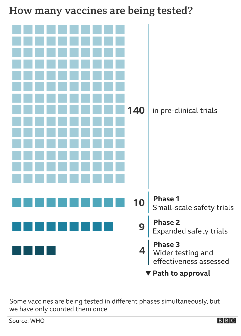
Today we look at a wee graphic from the BBC examining the current state of Covid-19 vaccines. None have been approved, but 163 are on the path to approval.
This falls into the category of not everything has to be super complex. Each vaccine is shown as a discrete unit, a small square. For me in this instance this works better than a bar chart showing the total number per each phase. It highlights how each vaccine is a distinct unit and that it can move from one section down to the next. (Although I suppose if it fails a phase it can also be removed entirely.)
And if you want another reason why a nationalist, isolationist foreign policy that bashes foreign countries is not great…none of the Phase 3 candidates, closest to approval, are from an American company or institution.
Credit for the piece goes to the BBC graphics department.
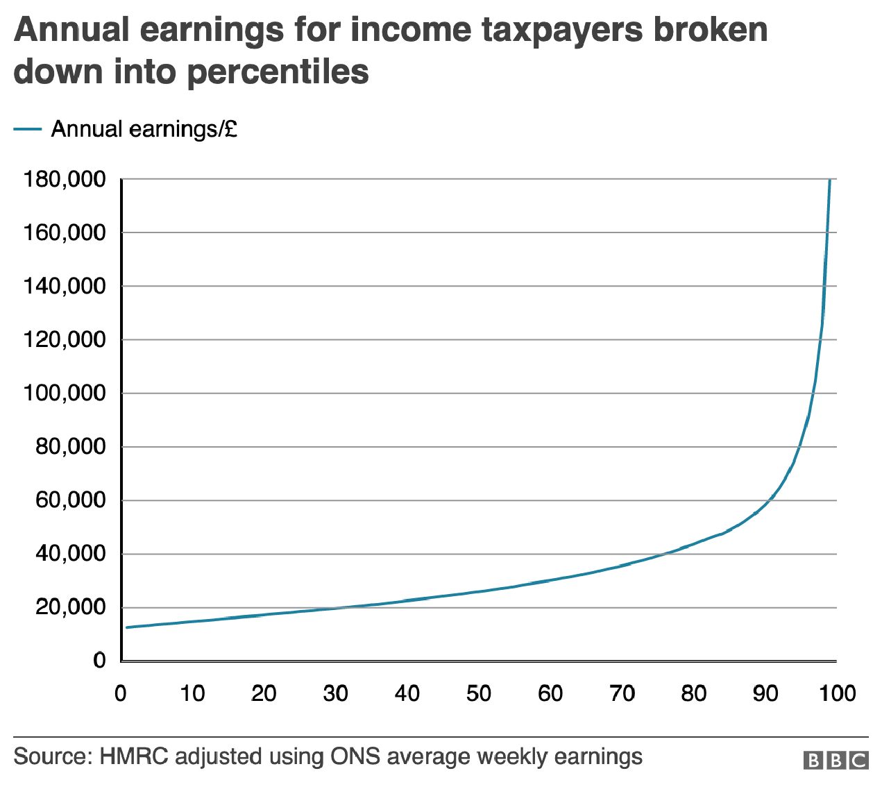
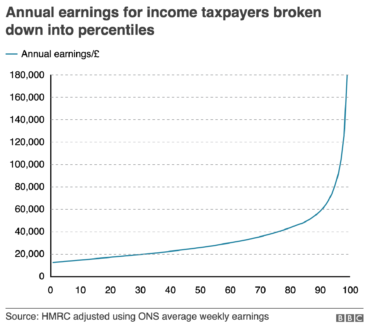
The British election campaign is wrapping up as it heads towards the general election on Thursday. I haven’t covered it much here, but this piece from the BBC has been at the back of my mind. And not so much for the content, but strictly the design.
In terms of content, the article stems from a question asked in a debate about income levels and where they fall relative to the rest of the population. A man rejected a Labour party proposal for an increase in taxes on those earning more than £80,000 per annum, saying that as someone who earned more than that amount he was “not even in the top 5%, not even the top 50”.
The BBC looked at the data and found that actually the man was certainly within the top 50% and likely in the top 5%, as they earn more than £75,300 per annum. Here in the States, many Americans cannot place their incomes within the actual spreads of income. The income gap here is severe and growing. But, I want to look at the charts the BBC made to illustrate its points.
The most important is this line chart, which shows the income level and how it fits among the percentages of the population.
Are things lining up? It’s tough to say.
I am often in favour of minimal axis lines and labelling. Too many labels and explicit data points begin to subtract from the visual representation or comparison of the data. If you need to be able to reference a specific data point for a specific point on the curve, you need a table, not a chart.
However, there is utility in having some guideposts as to what income levels fit into what ranges. And so I am left to wonder, why not add some axis lines. Here I took the original graphic file and drew some grey lines.
Better…
Of course, I prefer the dotted or dashed line approach. The difference in line style provides some additional contrast to the plotted series. And in this case, where the series is a thin but coloured line, the interruptions in the solidity of the axis lines makes it easier to distinguish them from the data.
Better still.
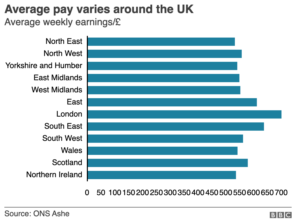
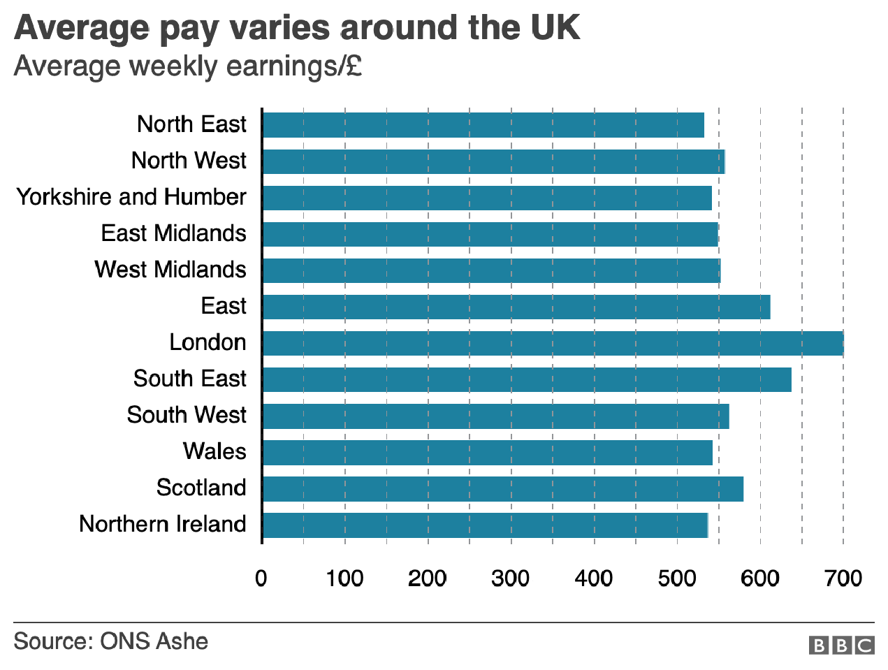
But the article also has another chart, a bar chart, that looks at average weekly incomes across different regions of the United Kingdom. (Not surprisingly, London has the highest average.) Like the line chart, this bar chart does not use any axis labels. But what makes this one even more difficult is that the solid black line that we can use in the line charts above to plot out the maximum for 180,000 is not there. Instead we simply have a string of numbers at the bottom for which we need to guess where they fall.
Here we don’t even a solid line to take us out to 700.
If we assume that the 700 value is at the centre of the text, we can draw some dotted grey lines atop the existing graphic. And now quite clearly we can get a better sense of which regions fall in which ranges of income.
We could have also tried the solid line approach.
But we still have this mess of black digits at the bottom of the graphic. And after 50, the numbers begin to run into each other. It is implied that we are looking at increments of 50, but a little more spacing would have helped. Or, we could simply keep the values at the hundreds and, if necessary, not label the lines at the 50s. Like so.
Much easier to read
The last bit I would redo in the bar chart is the order of the regions. Unless there is some particular reason for ordering these regions as they are—you could partly argue they are from north to south, but then Scotland would be at the top of the list—they appear an arbitrary lot. I would have sorted them maybe from greatest to least or vice versa. But that bit was outside my ability to do this morning.
So in short, while you don’t want to overcrowd a chart with axis lines and labelling, you still need a few to make it easier for the user to make those visual comparisons.
Credit for the original pieces goes to the BBC graphics department.
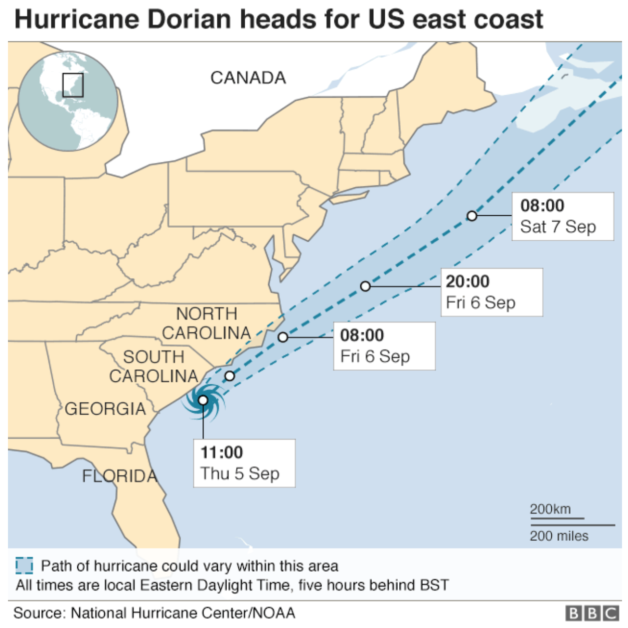
Dorian now speeds away from Newfoundland and into the North Atlantic. We looked at its historic intensity last week. But during that week, with all the talk of maps and Alabama, I noted to myself a map from the BBC that showed the forecast path.
Did New Jersey eat Delaware?
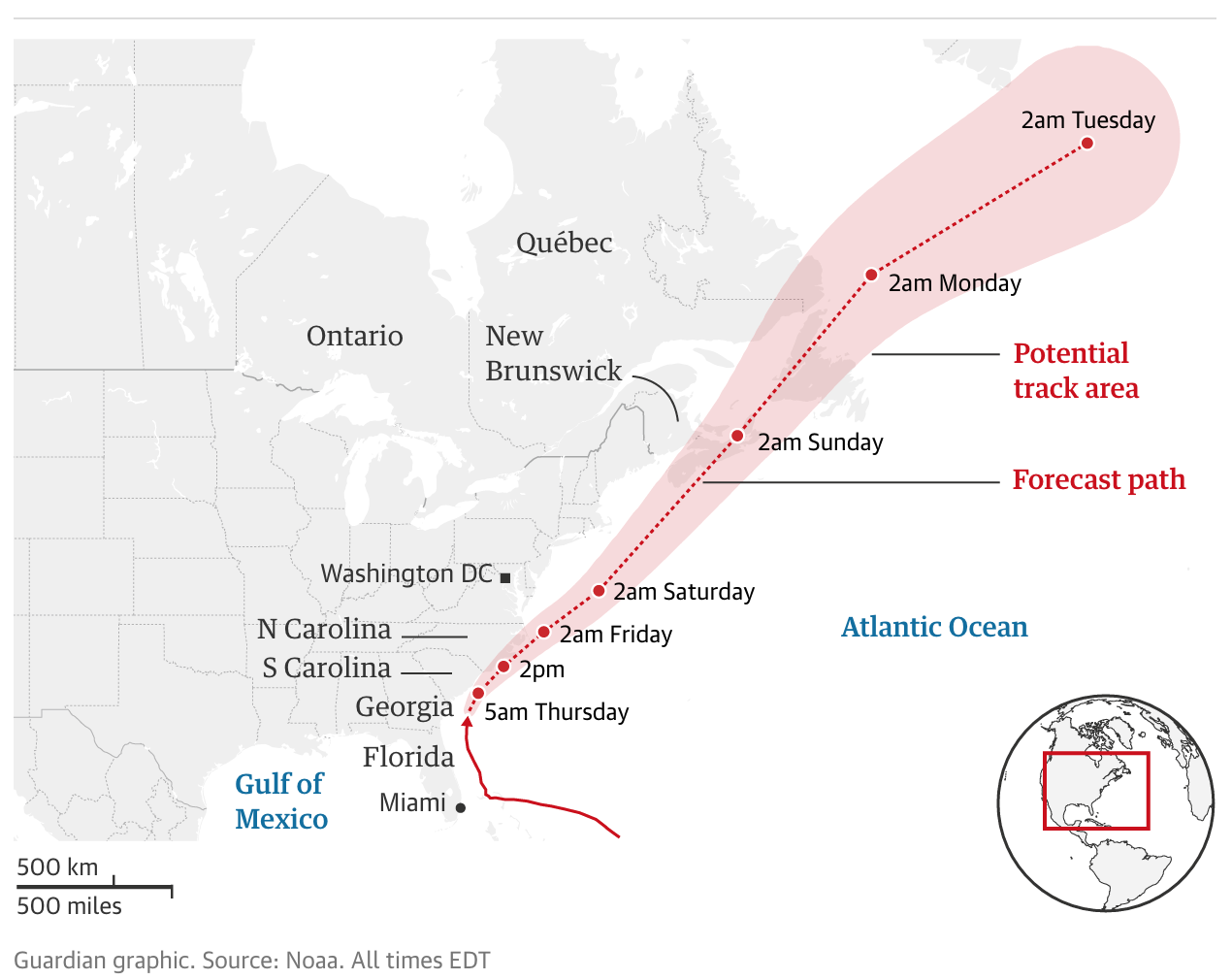
But note the state borders. New Jersey and Delaware have merged. Is it Delawarsey? And what about Maryland, Virginia, and the District of Columbia? Compare that to this map from the Guardian.
Here the states are intact
What we have are intact states. But, and it might be difficult to see at this scale, the problem may be that it appears the BBC map is using sea borders. I wonder if the Delaware Bay, which isn’t a land border, is a reason for the lack of a boundary between the two states. Similarly, is the Potomac River and its estuary the reason for a lack of a border between Virginia, Maryland, and DC?
I appreciate that land shape boundary files are easy, but they sometimes can mislead users as to actual land borders.
Credit for these pieces go the BBC graphics department and the Guardian graphics department.
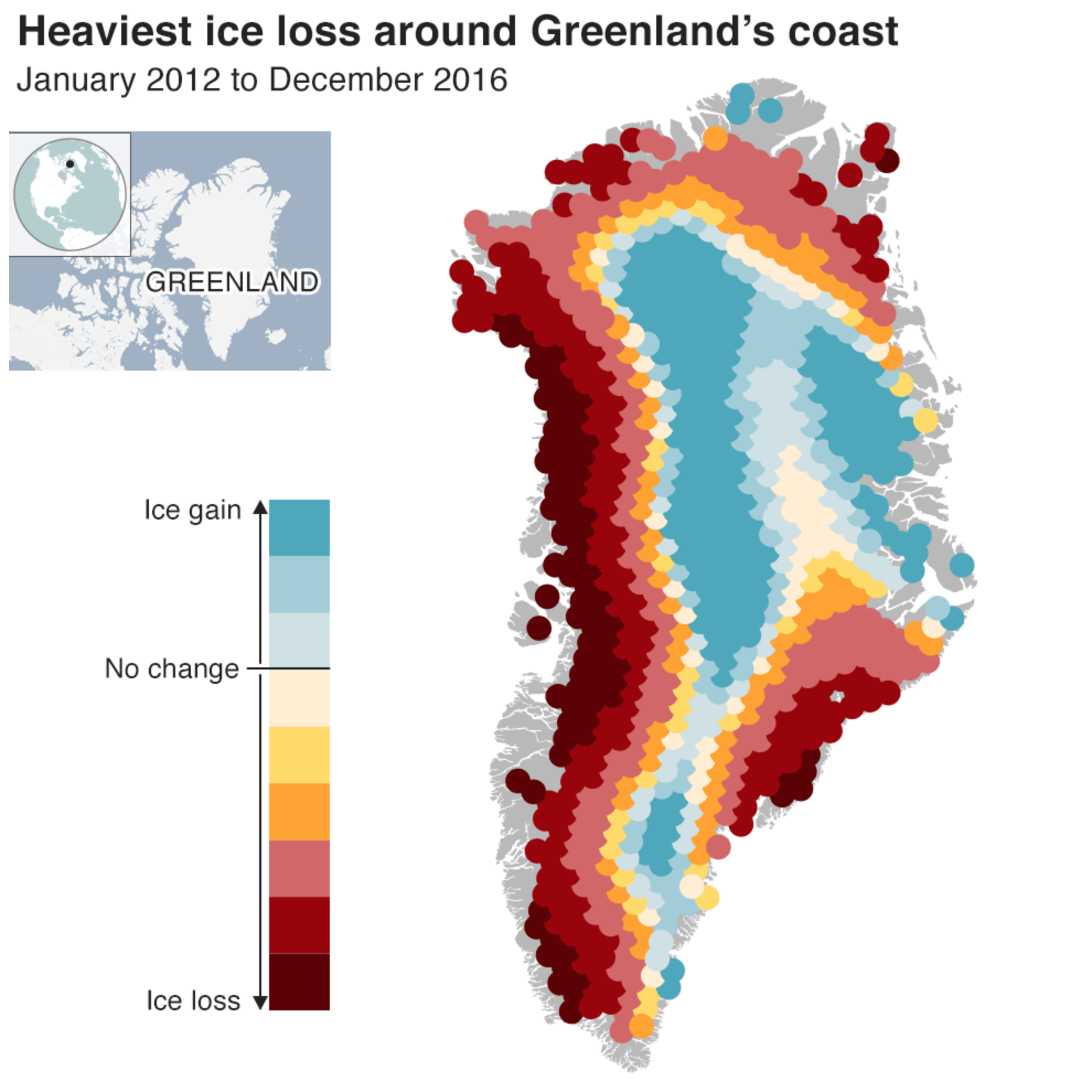
There is a lot going on in the world—here’s looking at you Brexit vote today—but I did not want to miss this frightening article from the BBC on the melting of Greenland’s ice. It’s happening. And it’s happening faster than thought.
There are several insightful graphics, including the standard photo slider of before and after, a line chart showing the forecast rise of sea levels within the possible range. But this one caught my eye.
Alarming rates along the coast.
The colour palette here works fairly well. The darkest reds are not matched by a dark blue, but that is because the ice gain does not match the ice loss. Usually we might see a dark blue just to pair with a dark red, but again, we don’t because the designers recognised that, as another chart shows, the ice loss is outweighing the gains, though there are some to be found most notably at the centre of the ice sheets. This is a small detail, but something that struck me as impressive.
My only nitpick is that the legend does not quantify the amounts of gain or loss. That could show the extremes and reinforce the point that the loss is dwarfing the gain.
Credit for the piece goes to the BBC graphics department.
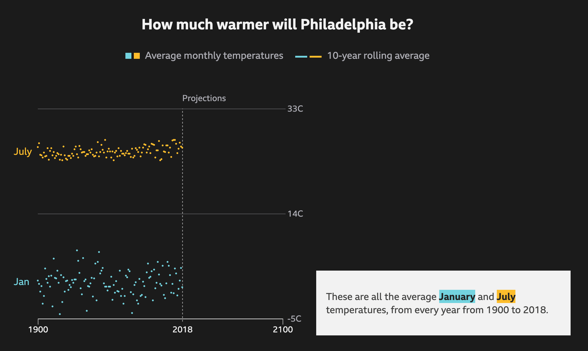
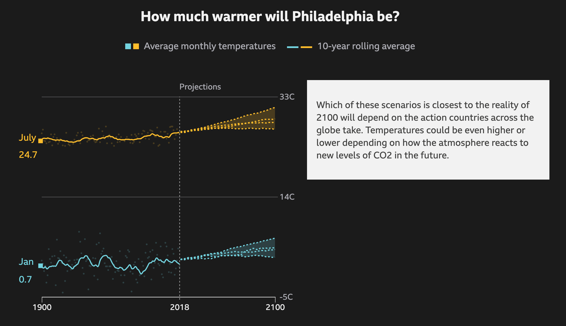
In Philadelphia, this summer has been warmer than average. But with most recent years being warmer than average, that might not mean much. However, a valid question is that with climate change, how much warmer will the city get on average? The BBC recently published an article that explored the temperature changes in cities around the world according to several different models for best to worst case scenarios.
The raw data so to speak
It does a nice job via scrolling of showing how the averages work as a rolling average and the increase over time. It runs through each scenario, from best case to worst case, as a dotted line and then plots each in comparison to each other to show the range of possible outcomes.
Ew. Just ew.
I know that dark or black background is in style for big pieces. But I still do not love them. Thankfully the choice of these two colours work here. The dotted lines also work for showing the projections. And in the intermediate steps, not screencaptured, the previous projections go dark and only the current one is highlighted.
Thankfully the text boxes to the right capture the critical numbers: the actual projection numbers for the monthly average. And they tie them to the lines via the colours used.
Not shown here are a few other elements of the piece. The top of the article starts with a spinning globe that shows how the average temperature across the globe has already changed. Spoiler: not well. While the spinning globe adds some interactivity to the article, it by definition cannot display the entire world all at once, like flat, two-dimensional projections do. This makes it difficult to see impacts across the globe simultaneously. A more standard projection map could have worked really well.
Lastly, the article closes with a few stories about specific locations and how these temperature increases will impact them. These use more illustrations and text. The exception, however, is a graphic of the Arctic that shows how summer sea ice coverage has collapsed over the last few decades.
Overall this is a strong piece that shows some global impacts while allowing the user to dive down into the more granular data and see the impact on some of the world’s largest cities.
Credit for the piece goes to BBC Visual and Data Journalism team.
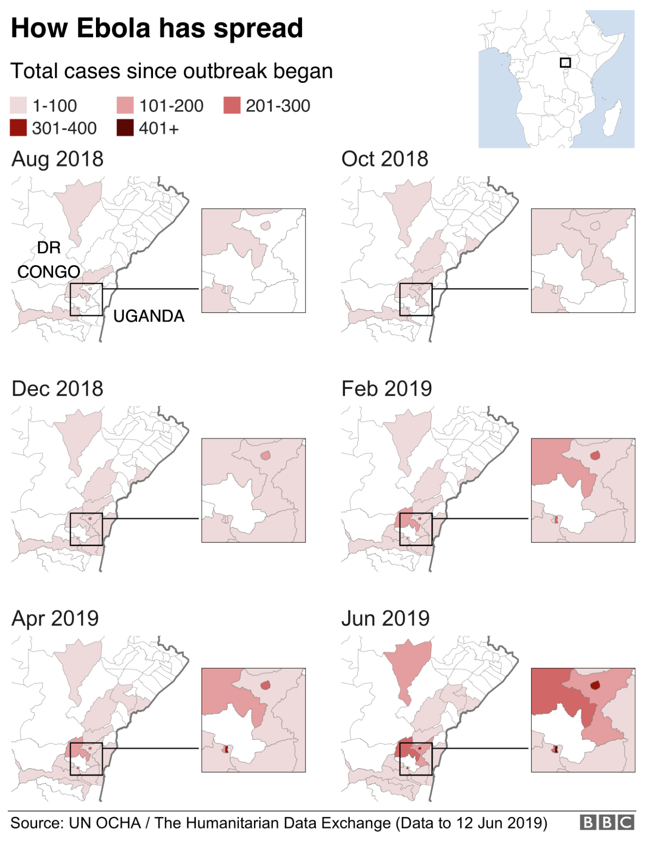
Ebola, which killed 11,000 people in West Africa in 2014 (whichIcoveredinacoupleofdifferentposts), is back and this time ravaging the Congo region, specifically the Democratic Republic of the Congo (DRC). The BBC published an article looking at the outbreak, which at 1,400 deaths is still far short of the West Africa outbreak, but is still very significant.
That’s looking like a tenuous border right now…
The piece uses a small multiples of choropleths for western Congo. The map is effective, using white as the background for the no case districts. However, I wonder, would be more telling if it were cases per month? That would allow the user to see to where the outbreak is spreading as well as getting a sense of if the outbreak is accelerating or decelerating.
The rest of the article features four other graphics. One is a line chart that also looks at cumulative cases and deaths. And again, that makes it more difficult to see if the outbreak is slowing or speeding up. Another is how the virus works and then two are about dealing with the virus in terms of suits and the containment camps. But those are graphics the BBC has previously produced, one of which is in the above links.
Credit for the piece goes to the BBC graphics department.
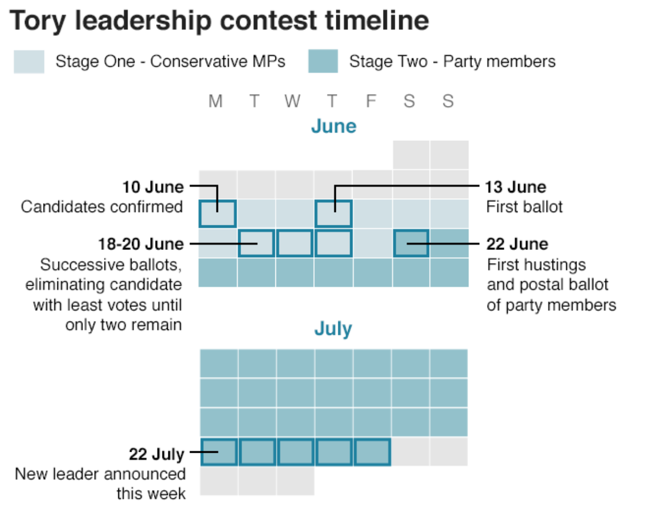
Today is another day in the Tory leadership election that will eventually see approximately 120,000 members of the Conservative Party electing the next prime minister of the 66,000,000 people living in the United Kingdom. The remaining candidates need at least 33 votes from MPs to move on. Those and/or the last place candidate will be eliminated. The question today is whether Dominic Raab, Sajid Javid, and Rory Stewart can move to the next round along with the front runner Boris Johnson and his two not-really-close-but-someone-has-to-be-a-significant competitors, Jeremy Hunt and Michael Gove.
But what happens after today’s vote? The BBC created a graphic explaining it all.
Oh yeah, and Brexit is still happening.
It’s a simple concept: a calendar that uses shades and outline boxes to highlight particular dates.
But the elephant in this particular Westminster cloakroom is that the Tories are using all this time whilst the Brexit clock keeps ticking down to 31 October.
Credit for the piece goes to the BBC graphics department.
Climate change is a thing. And facing it will require a lot of our societies. But the longer we choose not to act, the more the impact will be felt by later generations. Consequently, across the world, young students have been walking out of class to shine light on an issue on which they, as children, have little direct impact. Yet. But what about us? The ones who can vote and make lifestyle decisions?
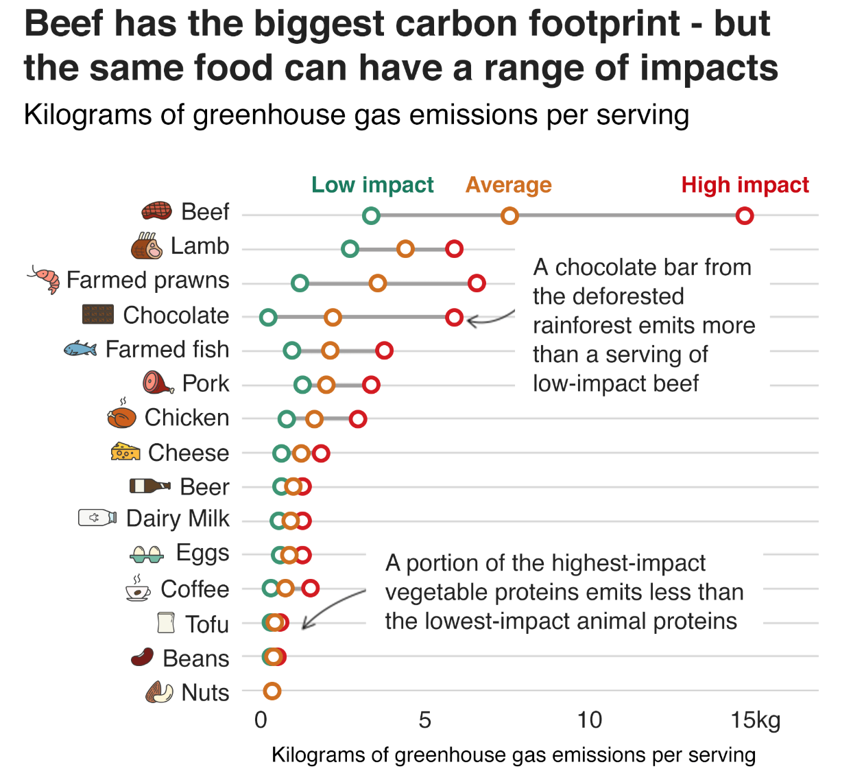
The BBC had a piece where, after soliciting questions from their readership, they answered questions. One question being, what can individuals do to reduce their impact. And while clearly individuals need to do more than one thing, one facet can be examining one’s diet. The article included this graphic on the climate impact of various food types, vis-a-vis greenhouse gas emissions.
Is this saying I should drink more beer?
Essentially we are looking at a simplified box plot of greenhouse gas emissions per serving of food (and drink) type. The box plot looks at a range of values for a specific item. It usually shows the extremes at both ends; the range of a significant number of the data points, e.g. 80% of the set, or by decile, or by quartile; and then lastly the average, be it mean or median. Here we have only low impact, high impact, and average impact. Presumably the minimum, maximum, and then either mean or median.
And it works really well. Chocolate is a great example of how on average, chocolate isn’t terrible. But certain chocolates can have far worse ramifications than low-impact beef, or average-impact lamb and prawns. And beef is well known to be one of the most impactful types of food.
From a design standpoint, I don’t know if the colours necessarily help. The average beef impact, for example, is worse than the high-impact maximum of every other food listed. But the association of green=good and red=bad here has little value because by that logic, the average=gold beef should be red as it sits above the high-impact everything else. A less editorial choice could be made of say a light grey or blue and then have the bright colour, maybe still orange, indicate where the average sits on that spectrum.
I do like the annotations on the chart. It highlights particular stories, like the aforementioned chocolate one, that the casual, i.e. skimming, reader may miss.
I could probably do without the little food illustrations. But the designer did a good job of making them all recognisable in such a small space—far from an easy task. And being so small, they don’t really distract or take away from the whole graphic.
Overall, this is a strong graphic.
Credit for the piece goes to the BBC graphics department.
Maps are tricky things. They are simplified means of conveying, often in two-dimensions, a highly complex three-dimensional object. An object that includes geological data, climatological data, human demographic data, biome data, and even geopolitical data. Consequently, any designer has to make decisions about what things to include and what not to include on a particular map.
Often times, a lot of things can be struck from a map. How often do you really need to explicitly see the tectonic plates? Climate regions? Plant hardiness? Even topographic figures? If you do not need to show them, omit them. Easy peasy.
One level, if you will, of data that is often difficult is that of geopolitics, or the placement of arbitrary lines on Earth that demarcate borders of sovereignty or authority. Everyone claims something. Alas, sometime those claims overlap. But if you are showing the world and a region in conflict, how do you show those borders? How would you, for example, show the limits of present-day Israel, it’s settlements, Palestinian territory pre-1967, Palestinian area of control today? Jammu and Kashmir (and China)? Abyei? The Senkaku Islands?
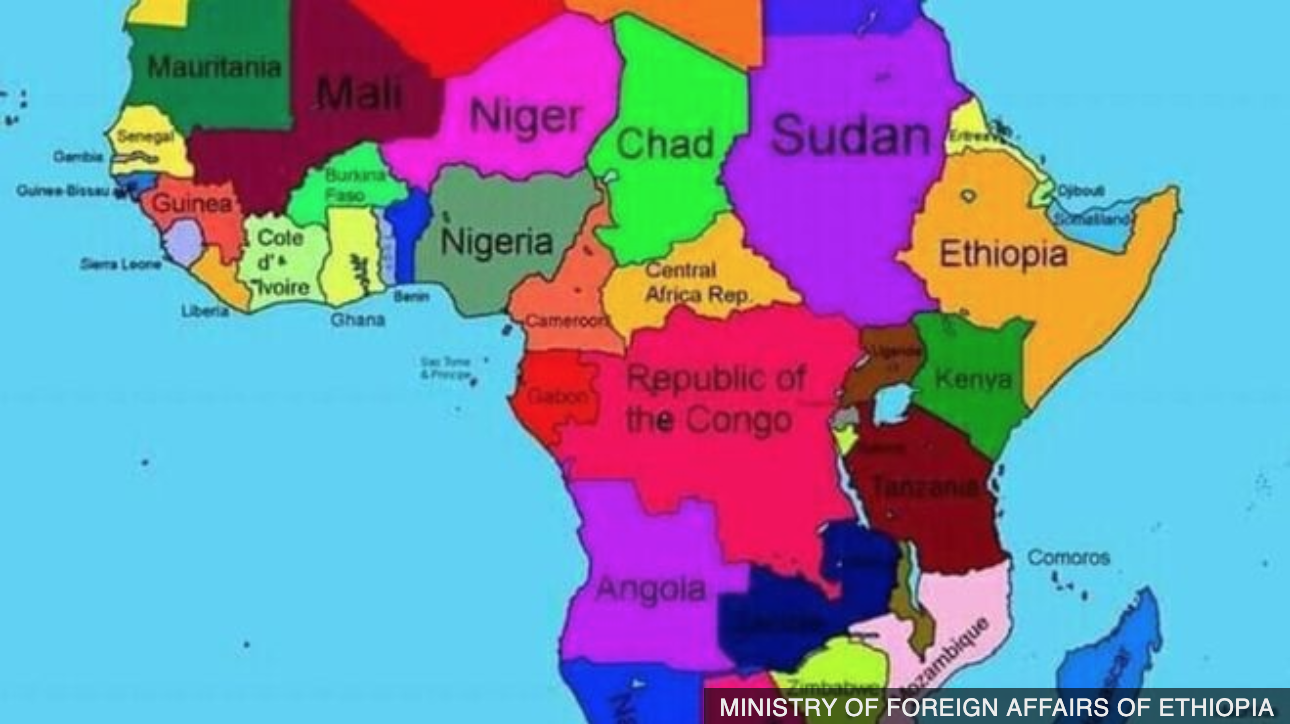
Well, last week, we got news from Ethiopia where the Ministry of Foreign Affairs published a map that, well, looked in part like this:
Where’s Waldo? Not in Somalia.
And that map set off a minor row. The entire ministry’s website is now offline and the ministry apologised for not knowing how the map “crept” onto the site.
But it potentially illustrates someone’s beliefs on the true extent of Ethiopian rule. Because, to the southeast, along the coast of the Indian Ocean, that is the sovereign country of Ethiopia. Oddest about the map, it shows Somaliland, a breakaway region of Somalia internationally recognised by very few states, as an independent country.
On the other hand, I doubt whether this was truly a malicious plot. It contains at least two other substantial errors. Immediately west of Ethiopia proper is Sudan. The map ignores the new state of South Sudan (and the aforementioned disputed territory of Abyei). And then a bit further west is the Republic of the Congo. And that one is all messed up. There is, of course, a country called the Republic of the Congo, but it is a relatively small fraction of that reddish-pink shape and exists in the west. The remainder of the shape is one of the largest countries in the world—the Democratic Republic of the Congo, DRC. (Often times you will hear the smaller state, Republic of the Congo, called Congo-Brazzaville after its capital to distinguish between the two.) But since the DRC is one of the more powerful states on the continent why would the Ethiopian Ministry of Affairs want to start something?
And that’s why I think this is a minor dustup about nothing. But, it shows how acknowledging which arbitrary lines drawn on a map we choose to display can create tensions. And worse.
Credit for the piece goes to the Ethiopian Ministry of Foreign Affairs.
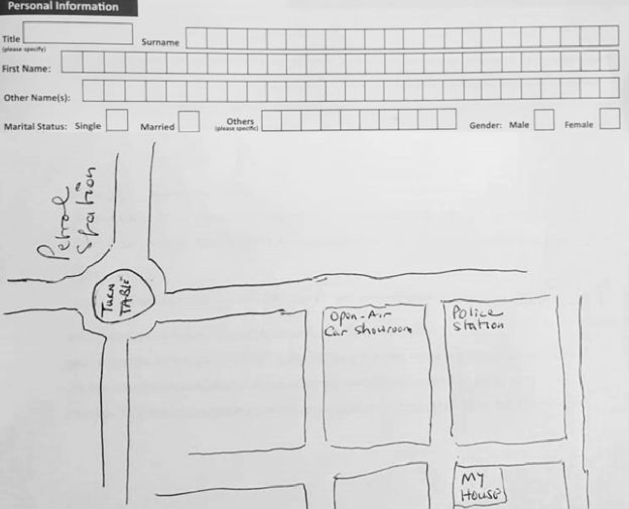
I am always intrigued by the mental maps people create for themselves and the environments in which they live. (Try it yourself, draw a map of your day-to-day world. How far can your mind draw streets, neighbourhoods, landmarks, &c. without the aid of a Google Maps?) In this article from the BBC, a Sierra Leonean-Gambian journalist related how he dealt with the lack of a formal address system in the Gambia impacted his ability to do even the simple things like providing a mailing address on postal or banking forms. They provide a very large space for the individual to draw their home address on a map.
At the corner of the street south of the roundabout and between the police station and open air car showroom.
But unlike my interest in what could you or I draw, this is practical. There is no other option than to be able to draw your neighbourhood. The whole article is well worth a read to help you…gain perspective on your surroundings.