Last Monday I stated that I would attempt a longer piece on the graphics explaining the shootings in Orlando. Since I do not have access to the print versions, I am examining only the digital versions here. Go grab a cup of tea, because this is certainly one of my longer pieces.
One of the most common ways sites covered the story was through maps of the club, Pulse. It makes a lot of sense—if we want to understand what happened inside the building we need to be able to place ourselves inside the building. So how to do that?
The first thought would be photography. But, the site is a crime scene likely riddled with bullets and stained with blood. Probably not the best thing for publications to use. So we are left with illustrations of the interior. But what level of detail do readers need to understand the story?
At the one end of the spectrum we have the stripped-down and simplified graphic from the BBC.
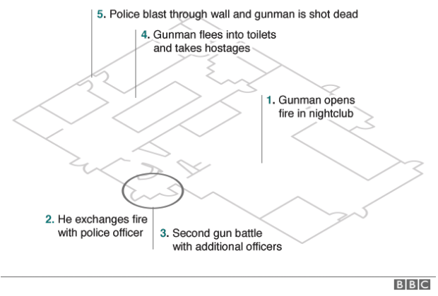
In many respects this could offer the clearest explanation. Unlike the next versions, we have no graphical elements with which to confuse and clutter the drawing. Walls are omitted for a far more architectural layout. Doors are clearly marked, but that is it. We have no indication of where other key places are located. Where are the restrooms into which the attacker fled with hostages? Where are the dance floors? Where is the patio through which people escaped? We get some indication through the timeline annotations, but a lot of the detail needed to provide context is missing.
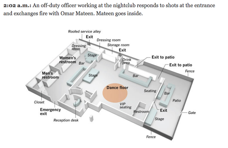
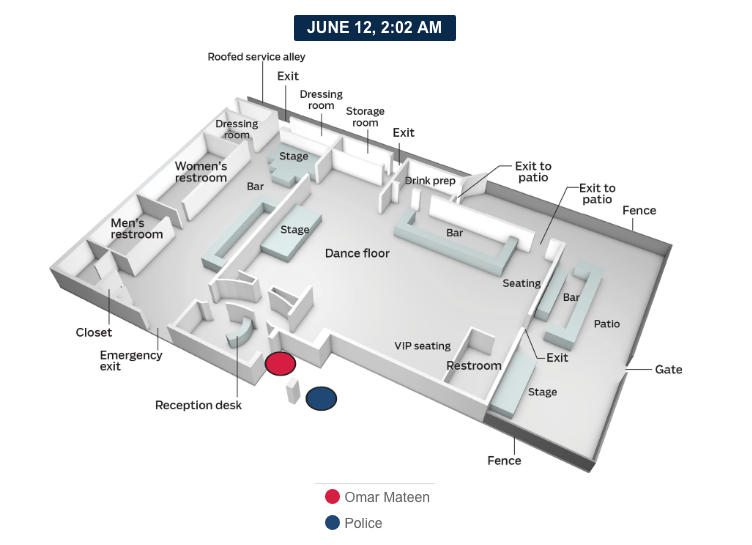
The New York Times takes a more detailed approach.
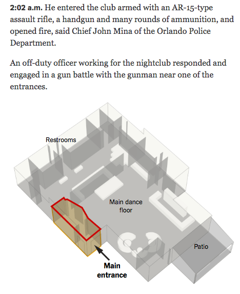
First you can see that the graphics, while smaller, are interspersed within a text-driven timeline of events. Key areas at that point in the timeline are highlighted on the graphic. For the graphic itself, the Times opts for a high-angle view with walls extending from the floor plan and the three key areas are annotated within the graphic. Colour is kept to a minimum with only whites and greys used in addition to the highlight. However, the high grey walls overlap with each other and the unidentified white boxes. What are the white boxes? Are they important? Do the walls need to be grey? Do they need to be so high that they interfere with the graphic?
We can see some different answers to those questions from the Wall Street Journal.
Here the graphic is lighter in overall tone, with white and very faint greys replacing the darker tones in the New York Times’ piece. They Journal opts for the same graphics within timeline treatment. They also highlight the areas of the club relevant to the story at that moment in time. But here we first find a larger graphic. The Times could have had space limitations on their online site or they could have had to reuse graphics from their print edition for their online edition. While the Times could have very real reasons for the smaller images, the Journal’s larger graphic gives the content the space it needs to be read and understood comfortably. Also note how the use of grey vs. white for emphasis is reversed. Whereas the Times used white for unmarked boxes and grey for walls and floors, the Journal uses white for the floors and the walls. Grey is used to callout important parts of the club that are then crucially labelled, e.g. where the bars are located. Another really nice touch missing from my screenshot is how the Journal only labels the elements in the first graphic in the timeline. The second graphic only calls out the newly important elements.
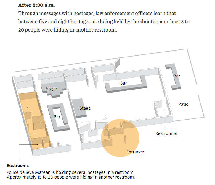
The Washington Post takes a similar approach to that of the Journal.
We see above the timeline a large graphic identifying the key areas of the club. The use of the small multiples in the timeline then allows the graphics to be smaller and thus accompanied by more text. But in the graphics, the Post diverges from the Journal’s direction in the graphic’s design. We find the layout depicted at a lower angle. And instead of a restrained palette, we find warm beiges and ochres depicting the floors and key elements like the bars. The shadows here begin call more attention to themselves than in the previous designs. We also find high levels of detail with the inclusion of bar stools and seat cushions. On the large graphic, the colour and detail, while distracting, still work because of the space. But in the small multiples for the timeline, a simplified version without stools and seats and a toned-down palette could make the graphic easier to understand.
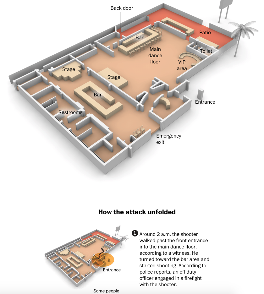
And then somewhere between the approaches of the Journal and the Post we have the Los Angeles Times.
We return to a restrained palette with colour used sparingly to emphasise key parts of the narrative. Detail is limited to the key elements, without any illustrative adornments like furniture. Typographic distinctions, bold vs. italic, delineate the important areas of the club from the remainder of the context. Elements like service alleys, fences, and the patio gate are clearly marked and provide that context of the possible escape routes for patrons attempting to flee the attacker. The graphic then repeats through the timeline, but the subsequent graphics reflect a missed opportunity. Each remains as labelled as this first, and the labels begin to distract from understanding the narrative.
Then we have the Orlando Sentinel’s timeline graphics.
Note any similarities in this graphic to the preceding one? The Tribune Publishing Company, to be rebranded as tronc, owns both the Los Angeles Times and the Orlando Sentinel. So my guess would be the graphics departments collaborated or one of them created a shared asset to be used across the Tribune Publishing Company’s—sorry, tronc’s—media platforms. The Sentinel’s version lacks the finer design details of the LA Times’s, for example note how the typographic treatment here lacks the clearer hierarchy present in the LA Times’ version. I doubt the small type size increase would be noticed by the audience, though I could be wrong. But in terms of providing a timeline of events, the Sentinel’s version, which incorporates the above graphic as well as other media, is the most detailed and complete.
Then similar to some extents to the preceding graphics, we have a piece from the Orange County Register.
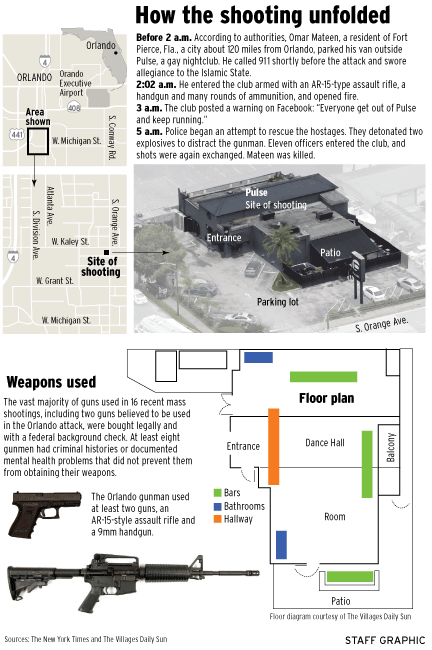
As you can likely tell from the screenshot, this is a graphic where the entire piece is designed as a large graphic file instead of components on the page. It could be because the piece was designed primarily for print and not digital consumption. The layout of the club draws heavily on the BBC’s architectural drawing concept, but here is executed far more awkwardly. Instead of including hallways in the schematic, they are indicated by coloured rectangles. And we also know from the other graphics that almost the entirety of the wall at the graphic’s top supported the club’s main bathrooms. The graphic itself is sourced from The Villages Daily Sun, but the OC Register would have been better served by sourcing a more accurate and more clearly designed graphic for the layout. I should also point out the photograph at the top of the graphic appears to have come directly from the New York Times.
Lastly we have the National Post, which is at the other end of the spectrum.
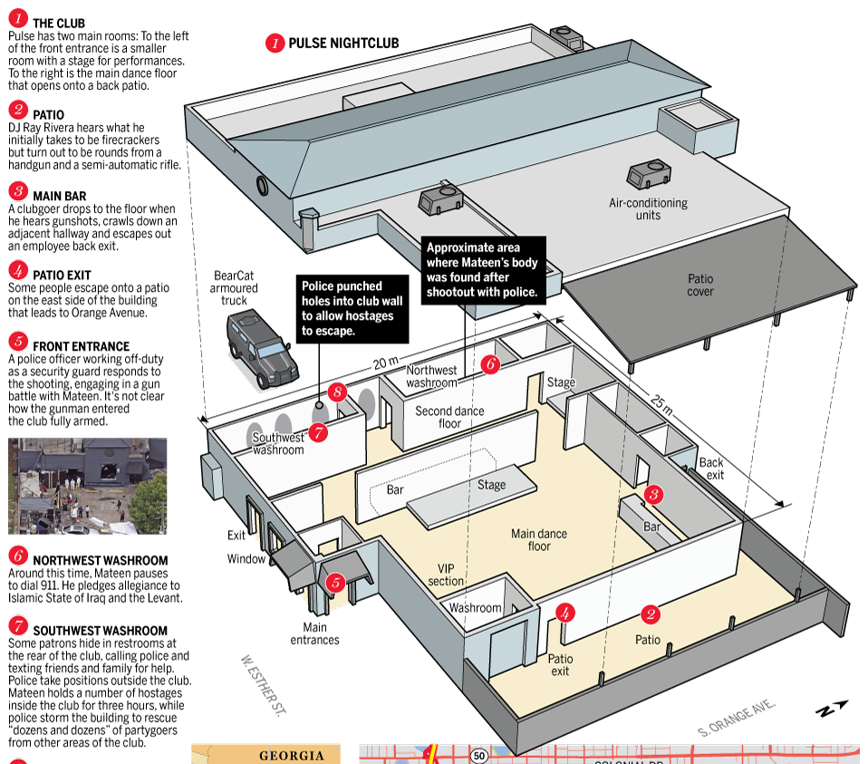
Per the style of the National Post, this graphic is more illustrative in its quality than the others. Like the Orange County Register, the National Post designed an entire graphic instead of smaller components on a webpage. The timeline occupies the left column and numbers correspond to locations in the club. However, I think the graphic could have been made more clear if the roof illustration were removed and a higher angle taken to make the back of the club easier to see.
Different publications included different amounts and types of supplemental context. The Washington Post and Wall Street Journal, for example, included additional graphics on mass shootings. Others, like the New York Times, provided links to pieces that examined the context separate from the timeline of events.
Is there a best design among these? Well, design exists to solve problems, and those problems could vary from publication to publication. How soon did the graphics needed to be published? How many people worked on the design? How much information was available when producing the work? Were print considerations necessary?
For me, the Orlando Sentinel’s work, in toto, most clearly presented the narrative. While I quibble with particular elements of the design, again, I would have removed most of the text labels after their first appearance, it provides a balanced amount of detail and broad overviews in a clear fashion. Colour is used to emphasise elements in that moment. The illustration itself does not distract and allows the reader to focus on the story itself.
Credit for the pieces goes to a lot of people.
BBC: BBC graphics department
New York Times: Gregor Aisch, Larry Buchanan, Joe Burgess, Ford Fessenden, Josh Keller, K.K. Rebecca Lai, Iaryna Mykhyalyshyn, Haeyoun Park, Adam Pearce, Yuliya Parshina-Kottas, Sergio Peçanha, Anjali Singhvi, Derek Watkins, and Karen Yourish.
Wall Street Journal: Wall Street Journal graphics department
Washington Post: Weiyi Cai, Emily Chow, Chiqui Esteban, Lazaro Gamio, Chris Ingraham, Laris Karklis, Denise Lu, and Tim Meko.
Los Angeles Times: Eben McCue and Angelica Quintero.
Orlando Sentinel: Gal Tziperman Lotan, Charles Minshew, Mike Lafferty and Andrew Gibson.
Ocean County Register: Ocean County Register graphics staff
National Post: Mike Faille and Dean Tweed.