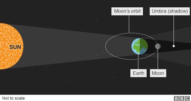
Last night we experienced a total lunar eclipse here in Chicago. Unfortunately, significant cloud cover meant that much of the event went unseen. That was unfortunate, because eclipses are fantastic. To explain it we have this piece from the BBC.
What is a lunar eclipse
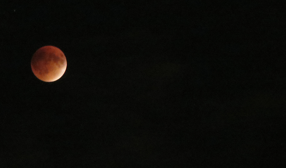
And for those were either unable to see it or did not know about it, here is one of the photos I took.
During the eclipse
Credit for the diagram goes to the BBC graphics department.
With Xi Jinping visiting the United States the BBC published an article looking at China’s changes over the years. In general, I don’t like the article—why are they using pigs to look at pork consumption? My general dislike aside, they do have a map that plots urban centres with more than one million people and how that map has changed since 1970 and will change out to 2030.
Urban centres with more than a million people
I probably would not have used that terrain map as the background as blue-green circles on the green coast are a bit difficult to read. A lost opportunity of a sort—assuming it is possible at all—is to use a satellite image of China for each year and overlay the circles on that. One can only imagine that China’s urbanisation has gone together with drastic changes to the landscape.
Credit for the piece goes to the BBC graphics department.
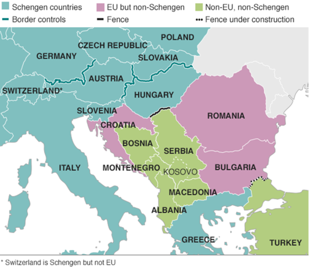
Last week we looked at a map produced by the Washington Post, which detailed the routes chosen by migrants and refugees desiring to reach the European Union. This week, I want to compare that to one from the BBC—there are others, even from the BBC, but we will examine them later—that details the differences in countries along the route.
EU border map
The previous map simply highlighted countries in the Schengen Area, which allows for Passport-free travel between participating EU members. This map uses colour to denote which countries participate and whether they belong in the EU. But it also uses white lines to indicate border, so that Schengen Area countries seem more contiguous. This allows them to use colour to add the layer of recent news: recently imposed border controls and newly constructed fences. My concern in this particular piece is that those pink and green countries should probably have some sort of line indicating that they do have border controls.
Credit for the piece goes to the BBC graphics department.
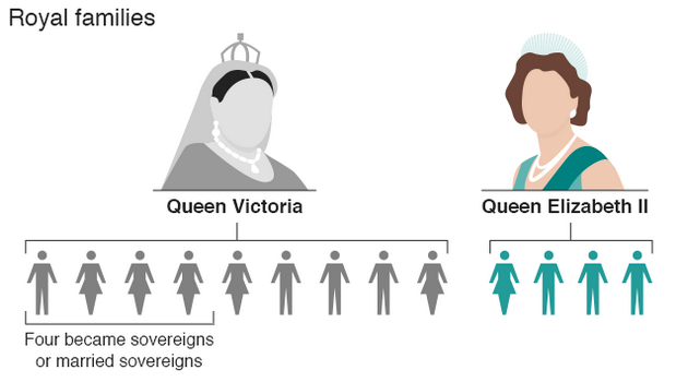
Following on from yesterday’s post about Queen Elizabeth’s timeline as she passed Queen Victoria, today we have another selection from the BBC that compares the reigns of the two queens. Unfortunately, while the screenshot below is okay, the overall graphics and illustrations strike me as a bit too simple and not terribly useful in making comparisons.
The royal families
Credit for the piece goes to the BBC graphics department.
As of today, Queen Elizabeth is the longest reigning British monarch. She has surpassed the record of the famous Queen Victoria, Elizabeth’s great-great-grandmother at 63 years and seven months. Obviously a lot of things have changed over those 63 years, and in this article the BBC uses a graphic to look at how the world stage has changed.
Queen Elizabeth II’s reign
Credit for the piece goes to the BBC graphics department.
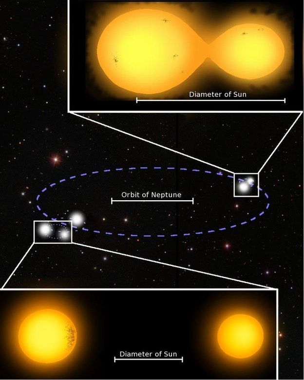
While the title sounds science-fiction-y, it is true. Star Wars has a famous scenece where a landscape is shown with a binary star system in the sky. But we now know of a quintuple-star system that has two separate sets of binary stars. This BBC article takes a look at how the system is structured.
Two binary star systems
Credit for the piece goes to the BBC graphics department.
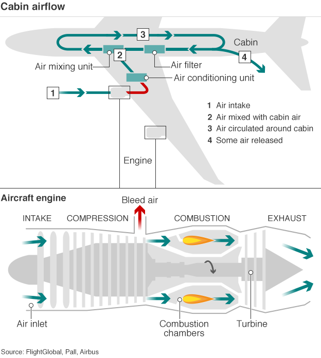
Today’s post looks at an illustration from the BBC about aircraft cabin flow. As I have flown on four aircraft in the last month—quite a lot for me—I do recall thinking during one particular flight just where the air intakes were on the aircraft. It never dawned on me that they were in the actual engines themselves.
Air flow diagram for an aircraft
I think from a design side the only thing I would change is the width of the line for the airflow. That would show how while some is released, replacement air comes from the air mixing unit.
Credit for the piece goes to the BBC graphics department.
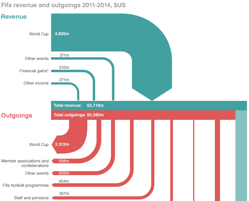
If you did not hear about it the other day, the head of FIFA resigned. That is kind of a big deal because football (in the rest-of-the-world sense of the word) is kind of a big deal. But the organisation that runs it is generally seen as wholly corrupt. So this BBC piece takes a look at the revenue and spending—at least so far as we know about it.
Sort of a Sankey diagram
Credit for the piece goes to the BBC graphics department.
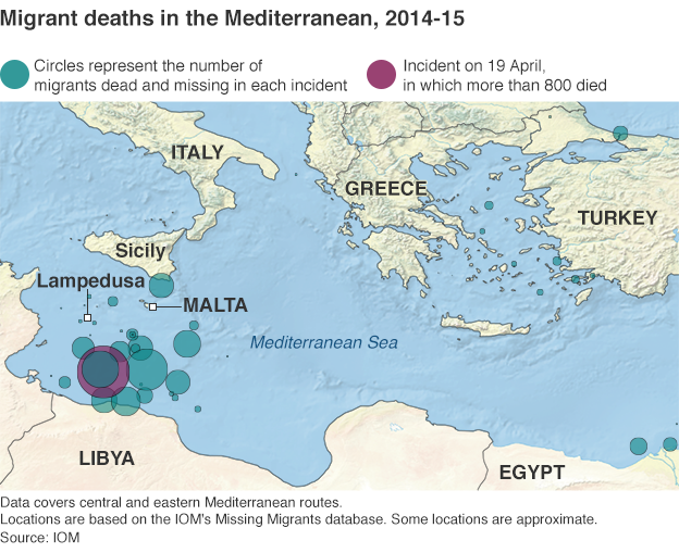
Yesterday we looked at a map of coal plants, with the dots sized by capacity. Today, we have a similar approach in a much smaller graphic about a much different topic. The BBC published this map yesterday in the context of an article about a report of the EU contacting Australia in regards to its migrant interception programme.
Where the migrants have died
Compared to the maps we saw yesterday, I’m not so keen on this. Not the idea, mind you. I think that the story bears telling in a graphical, visual format. Look at how many of those deaths occur in the waters between Libya and Italy. Not between Tunisia and Italy. Not between countries of the eastern Mediterranean and islands like Cyprus or Crete.
But, the blue-green colour used to identify previous incidents is too close to the blue of the Mediterranean for my taste. Though, in fairness, that does make the purplish colour highlighting the most recent incident stand out a bit more. But even the map of the Mediterranean includes details that are not likely necessary. Do we need to show the topography of the surrounding countries? Do we need to see the topography of the sea floor? Probably not, although in a different piece the argument could be made geography determines the migration routes. Compare that to Bloomberg’s piece, where the United States was presented in flat, grey colours that allowed the capacity story to come to the forefront.
Lastly, a pet peeve of mine with maps and charts like this. Please, please, please provide a scale. I understand that humans are poor at comparing differences in area. And that is a reason why bars and dots are so often a clearer form of communication. But, in this piece, I have no idea whatsoever about the magnitude and scale of these incidents. Again, compared this to the Bloomberg piece, where in the bottom corner we do have two circles presented to offer scale of capacity.
Credit for the piece goes to the BBC graphics department.
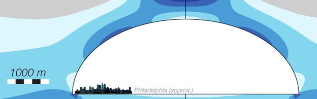
Today’s post falls somewhere between just for fun and science reality. Remember moon bases? Newt Gingrich’s ridiculed comment about a habitable moon base by 2020? Well, one problem with colonies on other planets—or even interstellar transport for that matter—is radiation. The moon has no magnetosphere and no atmosphere. So it can be bombarded by both radiation and meteorites.
But, now we have lava tubes. Well, in theory at least. Scientists have run the numbers and found that if lava tubes exist on Mars, they would be structurally sound to support colonies within lava tubes. And that brings us to the raison d’etre of today’s post: the diagram used to explain that science.
I present you all with your hypothetical moon base: New Philadelphia.
New Philadelphia looks just like today’s Philadelphia