All the Colours, All the Space

Everyone knows inflation is a thing. If not, when was the last time you went shopping? Last week the Boston Globe looked specifically at children’s shoes. I don’t have kids, but I can imagine how a rapidly growing miniature human requires numerous pairs of shoes and frequently. The article explores some of the factors going into the high price of shoes and uses, not very surprisingly, some line charts to show prices for components and the final product over time. But the piece also contains a few bar charts and that’s what I’d like to briefly discuss today, starting with the screenshot below.

What is going on here?

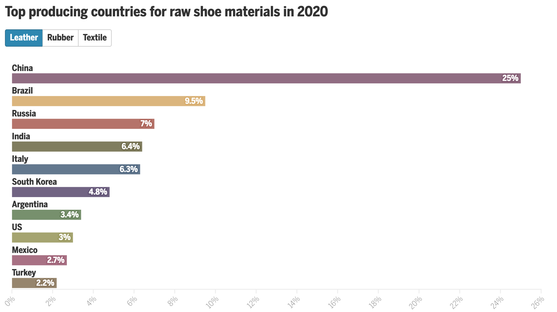
What we see here are a list of countries and the share of production for select inputs—leather, rubber, and textiles—in 2020. At the top we have a button that allows the user to toggle between the two and a little movement of the bars provides the transition. The length of the bar encodes the country in question’s market share for the selected material.

We also have all this colour, but what is it doing? What data point does the colour encode? Initially I thought perhaps geographic regions, but then you have the US and Mexico, or Italy and Russia, or Argentina and Brazil, all pairs of countries in the same geographic regions and yet all coloured differently. Colour encodes nothing and thus becomes a visual distraction that adds confusion.

Then we have the white spaces between the bars. The gap between bars is there because the country labels attach to the top of the bars. But, especially for the top of the chart, the labels are small and the gap is at just the right height such that the white spaces become white bars competing with the coloured bars for visual attention.

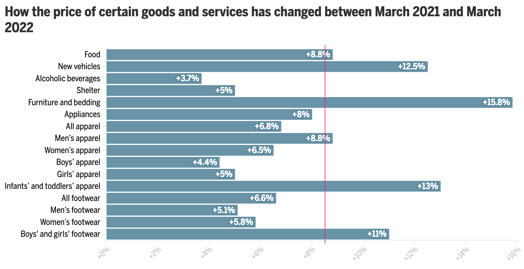
The spaces and the colours muddy the picture of what the data is trying to show. How do we know this? Because later in the article we get this chart.

Ahh, much better. Much clearer.

This works much better. The focus is on the bars, the labelling is clear, almost nothing else competes visually with the data. I have a few quibbles with this design as well, but it’s certainly an improvement over the earlier screenshot we discussed. (I should note that this graphic, as it does here, also comes after the earlier graphic.)

My biggest issue is that when I first look at the piece, I want to see it sorted, say greatest to least. In other words, Furniture and bedding sits at the top with its 15.8% increase, year-on-year, and then Alcoholic beverages last at 3.7%. The issue here, however, is that we are not necessarily looking at goods at the same hierarchical level.

The top of the list is pretty easy to consider: food, new vehicles, alcoholic beverages, shelter, furniture and bedding, and appliances. We can look at all those together. But then we have All apparel. And then immediately after that we have Men’s, Women’s, Boys’ , Girls’, and Infants’ and toddlers’ apparel. In other words, we are now looking at a subset of All apparel. All apparel is at the same level of Food or Shelter, but Men’s apparel is not.

At that point we would need to differentiate between the two, whilst also grouping them together, because the range of values for those different sub-apparel groups comprise the aggregate value for All apparel. And showing them all next to Food is not an apples-to-apples comparison.

If I were to sort these, I would sort by from greatest to least by the parent group and then immediately beneath the parent I would display the children. To differentiate between parent-level and children-level, I would probably make the bars shorter in the vertical and then address the different levels typographically with the labels, maybe with smaller type or by putting the children in italic.

Finally, again, whilst this is a massive improvement over the earlier graphic, I’d make one more addition, an addition that would also help the first graphic. As we are talking about inflation year-on-year, we can see how much greater costs are from Furniture and bedding to Alcoholic beverages and that very much is part of the story. But what is the inflation rate overall?

According to the Bureau of Labour Statistics, inflation over that period was 8.5%. In other words, a number of the categories above actually saw price increases less than the average inflation rate—that’s good—even though they were probably higher than increases had been prior to the pandemic—that’s bad. But, more importantly for this story, with the addition of a benchmark line running vertically at 8.5%, we could see how almost all apparel and footwear child-level line items were below the inflation rate. But the children and infant level items far exceeded that benchmark line, hence the point of the article. I made a quick edit to the screenshot to show how that could work in theory.

To the right, not so good.

Overall, an interesting article worth reading, but it contained one graphic in need of some additional work and then a second that, with a few improvements, would have been a better fit for the article’s story.

Credit for the piece goes to Daigo Fujiwara.

Obfuscating Bars

On Friday, I mentioned in brief that the East Coast was preparing for a storm. One of the cities the storm impacted was Boston and naturally the Boston Globe covered the story. One aspect the paper covered? The snowfall amounts. They did so like this:

All the lack of information

This graphic fails to communicate the breadth and literal depth of the snow. We have two big reasons for that and they are both tied to perspective.

First we have a simple one: bars hiding other bars. I live in Greater Centre City, Philadelphia. That means lots of tall buildings. But if I look out my window, the tall buildings nearer me block my view of the buildings behind. That same approach holds true in this graphic. The tall red columns in southeastern Massachusetts block those of eastern and northeastern parts of the state and parts of New Hampshire as well. Even if we can still see the tops of the columns, we cannot see the bases and thus any real meaningful comparison is lost.

Second: distance. Pretty simple here as well, later today go outside. Look at things on your horizon. Note that those things, while perhaps tall such as a tree or a skyscraper, look relatively small compared to those things immediately around you. Same applies here. Bars of the same data, when at opposite ends of the map, will appear sized differently. Below I took the above screenshot and highlighted two observations that differed in only 0.5 inches of snow. But the box I had to draw—a rough proxy for the columns’ actual heights—is 44% larger.

These bars should be about the same.

This map probably looks cool to some people with its three-dimensional perspective and bright colours on a dark grey map. But it fails where it matters most: clearly presenting the regional differences in accumulation of snowfall amounts.

Compare the above to this graphic from the Boston office of the National Weather Service (NWS).

No, it does not have the same cool factor. And some of the labelling design could use a bit of work. But the use of a flat, two-dimensional map allows us to more clearly compare the ranges of snowfall and get a truer sense of the geographic patterns in this weekend’s storm. And in doing so, we can see some of the subtleties, for example the red pockets of greater snowfall amounts amid the wider orange band.

Credit for the Globe piece goes to John Hancock.

Credit for the NWS piece goes to the graphics department of NWS Boston.

How the Globe’s Writers Voted

Yesterday we looked at a piece by the Boston Globe that mapped out all of David Ortiz’s home runs. We did that because he has just been voted into baseball’s Hall of Fame. But to be voted in means there must be votes and a few weeks after the deadline, the Globe posted an article about how that publication’s eligible voters, well, voted.

The graphic here was a simple table. But as I’ll always say, tables aren’t an inherently bad or easy-way-out form of data visualisation. They are great at organising information in such a way that you can quickly find or reference specific data points. For example, let’s say you wanted to find out whether or not a specific writer voted for a specific ballplayer.

Just don’t ask me for whom I would have voted…

Simple red check marks represent those players for whom the Globe’s eligible staff voted. I really like some of the columns on the left that provide context on the vote. For the unfamiliar, players can only remain on the list for up to ten years. And so for the first four, this was their last year of eligibility. None made the cut. Then there’s a column for the total number of votes made by the Globe’s staff. Following that is more context, the share of votes received in 2021. Here the magic number if 75% to be elected. Conversely, if you do not make 5% you drop off the following year. Almost all of those on their first year ballot failed to reach that threshold.

The only potential drawback to this table is that by the time you reach the end of the table, there are few check marks to create implicit rules or lines that guide you from writer to player. David Ortiz’s placement helps because six—remarkably not all Globe writers voted for him—it grounds you for the only person below him (alphabetically) to receive a vote. And we need that because otherwise quickly linking Alex Rodriguez to Alex Speier would be difficult.

Finally below the table we have jump links to each writer’s writings about their selections. And if you’ll allow a brief screenshot of that…

Still don’t ask me

We have a nicely designed section here. Designers delineated each author’s section with red arrows that evoke the red stitching on a baseball. It’s a nice design tough. Then each author receives a headline and a small call out box inside which are the players—and their headshots—for whom the author voted. An initial dropped capital (drop cap), here a big red M, grabs the reader’s attention and draws them into the author’s own words.

Overall this was a solidly designed piece. I really enjoyed it. And for those who don’t follow the sport, the table is also an indicator of how divisive the voting can be. Even the Globe’s writers couldn’t unanimously agree on voting for David Ortiz.

Credit for the piece goes to Daigo Fujiwara and Ryan Huddle.

Hey Boo Boo

When I was in the Berkshires, one thing I noticed was signs about bears. Bear crossing. Don’t feed the bears. Be beary careful. Okay, not so much the latter. But it was nonetheless odd to a city dweller like myself where I just need to be wary of giant rats.

Less than a month later, I read an article in the Boston Globe about how the black bear population in Massachusetts is expanding from the western and central portions of the state to those in the east.

The graphic in the article actually comes from the Massachusetts Division of Fisheries and Wildlife, so credit goes to them, but it shows the existing range and the black bears’ new range.

I understand the inclusion of the highways in red, green, and black, but I wish they had some even simple labelling. In the article they mention a few highways, but my familiarity with the highway system in Massachusetts is not great. Also, because the designer used thin black lines to demarcate the towns, one could think that the black lines, especially out west, represent counties or other larger political geography units.

Credit for the piece goes to the Massachusetts Division of Fisheries and Wildlife.

Hot and Not So Hot Graphics

Thankfully today’s forecast calls for cooler temperatures. Your author is not a fan of hot weather, which means being outside in summer is…less than ideal. It also means that the air conditioner runs frequently and on high for a few months. (Conversely, I can probably count on one hand the number of times I turned on the heat this winter.)

The problem is, the two biggest contributors to US carbon emissions? Heating/cooling and transport. In other words, heating your home in the winter, cooling it in the summer, and then driving your non-electric vehicle.

After the recent heatwave in New England, the Boston Globe examined the impact of the heatwave on the environment. The article led with the claim it used four charts to do so. I quibble with that distinction because this is a screenshot of the second graphic.

Illustrating is hard

I mean, it’s not prose text. Rather, we have three factettes paired with illustrations. At the top of this post, I mentioned the impact of transport for a reason. In an ideal world, in order to get carbon emissions under control one of the changes we would need to see is getting people out of their personal automobiles and into mass transit. Subways and light rail are far cleaner and can actually be cheaper for households than car ownership. And so we should be encouraging their use and building more of them.

Look above and you’ll see an icon of a subway car. Except it’s not. The graphic/factette is actually talking about rail cars full of coal that transport fuel from mine to generating station. Those look more like this, from James St. James via Wikimedia Commons.

Small, subtle details matter. And so I’d propose a new icon that tries to capture the industrial coal train, ideally something that I spent more than five minutes on.

Illustrating is still hard

But it breaks the linkage between passenger train and coal train, which is not ideal for the purposes of an article highlighting the environmental impacts of US households.

That all said, the article did a really good job with the other graphics it used. My favourite was this chart, decidedly not a combination chart.

Making charts can also be hard, though

It looks at the correlation between high temperatures and energy usage. But, instead of lazily throwing the temperatures atop the bars, the designers more carefully placed them below the energy usage chart. The top chart should look familiar to those who have been following my Covid-19 charts, a daily number that then has the rolling seven-day average plotted above it to smooth out any one-day quirks. The designer then chose to highlight the heatwave in red.

For temperatures, I like the overall approach. But I wonder if a more nuanced approach could have taken the graph a step farther to excellent. Presently we have a single red line representing daily average high temperature. But in the plot above we use red to indicate the heat wave of early June, five consecutive days of temperatures in excess of 90ºF. What if that line were black or grey or some neutral colour, and then only the heatwave was coloured in red? It would more clearly link the two together. And it avoids the trap of red implying heat, when you need to only go back to late May when the East Coast had early spring like temperatures near 50ºF, decidedly not red on a temperature scale.

Overall, though, it’s refreshing to see a thoughtful approach taken here instead of the usual slapdash throw one chart atop the other.

And the rest of the article uses restrained, smart graphics as well. Bar charts and small multiples to capture air pollution and EMS calls. You should read the full article for the insights and the feedback loops we have.

After all, it’s not that the heating/cooling is itself the problem, especially since the removal of CFCs since the Montreal Protocol in 1987 that banned those pesky chemicals that harm the ozone layer—remember when that was the big environmental issue in the 1990s? The issue is how we generate the electricity that powers the heating/cooling systems—and if you want to use electric cars, whence comes their electric charge—as if we’re using coal plants, that just exacerbates the problem. But if we use carbon-less plants, e.g. nuclear, solar, or wind, we’re not generating carbon emissions.

Credit for the piece goes to John Hancock.

The Freedom of the Press

By now you may have heard that this Thursday media outlets across the United, joined by some international outlets as well, have all published editorials about the importance of the freedom of the press and the dangers of the office of the President of the United States declaring unflattering but demonstrably true coverage “fake news”. And even more so, declaring journalists, especially those that are critical of the government, “enemies of the people”.

I have commented upon this in the past, so I will refrain from digressing too much, but the sort of open hostility towards objective reality from the president threatens the ability of a citizenry to engage in meaningful debates on public policy. Let us take the clearly controversial idea of gun control; it stirs passions on both sides of the debate. But, before we can have a debate on how much or how little to regulate guns we need to know the data on how many guns are out there, how many people own them, how many are used in crimes, in lethal crimes, are owned legally or illegally. That data, that verifiably true data exists. And it is upon those numbers we should be debating the best way to reduce the numbers of children massacred in American schools. But, this president and this administration, and certain elements of the citizenry refuse to acknowledge data and truth and instead invent their own. And in a world where 2+2=5, no longer 4, who is to say next that no, 2+2=6.

There are hundreds of editorials out there.

Read one from the Philadelphia Inquirer, the Chicago Tribune, the Guardian, and/or the New York Times.

But the one editorial board that started it is that of the Boston Globe. I was dreading how to tie this very important issue into my blog, which you all know tries to focus on data and design. As often as I stand upon my soap box, I try to keep this blog a little less soapy. Thankfully, the Globe incorporated data into their argument.

The end of their post concludes with a small interactive piece that presents survey data. It shows favourability and trustworthiness ratings for several media outlets broken out into their political leanings. The screenshot below is for the New York Times.

Clearly Republicans and Democrats view the Times differently

The design is simple and effective. The darker the red, the more people believe an outlet to be trustworthy and how favourably they view it.

But before wrapping up today’s post, I also want to share another bit from that same Boston Globe editorial. As some of you may know, George Orwell’s 1984 is one of my favourite books of all time. I watched part of a rambling speech by the president a few weeks ago and was struck at how similar his line was to a theme in that novel. I am glad the Globe caught it as well.

Credit for this piece goes to the Boston Globe design staff.

Miniature Ball Fields

Last week Jackie Bradley Jr., the starting centerfielder for the Boston Red Sox, saw his hit-streak end at 29 games. For those of you who do not follow baseball, that means he hit the ball and reached first base safely without causing an out for 29 games in a row. Quite a feat. Anyway, because it is a feat, the story gets covered and in this case, by the Boston Globe.

They wrote several articles on Bradley and the hit streak, but this one included a small, interactive graphic that mapped out his hits. Because a streak exists over time, the component includes a slider to show how the hits have progressed.

Bradley hit to all parts of the field

Worth keeping in mind that this was merely a sidebar graphic, not a large and fully immersive piece. The piece itself features only a few tables detailing baseball data comparisons, but it exists in a new design layout from the Globe featuring bigger, glossier photographs. Not all graphics need to be the biggest element on the page. From a pacing perspective, it sometimes helps to have a small graphic placed next to the important text to provide immediate context. Speaking of context…

The graphic in the context of the page

Overall, a very nice piece.

Credit for the piece goes to the Boston Globe graphics department.

Boston Bruins New Breakout Play

If you guys have not yet figured out, I am a baseball guy. But that is pretty much my only sport. And so maybe you can help explain to me just what is going on in today’s piece from the Boston Globe. I think it is attempting to explain hockey formations for the Boston Bruins.

A breakout play
A breakout play

Credit for the piece goes to Joe Moore.

David Ortiz Still Has 500 Home Runs

So what I was saying yesterday about there not being a new Boston Globe piece about David Ortiz’s 500 home runs. I was wrong. I missed it. But, here you go, in its semi-splendour (not digging the illustration of the baseballs /quibble). There are some merits to the piece in terms of the filtering—you can by season, opponent, or the teams for which Ortiz played (only 58 for the Twins)—but let us not lose fact of the fact that this is all about No. 500.

I have seen a few in my years, including that one.

Credit for the piece goes to Patrick Garvin.

David Ortiz Has 500 Home Runs

This past weekend, David Ortiz hit his 500th home run, a significant milestone in Major League Baseball attained only by a handful of players. This piece from the Boston Herald commemorates the feat—with too many photographs and embellishment for my liking—by putting his season totals on a timeline while putting Ortiz at the bottom of the 500+ home run club.

The timeline of the home runs

The following piece dates from April 2015 and was about the impact of defensive shifting on Ortiz, but it has a nice graphic on his home run output. It’s just outdated by most of this season. But, from a data viusalisation standpoint, I find it a far more useful and telling graphic.

A look at Ortiz's home runs
A look at Ortiz’s home runs

Credit for the Boston Herald piece goes to Jon Couture.

Credit for the Boston Globe piece goes to the Boston Globe graphics department.