Sorry about last week, everyone. I had some trouble with the database powering the blog here. Great week for things to go down, right? Well, either way, we’re back and it’s not like the news is stopping. This week? Brexit’s back, baby.
I’m never using the word “baby” again on this blog.
I have been saving this piece until the announcement of Article 50 by the UK government. I know the British and Europeans among my audience likely know what that means, but for the rest of you, Article 50 is the formal mechanism by which the United Kingdom starts the two-year process to leave the European Union.
Think of it like signing the divorce papers, except that the divorce isn’t unofficial for two years until after that date. The interim period is figuring out who gets which automobile, the dinnerware, and that ratty-old sofa in the basement. Except that instead of between two people, this divorce is more like a divorce between polygamists with multiples husbands and wives. So yeah, not really like a divorce at all.
What the EU wants from Brexit at a desktop scale
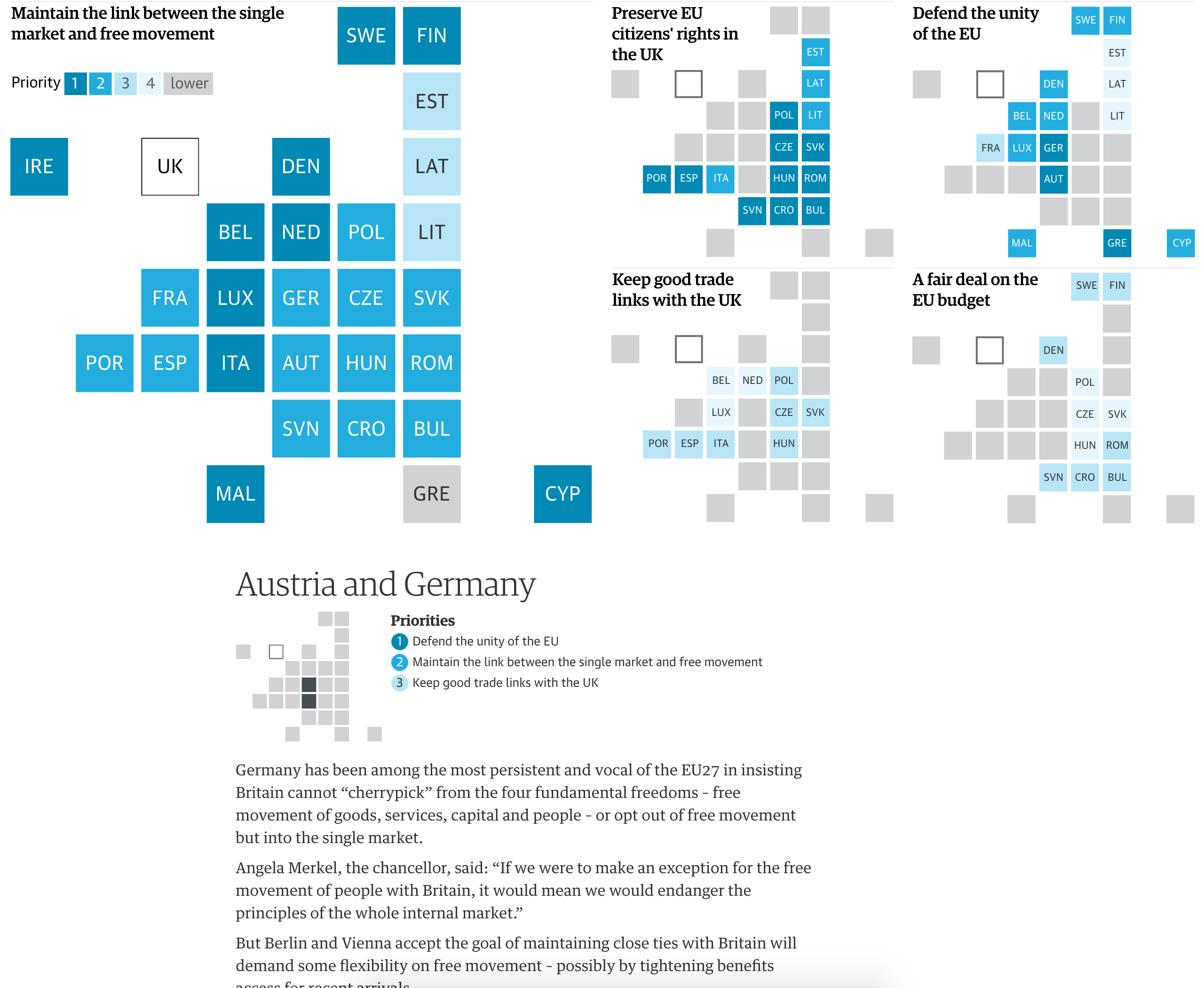
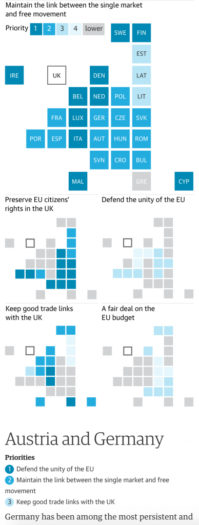
This piece from the Guardian attempts to explain what the various parties want from the United Kingdom and from the eventual settlement between the UK and the EU. It leads off with a nice graphic about the importance of a few key issues in a cartogram. And then several voting blocs run down the remainder of the page with their key issues.
What the EU wants from Brexit at a mobile scale
I really like this piece as the small multiples for each section refer back to the opening graphic. But then on a narrow window, e.g. your mobile phone, the small multiples drop off, because really, the location of the few countries mentioned on a cartogram is not terribly important to that part of the analysis. It shows some great understanding of content prioritisation within an article. In a super ideal world, the opener graphic would be interactive so the user could tap the various squares and see the priorities immediately.
But overall, a very solid piece from the Guardian.
Credit for the piece goes to the Guardian’s graphics department.
I was having a conversation with a mate the other night about what Brexit means for Scottish independence. This mate, however, is an American. Because when American politics are depressing and nonsensical, we turn to British pol—wait, never mind.
Despite the overall UK vote to leave the European Union, Scotland (and London, and Northern Ireland) voted overwhelmingly to remain. But since part of the whole vote no to independence thing was remaining part of the EU thing, shouldn’t Scotland now be well positioned for IndyRef2?
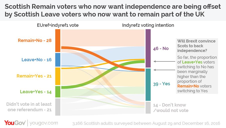
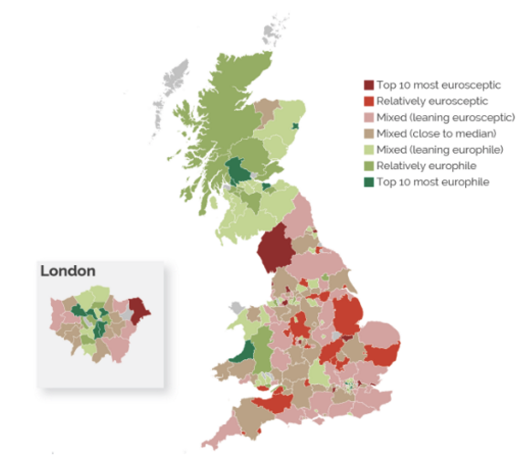
I read this article from the Guardian back in January and meant to share it with you all, but I somehow forgot about it. So at long last, it turns out no, not so much. The whole thing is worth a read; it uses YouGov survey data to break out voters into different camps. And what sort of nails the argument is this graphic.
About that independence…
There are four/five groups of Brexit/IndyRef1 voters that then get sorted into two/three IndyRef2 results (yes, no, maybe I don’t know?). And what you can see is that yes, a significant number of those who voted to Remain in the EU, but voted no to Scottish independence would now vote for independence. But, an almost equal number of those who voted to Remain and also voted for Scottish independence would now vote against Scottish independence. In effect, these two voter movements are cancelling out any potential gains for a future Scottish independence vote.
Credit for the piece goes to the YouGov graphics department.
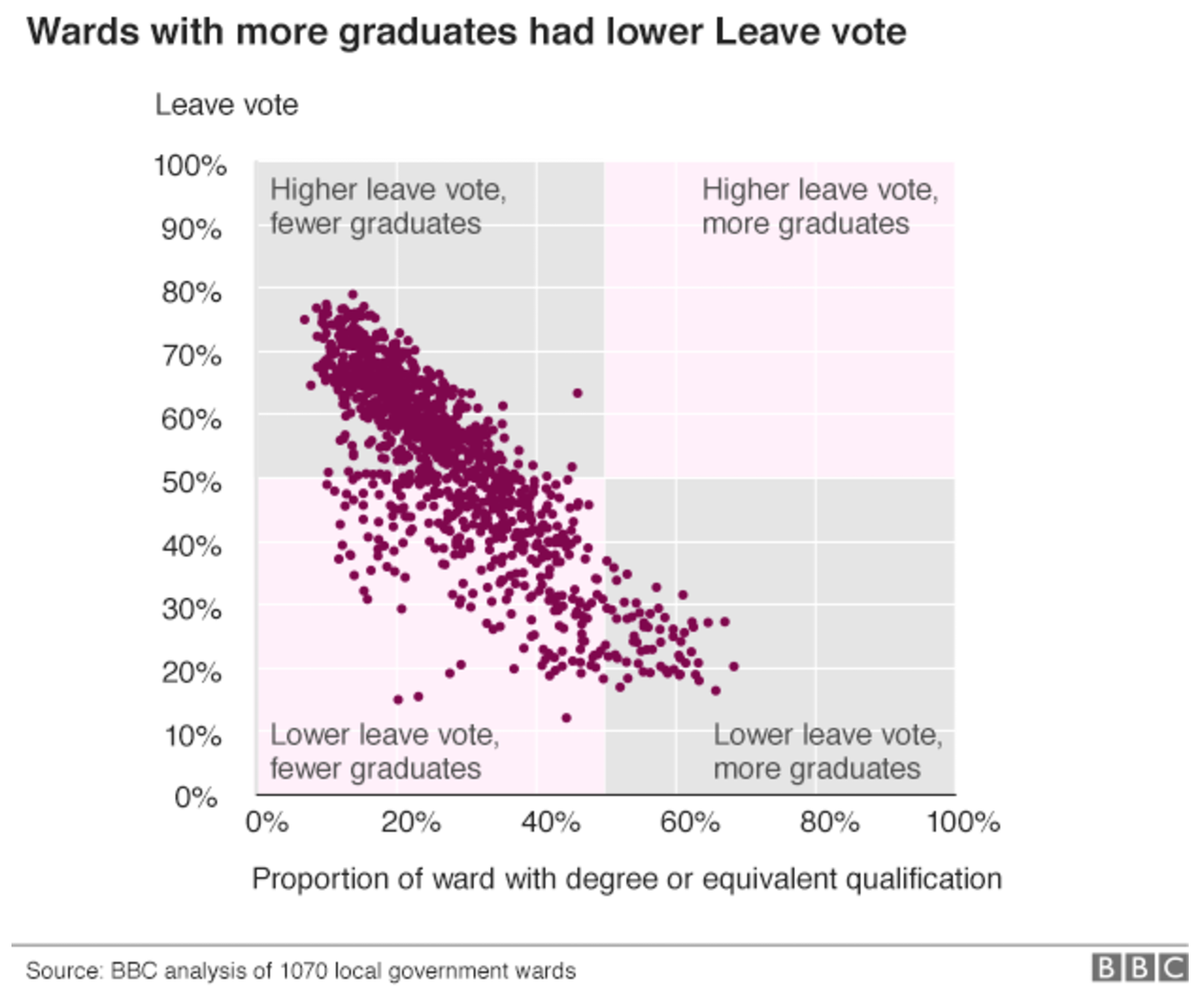
So this isn’t quite a shocker, but the BBC gained access to more granular Brexit vote data, and then examined the results against demographic data. The conclusion, a lower education level best corresponded to voting to leave the European Union. Again, we all sort of knew that, but this provides an even larger, richer sample size.
Still a sad result
What is interesting from the American perspective is how that compares with the election of Donald Trump. In that case as well, lower levels of education correlated well with votes for Trump.
Of course now I will be closely following the elections in the Netherlands, France, and Germany this year to see if the same lower education level corresponds to the vote in favour of populist, nationalist political parties, e.g. Marine le Pen and Geert Wilders.
Credit for the piece goes to the BBC graphics department.
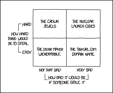
I’m still freaking out over Brexit. So enjoy this Friday with this four-quadrant chart from xkcd. Relevant because of references to the crown jewels of the United Kingdom.
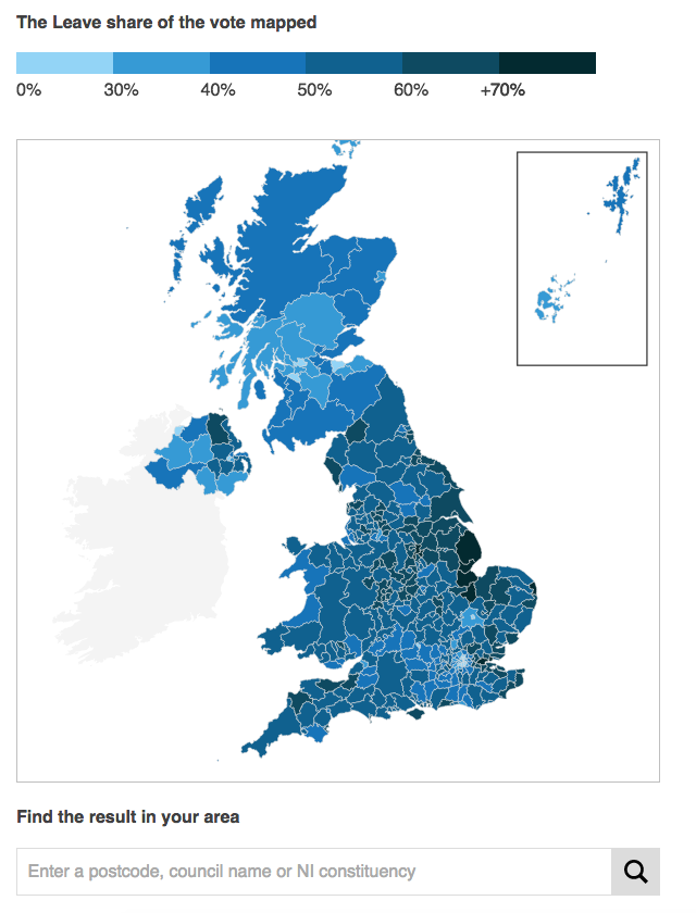
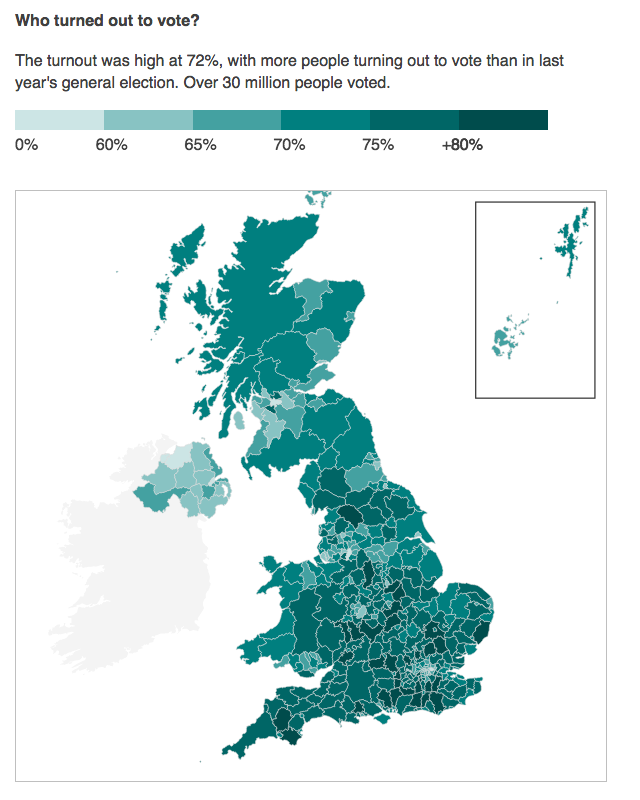
So now it is two weeks since the Brexit vote. Yesterday, I looked at the results designs from the New York Times. Today I want to take a look at those of the BBC. Not surprisingly the two share in the use of choropleth maps; the choice makes a lot of sense. People vote within districts and those form the most granular unit of data available. But, whereas the New York Times led and really focused on one giant map, the BBC opted to use multiple, smaller maps. (They did choose a different page for their live results, but we are comparing post-result coverage.) For example, their piece leads in with a map of Leave’s results share.
Leave’s share
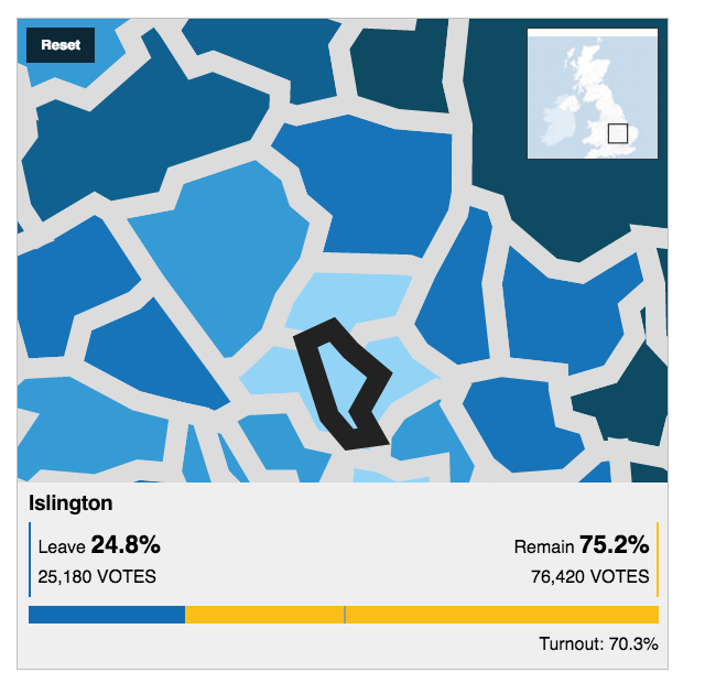
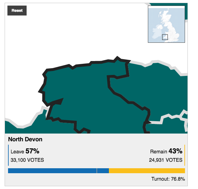
There are a few key differences between this and the New York Times. First and foremost, this map is interactive. Mousing over various districts provides you the name, and by clicking you move into a zoomed-in view of the district. It displays the district name, the vote totals and share for the two camps, and then voter turnout. From a design standpoint, the problem with the zooming in is that the scales of the outlining stroke does not change.
Zoomed in, looking at central London
A thin stroke at the national, zoomed-out view, translates to a thick, clunky, and awkward-looking outline at the local, zoomed-in view. And as the above screenshot highlights, many of the urban districts are small in comparison to the more rural districts. Unfortunately the map does not offer the functionality of zooming-in prior to selecting a district. So many of the districts in the more urban areas like London, Manchester, Birmingham, and Belfast are difficult to see and select. Thankfully, below the map the BBC offers a function to type in your district, post code, or Northern Irish constituency to help you find smaller districts.
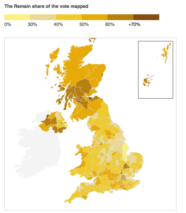
Another design criticism I have with the piece is the colour palette. Broadly speaking, the piece uses blue and yellow. The two colours make sense in a few ways. Both are present on the European Union flag, with yellow stars on a blue field. (Importantly the twelve stars do not represent EU members like the US flag’s fifty stars represent the states.) Another, far looser interpretation could be the blue of the Conservatives and the yellow closer to the gold of the UK’s Liberal Democrats, the former broadly anti-EU and the latter pro-EU. Regardless of the rationale, the choice of yellow to display multiple levels of data is less than stellar (pun intended), as this Remain share map highlights.
Remain’s share
Having multiple tints and shades of yellow makes the map difficult to read. The lowest value yellow is brighter than the next higher level, and so stands out more vividly on the map than those districts that had a higher share of Remain votes. Using yellow against blue does work, especially in the bar charts throughout the piece and seen in the aforementioned Islington screenshot. But, as a colour for wider, more intense use, yellow was not the wisest decision.
The BBC also included several other choropleth maps exploring the vote breakdown. In this instance of voter turnout, we have the same choropleth map, but a green colour indicating the total vote turnout.
Voter turnout
The colour and its choice makes broad sense; green is what one gets when they mix yellow and blue, when you combine Remain and Leave. However, the map functionality of clicking to reveal results still shows the overall results.
Should the vote results be given the highest priority?
At this point, we have moved on from the vote results themselves to the breakdown of the vote. I would have redesigned the mouse-click to display a results view that highlighted turnout over the results themselves. Certainly keeping the results is important, but the focus of this map is not the vote, but the turnout. The data display should be designed to keep that consistent.
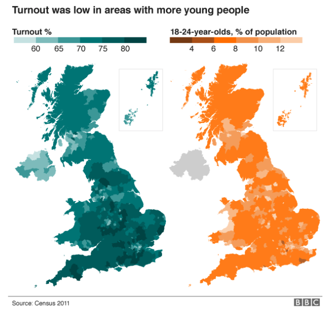
One part of the piece where I quibble with the designer selection of chart type follows on from turnout: a comparison of turnout to the youth population.
The turnout vs the youth
Asking people to compare undistinguished districts on one map to those of another—note the white district lines have here disappeared—is difficult. My first thought: I would have instead opted for an interactive scatterplot. Comparing the turnout on one axis and youth on the other, the user would have an easier time identifying any correlations or clusters of data.
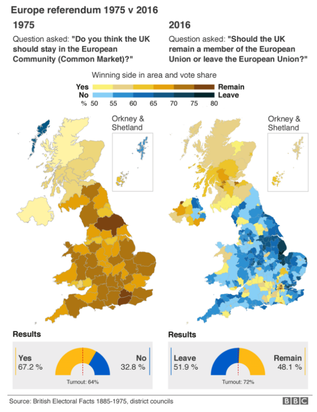
In contrast, the following map comparison would not work via a scatterplot. Here we compare June’s results to those of a vote in 1975. In the intervening years, the geography of the voting districts changed, and so a one-to-one comparison is impossible.
1975 vs. 2016
The broad scope, however, is clear. A resounding vote to stay part of the European Market or single market in 1975 evolved into a narrow but decisive vote to leave the European Union in 2016.
The piece then closes out with an interactive map of the total results and then, importantly, a long list of bar charts showing each district’s results. Unlike the map, however, the bar charts are a static graphic. And with a few hundred to view, it becomes difficult to isolate and compare two in particular. But the selection of the visualisation type makes a user’s comparison far more precise.
The results as a series of bar charts
Overall, I would rate the piece a solid work, but with some clear areas of improvement. And who knows? Maybe there will be a second referendum. Or a new general election. And in that case, the BBC could improve upon the designs herein.
Credit for the piece goes to the BBC graphics department.
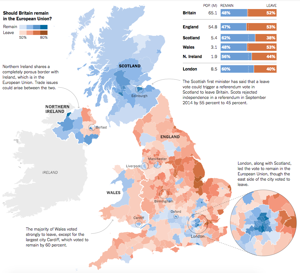
Well a little under two weeks later and here we are: Brexit. I wanted to take a moment in a slightly longer piece and comment on it. Not the results, because no, that I can leave to a pint at the pub. Instead I wanted to comment on this particular results content from the New York Times that I rather admire.
Overall the piece is not interactive; it features a static choropleth map with annotations and insets, particularly of greater London. On a side note, I would be remiss if I did not point out that similarly to the piece I wrote last week, this map omits a voting district: Gibraltar. Gibraltar, like Northern Ireland, borders the European Union directly via Spain. And despite voting overwhelmingly to remain in the EU, Gibraltar is omitted from these results.
The large format results
In a large layout, the piece makes excellent use of annotation text to indicate the overview stories for the home nations of the United Kingdom: Scotland, Wales, and Northern Ireland. Northern Ireland, of course, will likely have to deal with the reintegration of border controls between the Republic of Ireland and Northern Ireland, a point the piece makes quite clear.
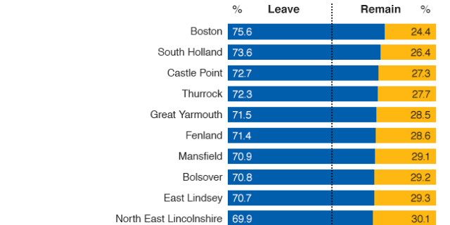
Additionally the map makes use of small elements to draw attention to data points, i.e. geographies, worth noting. London dominates the urban landscape, but other important cities like Belfast, Manchester, Birmingham are circled to show the strength of Leave/Remain. I would be curious to know the rationale behind including some areas, but omitting others, e.g. the strong Remain results in Cambridge or Brighton or the strong Leave results in Boston, require knowing just where cities are located in England.
From a design standpoint, the colours used in the map work really well together in contrast to other palette choices one could make. (We will take a look at that tomorrow.) Additionally, the shape of the United Kingdom allows for contextual elements, e.g. the regional result aggregates, to be placed much closer and nearer to the results. The space also allows for those annotations to be placed near their particular geographies.
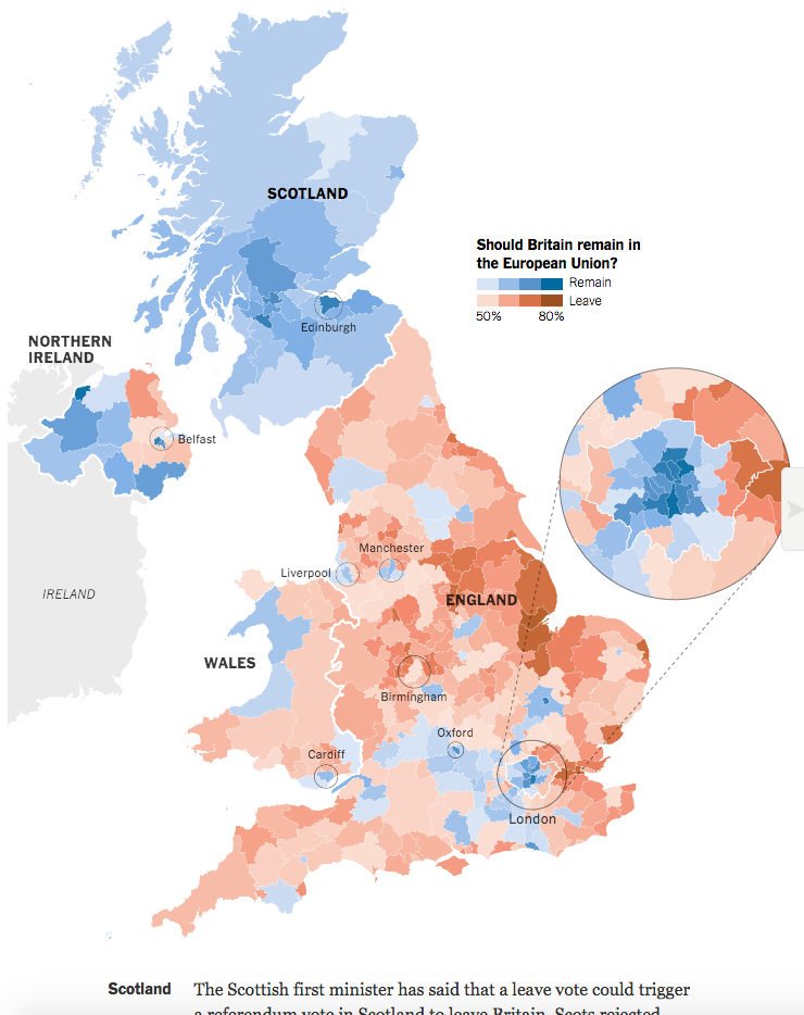
But, what makes the piece stand out is when the user consumes it on smaller screens. On a more tablet-sized screen, we see a tweaked layout.
The results on a medium-sized screen
It makes use of the remaining wide-aspect dimensions to move the greater London results into a white space carved out by the peninsula of East Anglia. While the city and home nation labels remain, the regional annotations and results are gone from the graphic. Instead, they have been placed below the map, the main and most important part of the story.
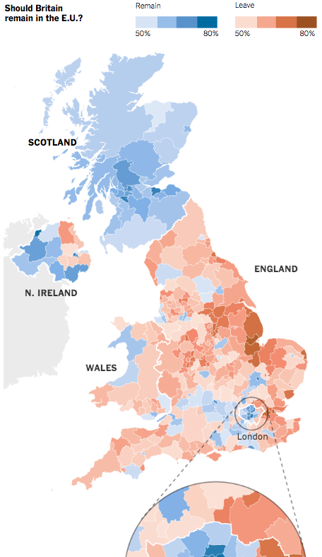
Then for mobile phone or other narrow displays, the piece degrades even further.
The results on a narrow screen
City labels and circles are gone, with the exception of London. The greater London inset moves from alongside the map to now below the map, in the Channel so to speak. This layout allows for a narrow screen to better view the geographic results and then scroll down into the districts of London that require more space to be displayed. The annotations and stories remain below the graphic.
The design of the overall piece accounts nicely for at least three different screen sizes while keeping the story constant. All the truly changes is the layout of the graphic (and the loss of a few contextual labels at the smallest of sizes). Overall, it makes for a rich and compelling—and well designed—piece on the Brexit results.
Credit for the piece goes to Gregor Aisch, Adam Pearce, and Karl Russell.
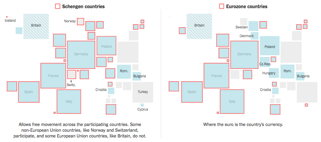
The United Kingdom voted to leave the European Union. Kind of a big deal, right? After the vote, the New York Times put together a piece on just how connected Europe remains. For example, European defence can largely be considered guaranteed through NATO, to which the United Kingdom remains. The screenshot below details which European countries participate in the Schengen Zone and the Eurozone, the former creates a common border the latter a common currency.
I personally dislike the use of squares to represent European countries, with the size determined by the population. Granted the piece opens with a large map labelling every country, but it does require a user to have the ability to abstract the geography of Europe. Adding a degree of interactivity over each square would partially resolve the issue.
Travel and currency connectivity throughout Europe
Credit for the piece goes to James Kanter and Iaryna Mykhyalyshyn.
This week I really wanted to hold off on commenting about Brexit graphics until things settled down—admittedly thinking Remain would win. Now that Thursday has arrived, I think we can all agree that settling down is not happening and the UK really is leaving the EU.
As an Irish American, I grew up with frequent commentary about the Troubles and the general situation in Ireland. So by dint of my heritage, I care about how Brexit impacts Northern Ireland. Unfortunately this graphic from the New York Times on Brexit sentiments entirely omitted Northern Ireland. (It is far from the first time graphics about the UK omit Northern Ireland.)
Where is Northern Ireland?
But, what irritates me in particular about this graphic at this historic time, is what the designers did choose to include. If you look to the north and west of Scotland, you will find the Outer Hebrides and Orkney Islands. From the legend it appears there are no results, accordingly the islands remain—pun intended—grey for, I presume, a classification of not applicable or something similar. (Although, that should also be clarified in the legend.) But, while we are given an inset of Greater London’s results, the entire home nation of Northern Ireland is omitted from the results. (I could then mention how Northern Ireland was not ignored when it came to the Euro 2016 Round of 16 participant results, but I do not understand football enough to comment intelligently.)
And since we mentioned Northern Ireland, we should also mention that Gibraltar is absent from the results map presented here. Gibraltar was once Spanish territory. However, Spain ceded it to the United Kingdom in 1713 as part of the Peace of Utrecht made to end the War of the Spanish Succession. Gibraltar voted overwhelmingly to Remain. And as with Scotland and Northern Ireland, it will (likely) be dragged out of the EU against its people’s wishes.
Credit for the piece goes to the New York Times graphics department.
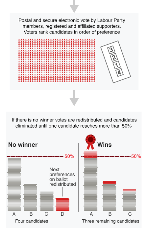
But, how does he go? Well admittedly there are legal questions about whether or not the following process can be kicked off, but presuming it does occur, we have a BBC graphic to explain it. It is a tad long and scrollable, so it does not fit in a single view. Worth heading to the article and checking it out. In short, though, it’ll be a messy time for Labour.
A view on how the preferred voting bit goes
Credit for the piece goes to the BBC graphics department.
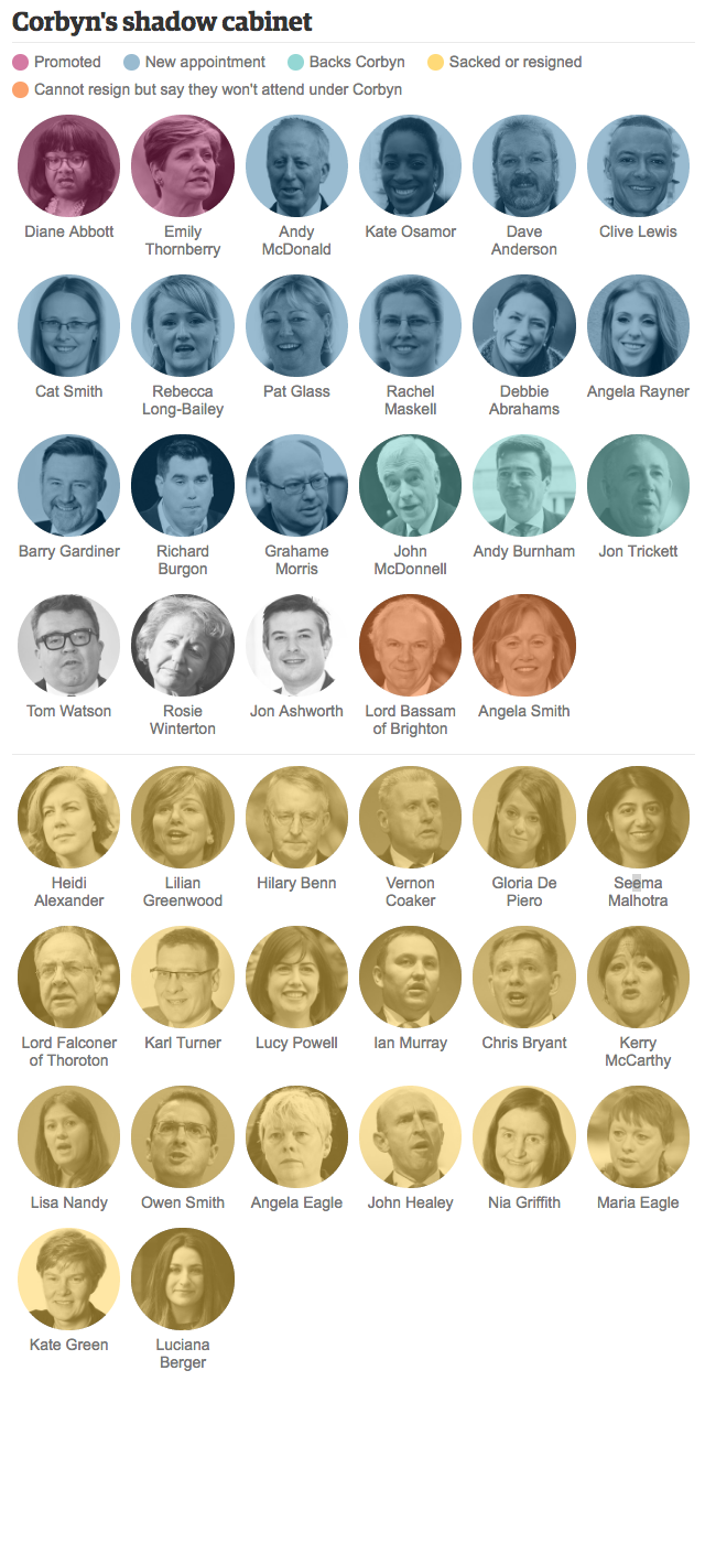
And by he, I am referring to Jeremy Corbyn, leader of the Labour Party in the (dis)United Kingdom. Why? Well, one word: Brexit. And don’t worry, I intend on coming back to that in more detail later. Once somebody somewhere knows just what is going on. But for now, we can enjoy this piece from the Guardian about the complete collapse of the Labour shadow government.
All the resignations (and the one sacking that started it all)
Credit for the piece goes to the Guardian graphics department.