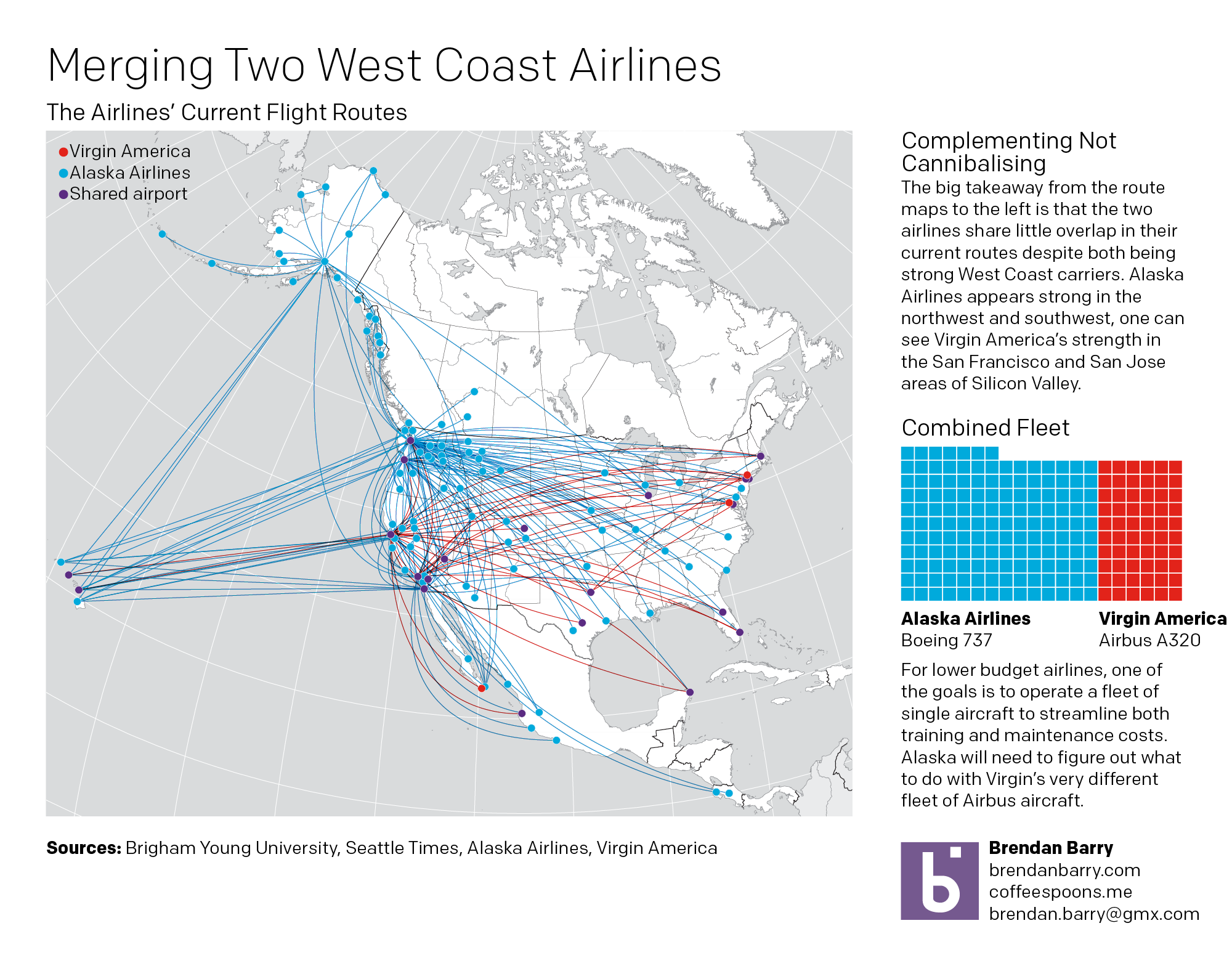
Alaska Airlines and Virgin America made some news the past few days when they announced Alaska would purchase Virgin America for $2.6 billion. I mapped out the flight routes of the two carriers to see where they overlapped. You can see the results in my piece for the blog today below.
A brief look at the merger of Alaska Airlines and Virgin America
Credit for the work is mine, except the underlying map, which I sourced from Brigham Young University Geography Department.
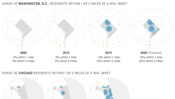
Today’s piece comes via my co-worker and is about the growth of urban Walmart stores. The article is from NPR and includes a nice series of small multiples of store locations in three select cities: Washington, Chicago, and Atlanta. In full disclosure, I live about two blocks from one of the urban Walmarts in Chicago. So go figure.
The growth of urban Walmarts
Credit for the piece goes to April Fehling, Tyler Fisher, Christopher Groskopf, Alyson Hurt, Livia Labate, and Ariel Zambelich.
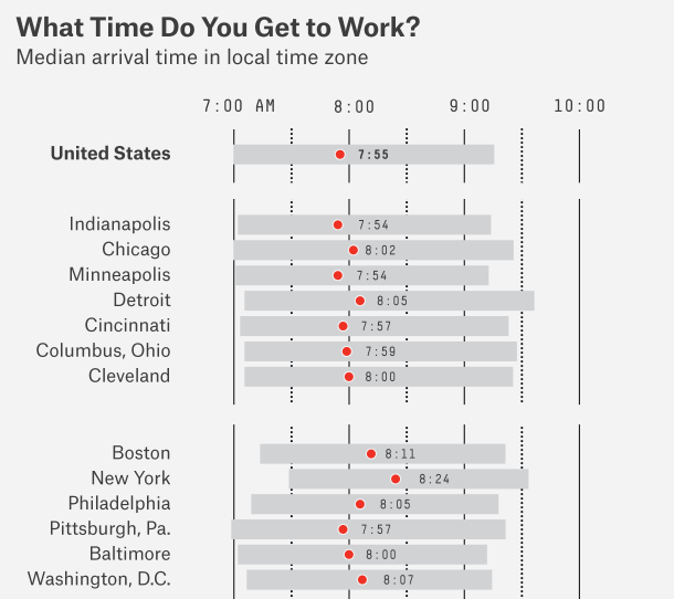
…forty minutes late with an iced coffee? It’s what we millennials do since we don’t understand that time exists between 04.00 and 10.30. Don’t believe me? Well, Nate Silver over at FiveThirtyEight crunched the numbers and it turns out that there is some truth in the humour. Cities with a younger, more millennial workforce tend to see workdays start later.
Selected cities in the Eastern and Central time zones
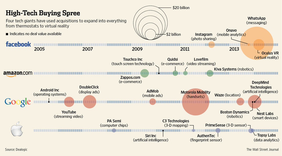
Last week Facebook acquired a company specialising in virtual reality. The Wall Street Post put together a timeline of technology company acquisitions over the last several years. Each line is a different company and sizes of dots represent the value of the different purchases.
Technology company acquisitions
Credit for the piece goes to the Wall Street Journal’s graphics department.
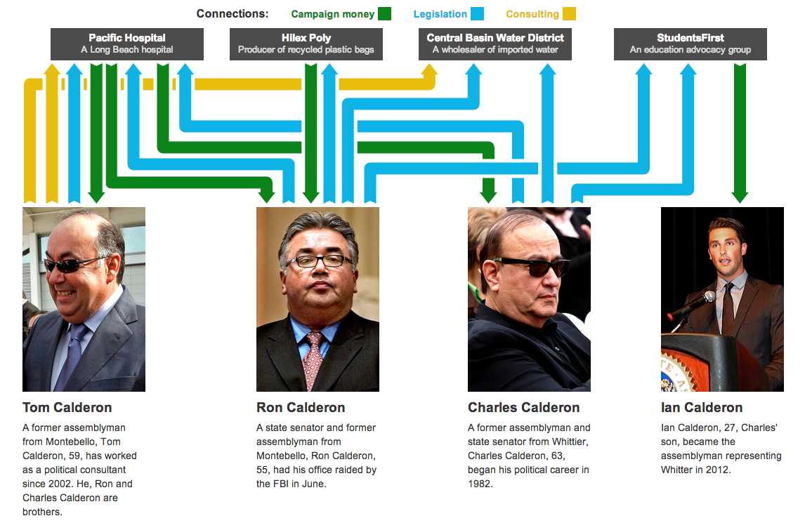
I am not terribly familiar with local politics outside of my local areas. So the background and details of this piece escape me. However, this interactive graphic and story from the Los Angeles Times does a really great job of leading the reader through the story.
First, the piece starts with a general overview or flowchart of the network of connections. Mouseovers do a fine job of highlighting and filtering for the appropriate piece. For example, a person shows the entities to which he is connected whereas the entities show the people to which it is connected.
The flow diagram of connections
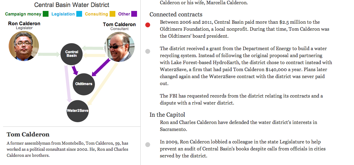
Secondly, the piece then goes in detail about the different connections. The example screenshot below shows how each story is highlighted by a red dot as the user scrolls down the page. When that story is highlighted, the network diagram to the left changes, either replacing the contacts or highlighting the contacts specifically noted in the story.
Example of the connections in this story
As I said at the outset, this is a very nice piece that step-by-step shows and explains how all the connections work while filtering out the momentarily irrelevant data. Very well done.
I’m not a coffee guy. I drink tea. At most I have one or two espresso drinks per year. But up in Boston, they have been looking this week at coffee preferences. The question is which is your coffee spot? Dunkin Donuts (from Massachusetts) or Starbucks (from Washington)? Northeast or Pacific Northwest? In a piece that reminds me of the New York Times’ Wawa vs. Sheetz graphic, the Boston Globe plotted the locations of the two national coffee chains. This interactive piece allows you to toggle between dots for Dunkin Donuts (orange, naturally) and Starbucks (green, of course).
Dunkin Donuts vs. Starbucks in Massachusetts
They complemented the Massachusetts-focused piece with a longer article that looked at the national distribution.
Dunkin Donuts vs. Starbucks between New York and Philadelphia
Credit for the piece goes to Alvin Chang and Matt Carroll.
Well maybe not so much the space. Anyway, Nicolas Rapp, who does a lot of work for Fortune Magazine and previously the AP, created his first connected scatter plot. I have been a fan of them for quite some time and have been able to use them fromtimetotime. Rapp’s scatter plot looks at the profits and revenues of the Fortune 500 in the last 20 years. But what I think makes his piece particularly strong are the two annotations he provides to explain the “loops” in the data: the two big recessions.
Once when I worked at the Jersey shore as a kid a woman purchased her books and then asked me the location of the nearest ATM. I replied “Wawa”. She looked at me as if what I said was gobbledy-gook. She asked again. I replied “Wawa” again but with probably a look of confusion upon my face. It turned out she was from California and she thought I was mentally ill. I did not understand how anyone did not or could not know about the awesomeness of Wawa.
But for all of my upbringing in the Philadelphia suburbs/South Jersey loyalty to Wawa, I must confess to an unfortunate divide in Pennsylvania between we civilised folks near Philly and, well, the rest of the state. We in the Philadelphia metropolitan area are loyal to Wawa. The rest of the state swears allegiance to Sheetz. But how stark is this geographic loyalty? The New York Times mapped store locations with Wawa in blue and Sheetz in red to accompany an article about the “tribal loyalties” to the two chains.
The geographic footprint of Wawa (blue) vs. that of Sheetz (red)
For those more curious about this author’s loyalties, the author of the article, Trip Gabriel, included photos by Mark Makela of one of my local Wawas (the one near Malvern at 202 and 29 for my hometown readers) as the main image for the article along with photos of interiors in West Chester. And of course the Wawas where I grew up:
Google is a big company. What do big companies do from time to time? Market themselves. And so this is a screenshot from a fun interactive infographic piece that has supplementals from text to photos to videos as Google explains how an e-mail is sent. All the while Google touts its green energy initiatives and energy efficiencies. It’s a game changing win-win paradigm-shifting grand slam of a piece. (Sorry, that just felt like an appropriate place to use CorporateSpeak.)
Kickstarter has been around for a little while now, financing some interesting projects. The New York Times has an infographic about how much each project earned. And while there is nothing particularly fancy about each, they are all scatter plots, the quirk is that the time and value axes have been reversed from their customary positions. While unusual, it supports the longer range for the monetary figures and the short range for the three years of Kickstarter history.
Kickstarter fundraising
Furthermore, the data is broken out into different industries, e.g. design, food, and dance, that have adjusted value scales to make intra-industry comparisons easier. Nothing fancy, but an attentive care to the detail of the data.


 vs. that of Sheetz (red)")


