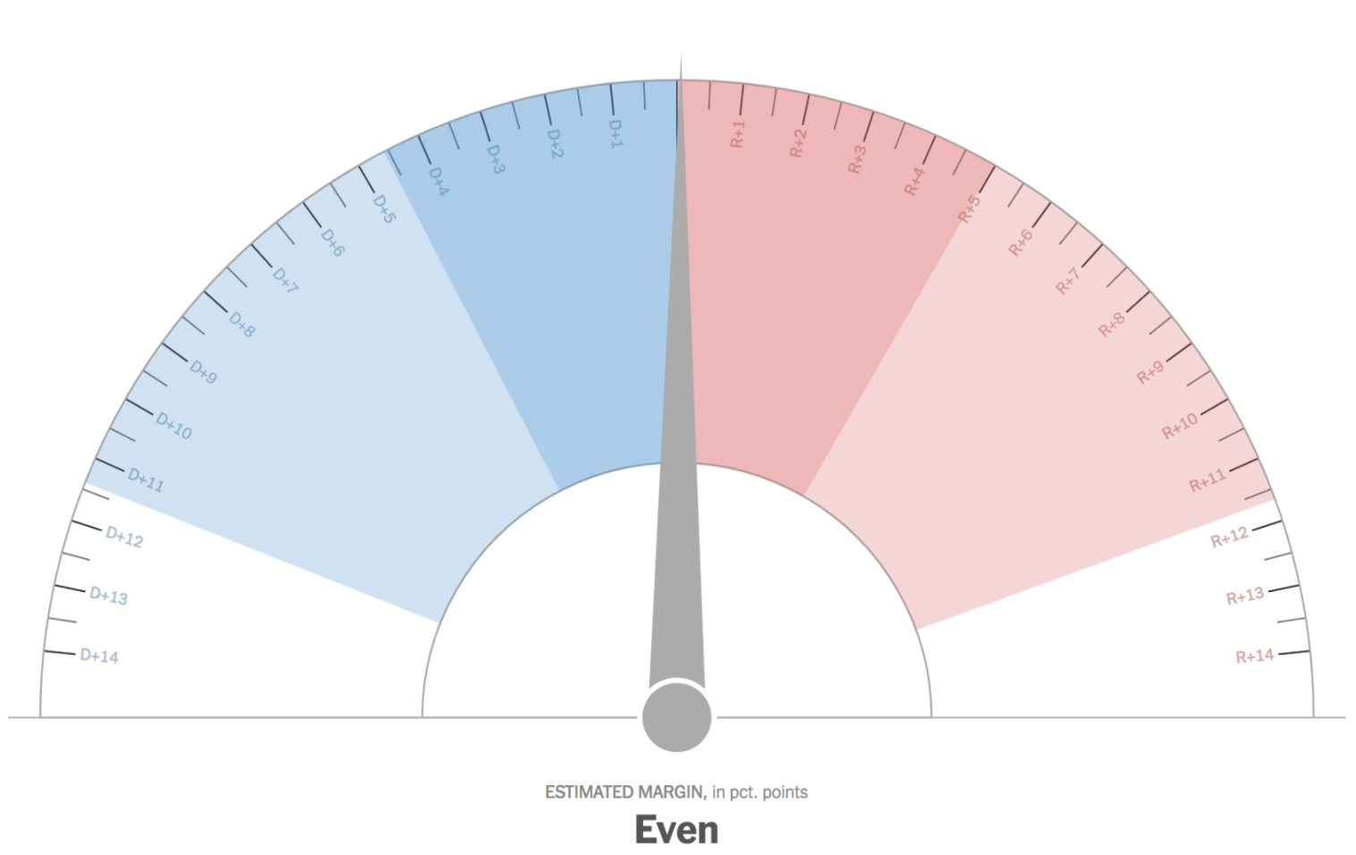
I am exhausted. I tried to stay up late enough to catch the absentee ballots from Washington County. Alas, I did not quite make it. (You better bet I will be drinking all the caffeine today.) But someone else did not quite make it through the night. Or rather, something. What was it? The New York Times election night needle.
To understand why the Times made the needle, read this really great explainer. The super short version: it tries to forecast the results of that particular election day, accounting for things like uncounted votes. On television, analysts and large interactive screens can show how, usually, urban districts are counted first then followed by slower-to-return rural areas. But for people following results solely online, those nuances might well be lost. Enter the needle.
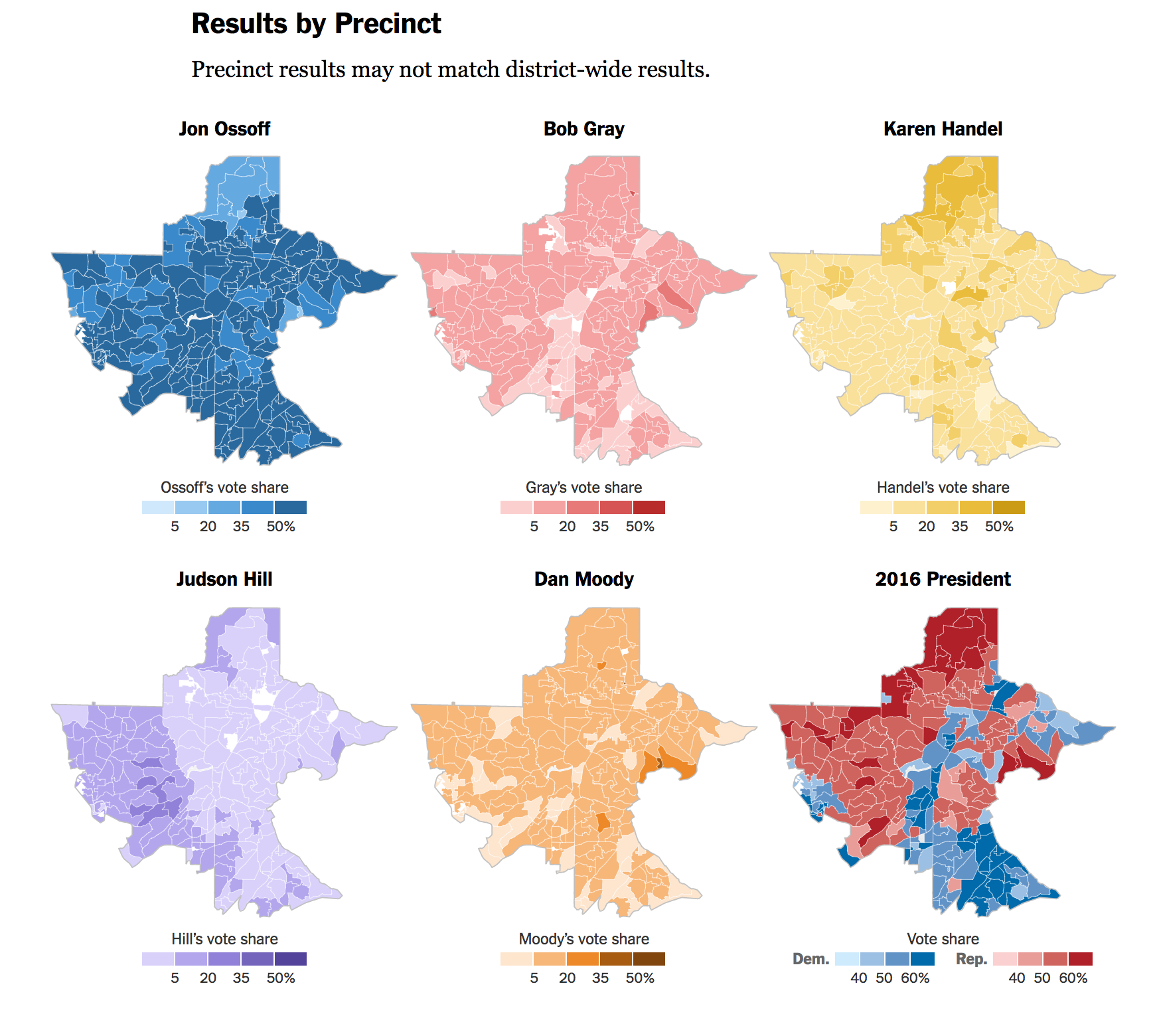
Last night, like much of the Twitterverse I follow for politics, I had the needle open in one tab. But as the results began to come in, something odd was happening on the Times’ results page. The votes were being displayed in a precinct-by-precinct fashion in Allegheny, Washington, and Greene Counties. But Westmoreland was oddly grey. It turned out, the county elections board was not, I suppose, digitally publishing the precinct results, only county-wide.
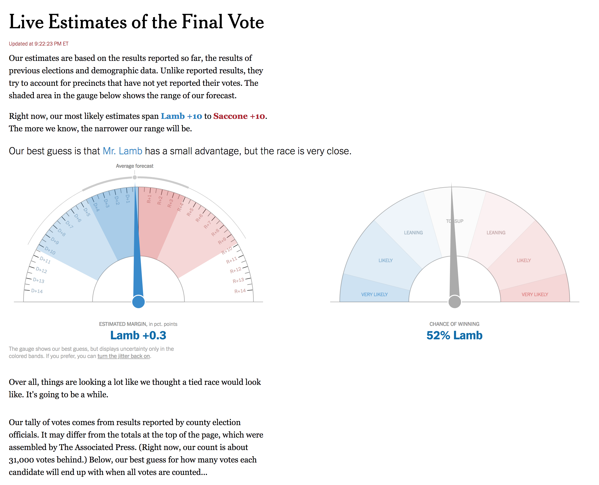
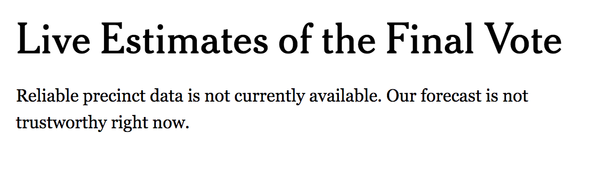
Fun fact, the needle’s model is apparently built on precinct results. So how do you have a needle if something like 30% of the model’s required or expected data will not be available? The Times tweeted about it a few times, but ultimately pulled it down. Better to not have it and be right than have it wrong just to have it.
But that brings me to the second point about the needle. Well done to BuzzFeed’s Decision Desk HQ, who were presciently concerned about the ability of the county to get precinct level results up online. So they sent a reporter, as in a human being, to Westmoreland to get the analogue results and then upload them to BuzzFeed’s own results spreadsheet. (I never did find a BuzzFeed live results page.)
Who knows the budget difference between the New York Times’s graphics/politics desks and that of BuzzFeed’s, but the ability to put a single person in Westmoreland made the difference for BuzzFeed, whose coverage via Decision Desk HQ, made for a more compelling following because they were, old school like, reading out results as they came in via reporters. And because there were no exit polls in the election, we had to wait for all the votes. Strangely, it almost felt like watching a UK general election where you have to wait hours for some constituencies to announce results. Though this election had a noticeable lack of Raving Monster Loony candidates.
I bring up the BuzzFeed contribution to the night because it does show how sometimes the sheer fact of placing a reporter on the ground can yield tremendous results. Come November, no, I don’t think any single media organisation can afford to put a reporter in every single US county. But I would bet the Times will be working on how to better precinct proof their needle.
Credit for the piece goes to Nate Cohn, Josh Katz, Sarah Almukhtar, and Matthew Bloch.