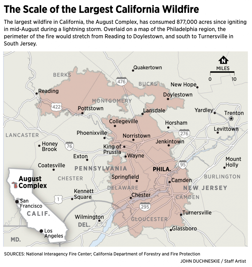
The West Coast is a different scale than the East Coast. After all, California alone is almost the size of New England and parts of the Mid-Atlantic combined. So when we take that enormous size into consideration, how big are these fires on an East Coast scale? It can be difficult to imagine.
Thankfully the Philadelphia Inquirer addressed the issue.
It’s a simple concept, but I love these kind of graphics. The East Coast is dense and cities and towns are clustered closer together, being they were founded before personal automobiles were things. And so the August Complex fire in California would cover a significant portion of the Philadelphia metropolitan area, almost wiping it all off the map.
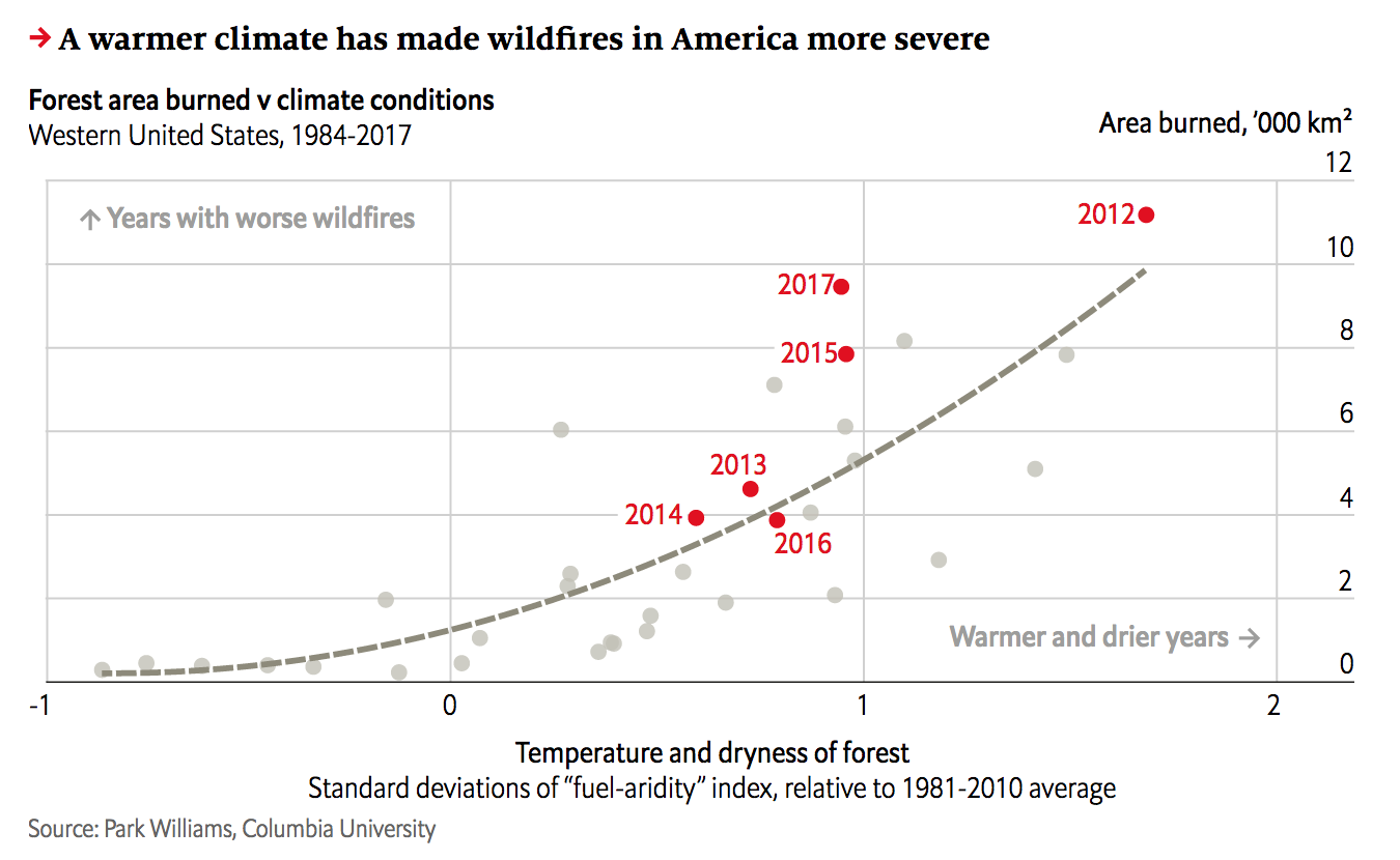
Yesterday we looked at the wildfire conditions in California. Today, we look at the Economist’s take, which brings an additional focus on the devastation of the fires themselves. However, it adds a more global perspective and looks at the worldwide decline in forest fires and both where and why that is the case.
California isn’t looking too…hot. Too soon?
The screenshot here focuses on California and combines the heat and precipitation we looked at yesterday into a fuel-aridity index. That index’s actual meaning is simplified in the chart annotations that indicate “warmer and drier years” further along the x-axis. The y-index, by comparison, is a simpler plot of the acres burned in fires.
This piece examines more closely that link between fires and environmental conditions. But the result is the same, a warming and drying climate leaves California more vulnerable to wildfires. However, the focus of the piece, as I noted above, is actually on the global decline of wildfires.
Only 2% of wildfires are actually in North America, the bulk occur in Africa. And the piece uses a nice map to show just where those fires occur. In parallel the text explains how changing economic conditions in those areas are lessening the risk of wildfire and so we are seeing a global decline—even with climate change.
Taken with yesterday’s piece with its hyper-California focus, this provides a more global context of the problem of wildfires. It’s a good one-two read.
Credit for the piece goes to the Economist Data Team.
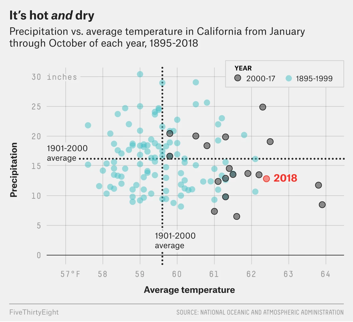
Wildfires continue to burn across in California. One, the Camp Fire in northern California near Chico, has already claimed 77 lives. But why has this fire been so deadly?
FiveThirtyEight explained some of the causes in an article that features a number of charts and graphics. The screenshot below features a scatter plot looking at the temperature and precipitation recorded from winter through autumn every year since 1895.
The evolving California climate
The designers did a good job of highlighting the most recent data, separating out 2000 through 2017 with the 2018 data highlighted in a third separate colour. But the really nice part of the chart is the benchmarking done to call out the historic average. Those dotted lines show how over the last nearly two decades, California’s climate has warmed. However, precipitation amounts vary. (Although they have more often tended to be below the long-term average.)
I may have included some annotation in the four quadrants to indicate things like “hotter and drier” or “cooler and wetter”, but I am not convinced they are necessary here. With more esoteric variables on the x- and y-axis they would more likely be helpful than not.
The rest of the piece makes use of a standard fare line chart and then a few maps. Overall, a solid piece to start the week.
Credit for the piece goes to Christie Aschwanden, Anna Maria Barry-Jester, Maggie Koerth-Baker and Ella Koeze.
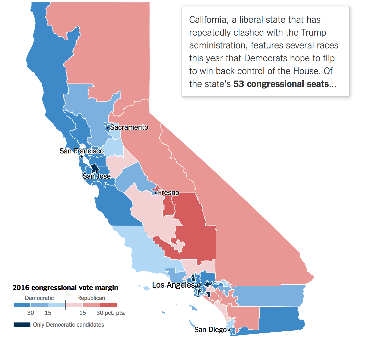
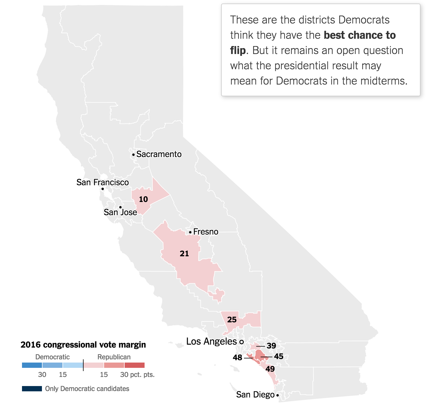
Today is primary day and everyone will be looking to the California results. Although probably not quite me, because Eastern vs. Pacific time means even I will likely be asleep tonight. But before we get to tonight, we have a nice primer from last Friday’s New York Times. It examines the California House of Representatives races that we should be following.
53 districts are a lot to follow in one night…
Like most election-related pieces, it starts with a map. But it uses some scrolling and progressive data disclosure. The map above, after a bit of scrolling, finally reveals the districts worth following and their 2016 vote margins.
Out of all 53, these are the districts the Times says to watch
From there the article moves onto a bit of an exploration of those few districts. You should read the full article—it’s a short read—for the full context on the California votes today. But it does make some nice of bar and line charts to plot the differences in presidential race vs. congressional race margins and the slow Democratic shift.
Credit for the piece goes to Jasmine C. Lee and Karen Yourish.