Misleading Graphics Aren’t Limited to US Elections

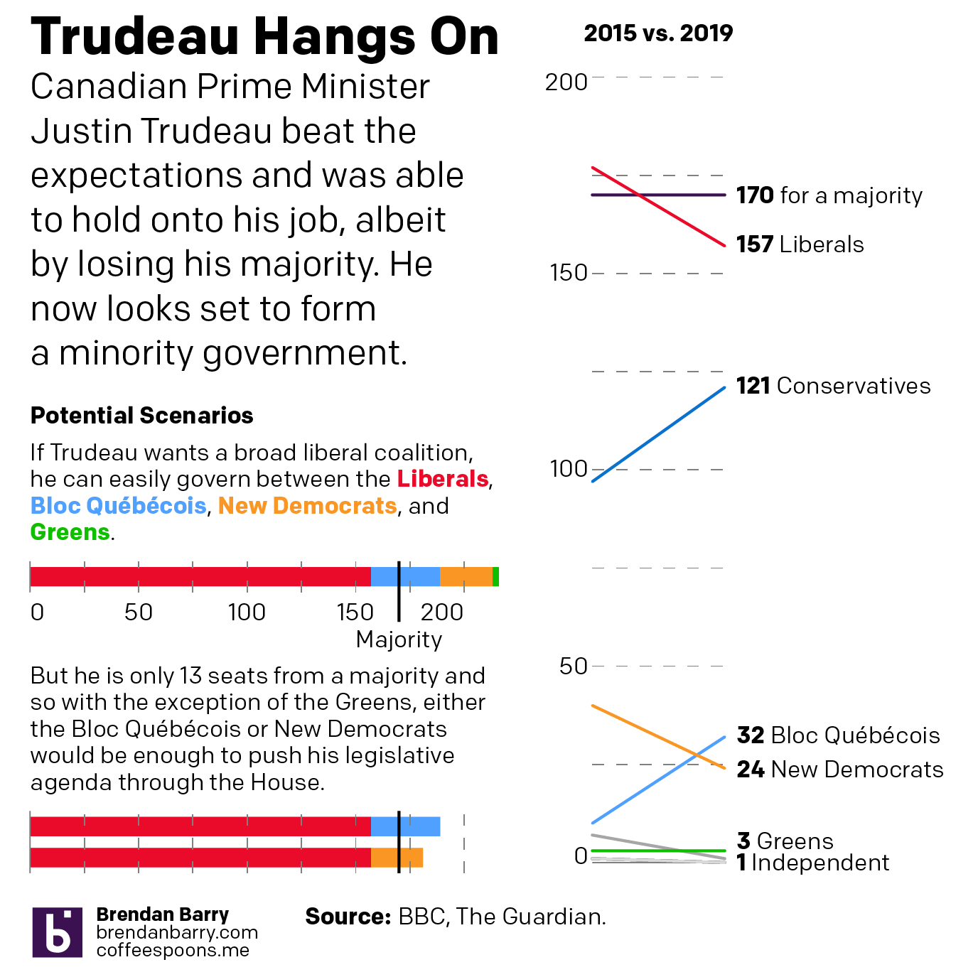
Last week I wrote about how CBS News’ coverage of the California recall election featured a misleading graphic. In particular, the graphic created the appearance that the results were closer than they really were.

This week we had another election and, sadly, I find that I have to write the same sort of piece again. Except this time we are headed north of the border to Canada.

I was watching CBC coverage last night and I noticed early on that the vote share bar chart looked off given the data points. Next time it popped up I took a screenshot.

Look at the bars

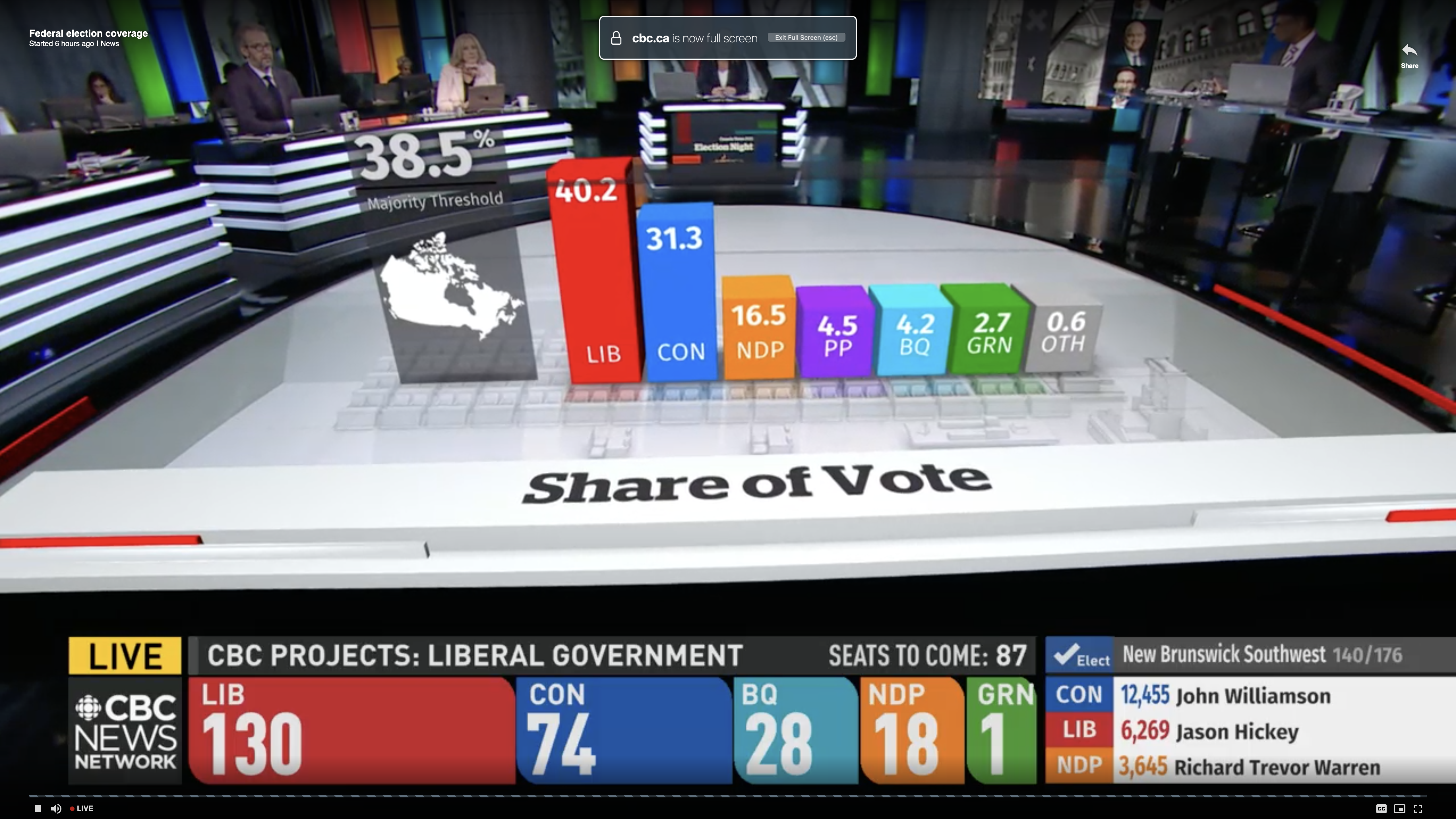
First we need to note these are three-dimensional and the camera angle kept swinging around—not ideal for a fair comparison. This was the most straight-on angle I captured.

Second, at first glance, we have the Conservative share at a little more than 3/4 the Liberal vote share. That looks to be about right. Then you have the New Democratic Party (NDP) at roughly half the vote of the Conservatives. And the bar looks about half the height of the blue Conservative bar. Checks out. Then you have the People’s Party of Canada at roughly 1/4 the amount of NDP votes. But now look at the bar’s height. The purple bar is nearly the same height as the orange bar.

Clearly that is wrong and misleading.

The problem, I think, is that the designers artificially inflated the height of the bars to include the labels and data points for the bars. The designers should have dropped the labelling below the bars and let the bars only represent the data.

I created the following graphic to show how the chart should have looked.

And my take…

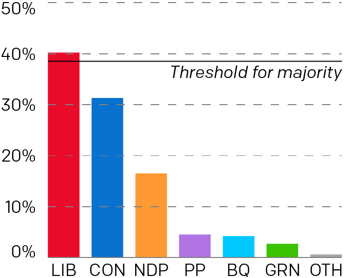
Here you can more clearly see how much greater the NDP victory was over the People’s Party. The labelling falls below the charts and doesn’t distort the height comparison between the bars. In some respects, it wasn’t even close. But the original graphic made it look else wise.

I just wish I knew what the designers were thinking. Why did they inflate the bars? Like with the CBS News graphic, I hope it wasn’t intentional. Rather, I hope it was some kind of mistake or even ignorance.

Credit for the original piece goes to the CBC graphics department.

Credit for the updated version is mine.

Canadian Election Results

Yesterday Canada went to the polls for the 43rd time. Their prime minister, Justin Trudeau, has had a bad run of it the last year or so. He’s had some frivolous scandals with wearing questionable fashion choices to some more serious scandals about how he chose to colour his face in his youth to arguably the most serious scandal where an investigation concluded improperly attempted to influence a criminal investigation for political gain. (Sound familiar, American readers?) Consequently, there was some chatter about whether he would lose to the Conservatives.

But nope, Trudeau held on.

So this morning I charted some of the results. It was a bad night for Trudeau, but not nearly as bad as it could have been. He remains in power, albeit head of a minority government.

That's a steep drop in seats, but it could have been worse
That’s a steep drop in seats, but it could have been worse

Credit for the piece goes to me.

The Canadian Elections

Canada held an election yesterday. For your briefing on it, John Oliver did a great job on Last Week Tonight. But for the serious coverage, we have results.

Here we have the results coverage by the National Post. It’s your standard choropleth coloured by the victor in each riding, or constituency. From a design side, I find the pattern fill interesting and not something I have seen done before for a political map.

I just chose a place I had visited in Canada

But I really like what the CBC did. They built an interactive application to cover the evening’s results as they arrived. This screenshot is for the riding in Fredericton, where my ancestors lived in the 19th century. (I had to have a connection to the ridings somehow.) In particular, I liked the ability to star ridings of interest and have them immediately retrievable. The CBC complemented that with a list of ridings to watch. It was a great resource for the evening.

Fredericton results
Fredericton results

But then they also covered the results with an article with interactive graphics. This is more your standard fare with choropleths, bar charts, and line charts. But they flow through the article quite sensibly. Overall, a solid results piece.

Party results per region

Credit for the National Post piece goes to the National Post graphics department.

Credit for the CBC piece goes to the the CBC graphics department.

Canada vs. the United States

Last week I was asked what was the population of Canada. I first said 30 million. I then figured that was too small so I said more like 50–60 million. Turns out I was closer to being correct the first time. A Google search that cites the World Bank among its sources listed the population as nearer to 35 million. But what does that mean?

Over at I Love Charts, the United States was broken down into units shaped by the size of the population of Canada. Roughly, the United States = 10 Canadas.

How many Canadas in the US?

Credit for the piece goes to an unknown individual. If discovered, I would appreciate being informed.

Canadian Debt

Canada, along with Australia, was one of the few Western, industrialised economies to weather the global recession of 2008 fairly well. However in recent years, despite the economic boom in the energy-rich western provinces, many of Canada’s provinces have been accumulating substantial—though not yet crippling—levels of debt. Toronto’s National Post explores the federal and provincial situation using small (or perhaps medium-sized) multiples.

Canada's debt
Canada's debt

Credit for the piece goes to Richard Johnson.

Fighter Jets

A large-scale infographic with lots of drawings of fighter jets. That’s pretty much what this is. And that’s cool enough for me. The background is that the US fighter programme for the F-35 is increasingly ridiculously expensive and beyond budget. Some nations, like Canada, are starting to have second thoughts. This post outlines potential options and adversaries.

Not all of these aircraft are really options. For example, the US has banned the export of the F-22 and it is highly unlikely that Canada would purchase the Raptor. Will the Russians ever build the PAK FA? They’ve been trying to build them for years and the aircraft has yet to go into production. Regardless of the likelihood of facing the adversaries or procuring the options, they’re still pretty cool illustrations and side-by-side comparisons.

Fighter jet options and adversaries for Canada

Credit for the piece goes to Jonathon Rivait, Mike Faille, and Matt Gurney.

Canadian Tradin’

The Globe and Mail of Canada published an infographic that where I work would probably be called a datagraphic. It presents data in a graphic fashion without a lot of context or conclusions that turn data into information. The piece in question looks at Canada’s balance of trade, i.e. how much it imports from other countries vs how much it exports to other countries.

Canadian trade
Canadian trade

While I appreciate the goal of the overall piece and fully understand that it may have in fact first lived in the print edition, the version shown on their website feels too large for the few data points contained within the graphic. The bars on the right and beneath the timeline are far too wide. The sections could likely have been condensed into a smaller, more compact space that would have given more visual weight to the timeline that clearly tells the story of a more volatile trading period for Canada since the global recession of 2008.

I also would probably change the chart type or simply look at a different data set for the trade balance with principal partners because the data for Japan barely registers. And while the other data can be seen, the minor differences are difficult to read. I would probably shift the emphasis from the actual dollar value of exports and imports to the percentage growth (or decline) of each over the last year.

Canadian Military Spending

Canada is spending more than ever on its military. The question is, to what end? Canada shares a land border with only two countries. And one of them is us…

From the National Post comes an infographic looking at the rising expenditures on defence and how it currently ranks in the world.

Canadian military spending

Credit for the piece goes to Tristin Hopper and Richard Johnson.

Immigrating to Canada

The Globe and Mail has been working on a story about immigration to Canada because apparently not all immigrants come to America. The story has its section headers running down the side column of the page, like many other segmented stories you’ll see posted online these days, but also uses graphics to make and supplement its arguments.

This one chart from the piece is an example of how the simple format of a line chart can clearly express and visualise an interesting trend. Immigrants from the past two decades earn less than immigrants to Canada in the 1970s. Those from the early 90s, however, do appear to have a faster rate of income growth that approaches parity with Canadian-born income-earners.

Income of Canadian Immigrants