
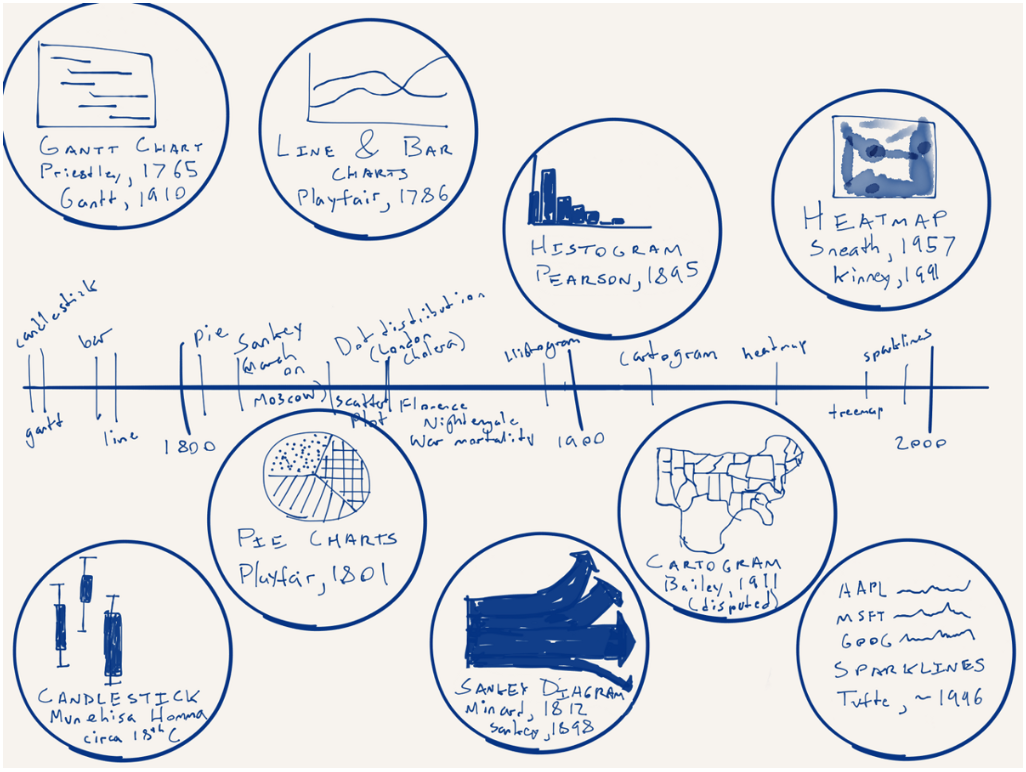
From time to time in my job I hear the desire or want for more different types of charts. But in this piece by Nick Brown over on Medium, we can see that there are really only a few key forms and some are already terrible—here’s looking at you, pie charts. How new are some of these forms? Turns out most are not that new—or very new depending on your history/timeline perspective. Brown illustrated that timeline by hand.
Worth the read is his thoughts on what is new for data visualisation and what might be next. No spoilers.
Credit for the piece goes to Nick Brown.