
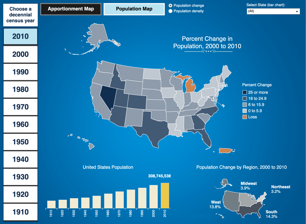
Admittedly, I was trying to find a data set for a piece, but couldn’t find one. So instead for today’s post I’ll turn to something that’s been sitting in my bookmarks for a little while now. It’s a choropleth map from the US Census Bureau looking at population change between the censuses.
The reason I have it bookmarked is for the apportionment map, but I will save apportionment for another post because, well, it’s complicated. But map colours are a thing we’ve been discussing of late and we can extend that conversation here.
What I find interesting about this map is how they used a very dark blue-grey colour for their positive growth and an orange that is a fair bit brighter for negative growth, or population loss. And because of that difference in brightness, the orange really jumps out at you.
To be fair, that’s ideal if you’re trying to talk about where state populations are shrinking, because it focuses attention on declines. But, if you’re trying to present a more neutral position, like this seems to be, that colour choice might not be ideal.
Another issue is that if you look at the legend it simply says loss for that orange. But, look above and you’ll see four bins clearly delimited by ranges of percents for the positive growth. If we are trying to present a more neutral story, the use of the orange places it visually somewhere near the top of that blue-grey spectrum.
If you look at the percentages, however, Michigan’s population decline was 0.6% and Puerto Rico’s 2.2%. If this map used a legend that treated positive and negative growth equally, you would place that one state and one should-be state in a presumably light orange. The scale of their negative growth is equal to something like Ohio, which is in the lightest blue-grey available.
Consequently, this map is a little bit misleading when it comes to negative growth.
Credit for the piece goes to the Census Bureau graphics team.