Into the Memory Hole

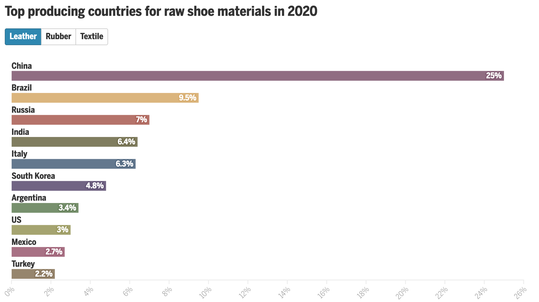
I noticed an interesting thing this morning. Over the holiday weekend I bookmarked a BBC News article about new airlines because it included a small graphic showing the number of airlines started during the pandemic (32) and the number of new airlines lost during the pandemic (55). The graphic used a stock three-dimensional illustration of a passenger airlines with a blank white body. From the top of the body rose two white bars, next to the left was the shorter of the two with a 32. The right was taller and had a 55. Above each was a header saying something to the effect of “Airlines started in 2020” and “Airlines lost in 2020”, respectively. Funny thing this morning that when I returned to the bookmark with this post in mind, the article’s graphic had disappeared.

This weekend I happened to start re-reading 1984, George Orwell’s classic dystopian novel about a man named Winston Smith. He works in the Records Department and is tasked with “rectifying” misstatements. I had just finished reading the section where Orwell describes Smith’s work wherein he takes previously published newspaper articles about statistics and figures and then edits them to include new numbers aligned with the actual outputs. This way should anyone read the old article for evidence of a previous past, they find the output forecasts have always been correct. He then destroys the written record of the old past by dumping it into a memory hole, a pneumatic tube that delivers it straight to a furnace where the old past is incinerated and thus replaced with Smith’s new version.

When I read the article again, because the graphic was gone, I read a paragraph that had figures for 2021. I cannot recall those numbers being present earlier this weekend. But they are roughly where I remember the old graphic being. Yet the article includes no note about any edits to a previous version let alone what those edits may have been. And so now I am left wondering if I really saw what I think I remember that I saw. How very Orwellian.

But let’s assume I did see what I thought I saw, the graphic was actually unnecessary. It presented two figures, 32 and 55. The bar chart itself had no axis labels and that made it a bit difficult to believe the numbers themselves. It did not help that the white bars blended almost seamlessly into the white body of the airliner. Moreover, the graphic was large and fit the full width of the text column. For two figures.

My initial goal was to show this graphic I made to show just how little space truly needs to be used to show an effective graphic. I also changed the direction of the bars. Instead of making one bar about the positive change and the other the negative change, I made both bars about the change. Therefore the one bar moved upwards with the positive (32) and the other downwards with the negative (55). I then plotted a dot to show the net change between the two. Yes, 32 airlines were created in 2020. But that still made for a net loss of 23 that year.

But because the graphic was missing and there was some new text for 2021 figures, I decided to incorporate them as well to show how the trend basically continued year over year.

Finally, a graphic

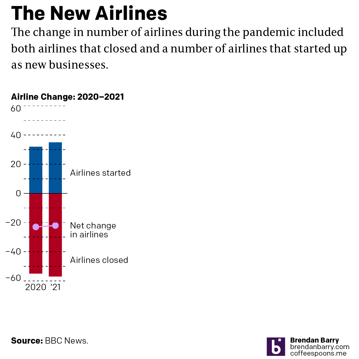
I left the white space to the right to illustrate how you really do not need a full-width graphic to display only six data points, itself a three-fold increase on the original graphic’s data content. The original graphic contained more illustrated plane than it did data content.

Graphics should be about the data, not about the splashy, flashy, whizbang background content that ultimately distracts our attention away from what should be the focal point of the piece: the data. The article still contains photos of planes with the livery of the new airlines, of empty terminals to represent the pandemic losses, and portraits of executives. This graphic did not need an illustrated plane taking over the graphic. It needed to only show those two numbers.

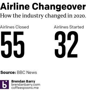
I would even contend that the article could have made do with a simple factette, two big numbers. Airlines closed in 2020 and the airlines opened. It need not be fancy, but it quickly delivers the big numbers with which the reader should be concerned. You don’t need to see an aircraft or a terminal. You could add some colour to the numbers or even a minus sign as there is a significant difference between a 55 and a -55. But all in all, the graphic need not be full width like it was originally.

But I think we should all keep in mind the value of transparency. The graphic did exist, of that I am certain. But future readers or even my sanity cannot be sure that it did. And in an era where “fake news” and fact-checking are important, I wonder if we need to be including corrections notes in more of our news articles. Because if we lose faith in our news, we have little left to lean upon in our societal discourse about the events of our time.

Credit for the piece is mine.

School Shootings

The Wall Street Journal put together a nice piece about the uptick in elementary school shootings, both in the number of shootings and the number of deaths. It used two bar charts, regular and stacked, and a heat map to tell the story. The screenshot below is from a graphic that looks at the proportion of school shootings that occur at elementary schools. They are not as common, but as other graphics in the article show, they can be quite deadly.

Not a great trend…

The graphic above does a nice job of distilling the horror of a tragedy into a single rectangle. That is an important task because it allows us to detach ourselves and more rationally analyse the situation. Unfortunately the analysis is that yes, Virginia, things really have been getting worse.

Overall the article is simple but soberingly effective. School shootings are a problem with which American society has not dealt and my cynical side believes with which we will continue to not deal.

Credit for the piece goes to James Benedict and Danny Dougherty.

The Shrinking Colorado River

Last week the Washington Post published a nice long-form article about the troubles facing the Colorado River in the American and Mexican west. The Colorado is the river dammed by the Hoover and Glen Canyon Dams. It’s what flows through the Grand Canyon and provides water to the thirsty residents of the desert southwest.

But the river no longer reaches the ocean at the Gulf of California.

Why? Part drought, part population growth, and part economic activity. The article does a great job of exploring the issue and it does so through the occasional use of information graphics. This screenshot captures the storage capacity of the two main dams, Lake Mead and Lake Powell, created by the Hoover and Glen Canyon Dams, respectively. You may have heard of these recently because the water shortages presently affecting the region have brought reservoir levels to some of their lowest levels in years. And that means people have been finding all sorts of things.

But the graphic does a nice job of showing just how low things have gotten of late. Naturally I am curious what the data looks like on a longer timeline. Hoover Dam, of course, began during the administration of Herbert Hoover but was completed during the Franklin Roosevelt administration—who also renamed the dam as Boulder Dam though Congress reversed that change in 1947. Lake Powell came along three decades later and so the timelines would not be the exact same, but I am curious all the same.

Low and getting lower

The overall article makes sparse use of the graphics and they occupy much less space in the design than the numerous accompanying photographs. But the balance in terms of content works, I just would have preferred the charts and maps a bit larger.

Contrast this to what we explored last week in a New York Times piece, specifically the online version. There we saw graphics with no headers, data descriptors, axes labels, &c. Here we see the Washington Post was able to create a captivating piece but treat the data and information—and the reader—with respect. There are fewer graphics in this piece, but the way they were handled puts this leaps and bounds above the online version we looked at last week.

Credit for the piece goes to a lot of people, but the graphics specifically to John Muyskens. The rest of the credits go to the author Karin Brulliard and then just copying and pasting from the page: Editing by Amanda Erickson and Olivier Laurent. Photography by Matt McClain. Video by Erin Patrick O’Connor and Jesús Salazar. Video editing by Jesse Mesner-Hage and Zoeann Murphy. Graphics by John Muyskens. Graphics editing by Monica Ulmanu. Design and development by Leo Dominguez. Design editing by Matthew Callahan and Joe Moore. Copy editing by Susan Stanford. Additional editing by Ann Gerhart.

More on Those Million Covid-19 Deaths

Yesterday I focused on the big graphic from the New York Times that crossed the full spread of the front/back page. But the graphic was merely the lead graphic for a larger piece. I linked to the online version of the article, but for this post I’m going to stick with the print edition. The article consists of a full-page open then an entire interior spread, all in limited colour. The remainder of the extensive coverage consists of photo essays and interviews that understandably attempt to humanise the data points, after all, each dot from yesterday represented one individual, solitary, human being. That is an important element of a story like this and other national and international tragedies, but we also need to focus on the data and not let the emotion of the story overwhelm our rational and logical analysis.

Sometimes it’s hard to realise we’re in the third year of this pandemic.

From a data visualisation standpoint the first page begins simply enough with a long timeline of the Covid-19 pandemic charting the number of absolute deaths each day. As we looked at yesterday, the absolute deaths tell part of the story. But if we were to have looked at the number of absolute cases in conjunction with the deaths, we could also see how the virus has thus far evolved to be more transmissible but less lethal. Here the number of daily deaths from Omicron surpassed Delta, but fell short of the winter peak in early 2021. But the number of cases exploded with Omicron, making its mortality rate lower. In other words, far more people were getting sick, but as far fewer were dying.

An interesting note is that if you take a look at the online version, there the designers chose a more stylised approach to presenting the data.

All the dots

Here they kept the dot approach and simply stacked and reordered the dots. However, I presume for aesthetic reasons, they kept the stacking loose dots and dropped all the axis lines because it does make for a nice transition from the map to this chart. But they also dropped all headings and descriptors that tell the reader just what they are looking at. These decisions make the chart far less useful as a tool to tell the data-driven element of the story.

There are three annotations that label the number of deaths in New York, the Northeast, and the rest of the United States. But what does the chart say? When are the endpoints for those annotations? And then you can compare the scale of the y-axis of this chart and compare it to the printed version above. A more dramatic scale leads to a more dramatic narrative.

This sort of visual style of flash and fancy transitions over the clear communication of the data is why I find the print piece more compelling and more trustworthy. I find the online version, still useful, but far more lacking and wanting in terms of information design.

The interior spread is where this article shines.

Just a fantastic spread.

From an editorial design standpoint, the symmetry works very well here. It’s a clear presentation and the white space around the graphic blocks lets that content shine as it should in this type of story. Collectively these pieces do a great job telling the story of the pandemic thus far across the nation. The graphics do not need a lot of colour and make do with sparse flash. Annotations call the reader’s attention to salient points and outliers.

Very nice work here.

From a content standpoint, I would be particularly curious if we have robust data for deaths by education level. Earlier this year I recall reading news about a study that said education best correlated to Covid cases, and I would be curious to see if that held true for deaths. Of course these charts do a great job of showing just how effective the vaccines were and remain. They are the best preventative measure we have available to us.

More really nice graphics

Here I disagree with the design decision of how to break down the states into regions. The Census Bureau breaks down the United States into four regions using the same names as in the graphic above. However, if you look closely at the inset map, you will see that Delaware, Maryland, and West Virginia in particular are included as part of the Northeast. (I cannot tell if the District of Columbia is included as part of the Northeast or South.)

Now compare that to the Census Bureau’s definition:

How the government defines US geography

If you ask me to include Delaware and Maryland as part of the Northeast, well, if you’re selling it, I’ll buy it. After all, just because the Census Bureau defines the United States this way does not mean the New York Times has to. Both are connected to the Northeast Corridor via Amtrak and I-95 and are plugged into the Megalopolis economy. Maybe the Potomac should be the demarcation between Northeast and South. But I struggle to understand West Virginia. Before you go and connect it to the Northeast, I would argue that West Virginia has far more in common with the Midwest geographically, economically, and culturally.

More critically, given this issue, it strikes me as a serious problem when the online version of the chart—with the aforementioned issues—does not even include the little inset to highlight this at best unusual regional definition.

Where would you place West Virginia?

And so while I have reservations about the data—how would the data have looked if the states were realigned?—the design of the line charts overall is good.

Again, I am talking about the print version, not that online graphic. I would argue that the above screenshot is barely even a chart and more “data art” or an illustration of data. Consider here, for example, that for the South we have that muted slate blue for the dots, but the spacing and density of the dots leads to areas of lighter slate and darker slate. But a lighter slate means more space between stacked dots and darker slate means a more compact design. A lighter colour therefore pushes the “edge” of the line further up the y-axis and artificially inflates its value, not that we can understand what that value is as the “chart” lacks any sort of y-axis.

Finally the print piece has a set of small multiples breaking down deaths by income in the three largest American cities: New York, Los Angeles, and Chicago. These are just great little charts showing the correlation between income and death from Covid, organised by Zip code.

But this also serves as a stark reminder of just how much better the print piece is over the online version. Because if we take a look at a screenshot from the online article, we have a graphic that addresses all the issues I pointed out earlier.

Why couldn’t the online article kept to this style?

I am left to wonder why the reader of the online version does not have access to this clearer and more accurate representation of the data throughout the piece?

To me this article is a great example of when the print piece far exceeds that of the online version. Content-wise this is a great story that needed to be told this weekend, but design wise we see a significant gap in quality from print to online. Suffice it to say that on Sunday I was very glad I received the print version.

Credit for the piece goes to Sarah Almukhtar, Amy Harmon, Danielle Ivory, Lauren Leatherby, Albert Sun, and Jeremy White.

Political Hatch Jobs

Earlier this week I read an article in the Philadelphia Inquirer about the political prospects of some of the candidates for the open US Senate seat for Pennsylvania, for which I and many others will be voting come November. But before I get to vote on a candidate, members of the political parties first get to choose whom they want on the ballot. (In Pennsylvania, independent voters like myself are ineligible to vote in party primaries.)

This year the Republican Party has several candidates running and one of them you may have heard of: Dr. Oz. Yeah, the one from television. And while he is indeed the front runner, he is not in front by much as the article explains. Indeed, the race largely had been a two-person contest between Oz and David McCormick until recently when Kathy Barnette pulled just about even with the two.

In fact, according to a recent poll the three candidates are all statistically tied in that they all fall within the margin of error for victory. And that brings us to the graphic from the article.

It would be funny to see a candidate finish with negative vote share.

Conceptually this is a pretty simple bar chart with the bar representing the share of the support of those polled. But I wanted to point out how the designer chose to represent the margin of error via hatched shading to both sides of the ends of the red bar.

In some cases the hatch job does not work for me, particularly with those smaller candidates where the bar goes negative. I would have grave reservations about the vote should any candidate win a negative share of the vote. 0% perhaps, but negative? No. I also don’t think the grey hatching works as well over the grey bar in particular and to a lesser degree the red.

I have often thought that these sorts of charts should use some kind of box plot approach. So this morning I took the chart above and reworked it.

Now with box plots.

Overall, however, I really like this designer’s approach. We should not fear subtlety and nuance, and margins of error are just that. After all, we need not go back too far in time to remember a certain candidate who thought she had a presidential election locked up when really her opponent was within the margin of error.

Credit for the piece goes to John Duchneskie.

All the Colours, All the Space

Everyone knows inflation is a thing. If not, when was the last time you went shopping? Last week the Boston Globe looked specifically at children’s shoes. I don’t have kids, but I can imagine how a rapidly growing miniature human requires numerous pairs of shoes and frequently. The article explores some of the factors going into the high price of shoes and uses, not very surprisingly, some line charts to show prices for components and the final product over time. But the piece also contains a few bar charts and that’s what I’d like to briefly discuss today, starting with the screenshot below.

What is going on here?

What we see here are a list of countries and the share of production for select inputs—leather, rubber, and textiles—in 2020. At the top we have a button that allows the user to toggle between the two and a little movement of the bars provides the transition. The length of the bar encodes the country in question’s market share for the selected material.

We also have all this colour, but what is it doing? What data point does the colour encode? Initially I thought perhaps geographic regions, but then you have the US and Mexico, or Italy and Russia, or Argentina and Brazil, all pairs of countries in the same geographic regions and yet all coloured differently. Colour encodes nothing and thus becomes a visual distraction that adds confusion.

Then we have the white spaces between the bars. The gap between bars is there because the country labels attach to the top of the bars. But, especially for the top of the chart, the labels are small and the gap is at just the right height such that the white spaces become white bars competing with the coloured bars for visual attention.

The spaces and the colours muddy the picture of what the data is trying to show. How do we know this? Because later in the article we get this chart.

Ahh, much better. Much clearer.

This works much better. The focus is on the bars, the labelling is clear, almost nothing else competes visually with the data. I have a few quibbles with this design as well, but it’s certainly an improvement over the earlier screenshot we discussed. (I should note that this graphic, as it does here, also comes after the earlier graphic.)

My biggest issue is that when I first look at the piece, I want to see it sorted, say greatest to least. In other words, Furniture and bedding sits at the top with its 15.8% increase, year-on-year, and then Alcoholic beverages last at 3.7%. The issue here, however, is that we are not necessarily looking at goods at the same hierarchical level.

The top of the list is pretty easy to consider: food, new vehicles, alcoholic beverages, shelter, furniture and bedding, and appliances. We can look at all those together. But then we have All apparel. And then immediately after that we have Men’s, Women’s, Boys’ , Girls’, and Infants’ and toddlers’ apparel. In other words, we are now looking at a subset of All apparel. All apparel is at the same level of Food or Shelter, but Men’s apparel is not.

At that point we would need to differentiate between the two, whilst also grouping them together, because the range of values for those different sub-apparel groups comprise the aggregate value for All apparel. And showing them all next to Food is not an apples-to-apples comparison.

If I were to sort these, I would sort by from greatest to least by the parent group and then immediately beneath the parent I would display the children. To differentiate between parent-level and children-level, I would probably make the bars shorter in the vertical and then address the different levels typographically with the labels, maybe with smaller type or by putting the children in italic.

Finally, again, whilst this is a massive improvement over the earlier graphic, I’d make one more addition, an addition that would also help the first graphic. As we are talking about inflation year-on-year, we can see how much greater costs are from Furniture and bedding to Alcoholic beverages and that very much is part of the story. But what is the inflation rate overall?

According to the Bureau of Labour Statistics, inflation over that period was 8.5%. In other words, a number of the categories above actually saw price increases less than the average inflation rate—that’s good—even though they were probably higher than increases had been prior to the pandemic—that’s bad. But, more importantly for this story, with the addition of a benchmark line running vertically at 8.5%, we could see how almost all apparel and footwear child-level line items were below the inflation rate. But the children and infant level items far exceeded that benchmark line, hence the point of the article. I made a quick edit to the screenshot to show how that could work in theory.

To the right, not so good.

Overall, an interesting article worth reading, but it contained one graphic in need of some additional work and then a second that, with a few improvements, would have been a better fit for the article’s story.

Credit for the piece goes to Daigo Fujiwara.

The Potential Impacts of Throwing Out Roe v Wade

Spoiler: they are significant.

Last night we had breaking news on two very big fronts. The first is that somebody inside the Supreme Court leaked an entire draft of the majority opinion, written by Justice Alito, to Politico. Leaks from inside the Supreme Court, whilst they do happen, are extremely rare. This alone is big news.

But let’s not bury the lede, the majority opinion is to throw out Roe v. Wade in its entirety. For those not familiar, perhaps especially those of you who read me from abroad, Roe v Wade is the name of a court case that went before the United States Supreme Court in 1971 and was decided in 1973. It established the woman’s right to an abortion as constitutionally protected, allowing states to enact some regulations to balance out the state’s role in concern for women’s public health and the health of the fetus as it nears birth. Regardless of how you feel about the issue—and people have very strong feelings about it—that’s largely been the law of the United States for half a century.

Until now.

To be fair, the draft opinion is just that, a draft. And the supposed 5-3 vote—Chief Justice Roberts is reportedly undecided, but against the wholesale overthrow of Roe—could well change. But let’s be real, it won’t. And even if Roberts votes against the majority he would only make the outcome 5-4. In other words, it looks like at some point this summer, probably June or July, tens of millions of American women will lose access to reproductive healthcare.

And to the point of this post, what will that mean for women?

This article by Grid runs down some of the numbers, starting with laying out the numbers on who chooses to have abortions. And then ultimately getting to this map that I screenshot.

That’s pretty long distances in the south…

The map shows how far women in a state would need to travel for an abortion with Roe active as law and without. I’ve used the toggle to show without. Women in the south in particular will need to travel quite far. The article further breaks out distances today with more granularity to paint the picture of “abortion deserts” where women have to travel sometimes well over 200 miles to have a safe, legal abortion.

I am certain that we will be returning to this topic frequently in coming months, unfortunately.

Credit for the piece goes to Alex Leeds Matthews.

Where’s My (State) Stimulus?

Here’s an interesting post from FiveThirtyEight. The article explores where different states have spent their pandemic relief funding from the federal government. The nearly $2 trillion dollar relief included a $350 billion block grant given to the states, to do with as they saw fit. After all, every state has different needs and priorities. Huzzah for federalism. But where has that money been going?

Enter the bubbles.

I mean bubbles need water distribution systems, right?

This decision to use a bubble chart fascinates me. We know that people are not great at differentiating between area. That’s why bars, dots, and lines remain the most effective form of visually communicating differences in quantities. And as with the piece we looked at on Monday, we don’t have a legend that informs us how big the circles are relative to the dollar values they represent.

And I mention that part because what I often find is that with these types of charts, designers simply say the width of the circle represents, in this case, the dollar value. But the problem is we don’t see just the diameter of the circle, we actually see the area. And if you recall your basic maths, the area of a circle = πr2. In other words, the designer is showing you far more than the value you want to see and it distorts the relationship. I am not saying that is what is happening here, but that’s because we do not have a legend to confirm that for us.

This sort of piece would also be helped by limited duty interactivity. Because, as a Pennsylvanian, I am curious to see where the Commonwealth is choosing to spend its share of the relief funds. But there is no way at present to dive into the data. Of course, if Pennsylvania is not part of the overall story—and it’s not—than an inline graphic need not show the Keystone State. In these kinds of stories, however, I often enjoy an interactive piece at the end wherein I can explore the breadth and depth of the data.

So if we accept that a larger interactive piece is off the table, could the graphic have been redesigned to show more of the state level data with more labelling? A tree map would be an improvement over the bubbles because scaling to length and height is easier than a circle, but still presents the area problem. What a tree map allows is inherent grouping, so one could group by either spending category or by state.

I would bet that a smart series of bar charts could work really well here. It would require some clever grouping and probably colouring, but a well structured set of bars could capture both the states and categories and could be grouped by either.

Overall a fascinating idea, but I’m left just wanting a little more from the execution.

Credit for the piece goes to Elena Mejia.

How Accurate Is Punxsutawney Phil?

For those unfamiliar with Groundhog Day—the event, not the film, because as it happens your author has never seen the film—since 1887 in the town of Punxsutawney, Pennsylvania (60 miles east-northeast of Pittsburgh) a groundhog named Phil has risen from his slumber, climbed out of his burrow, and went to see if he could see his shadow. Phil prognosticates upon the continuance of winter—whether we receive six more weeks of winter or an early spring—based upon the appearance of his shadow.

But as any meteorological fan will tell you, a groundhog’s shadow does not exactly compete with the latest computer modelling running on servers and supercomputers. And so we are left with the all important question: how accurate is Phil?

Thankfully the National Oceanic and Atmospheric Administration (NOAA) published an article several years ago that they continue to update. And their latest update includes 2021 data.

Not exactly an accurate depiction of Phil.

I am loathe to be super critical of this piece, because, again, relying upon a groundhog for long-term weather forecasting is…for the birds (the best I could do). But critiques of information design is largely what this blog is for.

Conceptually, dividing up the piece between a long-term, i.e. since 1887, and a shorter-term, i.e. since 2012, makes sense. The long-term focuses more on how Phil split out his forecasts—clearly Phil likes winter. I dislike the use of the dark blue here for the years for which we have no forecast data. I would have opted for a neutral colour, say grey, or something that is visibly less impactful than the two light colours (blue and yellow) that represent winter and spring.

Whilst I don’t love the icons used in the pie chart, they do make sense because the designers repeat them within the table. If they’re selling the icon use, I’ll buy it. That said, I wonder if using those icons more purposefully could have been more impactful? What would have happened if they had used a timeline and each year was represented by an icon of a snowflake or a sun? What about if we simply had icons grouped in blocks of ten or twenty?

The table I actually enjoy. I would tweak some of the design elements, for example the green check marks almost fade into the light blue sky. A darker green would have worked well there. But, conceptually this makes a lot of sense. Run each prognostication and compare it with temperature deviation for February and March (as a proxy for “winter” or “spring”) and then assess whether Phil was correct.

I would like to know more about what a slightly above or below measurement means compared to above or below. And I would like to know more about the impact of climate change upon these measurements. For example, was Phil’s accuracy higher in the first half of the 20th century? The end of the 19th?

Finally, the overall article makes a point about how difficult it would be for a single groundhog in western Pennsylvania to determine weather for the entire United States let alone its various regions. But what about Pennsylvania? Northern Appalachia? I would be curious about a more regionally-specific analysis of Phil’s prognostication prowess.

Credit for the piece goes to the NOAA graphics department.

Graduate Degrees

Many of us know the debt that comes along with undergraduate degrees. Some of you may still be paying yours down. But what about graduate degrees? A recent article from the Wall Street Journal examined the discrepancies between debt incurred in 2015–16 and the income earned two years later.

The designers used dot plots for their comparisons, which narratively reveal themselves through a scrolling story. The author focuses on the differences between the University of Southern California and California State University, Long Beach. This screenshot captures the differences between the two in both debt and income.

Pretty divergent outcomes…

Some simple colour choices guide the reader through the article and their consistent use makes it easy for the reader to visually compare the schools.

From a content standpoint, these two series, income and debt, can be combined to create an income to debt ratio. Simply put, does the degree pay for itself?

What’s really nice from a personal standpoint is that the end of the article features an exploratory tool that allows the user to search the data set for schools of interest. More than just that, they don’t limit that tool to just graduate degrees. You can search for undergraduate degrees.

Below the dot plot you also have a table that provides the exact data points, instead of cluttering up the visual design with that level of information. And when you search for a specific school through the filtering mechanism, you can see that school highlighted in the dot plot and brought to the top of the table.

Fortunately my alma mater is included in the data set.

Welp.

Unfortunately you can see that the data suggests that graduates with design and applied arts degrees earn less (as a median) than they spend to obtain the degree. That’s not ideal.

Overall this was a really nice, solid piece. And probably speaks to the discussions we need to have more broadly about post-secondary education in the United States. But that’s for another post.

Credit for the piece goes to James Benedict, Andrea Fuller, and Lindsay Huth.