Oil.

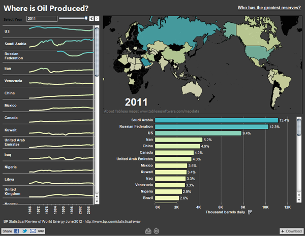
Oil, sweet oil. How we depend upon you for modern civilisation. BP published a report on world energy that Craig Bloodworth visualised using Tableau.
Oil production
Oil production

The piece has three tabs; one is for production, another consumption, and a third for reserves. (The screenshot above is for production.) But when I look at each view I wonder whether all the data views are truly necessary?

In production for example, is a map of a few countries truly informative? The usual problem of Russia, Canada, the US, and China dominating the map simply because they are geographically large countries reappears. Furthermore the map projection does not particularly help the issue because it expands the area of Siberia and the Canadian arctic at the expense of regions near the Equator, i.e. the Middle East. That strikes me as counter-intuitive since some of the largest oil producers are actually located within the Middle East.

A map could very well be useful if it showed more precisely where oil is produced. Where in the vastness of Russia is oil being sucked out of the ground? Where in Saudia Arabia? In the US? Leave the numbers to the charts. They are far more useful in comparing those countries like Kuwait that are major producers but tiny geographies.

Lastly about the maps (and the charts), the colour is a bit confusing because nowhere that I have found in my quick exploration of the application does the piece specify what the colours mean. That would be quite useful.

Finally, about the data, the total amount of oil produced, but more importantly consumed, is useful and valuable data. But seeing that China is the second largest consumer after the US is a bit misleading. Per capita consumption would add nuance to the consumption view, because China is over three-times as large as the US in population. Consequently, the average Chinese is not a major consumer. The problem is more that there are so many more Chinese consumers than consumers in any other nation—except India.

A bit of a hit and miss piece. I think the organisation and the idea is there: compare and contrast producers and consumers of oil (and consumers of other energy forms). Alas the execution does not quite match the idea.

Credit for the piece goes to Craig Bloodworth, via the Guardian.

Frack You, Gas Hole.

And not in the polite Galactica way, but more in the let’s drill you, rocks, and split you open. I could go in further detail about the injection of fracking fluids, but let’s leave the double entendre alone and talk about Marcellus Shale. It’s a layer of rocks in the dirt that contain natural gas. It’s a pain in the gas production industry (sorry) and thus is only economically viable when fuel prices are high.

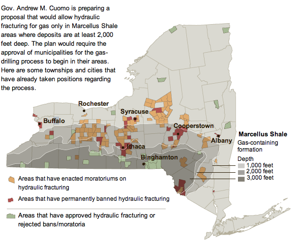
So in the 21st century with high fuel prices, energy companies are hydraulically fracturing (fracking) the rock to suck out all the natural gas. But this might be (probably is) causing environmental problems and thus human health problems. Ergo the controversy. This has now reached New York and so the New York Times created a simple map with some key layers of information to explain the controversy there.

NY Marcellus
NY Marcellus

Note the useful layers of depth of the shale and where those intersect (or do not) with areas that have banned or endorsed fracking.

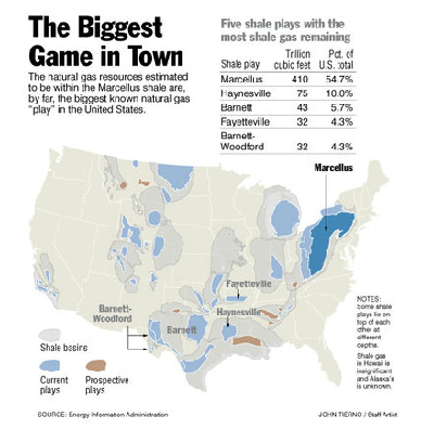
Western Pennsylvania has had similar problems, and the Philadelphia Inquirer has had an interactive special on their website up for a little while now. And by interactive infographic I mean largely just a play-through of static images. Unfortunately, the online content is not of the best resolution and leaves much to be desired. Fortunately the graphics would appear to be quite informative especially as part of a series. A pity they are not entirely legible.

Location
Location

Credit for the Inquirer piece goes to John Tierno.

Canadian Military Spending

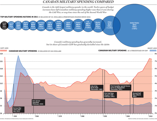
Canada is spending more than ever on its military. The question is, to what end? Canada shares a land border with only two countries. And one of them is us…

From the National Post comes an infographic looking at the rising expenditures on defence and how it currently ranks in the world.

Canadian military spending

Credit for the piece goes to Tristin Hopper and Richard Johnson.

Follow the Money. And Enjoy a Donut on the Way. Or a Pie.

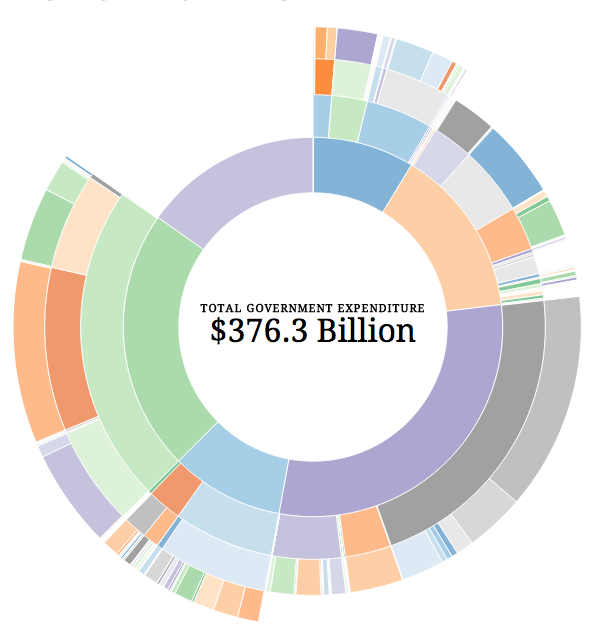
Visualising government budgets is always fun. Until you realise that you are seeing where your money is going. But now we look at Australia’s expenditures. And as I pay nothing in taxes to Australia, I get to keep my fun.

Australian budget
Australian budget

This piece is doing some interesting things within the framework of the donut chart I generally dislike. We do get to see the levels of detail for different departments or areas of spending. For example, one can see that costs for building Australia’s new destroyers and how that fits into the whole budget. Or, by clicking on a slice of the donut, one can zoom in to see how pieces fit at the selected level.

But the overall visual comparison of pieces and then identifying them through colour is less than ideal.

Found via the Guardian’s datablog, credit for the piece goes to Prosple and OzDocsOnline.

The Education Gap

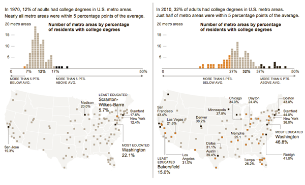
Last week, the New York Times looked at the growing education gap amongst this country’s largest metropolitan areas. The infographic, click the image below to go to the full version, is perhaps a bit more layered, nuanced, and complex than it looks at first. In about forty years, the number of adults with college degrees has doubled, good, but so too has the spread of those numbers across the set of cities, bad. And then to look at any geographic spread, the two datasets are mapped geospatially. By my eye, the Northeast and Pacific Northwest seem to be doing fairly well. Not so much around the rest of the country.

The education gap
The education gap

Credit for the piece goes to Haeyoun Park.

Consumer Eating Habits

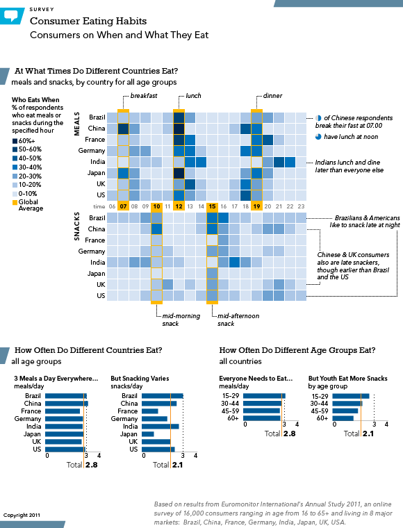
I generally refrain from posting links to my professional work. Normally because I’d have to be the first to criticise it and tear it apart. But also because a lot of it is confidential and behind the paywall—it’s like the Iron Curtain meets the Great Wall but really a lot less interesting.

Yet from time to time, through the work and deeds of others, things escape and make it into the wild. Then things are fair game. This is one of those times and one of those pieces. The image links to the third-party page.

Consumer Eating Habits


Economic Development in Africa

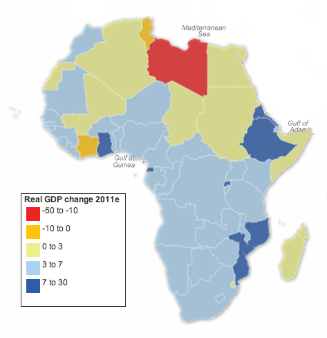
This falls under the just-because-it’s-about-geographies-doesn’t-mean-it-should-necessarily-be-visualised-as-a-map category. The Guardian has taken data from the African Economic Outlook, specifically real GDP growth rates, and charted them as a map. This caught my interest initially because of some work I have been doing that required me to read a report on African economic development in coming years. So I figured this could be interesting.

African GDP growth
African GDP growth

But it’s a map. That’s not to say there is anything inherently wrong about the map. Though the arrangement of the legend and size of each ‘bin’ of percentage values is a bit odd. I would have placed the positive at the top of the list and tried to provide an equal distribution of the data, e.g. 3–10 for both positive and negative values. But, without looking in any depth at the data, the designer may have had valid reasons for such a distribution.

That said, two finer points stick out to me. The first is Western Sahara. Long story short, it is a disputed territory claimed by different factions. I am not accustomed to ever seeing any real economic data coming out of there. But, according to the map, its growth is 0–3%. When one looks at the data, however, one finds that as I would have expected the data says “no data”. Ergo the green colour on the map is misleading. Not necessarily incorrect, for the growth could have been between those two points, but without any data one cannot say for sure.

The second concern for me is South Sudan—remember that story? For starters one cannot find it on the map; South Sudanese territory is depicted as part of Sudan. While South Sudan is one of the poorest countries on the earth, its split from Sudan is rather important. Looking at the data, one can see Sudan’s growth went from 8 to 4.5 to 5 to 2.8. Why the sudden drop? Probably because Sudan’s economic boom has largely been built on the boom in oil prices over the past decade or so. But, most of that oil is no longer in Sudan, Not because its been pumped dry, but rather most of the oil fields can now be found in South Sudan.

These are some of the contextual stories that make sense of a data set. But these are the stories lost in a simple, interactive map.

Credit for the piece goes to Nick Mead.

How Much Do You Work?

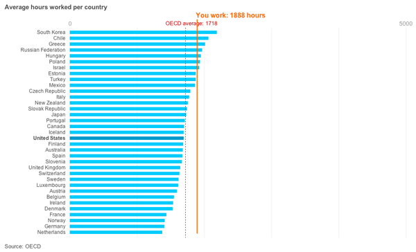
Have you ever wondered if you’re working too much? Thanks to an interactive infographic from the BBC, now you can see whether or not you are. At least in comparison to the rest of the OECD. The user enters an average number of hours worked per week and then their total number of holidays (including public holidays) and see a comparison of their hours spent worked against those of OECD member countries.

How much I probably work

Immigrating to Canada

The Globe and Mail has been working on a story about immigration to Canada because apparently not all immigrants come to America. The story has its section headers running down the side column of the page, like many other segmented stories you’ll see posted online these days, but also uses graphics to make and supplement its arguments.

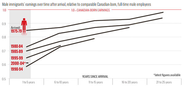
This one chart from the piece is an example of how the simple format of a line chart can clearly express and visualise an interesting trend. Immigrants from the past two decades earn less than immigrants to Canada in the 1970s. Those from the early 90s, however, do appear to have a faster rate of income growth that approaches parity with Canadian-born income-earners.

Income of Canadian Immigrants

Examining Growth in the G-20

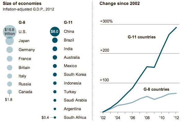
On Sunday the New York Times featured a small graphic highlighting the disparity in growth rates across the G-20 if broken into the ‘core’ G-8 and then what one might call the emerging markets of the G-11.

NYT Coverage of G-20 Growth

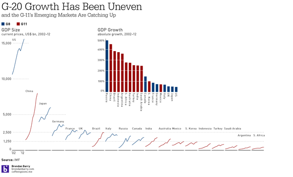
The charts are small yet compelling in telling the story of how the two different groups are performing. However, I was left wanting to better understand the comparisons between the sizes and growth of the various countries. The areas of circles are difficult to compare and aggregates mask interesting outliers. So, using what I imagine to be the same data from the IMF, I took a quick try at the data to create my own infographic.

My G-20 Size and Growth Graphic; click for the full-size view

Indeed, interesting stories began to appear as I plotted the data. Russia is a member of the G-8, but perhaps has more in common with the G-11. After all, Russia’s growth was nearly 500%. Similarly interesting were Canada and Australia. The former, a G-8 country, was the only G-8 country besides Russia to have greater than 100% growth. And Australia, certainly not an emerging market in most senses, experienced nearly 300% growth. Whereas the emerging markets of Mexico and South Korea lag behind the rest of the G-11.

Then, when plotting the sizes of the economies, China was no surprise as the second-largest economy. However, that Brazil has managed to already surpass the G-8 economies of Italy, Russia, and Canada was a bit shocking. And Brazil looks nearly ready to surpass the UK, but for its apparent recent downturn. Also interesting to note are the Financial Crisis dips in GDP across most countries. Some countries, like China, unsurprisingly did not suffer greatly. However, that Japan and South Africa kept on a steady pace of growth was unexpected.

All of that would have been missed but for a slightly deeper dive into the IMF data. And a few hours of my time.