The question with Apple computers is when to upgrade the operating system? Apple releases updates every few years. But, I might have to wait and skip the next one, Mountain Lion. After all, Apple is taking a step backward. xkcd explains:

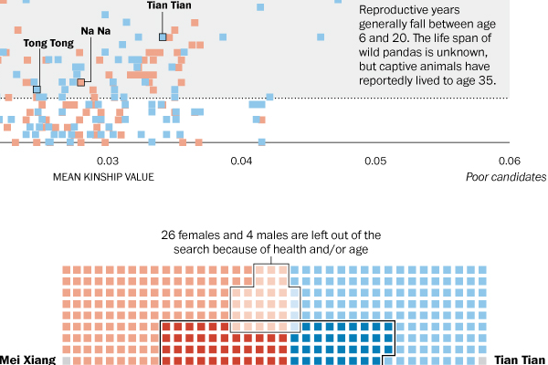
Animals need to reproduce. Well, except perhaps some of our own species…and so today’s infographic from the Washington Post looks at the birds and the bees. Or rather the pandas and the pandas. Or is that the pandas on pandas? Regardless, the reader can see that panda mating is not easy.
Credit for the piece goes to Cristina Rivero.
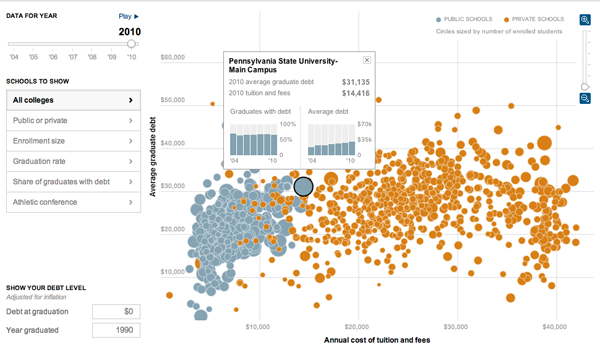
It’s that time of year when young men and women step outside into the big, real world and realise just how much money they owe to various creditors. Yay. The problem, however, has continued to get worse for students. This interactive infographic by the New York Times explains just how so by comparing student debt to costs.
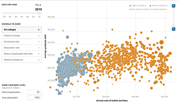
While the bubble chart is also available in map form—though I don’t find that particularly useful myself—the more interesting added layer of complexity comes from the data displayed when the user selects a specific university.
Credit for the piece goes to Jeremy White, Andrew Martin, Andrew W. Lehren, and Archie Tse.
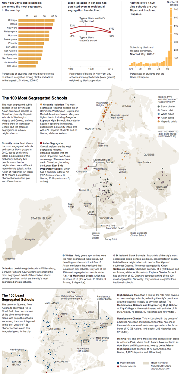
This weekend the New York Times looked at segregation in New York City schools by mapping the least (and most) diverse and offering quick comparisons to other large cities. (Is it really a surprise that the country’s largest cities also would need the largest demographic shifts to create diverse education environments?) Probably the best thing, seemingly as always, in the piece is the annotations that provide stories and context and explain the outliers that are all otherwise visualised in the infographic.
Credit for the piece goes to Ford Fessenden.
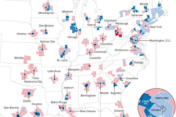
One area of particular contention for the American presidential candidates this year will be in the suburbs of major urban areas. This was where Romney in particular was able to defeat his Republican rivals, but is also home to large number of potential Obama supporters. Given his likely support in cities, Romney will need to well in the suburbs this time around.
The Washington Post looks at how suburban counties voted over the past two elections.
Credit for the piece goes to Ted Mellnik, Laura Stanton, and Karen Yourish.
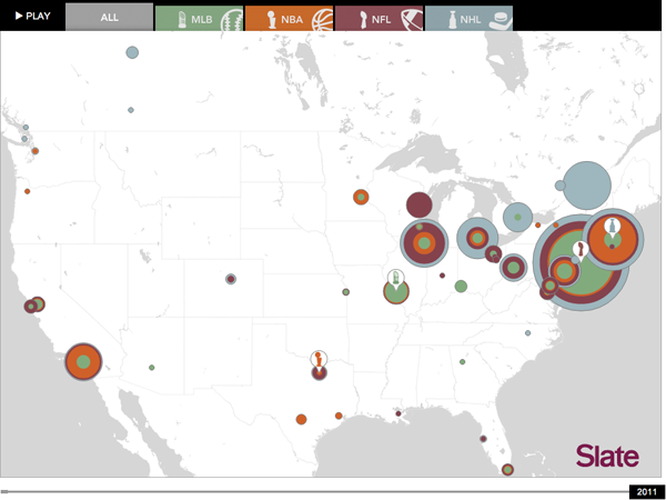
From Slate comes an interactive map of which cities have won what championships across the big four sports (baseball, basketball, football, and hockey). It plots the championships over time and allows the user to see just how dominant certain cities have been in certain sports.
Credit for the piece goes to Chris Kirk.
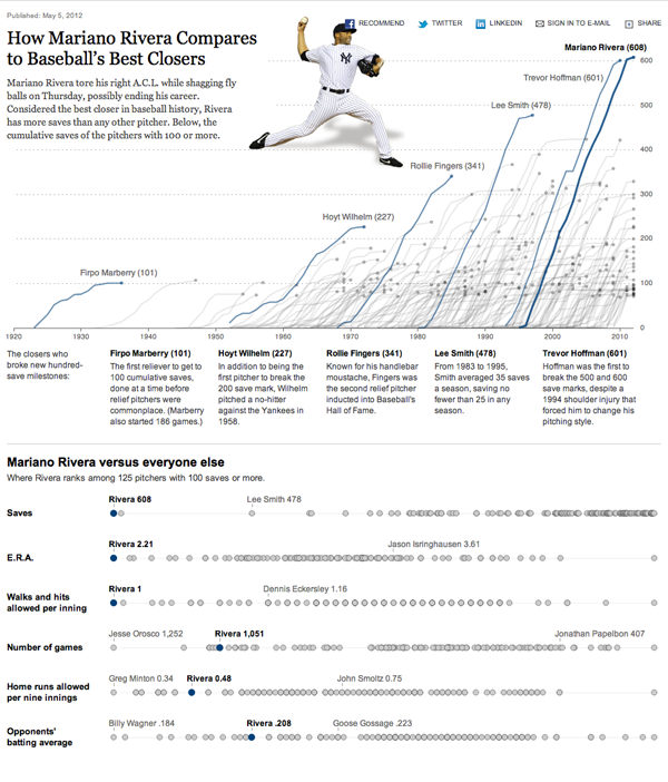
Mariano Rivera of the New York Yankees is(was?) one of the best closers in baseball history. I’ll give him that. So when a freakish accident brought to an end his season—and possibly his career—the New York Times of course had an(other) infographic about his historic numbers.
But I’m a Red Sox fan. And this whole sequence of events will always be my memory of Rivera.

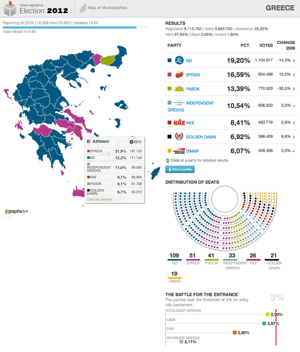
Over at the Guardian, I was using this interactive piece from igraphics to follow the election results there. (It was a slight bit more interesting than following the French presidential election, because everybody knew Sarkozy was going to lose.)
Credit for the piece goes to igraphics, a Greek data visualisation outfit.
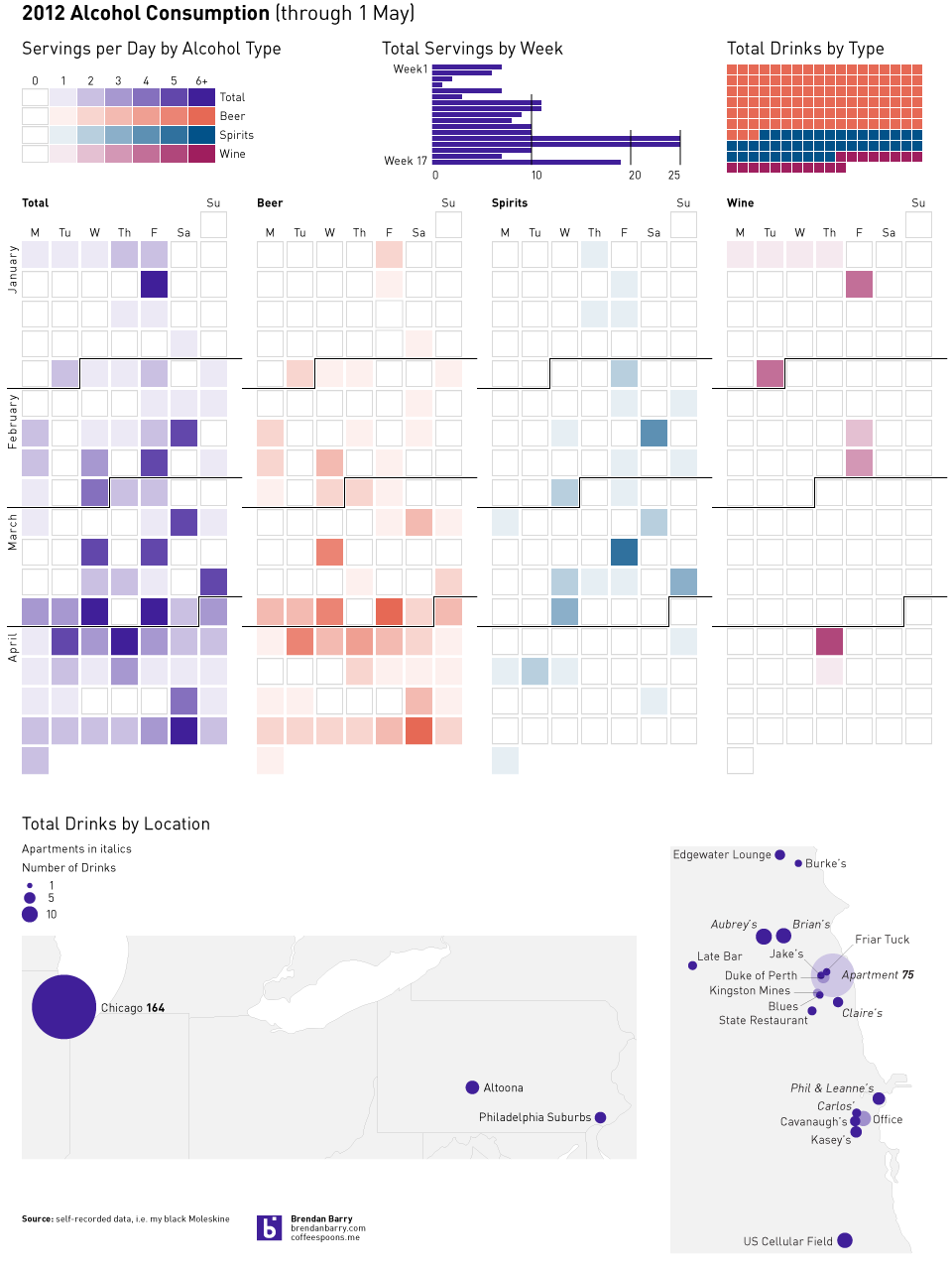
Last month I visualised my tea consumption data. But the other dataset that I record along with the tea is that of alcohol: when, where, and what I consume. The following is the result of four months of data, but you have to click for the full-scale view.
I don’t normally do the re-posts to the other blogs I follow, but this post on Flowing Data is a link to an interesting piece of analysis on the political groups in the US Senate. It’s worth a(nother) look.
