Battleground States

The BBC provides an interactive tool to explore the battleground states in the forthcoming election. A giant donut chart with 50 segments maps a segment to a state and its total number of electoral votes. The larger the electoral vote, e.g. California, the larger the segment. Beyond just a giant chart, however, the BBC has placed the states into different camps, the Democrats, the Republicans, and the Battleground states.

Republican strongholds

Selecting either the Democrat strongholds or the Republican strongholds highlights the states for each respective party. Not a lot of functionality is to be had. Clicking on a state merely displays its name and number of votes. But this is not the main function of the piece.
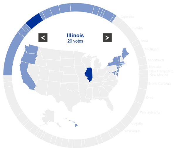
A Democrat stronghold

The main goal of the piece is to explore the Battleground states. When the user selects one, he or she is presented with a new view that moves the chart partially off-screen—while keeping the Battlegrounds in view—and moves a profile piece on-screen. This view contains both a text summary of the state and its challenges along with important demographic statistics.
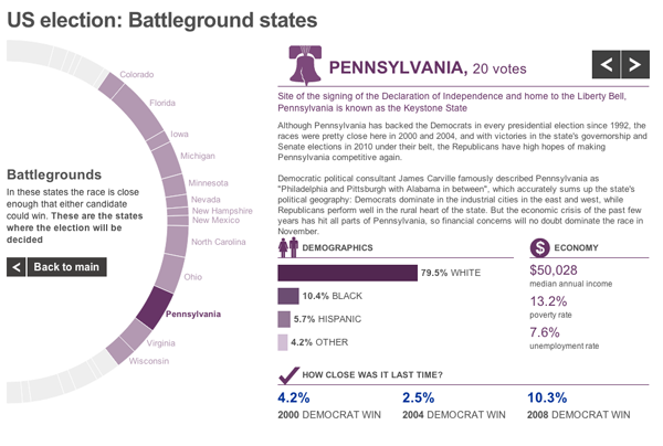
Battleground profile

For an American audience, there is probably little to be gained from the piece unless one is wholly unfamiliar with American politics. But for the more international part of the BBC News audience, this piece gives them quick insights into the various states that will be so important over the course of the next few months.

Nope, It’s Just Clouds in the Shapes of Birds and Planes.

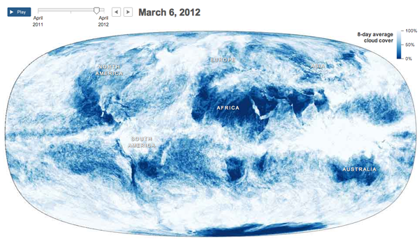
Supporting an article about how the clouds are the last great hope for the climate change skeptics, the New York Times published an interesting infographic that looks at cloud cover and insolation, the amount of solar energy that irradiates the planet.

The main feature is an animation of a year’s worth of cloud cover. The mapped data begins to clearly show the difference between air circulation over the oceans and over land, with the interface between the two creating the rough outlines of the continents.

Cloud map
Cloud map

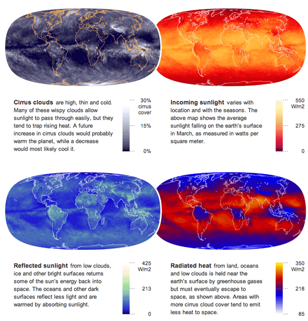
Supplementing the animation are four small multiples of different measures that look at energy and its conservation across the planet.

Energy maps
Energy maps

Credit for the piece goes to Jonathan Corum.

Kickstarter Fundraising

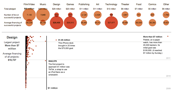
Kickstarter has been around for a little while now, financing some interesting projects. The New York Times has an infographic about how much each project earned. And while there is nothing particularly fancy about each, they are all scatter plots, the quirk is that the time and value axes have been reversed from their customary positions. While unusual, it supports the longer range for the monetary figures and the short range for the three years of Kickstarter history.

Kickstarter fundraising

Furthermore, the data is broken out into different industries, e.g. design, food, and dance, that have adjusted value scales to make intra-industry comparisons easier. Nothing fancy, but an attentive care to the detail of the data.

Merry F*%#-ing Christmas

The title is from perhaps my favourite Christmas song

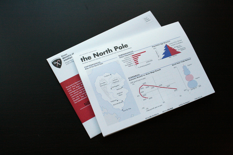
But the song relates to this post because earlier this week the print design blog For Print Only featured my annual Christmas card. I typically design and print a card to mail (as in a physical copy through the postal service, none of that e-card non-sense) to my friends and family. This past year I took to infographics to explore the realm of Santa and his North Pole dictatorship.

My Christmas Card
My Christmas Card

Credit for the photographs goes to FPO.

Analysing the Urban Environment

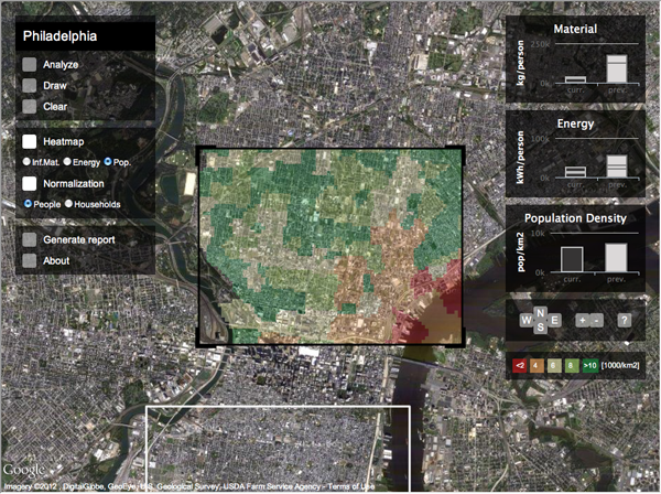
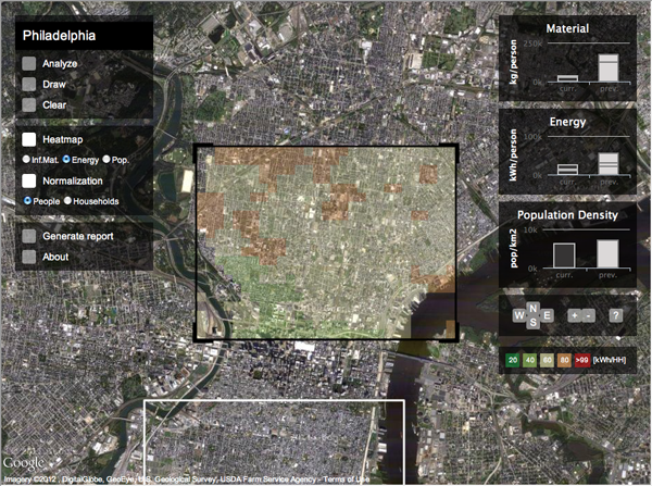
Via the Guardian comes an interactive piece from researchers at MIT and the Technical University of Lisbon that allows users to examine urban environments to compare population, energy use, and building material intensity for a select set of 42 different cities. The screenshots below are of neighbourhoods in Philadelphia.

Population density
Population density

Once the user has chosen an area, he or she can move on and analyse a different section of the city. This behaviour generates a comparison on the right of the current area to the previous area.

Energy use
Energy use

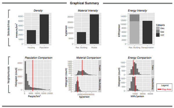
After the user has found an area of particular interest, he or she can generate a graphical report that summarises the findings for the selected area and compares that to other areas of similar scale in the city.

Graphical report
Graphical report

Credit for the piece goes to David Quinn and Daniel Wiesmann.

French Politics, Elections, and Data Visualisations.

The US is not the only country with elections in 2012. Actually quite a few other places have had them, will have them, or are in the midst of having them. The latter includes France, which had the first round of its presidential election earlier this week.

To put it simply, France has a first round to narrow the whole field to just two candidates—lots of democracies outside the US have multiple party systems that mean more than just two parties—and then a second round between the last two. Nicholas Sarkozy was thought likely to win the first round and then lose the second, but he instead lost the first outright. He still isn’t expected to do well in two weeks’ time. But, the French media of course produce infographics just as US, Canadian, and British media do. Except unlike the last three, French infographics tend to be in French and I tend to not read them because, well, I cannot.

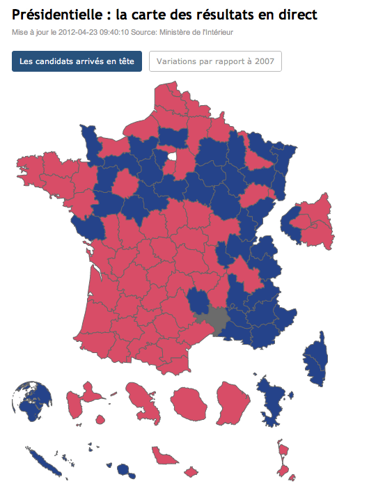
But pictures and colours make it easier. Socialists like red. Centre-right like blue.

From Le Figaro comes a map of the results. The island-looking thing on the right is Paris, beneath that Corsica, and then the bottom are the various overseas territories and departments that all vote.

Election results by French department

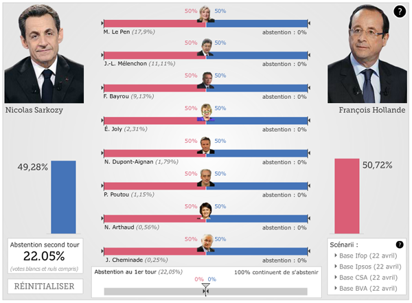
The question with French presidential elections—and in fact any country that has run-off elections—is what happens to the voters of the losers? For whom will they vote in the second round? Le Figaro also has an interactive piece that allows the user to play out different scenarios based on how many voters will not show up and of those who do, how they split their vote. Again, it’s in French, so I had to assume some things when playing around with the controls and then know a few things about French politics.

Scenario builder for Round 2

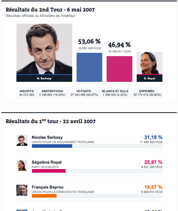
From Le Monde, another respected French media source that I have featured on more than one occasion, come some simpler visualisations of the results but with some nice features for comparison. The first is obviously a look at the 2007 results. (Anybody recall Segolene Royal? Her ex-husband/partner is Francois Hollande…the guy running for the Socialists this time round.)

Election results of 2007

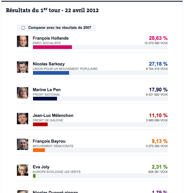
But another interesting view is that of the results strictly from 2012’s first round.

Election results 2012, Round 1

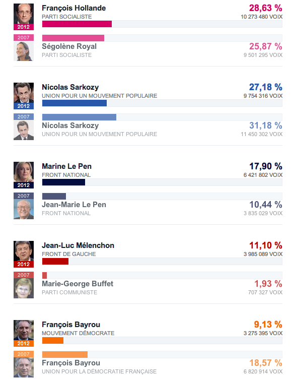
But with the added feature of comparing those results per party to their performance in 2007.

Round 1 comparison, 2012 to 2007

There are always interesting things going on in politics when it comes to data visualisation and infographics. We just have to look outside the US from time to time.

Who Survived and Who Perished the Sinking of the RMS Titanic

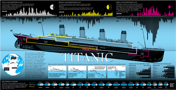
The anniversary of the RMS Titanic’s sinking led to a flurry of graphics related to the sinking, two of which I covered last week. Today’s is from the National Post and looks at the people onboard, most of whom died. Specifically, it breaks out the survivors and those who perished into their class—by berth not birth—and age. It also shows how empty most of the lifeboats were when they launched.

The casualties of the RMS Titanic

Credit for the piece goes to Richard Johnson.

Let’s Talk About the Weather

Global warming is probably not the worst-branded concept out there, but it is not particularly effective. Mostly because it implies the world will warm and warm evenly. In truth, some parts will get colder, some parts drier, some parts wetter, and yes, some parts warmer. Hence the better term is climate change.

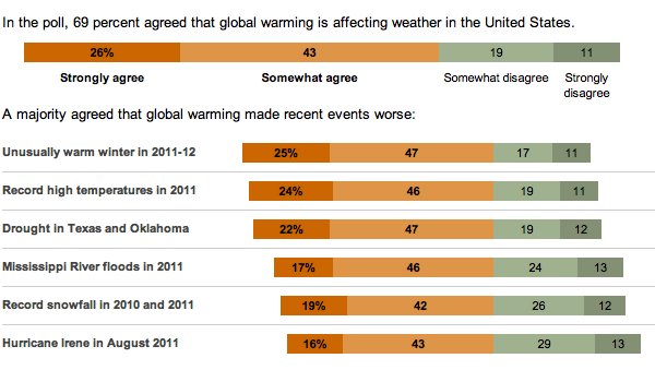
In the US, we have a tendency to be rather skeptical of climate change and the degree to which, if not whether entirely, it is due to mankind. So, the New York Times released the results of a survey about whether Americans believe recent weather events are related to global warming—their word choice, not mine.

Survey on global warming

While not all bars sum to 100, probably due to rounding, note how the bars are all aligned against the point of divergence between the scales of agreement and disagreement and then sorted according to agreement.

A Profile of Canada’s Immigrants

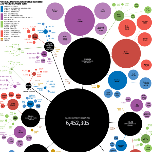
On the back burner of infographics to post is this piece from the National Post. The early data indicates that most of Canada’s high population growth rate comes from immigrants to the country. And while those details are not yet available, the piece looks at the 2006 data for an indication of from which places the immigrants are likely to come.

Cropping of immigrant origins

Credit for the piece goes to Richard Johnson.

Santorum Quits. Goodbye…and Thanks for all the Varicose Veins.

So Rick Santorum is now out of the race. Mitt Romney is basically now set to run against the President. But why should Santorum go out without an infographic looking back at the Republican primary race. (Since neither Newt nor Ron come even close to running the same race as Rick.)

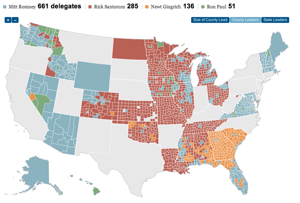
The New York Times put out an infographic looking at Rick Santorum’s campaign. And as one can see, he did do well in the evangelical and Christian conservative heartland of the United States. It just was not quite enough to beat Romney’s supporters.

County leaders in Republican primary states

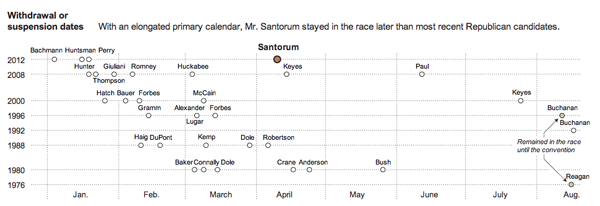
But, Santorum did manage to last longer in the race than many others have in recent years. So who knows, depending on how the election in November turns out, we may just see more of Rick in the future.

A timeline of withdrawal