These charts are not particularly well designed, but they were chosen by top economists for the BBC to talk about 2011.
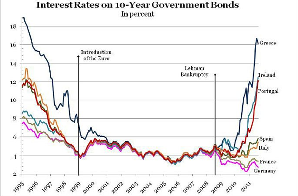
These charts are not particularly well designed, but they were chosen by top economists for the BBC to talk about 2011.

The riots in the UK earlier this year prompted questions about British society and the causes behind the riots. The Guardian has been reporting on different elements of the riots for some time now and has released the results of their work on discovering those causes. And naturally, survey results should be visualised for more awesomeness.
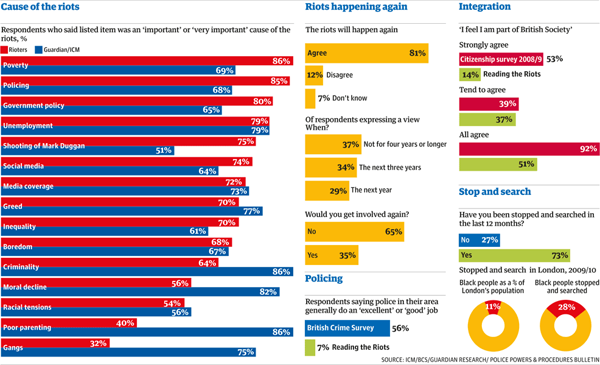
The discrepancies between the causes should be interesting. However, the number of bars and their tight spacing along with contrasting colours makes me wonder if the chart would be more effective not if it plotted the value of the responses, but rather the value of the difference in the responses.
There have been a lot of interesting maps of late that map out continents and planets, but today is one for the sea—the bottom of which we know less about than the surface of the Moon.
According to a story covered by the BBC, the US State Department backed an exploration of the Mariana Trench, a subduction zone where one oceanic plate is slipping underneath another. The result is an inward-folding crumple and then a bunch of volcanos—the Mariana Islands. The US wants to know if it can extend its economic zone further, but can only do so if certain geographic conditions are met. Hence, the study.
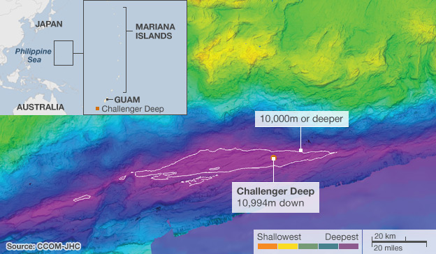
Challenger Deep is the deepest, lowest point on the planet. Though one can argue that because the Earth is not a perfect sphere, points in the Arctic and Antarctic may yet be deeper/nearer the centre of the Earth. If one were to Mount Everest, the tallest mountain on the planet, inside the Mariana Trench at Challenger Deep, the very tip of the mountain would still not break the surface of the ocean.
Via Fareed Zakaria, an interactive piece by Food Service Warehouse that looks at the leading nations of food consumption in calories—and what people spend for their food.
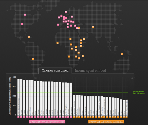
The map is not entirely useful, although it does at least hint at the geographic locations of the largest consumers (the West) and the smallest consumers (the Rest of the World). More interesting is the simple bar chart at the bottom of the interactive piece.
The BRICs are ten years old. Well, not really. But the concept of Brazil, Russia, India, and China becoming some of the world’s largest economies is. Well, not even that necessarily. But the coining of the term BRIC is a decade old. So the BBC has a small interactive piece showing why the BRICs matter.
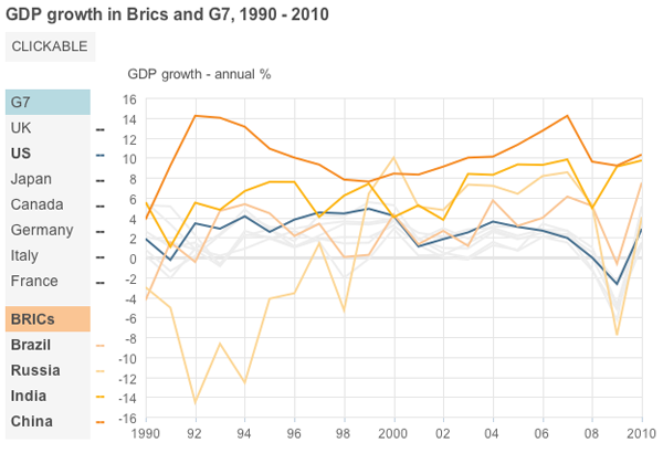
They do some interesting things with the use of hues and tints to group lines in the line charts and provide consistent groupings throughout the piece. And they have photos of leaders. Just in case you do not know what the finance minister of Italy looked like back in 2001…just do not ask me to remember his name.
Something I’ve been meaning to put up for a little while, the New York Times’ coverage of that city’s marathon and changes in the socioeconomic composition of the neighbourhoods through which the course winds.
The piece includes a narrated motion graphic explaining the changes along a map of the course, while a series of charts look at those factors from a static perspective. The horizontal axis being the route of the course.
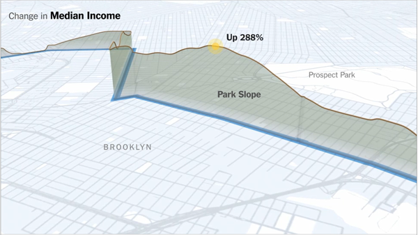
Credit for the piece goes to Graham Roberts, Alan McLean, Archie Tse, Lisa Waananen, Timothy Wallace, Xaquin G.V., Joe Burgess, and Joe Ward.
Nearly a month ago, the New York Times released an interactive piece along with a printed infographic about the European debt crisis in an attempt to explain just what is going on; I wrote about it here.
Now, the BBC has an interactive graphic showing how different countries relate to each other. The width of the lines relates to the amount of debt and the colours fall into three groups: red for high risk, yellow for medium risk, and grey for low risk. These are all fairly sensible and are echoed in the New York Times piece.
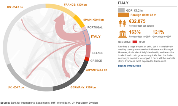
However, one advantage of the diagram used by the BBC is that the arrows emerge from an arc and show the total amount of debt going to the selected European (and US) economies. At least, I hope they do. That is how I read it, but it is not explicitly stated. I hope that I am correct. If so, this is better than the Times version which simply has a proportionally wide line starting from a circle. But without other lines, one cannot see the useful supplemental information about how much total trade the country has.
One element that sticks out is the selected state of the diagram. This uses a blue line that is rather crudely drawn atop the arc. Distractingly so. The colour choice works as blue contrasts with the reds, yellows, and greys, but the execution of the line drawing is simply poor.
Overall, the data is interesting, and if my assumption is correct, and presents a more meaningful picture of trade relations between the chosen countries. However, the execution of the piece’s design does leave me wanting more. And that, given the need to tell this story both completely and correctly, is unfortunate.
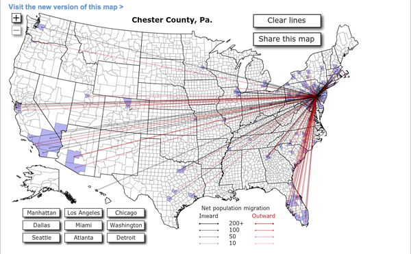
Forbes released Jon Bruner’s latest map of migration in the United States. It uses IRS figures to show inbound and outbound movement from counties across the United States. The work itself is an improvement from his map from last year, which was a bit more difficult to read. Beneath is the new version, and at the end, for comparison, the old.
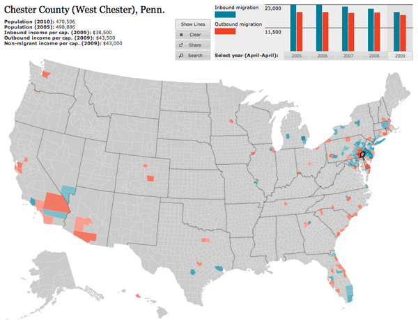
Firstly, the colour palette is far more sophisticated. Secondly, and most crucially, the user can hide the lines on the map, which obscures a key part of the story of migration in urban areas—higher income people moving out of the city and into the suburbs. Thirdly, the map data now includes additional years, which are available by clicking the small chart in the upper right—a welcome addition that allows the data from last year’s map to become accessible this year. Fourthly, and to be fair this may have existed previously but not that I can recall, the new map is accompanied by essays.
These essays use the map and its data to tell stories and explain what one sees going on with the data. It is (relatively) easy for one to put together a piece of data visualisation from a data set. But, without knowing where to look, users may not actually find anything valuable in the visualisation. By pointing to these essays, the map—already much improved from a design perspective—takes on a much more rounded and mature character and becomes more about generating information and knowledge than simply figures and statistics.
