Income Segregation in the Philadelphia Metro Area

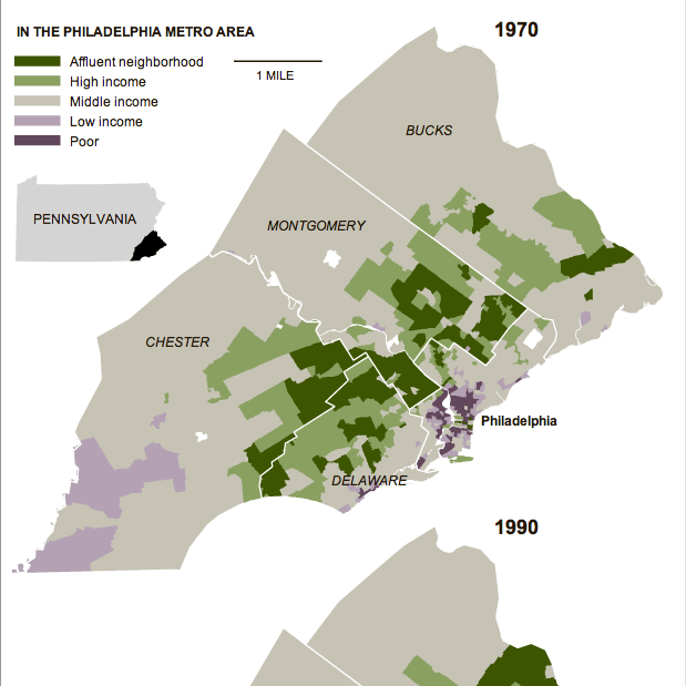
In an area very close to me…quite literally…the New York Times published an article about increasing segregation between the rich and the poor via the areas where they live. The study by Stanford University found that the Philadelphia metropolitan area saw the “sharpest rise” in segregation since the 1970s—the study used census data available through 2007. The accompanying graphic highlights the growth of the segregation from 1970, using small multiples of choropleths to compare 1970 to 1990 to 2007.

In 1970, much of the metro area was middle-income neighbourhoods. Certainly, the central core of Philadelphia was depressed. So too was Chester and rural southwestern Chester County. The upper-income neighbourhoods were in the close suburbs, note the townships stretching due west of the city and you see the Main Line, one of the most affluent areas of the United States, while other veins of wealth extend along other old rail lines leaving the city.
Neighbourhoods by Income in 1970

Those such as myself who are familiar with both the area and recent history should note that places like Coatesville and Downingtown are shown as middle-income. In the 1970s, areas like this and in similar places like Falls Township in Bucks County had robust steel and manufacturing sectors that employed a substantial portion of the local population.

But, compare this to 2007 and you will begin to see how many old factory towns of middle-income areas became dense pockets of depression while the city of Philadelphia itself saw a flight of wealth to the rest of the suburbs. The rural parts of Chester, Montgomery, and Bucks have seen high growth by means of new developments of upper-middle- and upper-income homes.

363 Days

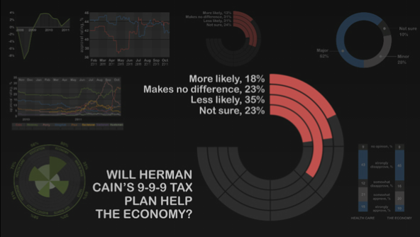
We are now just under 365 days away from Election Day 2012. Without a doubt, I shall have many politically-themed graphics coming. People just have to start making them. But for now, the Economist kicked it off Monday—when it was 365 days—with a motion graphic piece that outlines some of the polling numbers and challenges to the Republicans vying for power and President Obama determined to keep it.

365 days until Election Day 2012

Certain types of the chart are very much not helpful in determining the actual numerical comparisons. But, with the voiceover keeping our attention and explaining what is going on with the charts, it is as always interesting to experience a story told in charts and graphs for nearly three minutes. And about a story with real significance.

To Compare the Fares of Cabs

If you live in a big city, you’ve probably been running late, missed the bus or the train, needed to get home safely at least once. So you’ve probably taken a cab.

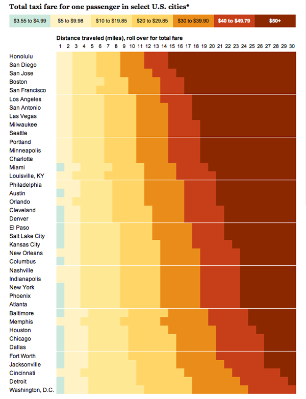
This interactive graphic from the Washington Post compares cab fares across a number of major cities in the United States. The cheapest cab rides are to be found in Washington D.C. The priciest are in Honolulu.

Comparison of Cab Fares Across Major US Cities

Credit for the piece goes to Todd Lindeman and Sisi Wei.

Humanity’s Not So Finest Hours

Humanity is amazing. We have great emotional power for love, sympathy, compassion, &c. We have great intellectual power; we have/are mastering mathematics and science to explore the depths of this ocean and the surfaces of planets not our own.

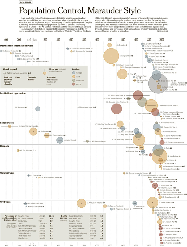
Yet with these great powers comes a great responsibility. And as we continue to reflect upon the milestone of reaching a population of 7 billion men and women, Bill Marsh at the New York Times, along with Micah Cohen, Matthew Ericson, and Kevin Quealy, reflected Sunday on humanity’s ability to let this responsibility slip from time to time and how at those times the human population of Earth fell.

Timeline of Humanity's Atrocities

The data comes from a book by Matthew White called “The Great Big Book of Horrible Things” that details the worst 100 cases of man killing fellow man. (Although, according to Marsh the account is humourous, though I have never read it.) At the top are no particular surprises: World War II, World War I, and Genghis Khan. The reigns of Chairman Mao, Stalin, and the Kims of North Korea. But a look further down the list, further down the timeline reveals in all its tarnished glory the history of humanity when we not quite so amazing.

Can a Republican Win the White House?

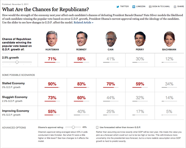
It’s Election Day. Well, not really. But, Nate Silver and the New York Times have come together to release an election simulator, if you will, focused on the chances that a Republican will win the White House.

Chances of Republican Candidates Winning the Election

You play with a few different variables to control the outcome: GDP growth and President Obama’s approval rating. These then are computed along with a few other things (I assume) and, like magic, you get to see your Republican pick’s changes of winning the election.

Keep in mind that these are just possible candidates, not necessarily likely candidates. John Huntsman, after all, is polling in the single digits in some of the early primary states. So while the moderate, centre-right, former ambassador to China, ex-governor of Utah looks almost unbeatable in several scenarios, I think most would agree that the Republican base will not vote for him.

But it is scenarios like that of Huntsman that are worth reminding us that perhaps the current party political system we have in the United States does not yield the best candidates for public office, nor the most broadly electable.

Random is the New Orderly

Ever been on a flight where there is not enough overhead luggage capacity for everyone? Then they make you stow your bag anyway? Well, apparently that’s what’s happening in these days of baggage fees—which make airlines quite profitable.

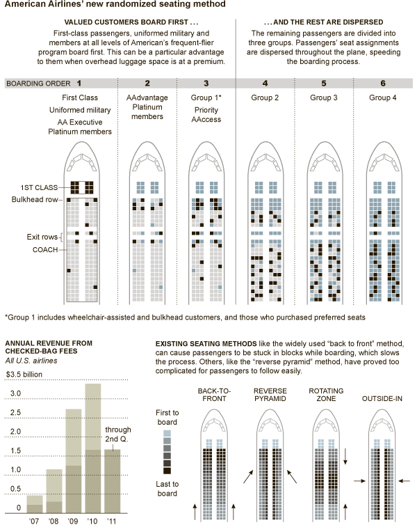
This diagram in the New York Times shows how American Airlines is changing from the more common front-to-back seating of passengers to a random assignment of seats in an attempt to reduce the time spent boarding the plane. After all, not only are baggage fees money, but so is time.

Boarding Diagram
Boarding Diagram

7 Billion Is a Big Number

We have seven billion living on the planet today. Or at least we think we do. Really, who knows? But for the sake of this blog post and many others like it along with news stories and water cooler conversations, let’s just say we’re at seven billion, okay?

So where do you fit into the giant seven billion-ness of the world?

The BBC can tell you.

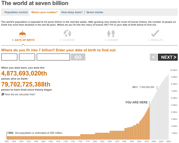
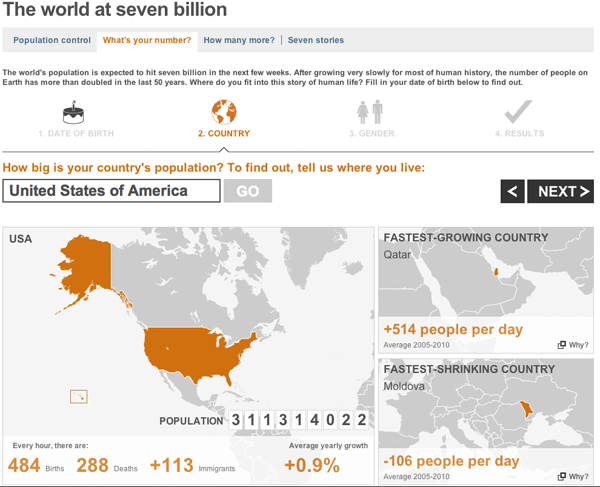
You enter a few data points such as your birthday and the country in which you live, and you get a customised you-are-a-unique-snowflake report on how special you are.

The graphs are not particularly fancy, but they work. More interesting of the whole set is the world population where you are placed in the context of the global population.

Where You Fit Within the World Population
Where Your Country of Residence Fits Within the World

Less interesting are the maps, which serve only to show you where in the world your country is located and then those of the greatest and least population growth or life expectancy. The secondary cases could be useful if the countries were small and relatively unknown. But in terms of life expectancy the highest growth is Japan most people know where Japan is located. The other countries noted, Qatar, Moldova, and the Central African Republic are probably less well-known by some, but could the data be better represented? Probably.

That’s a Whole Lotta People

On Halloween, we will welcome the 7 billionth person into this world. That’s a lot of people. And that means a lot of food, water, shelter, comforts, &c. Stress on limited resources could become a defining characteristic of the future.

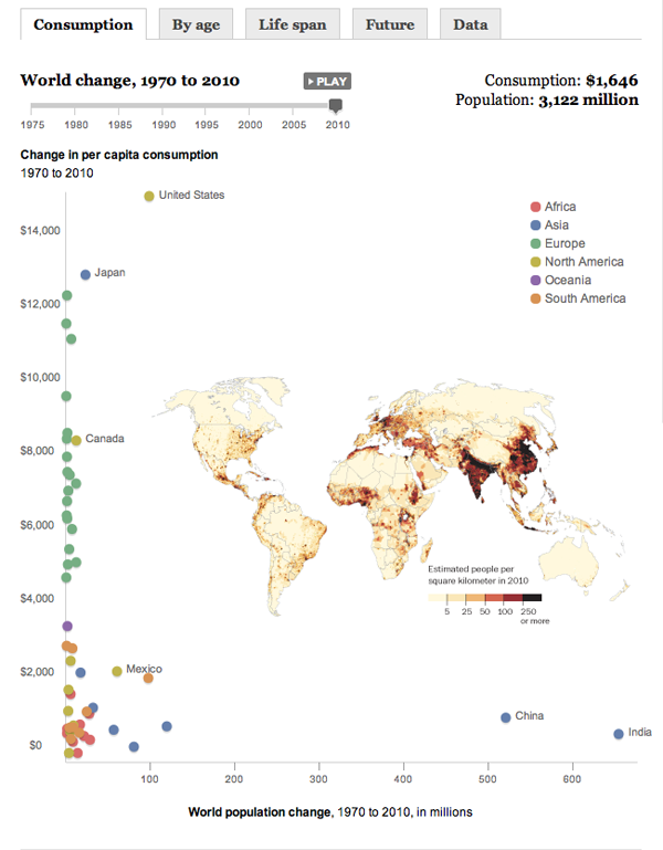
The Washington Post has an interactive piece with a few graphics out there about the growth of population. This screenshot is from the first tab about consumption. When you press play and watch the highlighted countries move through time and space, you see that the United States has not seen drastic population growth (x-axis) but has, on a per capita level, witnessed a strong growth in consumption (y-axis). Conversely, India and China have seen little growth in personal consumption but have dwarfed all others in population growth. There are very few who countries that have moved greatly in both consumption and population. And that’s probably a good thing.

Population Growth v Consumption Growth

If you check out the Future tab, you will also see that in less than twenty years we will all be having another slice of cake for the 8 billionth person in the world…

Credit for the work goes to Patterson Clark, Dan Keating, Grace Koerber and Bill Webster of the Washington Post.

Troop Levels in Iraq

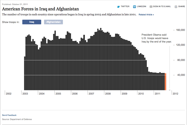
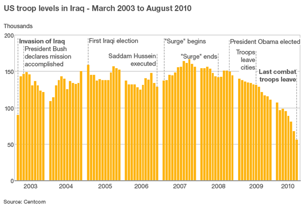
A few days ago, President Obama announced that all but perhaps 150 US troops in Iraq would be home before 1 Jan 2012. While the mission may have been accomplished over 8 years ago, we are finally seeing an end to the Iraq War.

Both the BBC and the New York Times created charts to show the strength of US forces in Iraq since the start of the war up until the end—the New York Times also compares these to troop levels in Afghanistan where we have a new ‘surge’ of troops.

The two are slightly different. The first from the New York Times is an interactive piece that allows you to mouse over each bar and access the actual number of troops present in Iraq that month. The bars are spaced tightly together with only the necessary gap to break apart years and provide the vertical scale.

New York Times chart

The BBC piece is a static image with no interaction. I do not care for the clustering of years, it breaks the visual rhythm of the piece and interrupts the story. I think in the design of the piece that the New York Times has the better and more effective chart. However, where the BBC truly succeeds is in offering bits of explanation for changes in the chart.

BBC chart
BBC chart

One might think that the war lasted several years with periods of great battles and great troop losses because the  number of soldiers stays roughly at 140 thousand. But the text lets us know otherwise. The first is obvious, the war begins. But it progresses to things like the declaring of mission accomplished, the surge, and when US troops left Iraqi cities.

These are not difficult pieces of analysis, nor do they require much investigatory journalism, but they provide the context that allows the chart to tell the story in its numbers.

Oh Great Gatsby

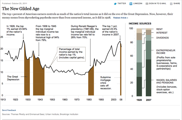
Income inequality basically means that the wealth of a country, in this case, is unevenly distributed with most of it falling in the hands of a very few people or families. Think the era of, as the title alludes to, Gatsby and the 1920s before the Crash.

Broadly speaking, a middle class requires a more dilute concentration of wealth, and as this graphic from the New York Times shows, we are seeing—Great Recession aside—the growing wealth of the wealthy at the expense of the rest of the country. Look at, for example, the 1950s, 60s, and 70s when the highest income bracket had its marginal tax rate in the 70% range. The top 1% owned only about 10% of the wealth. Just before the subprime crisis hit, that number was just under 25%.

Ownership of US wealth for the top 1%